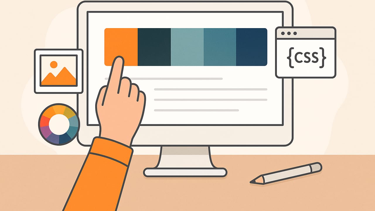
A great color palette clarifies hierarchy, amplifies brand personality, and improves usability. But moving from a single hue to a balanced, accessible set can be time-consuming without the right tools. That’s where a color palette generator shines. Whether you’re designing a mobile app, building a brand system, or selecting paint for a room, generators help you move fast while staying consistent with color theory and accessibility standards.
This guide explains how color palette generators work, which types to use for different tasks, how to evaluate contrast quickly, and how to export palettes for web, print, and collaboration. You’ll also find practical workflows, a comparison table, and code snippets that make implementation painless.
What Is a Color Palette Generator?
A color palette generator is a tool that creates coordinated sets of colors—usually a combination of primary, secondary, neutrals, and accent tones—based on an input such as a seed color, harmony rule, or image. Advanced generators let you lock specific swatches, adjust lightness/saturation, fine-tune harmony relationships, and export in multiple formats.
Common use cases include:
- Brand identity exploration and systematization
- UI/UX design with accessible component states
- Data visualization palettes for charts and maps
- Interior design and mood boards from photos
- Social content and marketing collateral
Color Models You’ll See: RGB, HEX, HSL, HSB, CMYK
Generators often present multiple color models. Knowing when each is useful helps you edit more confidently:
- RGB (Red, Green, Blue): Additive color for screens. Values 0–255.
- HEX: Hexadecimal notation of RGB for web (for example, #2B59C3). Compact and ubiquitous in CSS.
- HSL (Hue, Saturation, Lightness): Intuitive for adjusting tints, shades, and tones by separating color attributes.
- HSB/HSV (Hue, Saturation, Brightness/Value): Similar to HSL; useful for editing perceived brightness.
- CMYK (Cyan, Magenta, Yellow, Black): Subtractive color for print workflows. Requires careful proofing.
How Color Palette Generators Actually Generate
Behind the scenes, different methods guide how palettes are formed. Understanding these will help you choose the right tool for the job.
| Type | How it works | Best for | Pros | Watch-outs |
|---|---|---|---|---|
| Rule-based harmony | Uses color theory rules (complementary, analogous, triadic, tetradic) | Brand systems, UI kits | Predictable, balanced | Can feel formulaic without tweaks |
| Algorithmic scales | Generates tonal ramps and steps from a base hue | Design tokens, component states | Consistent spacing for states | Requires testing for contrast |
| Image-based sampling | Extracts dominant colors from photos or screenshots | Mood boards, inspiration, interiors | Context-rich, organic | Lighting can distort hues |
| AI/ML clustering | Finds color clusters and suggests combinations | Exploration, trend-driven palettes | Creative, unexpected results | May need curation for usability |
A Reliable Workflow With a Color Palette Generator
- Define the job: Clarify the use (brand, UI, print, interior) and constraints (dark mode, print stock, chart readability).
- Pick a base color: Use a brand hue, a product photo, or a mood image. If undecided, start with neutrals and add accents.
- Generate with structure: Select a method—harmony-based for brands, tonal scales for UI, or image sampling for mood.
- Lock, then explore: Lock essential swatches (primary, background, text). Vary saturation/lightness on supporting tones.
- Test contrast early: Validate key pairs (text on background, button on background, chart lines on fills). Adjust lightness gaps as needed.
- Reduce to essentials: Aim for 1–2 primaries, 2–4 accents, and a disciplined neutral scale.
- Name tokens: Use semantic names (color.text.primary, color.bg.elevated) instead of hard-coding hex codes.
- Export: Save as CSS variables, JSON tokens, ASE/ACO for Adobe, or swatches for Figma/Sketch and printer-ready profiles for print.
Accessibility and Contrast: Non‑negotiable
Readable color pairs are crucial. The Web Content Accessibility Guidelines (WCAG) specify contrast ratios:
- Normal text: AA ≥ 4.5:1; AAA ≥ 7:1
- Large text (≥18 pt regular or ≥14 pt bold): AA ≥ 3:1; AAA ≥ 4.5:1
- UI elements and graphical objects: AA requires 3:1 against adjacent colors for important states
Practical tips:
- In HSL, increase the lightness gap between text and background more than the saturation gap.
- For dark mode, don’t just invert—rebuild neutrals with slightly lower saturation to reduce glow.
- Check focus states: Ensure the focus ring contrasts with both background and component borders.
/* Example: applying an accessible palette with CSS variables */
:root {
  --color-bg: #0F172A;        /* slate-900 */
  --color-surface: #111827;   /* slightly lighter for cards */
  --color-text: #F9FAFB;      /* near-white for 7+:1 */
  --color-primary: #2B59C3;   /* brand */
  --color-primary-contrast: #FFFFFF; /* 4.5+:1 on primary */
  --color-accent: #F59E0B;    /* warm highlight */
}

body { background: var(--color-bg); color: var(--color-text); }
.button-primary {
  background: var(--color-primary);
  color: var(--color-primary-contrast);
}
.button-primary:focus {
  outline: 3px solid var(--color-accent);
  outline-offset: 2px;
}
Always verify contrast ratios with a checker, especially after adjusting lightness or overlaying layers (e.g., text on images).
“Color is a power which directly influences the soul.” — Wassily Kandinsky
From Photo to Palette: Tips for Image-Based Generation
Creating a palette from a photo is a fast way to capture a mood or match real-world materials. To get reliable results from a color palette generator that samples images:
- Start with clean lighting: Natural daylight reduces color casts. Avoid mixed light (incandescent + daylight).
- Crop to the subject: Remove busy backgrounds so dominant colors represent your focal point.
- Blur for average tone: A slight blur (or stepping back for a wider shot) reduces noise and yields truer averages.
- Include a neutral reference: A white or gray object in frame helps correct white balance later.
- Extract more than you keep: Sample 8–12 colors, then pare down to a core set of 5–7 for clarity.
- Normalize across devices: Screens vary; compare the palette on at least two displays.
Exporting and Implementing Your Palette
Choose exports that match your workflow and team tools:
- CSS variables: Best for web and design systems.
- JSON tokens: Shareable across platforms and build pipelines.
- ASE/ACO: Swatch files for Adobe apps.
- SVG swatches: Portable, previewable in the browser.
- CSV/XLSX: Lists with HEX, RGB, HSL for communication and audits.
{
  "color": {
    "bg": { "default": "#0F172A", "surface": "#111827" },
    "text": { "primary": "#F9FAFB", "muted": "#CBD5E1" },
    "brand": { "primary": "#2B59C3", "accent": "#F59E0B" }
  }
}
When handing off to developers, provide both the token names and their intended usage (e.g., “Use brand.primary for interactive elements like primary buttons and active tabs”). This reduces misapplication.
Common Mistakes When Using a Color Palette Generator
- Too many colors: Visual noise increases cognitive load. Trim accents; emphasize hierarchy.
- Low contrast neutrals: Subtle gray-on-gray can fail accessibility. Start with a strong text color and adjust backgrounds.
- Ignoring states: Don’t only style the default state. Generate hover, active, disabled, and focus variations.
- Skipping dark mode: Create a separate neutral scale optimized for dark backgrounds rather than inverting.
- Print mismatch: Convert to CMYK and proof on your actual paper stock if anything will be printed.
- Relying solely on hex tweaking: Use HSL to control lightness/saturation deliberately instead of guessing in RGB/HEX.
How to Choose the Best Color Palette Generator for You
Evaluate generators against your real constraints and deliverables:
- Input method: Need image sampling, harmony rules, or both?
- Controls: Can you lock swatches, snap to contrast targets, create tonal ramps, and adjust HSL precisely?
- Accessibility: Built-in contrast checking and simulation for color-vision deficiencies.
- Export formats: CSS variables, JSON tokens, ASE/ACO, SVG, and CSV support.
- Organization: Name swatches, group palettes, and version changes.
- Platform: Browser-based, desktop, or mobile. For field work, mobile capture can be a game changer.
- Collaboration: Sharing, comments, and permissions for teams.
- Privacy: Local processing if you’re working with sensitive brand imagery.
- Cost: Many tools are free with optional upgrades; ensure core features fit your budget.
Quick Reference: Generator Types and Use Cases
| Goal | Recommended generator | Why |
|---|---|---|
| Brand foundation | Rule-based + tonal scale | Predictable harmony with scalable ramps |
| UI design system | Algorithmic scales + contrast tooling | Consistent states and WCAG compliance |
| Interior mood board | Image-based | Captures real-world materials and lighting |
| Marketing campaign | AI/ML + rule-based refinement | Creative exploration, tuned for brand goals |
| Data visualization | Sequential/diverging scales | Accurate perception across values |
Putting It All Together
Think of a color palette generator as a starting engine, not a finish line. Begin with a clear intent, generate structurally sound color sets, validate accessibility, and refine for context—web, print, or physical space. Use semantic token names and robust exports to keep teams aligned, then test in real layouts to ensure your palette communicates clearly under real constraints.
If you often work from photos and need quick HEX, RGB, HSL, or HSB values on the go, an iOS app like Color Viewfinder can extract colors from images and help you build palettes you can later refine in your main design workflow.
The payoff is consistency, clarity, and confidence. With the right generator and a disciplined process, your palette will do more than decorate—it will direct attention, reinforce meaning, and make your work accessible to more people.
