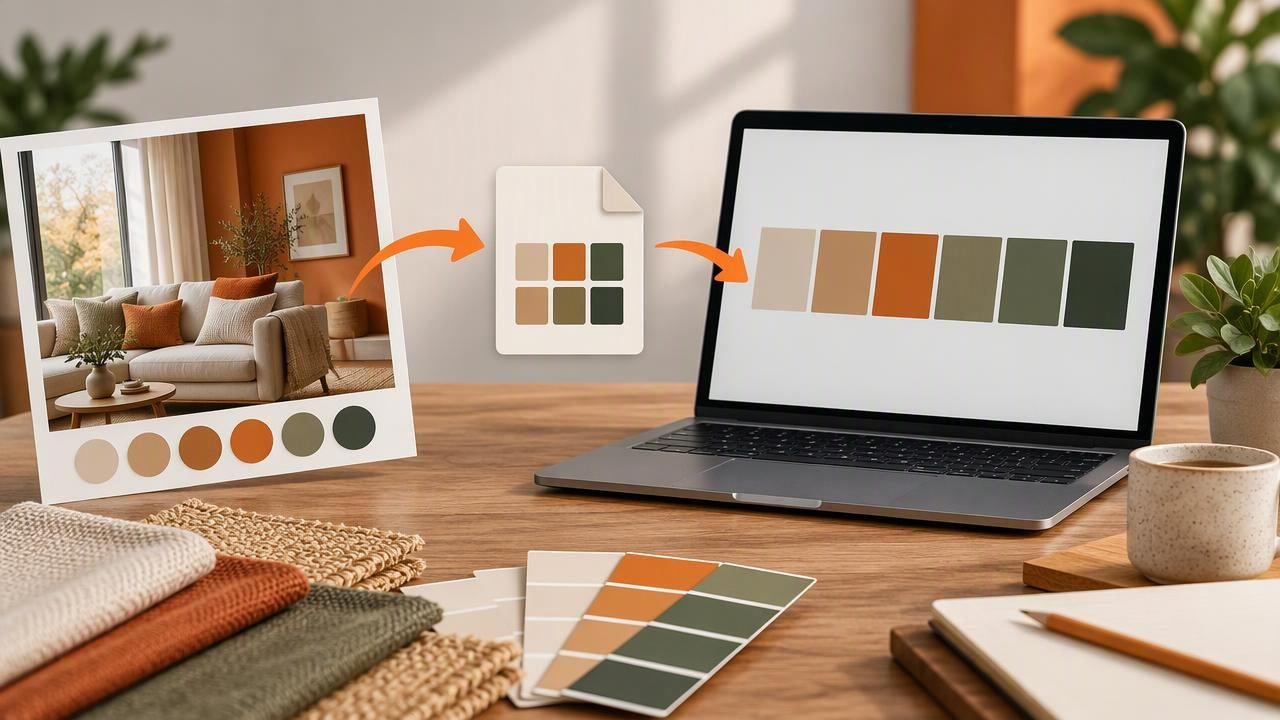
A room photograph can be a useful starting point for a decorating palette, but inspiration is easier to apply when its colors are named, organized, and ready to use in design software. An Adobe ASE exporter helps bridge that gap by saving color swatches in the Adobe Swatch Exchange format. You can then bring a palette into compatible Adobe applications and use it while developing mood boards, presentation graphics, or other visual materials.
ASE is a digital color-library format, not a paint specification. It can help you keep selected colors together, but it does not identify a guaranteed paint match, describe a finish, or ensure that colors will look identical on every screen or printed page. This guide explains a practical ASE workflow for decorators, from planning a palette to checking an exported file.
What an Adobe ASE file does
An ASE file stores color swatches in a format supported by Adobe design software and some other applications. Instead of copying color values one by one into a project, you can share a group of swatches as a single file. This is useful when a decorator and a graphic designer are working on related materials, such as a room concept and its presentation deck.
Think of ASE as a container for digital color selections. Depending on the exporter and destination application, swatches may include color values and names, and may be organized into groups. The exact details and import steps can vary by software and version, so check the documentation for the application you plan to use.
- Useful for: transferring a palette between compatible design tools, keeping swatches together, and reusing colors in visual documents.
- Not a substitute for: physical samples, supplier specifications, lighting assessments, or print proofs.
- Worth checking: whether the destination software supports ASE and how it handles imported color spaces and swatch names.
When decorators might use an ASE exporter
Decorators often gather references from room photos, fabric, artwork, flooring, or natural materials. A digital palette can make those references easier to discuss and develop. For example, imagine a living-room concept inspired by a photograph of a weathered blue door beside warm stone and leafy plants. You might record a muted blue, a pale warm neutral, a deep green, and a darker accent as a starting palette.
Once those choices are saved as swatches, they can be used in a mood-board layout or presentation without repeatedly entering each value. A shared ASE file can also reduce manual transcription when another team member needs the same colors. It does not decide which wall, trim, or textile should use each color; that remains a design decision based on the room, materials, and client brief.
Plan the palette before exporting
A tidy export begins with a tidy palette. Avoid collecting every appealing pixel from a photograph. A photo can contain many near-duplicates caused by shadows, reflections, compression, and changes in light. Instead, choose a manageable set of colors that represents the visual direction you want to explore.
- Choose a clear source. Select a photo with colors relevant to the project. Note whether it was taken in warm indoor light, bright daylight, or shade, since lighting affects how colors appear in an image.
- Select distinct roles. Identify a dominant color, supporting neutrals, one or two secondary colors, and an optional accent. These are palette roles, not fixed rules for how much of a room each color should occupy.
- Review the values. Check the HEX or RGB values and, where available, HSL or HSB values. Numerical values help distinguish similar swatches, but they describe screen color rather than a physical material.
- Name colors clearly. Use practical labels such as “soft stone neutral” or “deep foliage green,” or include a project code. Avoid names that imply a specific paint brand or finish unless you have verified that information separately.
- Remove redundant swatches. Keep colors that serve a purpose. A shorter, considered palette is generally easier to review and communicate than a long list of tiny variations.
A simple example palette
The following values are illustrative digital colors for a calm, nature-inspired concept. They are not extracted from a particular photograph, and they are not paint recommendations. Their purpose is to show how a decorator might give swatches descriptive names before exporting them.
| Swatch name | Example HEX | Possible palette role |
|---|---|---|
| Soft limestone | #D8D0C2 | Light neutral reference |
| Weathered blue | #617B86 | Muted secondary color |
| Leaf shadow | #53634F | Deep natural accent |
| Warm clay | #A66F58 | Small contrasting accent |
In a swatch library, these names help explain the palette at a glance. They should not be mistaken for material instructions: a color that works as a small digital accent may feel very different across a large wall or textured surface.
Exporting and importing an ASE palette
The exact controls depend on the palette tool and the Adobe application, but the overall process is straightforward. First, build and review the color set in a tool that can export ASE. Choose the ASE option, save the file with a useful project name, and keep a separate record of the source image or project context if that will help later.
Next, open the destination design application and locate its swatches or color-library controls. Use the application’s import or load-swatches function to select the ASE file. Depending on the software, imported colors may appear in a new library, a swatches panel, or another color-management area. Confirm that the expected names and values are present before using them in a project.
If import fails, check that the file has an ASE extension and was fully saved. Confirm that the destination application supports the format, and try a smaller test palette if the file contains many colors or groups. Avoid assuming that every application interprets all metadata in the same way. When a workflow depends on exact values, compare the imported swatches with the source values.
ASE compared with other palette exports
ASE is one option among several. Choose a format based on what the next person or application needs, rather than exporting every format by default.
| Format | Useful for | Considerations |
|---|---|---|
| ASE | Swatch libraries in compatible design applications | Import support and handling can vary between applications. |
| JSON | Structured color data for software workflows | Often requires a tool or script that can read the data. |
| CSS | Web design and front-end color variables | Best suited to web projects, not a room-material specification. |
| CSV | Tabular review and simple records | Convenient for lists, but may not preserve a visual swatch library. |
A decorator preparing a visual presentation may find ASE convenient when working in compatible software. A developer may prefer CSS or JSON, while a spreadsheet can make a CSV easier to audit. Keep the source values alongside any handoff when clarity matters.
Color values, displays, and real materials
Digital color codes are useful for consistency inside digital workflows, but they do not capture every factor that influences a finished room. A photograph’s white balance, exposure, screen settings, and surrounding colors can all affect perception. Paint, fabric, wood, and stone also have physical properties—such as texture, sheen, translucency, and variation—that a flat swatch cannot represent.
Use a photo-derived palette to explore direction and communicate an idea, not to promise a precise physical result. Before choosing materials, view appropriate physical samples in the actual space and observe them under the room’s lighting. If a project includes printed boards, remember that output devices and print settings can change appearance; an ASE export does not guarantee print accuracy.
Practical rule: use digital swatches to organize and discuss color ideas, then evaluate physical materials in context before making final selections.
Common ASE workflow mistakes to avoid
- Exporting too many near-identical colors: edit the palette so each swatch contributes a distinct option or role.
- Using vague file names: include a project or room reference, such as “north-living-room-inspiration,” rather than “palette-final-2.”
- Assuming a HEX value names a real product: keep brand, product, and finish details in a separate verified specification.
- Skipping the import check: reopen the file in the destination application and inspect names and values before sharing it.
- Treating a photo as a neutral measurement: document that the palette is inspired by an image, especially if the lighting or editing is unknown.
A reliable handoff checklist
Before sending a palette to a collaborator, check that the ASE file opens in the intended software, the swatches are named clearly, and the palette has been reduced to useful choices. Include a short note about the source and purpose of the colors. If the palette is part of a decorating proposal, state that the digital values are visual references and that material selections still require review in person.
For a photo-based starting point, Color Viewfinder’s guide to creating a color palette from a photo explains how image colors can become an organized digital palette; its app can inspect color values and export palettes in formats including ASE. Use that kind of workflow to support exploration and handoff, while keeping physical sample checks and final material decisions separate.
