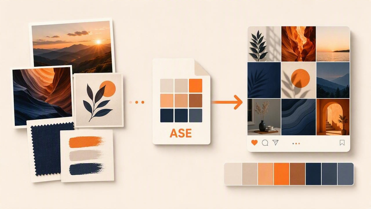
Finding the best Adobe ASE exporter to build a social media palette is less about choosing a single app and more about creating a dependable color workflow. A strong social media palette must work across Instagram posts, video thumbnails, Stories, Pinterest graphics, ads, presentation templates, and branded illustrations. To keep every asset recognizable, designers need colors that are easy to sample, organize, export, and reuse.
Adobe Swatch Exchange, or ASE, is a practical format for transferring color swatches into Adobe design tools. An ASE file can save the time-consuming work of manually entering HEX or RGB values into Illustrator, Photoshop, or InDesign. However, not every palette exporter handles color values, naming, grouping, or compatibility in the same way.
This guide explains what to look for in an Adobe ASE exporter, how to create an effective social media color palette, and how to avoid common color-management problems before they affect your content.
Why ASE Files Matter for Social Media Design
Social media graphics are produced quickly and often by more than one person. A brand may have a designer creating campaign templates, a social media manager resizing posts, and a video editor producing short-form clips. If each person picks colors by eye, brand consistency can disappear within a few weeks.
An ASE file creates a shared starting point. Instead of saying, “use the warm orange from the last post,” a designer can provide a named swatch with a precise value. This is especially useful when a visual identity includes several neutral tones, subtle background colors, or a rotating set of campaign accents.
ASE is most useful as part of a broader color system. It is not usually the final format used by a social platform, but it helps establish accurate colors in the Adobe tools where graphics are created.
What Makes the Best Adobe ASE Exporter?
The best exporter for your workflow should do more than create a downloadable file. It should preserve the decisions that make a palette usable in real creative projects.
1. Accurate Color Sampling
Start with accurate source colors. Whether you are extracting shades from a product photo, an interior image, a mood board, or an existing logo, the exporter should retain the intended RGB and HEX values. Small differences can be noticeable in digital content, particularly with saturated brand colors.
Look for a color extraction tool that displays values clearly and lets you make intentional adjustments before export. A sampled blue may need to become slightly darker for readable white text, while a pale beige may need more contrast before it becomes a usable background color.
2. Support for Named Swatches
Generic names such as “Color 1” and “Color 2” make a palette difficult to use later. The most practical ASE export workflow lets you rename swatches before exporting them.
- Primary Navy
- Campaign Coral
- Soft Sand Background
- Deep Charcoal Text
- Highlight Mint
Clear naming reduces mistakes when several people access the same swatch library. It also makes it easier to identify which colors are permanent brand colors and which are intended only for a seasonal campaign.
3. Palette Organization
A useful social media palette is rarely just five attractive colors. It should include colors with specific jobs: backgrounds, text, accents, highlights, buttons, charts, and overlays. Choose an exporter that supports organized palettes or at least lets you prepare a deliberate sequence of swatches.
For example, placing foundation colors first, followed by accents and neutrals, helps everyone understand the visual hierarchy as soon as the ASE file is opened.
4. Reliable Adobe Compatibility
An ASE exporter should produce a standard file that imports cleanly into the Adobe applications your team uses. Before committing to a full workflow, test one small palette in Illustrator and Photoshop. Check that the swatches appear correctly, that values are preserved, and that names remain understandable.
A reliable exporter is more valuable than one with a long feature list but inconsistent imports. Your goal is a file that saves time every time it is used.
5. Multiple Export Options
ASE should not be the only export format available. Social media work regularly moves beyond Adobe software. A flexible palette tool should also provide formats or values that work in web design, presentation tools, video editors, and team documentation.
| Format or Value | Best Use | Why It Helps |
|---|---|---|
| ASE | Adobe Illustrator, Photoshop, InDesign | Imports saved swatches into Adobe workflows. |
| HEX | Web graphics, templates, documentation | Easy to copy into browser-based tools and CSS. |
| RGB | Digital artwork and screen-based assets | Useful for social graphics viewed on displays. |
| HSL or HSB | Fine-tuning and color variations | Helps adjust brightness, saturation, and hue intentionally. |
Build a Social Media Palette Before You Export
Do not export every color found in an image. A photo may contain hundreds or thousands of colors, but a social media system needs a smaller, repeatable selection. Aim for a palette that supports recognition while leaving room for variety.
A practical starting system includes:
- One primary brand color for key graphic elements.
- One dark neutral for text, outlines, or contrast.
- One light neutral for backgrounds and breathing room.
- Two to three accent colors for campaigns, calls to action, or data graphics.
- One optional highlight color for limited emphasis.
This structure gives creators enough flexibility without encouraging random choices. A palette of six to eight carefully selected colors is often more useful than a large collection of loosely related swatches.
A Step-by-Step ASE Export Workflow
Step 1: Choose a Strong Visual Source
Start with an image that reflects the mood you want to communicate. It may be a product photograph, editorial image, interior space, travel scene, packaging concept, or brand mood board. High-quality images with clear lighting usually produce more dependable sampled colors than heavily filtered or compressed screenshots.
Step 2: Extract Candidate Colors
Sample more colors than you need at first. Capture major tones, shadows, highlights, and accents. Then review the collection for duplicates and near-duplicates. Two blues may look different in a photograph but be too similar to serve distinct roles in a graphic template.
Step 3: Refine for Digital Readability
Colors that look beautiful in a photo can fail in a social post. Check whether text remains readable over background colors and whether accents are visible on a small mobile screen. A muted pale yellow, for instance, may be useful as a decorative wash but unsuitable for important text or buttons.
Practical rule: Use image-derived colors as inspiration, then refine them for communication. A social media palette must be functional, not merely visually accurate to the original photo.
Step 4: Assign a Role to Every Swatch
Before exporting, label each color by purpose. This prevents an accent color from becoming a body-text color simply because it looks appealing. A simple palette map can be included in a brand guide or shared document:
Primary: #214C78
Text: #202124
Background: #F4F0E8
Accent 1: #E56A54
Accent 2: #73A69A
Highlight: #F2B84B
Step 5: Export the ASE File and Test It
Export the final palette as an ASE file, then import it into the Adobe application your team uses most often. Create one test post using the swatches. This quick test reveals whether names, order, and colors are clear enough for day-to-day use.
Common Mistakes When Exporting Color Palettes
Even a technically valid ASE file can lead to inconsistent output if the palette is not planned well. Watch for these common issues:
- Using too many colors: Large palettes make it easier to drift from the intended look.
- Ignoring accessibility: Low-contrast text can be difficult to read, especially on mobile devices.
- Sampling from filtered images: Strong filters may create colors that do not reflect the real product or environment.
- Mixing RGB and print expectations: Social media assets are screen-based, so RGB values should be your primary reference.
- Skipping a naming system: Unnamed swatches slow down collaborators and increase errors.
- Not documenting usage: A palette is stronger when people know which colors are primary, secondary, or decorative.
How to Keep the Palette Consistent Across Platforms
Once an ASE palette is imported into Adobe tools, use it as the source of truth for visual assets. Build reusable post templates with the primary background, text, and accent swatches already applied. Save versions for square posts, vertical Stories, landscape graphics, and video thumbnails.
Remember that platform compression and different device screens can alter the appearance of subtle colors. Use strong contrast for essential information, and avoid relying on two very similar tones to communicate different meanings. If a color is important for a call to action, test it at the smallest likely viewing size.
Review the palette periodically as your content evolves. You may add campaign accents without changing core brand colors, but record those changes so older and newer assets still feel related.
Choose an Exporter That Supports Your Entire Creative Process
The best Adobe ASE exporter is the one that helps you move from inspiration to organized, reusable swatches with minimal friction. Prioritize accurate color extraction, editable names, reliable ASE output, and easy access to HEX, RGB, HSL, or HSB values. These features turn a pretty image into a palette your team can actually use.
For designers who build palettes from photographs on iPhone or iPad, Color Viewfinder is one option for sampling colors and preparing values before moving them into a broader Adobe and social media design workflow.
