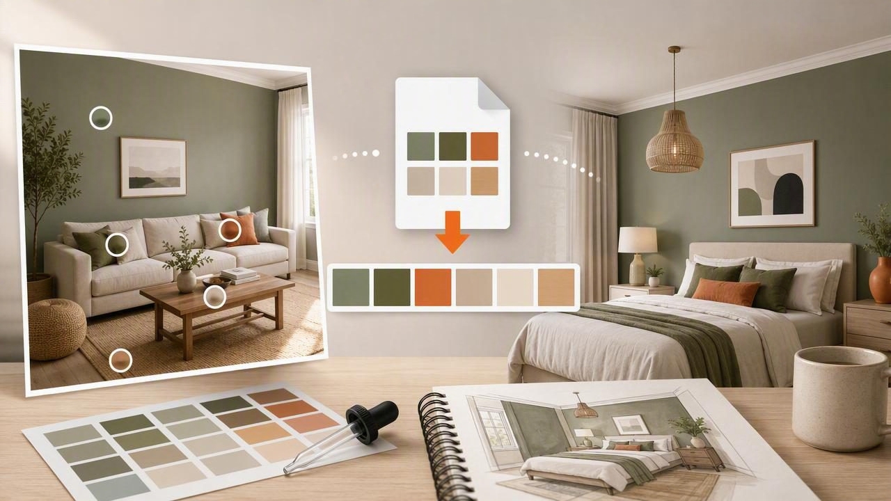
Finding the best Adobe ASE exporter to plan a room color scheme is less about choosing a complicated tool and more about creating a reliable workflow. An ASE file lets you take a carefully selected color palette from a photo and open it in Adobe design software, where you can test mood boards, furniture concepts, wall treatments, artwork, and digital presentation boards.
For interior designers, decorators, homeowners, and visual creators, this process turns visual inspiration into reusable color information. A photograph of a sunlit living room, patterned rug, favorite chair, landscape, or piece of art can become a starting point for a balanced room palette. Exporting those colors as an Adobe Swatch Exchange file keeps the palette organized across compatible Adobe workflows.
This guide explains how to extract colors from an image, build a room-ready palette, export it as ASE, and use it thoughtfully. It also covers an important limitation: digital color values can guide a scheme, but they are not a guaranteed match for physical paint, textiles, flooring, or print.
What Is an ASE File?
ASE stands for Adobe Swatch Exchange. It is a file format used to save and share color swatches between compatible Adobe applications. Instead of manually re-entering every HEX or RGB value into a new document, you can import an ASE palette and work from a set of named, reusable swatches.
For room planning, an ASE export is especially useful when your process includes digital deliverables. You might create a client mood board in Adobe Illustrator, assemble presentation pages in InDesign, or mock up a feature wall and styling direction in Photoshop. A consistent swatch library helps prevent accidental color drift between documents.
| Color format | Best use in a room-planning workflow |
|---|---|
| HEX | Digital mood boards, web references, and quick sharing |
| RGB | Screen-based visuals and Adobe documents |
| HSL / HSB | Comparing hue, saturation, brightness, and value relationships |
| ASE | Importing a reusable palette into compatible Adobe workflows |
| CSV / JSON / CSS | Documentation, development handoff, or structured palette records |
Why Export a Room Palette Instead of Picking Colors by Eye?
Picking colors by eye is valuable, but it can be difficult to repeat. A warm gray may look beige in one image and cool in another. A muted green can appear much brighter when placed near white walls. Extracting color values gives you a clear reference point before you start adjusting a palette for the room.
A photo-based palette also captures relationships that are easy to miss. In a well-composed interior image, the visual appeal may come from a subtle blend of warm off-white, dark wood brown, dusty blue, faded olive, and a small brass-toned accent. Sampling only the obvious “main” color can lose that layered effect.
An ASE exporter helps preserve these relationships in a practical design format. The result is not a finished decorating decision; it is a structured creative starting point.
A Practical Example: Turning a Living Room Photo Into an ASE Palette
Imagine you have a reference photo of a relaxed living room. It includes creamy walls, a charcoal sofa, oak shelving, olive cushions, and a rust-colored throw. Rather than extracting dozens of random pixels, choose colors according to their intended role in the space.
- Sample the dominant light neutral. This may become the background tone for walls, curtains, or large visual areas in the mood board.
- Sample the largest dark neutral. In this example, charcoal from the sofa can anchor the composition.
- Sample the warm material color. Oak or another wood tone adds warmth and keeps the palette from feeling flat.
- Choose one supporting color. Olive can provide a restrained connection to plants, textiles, or artwork.
- Choose one accent color. Rust can become the small, energetic note used for cushions, a vase, or a framed print.
A simplified palette could look like this:
Warm White: #E8E1D6
Charcoal:   #383837
Oak Brown:  #A8784F
Soft Olive: #7D8161
Rust Accent:#B45D3F
Once exported to ASE, these swatches can be imported into an Adobe document. You can then create colored blocks for walls, upholstery, wood finishes, and accessories. This makes it easier to see whether the accent color has enough contrast, whether the dark neutral is overwhelming, or whether the light base needs a warmer companion.
How to Choose the Right Colors From a Photo
The best room color schemes rarely come from extracting every color visible in an image. A photo often contains shadow, reflections, camera processing, and incidental objects that do not belong in the final plan. Curate the palette intentionally.
Start With Five Core Roles
- Base color: The broad, quiet color that establishes the room’s atmosphere.
- Secondary neutral: A darker or warmer balancing shade.
- Material tone: Wood, stone, leather, metal, or natural fiber influence.
- Supporting color: A low-intensity hue used in textiles, art, or decor.
- Accent color: A more noticeable color used sparingly for energy and focus.
This structure prevents a palette from becoming a collection of unrelated attractive colors. It gives each swatch a job. If two colors perform the same job, remove one unless you need extra variation for a detailed presentation.
Inspect More Than HEX Values
HEX codes are convenient for copying colors into digital tools, but HSL and HSB values can help you understand why colors work together. Two colors may have similar hue but differ sharply in saturation or brightness. That difference can make one feel calm and another feel dominant.
For example, a muted olive and a vivid emerald are both green-family colors, but they create entirely different interior moods. Before exporting your ASE palette, inspect whether your supporting colors are similarly restrained or whether one is unexpectedly intense.
Using an Adobe ASE Exporter in a Room Design Workflow
A useful ASE workflow should be simple enough to repeat whenever you find new inspiration. The goal is to move from image to swatches without losing track of what each color represents.
- Choose one clear inspiration image with lighting you understand.
- Extract a limited set of colors and inspect their HEX, RGB, HSL, or HSB values.
- Name swatches by role, such as “Wall Base,” “Dark Upholstery,” or “Terracotta Accent.”
- Export the curated palette as an ASE file.
- Import the swatches into your Adobe mood board or presentation document.
- Create large color areas first, then add furniture, finishes, and accessories.
- Revise the palette if one swatch dominates or fails to support the intended mood.
Clear swatch names matter. A label such as “Green 3” becomes confusing after several revisions. “Olive Cushion Accent” gives the color context and makes collaboration easier.
How Many Colors Should a Room Palette Include?
For most room-planning mood boards, five to seven colors are enough. More swatches may be useful for a complete material library, but a concise core palette is easier to evaluate. It also helps maintain visual discipline when shopping for textiles, accessories, and finishes.
A simple distribution can be described as 60-30-10, although it should not be treated as a strict rule:
- 60%: Base color, often walls or the largest visual area
- 30%: Secondary neutral or major furniture color
- 10%: Supporting and accent colors combined
In a small room, the strongest accent may need even less coverage. In a maximalist space, several accents can coexist, but they should still share a visible connection through temperature, saturation, or material texture.
Important Limitations: Screen Colors Are Not Physical Samples
An extracted digital value is a reference, not a promise. The same HEX or RGB color can look different on phones, tablets, monitors, and projectors. Interior surfaces add further variables: paint sheen, wall texture, room orientation, daylight, bulb temperature, shadows, and neighboring materials can all change how a color appears.
Use photo-extracted swatches to define direction and relationships, then verify important choices with physical samples in the actual room.
Do not assume a sampled color will match a paint manufacturer’s formula, fabric dye, tile, or wood finish. When selecting permanent or costly materials, compare physical samples under morning, afternoon, and evening lighting. Digital palettes are excellent for communication and early concept development, but they cannot guarantee real-world paint or print accuracy.
What Makes the Best Adobe ASE Exporter for This Task?
The best Adobe ASE exporter for planning a room color scheme should support a focused workflow: select colors from a photo, review precise values, edit the palette, name the swatches, and export a usable ASE file. It should help you keep the original inspiration connected to the resulting palette instead of treating colors as anonymous data.
Look for these practical capabilities:
- Photo-based color extraction for collecting visual inspiration
- Readable HEX, RGB, HSL, and HSB color values
- Palette editing so you can remove duplicate or distracting swatches
- Copyable color codes for notes and digital boards
- ASE export for Adobe-centered design workflows
- Additional export options when collaborators need CSS, CSV, or JSON references
If you want to extract a palette directly from an interior image on iPhone or iPad, Color Viewfinder’s guide to creating a color palette from a photo explains a practical mobile approach for inspecting and organizing sampled colors before export.
Final Takeaway
An Adobe ASE exporter is most valuable when it supports decisions rather than replacing them. Start with an inspiring photo, extract a small set of purposeful colors, assign each one a role in the room, and import the ASE palette into your digital mood board. Then test the concept against materials, lighting, and the scale of the actual space.
With that workflow, a room color scheme becomes easier to explain, revise, and share. You retain the emotional quality of the original image while gaining the structure needed for a polished interior design presentation.
