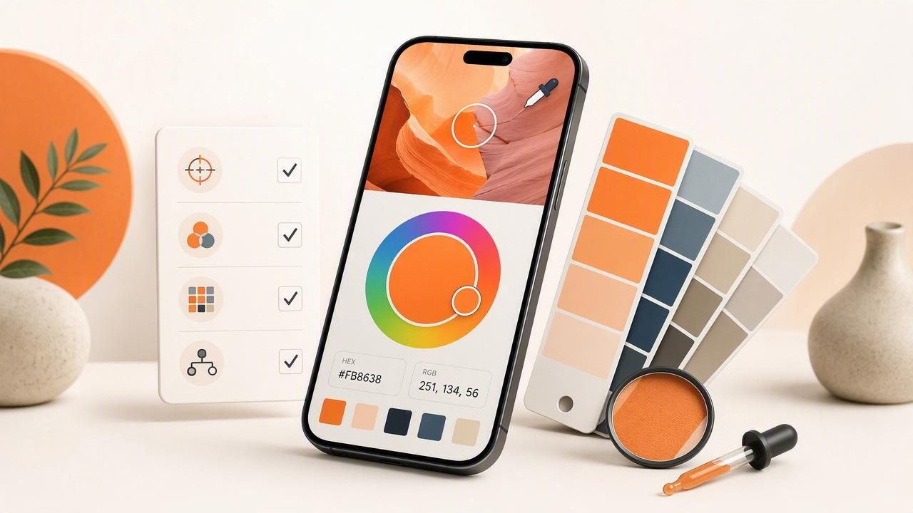
If you’re searching for the best color picker for iPhone, you’re probably trying to solve a very specific problem: translating real-world color into reliable, reusable digital values. Whether you’re building a brand palette, matching paint for an interior project, or grabbing colors from a reference photo for a UI mockup, the “best” choice is the one that fits your workflow—and keeps color accurate from capture to export.
This guide breaks down what matters (and what doesn’t) when evaluating iPhone color picker apps. You’ll learn how to judge accuracy, which color models you actually need, how to create palettes that look good together, and how to export colors so they’re usable in tools like Figma, Sketch, Photoshop, Illustrator, and design systems.
What a color picker app should do (beyond grabbing a HEX)
Many apps can sample a pixel and show a HEX code. The best tools go further: they help you extract multiple colors, organize them into palettes, and export in formats you can use immediately.
- Color extraction from photos (not just a live camera eyedropper).
- Multiple color models: HEX, RGB, HSL/HSB (and sometimes CMYK approximations).
- Palette building: save sets of colors, reorder, lock favorites, generate variations.
- Export options: copy codes, share palettes, export as images or design tokens.
- Workflow features: history, favorites, naming, layout options (swatches/grids).
Accuracy: the most misunderstood “feature”
Accuracy is tricky because your iPhone is not a colorimeter. What you want is repeatability and practical accuracy: if you sample the same photo (or the same area) you should get the same values, and those values should be close enough to use confidently in design.
What affects color accuracy on iPhone
- Lighting: warm indoor bulbs can shift everything yellow/orange; daylight shifts blue.
- White balance: auto-adjustments can change the perceived “true” color.
- Shadows and glare: glossy surfaces (paint, fabric, screens) can create false highlights.
- Compression: screenshots are usually cleaner than heavily compressed images.
- Display settings: True Tone/Night Shift affects what you see while sampling.
Practical steps to get more reliable picks
- Use a reference photo rather than sampling from the live camera when possible. Photos let you zoom and choose more deliberately.
- Turn off Night Shift and consider disabling True Tone while picking.
- Avoid specular highlights: sample midtones, not shiny hotspots.
- Pick multiple points within the same area and average mentally (or select the most representative value).
- Cross-check with HSL/HSB: if saturation/brightness look extreme, you may have sampled glare or shadow.
Rule of thumb: If a sampled color looks “too neon” or “too gray” compared to the object, you likely sampled a highlight or shadow. Move a few pixels and try again.
Which color formats you really need (HEX vs RGB vs HSL/HSB)
The best color picker for iPhone should support multiple color models because each model answers different questions:
- HEX: best for web/UI handoff and most design tools.
- RGB: useful for detailed editing and image-centric workflows.
- HSL: great for building harmonious palettes (tweaking lightness/saturation while keeping hue).
- HSB/HSV: intuitive for “make it brighter/darker” adjustments and quick variations.
If your goal is palette building, HSL/HSB support is a big deal. It lets you create consistent steps for tints/shades without drifting hue.
Palette features that separate “nice” from “actually useful”
A single color code isn’t a palette. A real palette is a set of related colors you can apply consistently across a project (brand, room, poster, UI). Look for these capabilities:
1) Multi-color extraction
Instead of picking one pixel, you should be able to extract several dominant or representative colors from a photo. The best tools make it easy to capture:
- Dominant tones (big areas like walls/sky)
- Accent colors (small but important details like signage or trim)
- Neutrals (grays, off-whites, blacks)
2) Palette organization
- Reorder swatches to match usage (primary, secondary, accents).
- Lock/favorite key colors while exploring variations.
- Name palettes by project (client, room, campaign).
3) Layouts for communicating color
Presentation matters when you’re sharing with clients or teammates. Useful layouts include:
- Swatches for quick reference
- Grids for comparing hues/values
- Stripes for seeing transitions and overall harmony
A quick comparison checklist (use this to choose fast)
When evaluating candidates for the best color picker for iPhone, scan the feature list and test with one real project image. This table highlights what to prioritize and why.
| Feature | Why it matters | What “good” looks like |
|---|---|---|
| Photo-based sampling + zoom | Improves precision and repeatability | Pinch-to-zoom, clear crosshair, stable values |
| HEX/RGB/HSL/HSB | Supports both handoff and palette refinement | One-tap copy, fast switching between models |
| Palette creation | Turns picks into a usable system | Save sets, reorder, duplicate, name palettes |
| Export formats | Saves time and reduces transcription errors | Copy codes, share text/CSV, export images/tokens |
| History & favorites | Prevents “lost” colors during exploration | Recent picks, starred colors, searchable lists |
| Accessibility checks (optional) | Helps meet contrast needs for UI | Contrast ratio or quick light/dark preview |
Workflow: from inspiration photo to a usable palette
Here’s a dependable process you can follow with almost any color extraction app.
Step 1: Start with a “clean” source image
- Use a well-lit photo with minimal shadows.
- If it’s a product or room shot, try taking a second photo from another angle to cross-check.
- For UI inspiration, prefer screenshots over camera photos of screens.
Step 2: Extract 5–9 colors (not 20)
Too many swatches makes decisions harder. A practical palette often includes:
- 1–2 primaries (your main identity colors)
- 1–2 secondaries (supporting hues)
- 1–2 accents (sparingly used highlights)
- 2–3 neutrals (background, text, surfaces)
Step 3: Normalize with HSL/HSB
After picking, refine consistency:
- Align lightness/brightness steps so your palette has predictable tints and shades.
- Reduce saturation slightly for large surfaces (walls, UI backgrounds).
- Keep one or two high-saturation accents for emphasis.
Step 4: Test in context
Before you “lock” the palette, test it where it will live:
- Drop colors into a quick UI frame (buttons, background, text).
- For interiors, apply colors to a simple mood board layout (wall, trim, fabric, wood).
- View in both bright and dim conditions; color relationships can shift.
Exporting colors without breaking your workflow
Export is where many “okay” apps become frustrating. Copy-pasting one HEX code at a time is slow and error-prone. Look for exports that match how you work:
- Plain text list for quick sharing in email or notes.
- CSV for spreadsheets and production tracking.
- Image swatches for client approval.
- Design tokens (or token-like JSON) for teams building design systems.
Example: turning a picked palette into simple design tokens
If your app can export a list of HEX values, you can quickly convert them into a token structure like this:
{
  "color": {
    "brand": {
      "primary": "#1E5BFF",
      "secondary": "#FFB020",
      "accent": "#12C2A9"
    },
    "neutral": {
      "900": "#121417",
      "600": "#5C636E",
      "100": "#F3F5F7"
    }
  }
}
Even if you don’t run a formal design system, naming colors like primary, accent, and neutral helps keep usage consistent across screens, slides, or rooms.
Common mistakes when picking colors from photos
- Sampling the wrong pixel: edges often include anti-aliasing or compression artifacts.
- Ignoring neutrals: without strong neutrals, bright palettes can feel chaotic.
- Over-indexing on one photo: build from a small set of references to avoid “accidental” lighting bias.
- No contrast check (for UI): a beautiful palette can still fail readability.
How to decide which app is “best” for you
Instead of chasing the longest feature list, decide based on your most common scenario:
- Graphic design & branding: prioritize palette organization, exports, and HSL/HSB refinement.
- Interior design: prioritize photo accuracy, easy comparison layouts, and sharable palette images.
- UI/product design: prioritize HEX workflow, contrast awareness, and token-friendly exports.
- Content creators: prioritize speed, history/favorites, and shareable visuals.
Final checklist for the best color picker for iPhone
- Can I reliably pick from photos with zoom and stable sampling?
- Does it show HEX and at least one perceptual model (HSL/HSB)?
- Can I build, save, and reorder palettes (not just single colors)?
- Are exports practical for my tools (text/CSV/image/tokens)?
- Does it feel fast enough to use daily?
If you want a simple starting point for photo-based palette building on iOS, Color Viewfinder is one option that focuses on extracting HEX/RGB/HSL/HSB values and organizing them into shareable palettes—useful if your workflow begins with real-world images.
