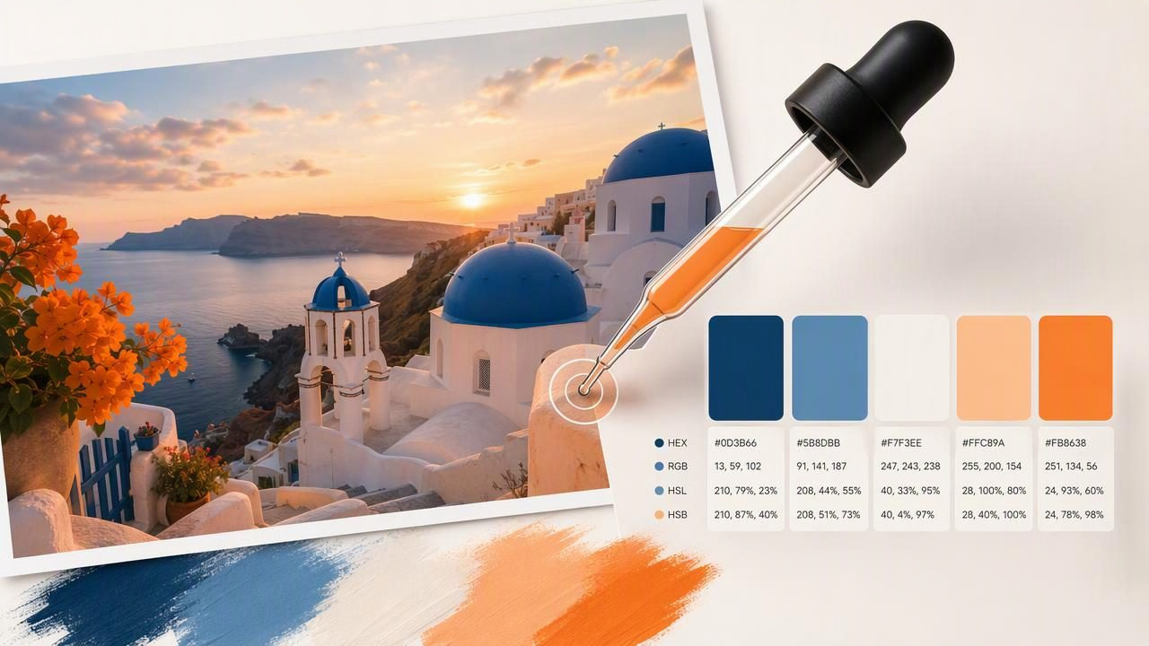
Travel is one of the richest sources of color inspiration. A sun-faded doorway in Lisbon, the turquoise water of a coastal town, a misty mountain trail, or a night market filled with neon signs can all suggest a memorable palette. The challenge is turning that visual impression into color values you can actually use in a design project.
The best photo color picker for travel inspiration helps you inspect a photograph, identify individual colors, and save them as practical values such as HEX, RGB, HSL, and HSB. Instead of relying on memory or trying to estimate a shade by eye, you can build a palette directly from the image that sparked the idea.
This guide explains how to capture travel color inspiration with a photo color picker, choose better source photos, create balanced palettes, and apply extracted colors to graphic design, interior concepts, digital mood boards, and other creative projects.
Why Travel Photos Make Excellent Color References
Travel photography contains color relationships that are difficult to invent from a blank screen. Natural light, local materials, weather, architecture, food, textiles, and signage create combinations with a sense of place. A single image might include a warm neutral background, a saturated accent, a deep shadow, and a soft highlight—all working together naturally.
For designers, the goal is not always to reproduce a scene literally. Instead, the photo becomes a reference for the color mood of a project. You might take the muted greens and stone grays from a forest path for a wellness brand, or use the terracotta, cream, and cobalt from a Mediterranean street photo for an editorial layout.
A photo color picker makes this translation more precise. It lets you move from “that blue feels right” to a documented value such as #2D7892, which can be shared, reused, adjusted, and exported for later work.
What Makes a Good Photo Color Picker for Travel Inspiration?
When choosing a design tool for color extraction, look beyond a simple color sample. Travel inspiration often starts with dozens of photos, changing lighting conditions, and a need to organize colors for future use. A useful workflow should make it easy to inspect images while preserving the practical data behind each color.
| Feature | Why It Matters for Travel Photos |
|---|---|
| Photo-based color extraction | Lets you sample colors from your own camera roll, screenshots, or reference images. |
| HEX and RGB values | Useful for websites, digital graphics, presentations, and interface work. |
| HSL and HSB values | Helpful when you need to adjust hue, saturation, lightness, or brightness intentionally. |
| Palette saving and layouts | Keeps related travel colors together as a reusable visual reference. |
| Export options | Makes it easier to move color data into design, development, or documentation workflows. |
The best choice is usually one that fits into the moment of discovery. If you are collecting inspiration while traveling, a mobile app can be especially useful because you can sample a photo shortly after taking it, before you forget what drew you to the scene.
Start With the Right Travel Photos
Even a capable color picker can only read the pixels in the image you provide. Better source images lead to more useful palettes. This does not mean every photo needs to be professionally shot; it means you should select images that clearly show the colors and atmosphere you want to capture.
Look for clear color relationships
Photos with a recognizable relationship between colors are easier to turn into palettes. For example, a market stall may contain a dominant canopy color, neutral baskets, bright produce, and dark shadows. Those elements can become a complete palette with defined roles.
Watch for extreme lighting
Golden hour, blue hour, rain, and indoor lighting all affect color. That effect may be exactly why you love the image, but it is important to understand what you are sampling. A white wall photographed at sunset may read as peach or gold, while the same wall in daylight could appear much cooler.
If your goal is a mood board, preserving the photographed color may be ideal. If your goal is to identify the apparent color of a material, take additional photos in more neutral light and compare the samples.
Choose photos with enough detail
A distant landscape can create a beautiful overall impression, but it may not offer a specific accent color to sample. Close-ups of painted walls, fabrics, tiles, storefronts, leaves, menus, and local objects often yield more distinct colors. Use both broad scenes and detailed shots to build a flexible travel palette.
A Practical Workflow: From Travel Photo to Usable Palette
Color extraction works best when it follows a deliberate sequence. Rather than sampling every attractive pixel in an image, identify the colors that have a job to do in your final project.
- Choose one hero image. Pick a travel photo that communicates the atmosphere you want: calm, energetic, earthy, luxurious, playful, or minimal.
- Identify the dominant color. This is often the color covering the largest area, such as sky blue, warm sand, deep green, or weathered concrete.
- Sample two supporting tones. Supporting colors should add range without competing with the dominant shade. Neutrals and softer variations are often useful here.
- Find one accent color. Look for a smaller but more saturated element: a red umbrella, yellow tile, coral flower, or electric sign.
- Add a dark and light anchor. A deep shadow and pale highlight improve contrast and make the palette easier to apply to layouts.
- Record each color value. Save the HEX code for digital work and note RGB, HSL, or HSB values when those formats support your next step.
- Review the palette away from the photo. A strong palette should still feel cohesive when the source image is hidden.
Travel Palette Example: A Coastal Town at Sunset
Imagine a photo of a coastal town at sunset. The image includes faded coral buildings, pale limestone walls, dark blue shutters, a soft peach sky, and nearly black shadows beneath balconies. A practical palette might look like this:
Coastal Sunset Palette
Coral facade:      #C96F5A
Limestone neutral: #D9CBB7
Shutter blue:      #315A73
Peach sky:         #F1B493
Balcony shadow:    #292A2D
This palette works because every color has a role. The limestone neutral can serve as a background, shutter blue can support headings or large blocks, coral and peach can become accents, and the dark shadow can carry readable text or outlines.
For a website, you might use the colors in a basic CSS system:
:root {
  --background: #D9CBB7;
  --text: #292A2D;
  --primary: #315A73;
  --accent: #C96F5A;
  --highlight: #F1B493;
}
The extracted values provide a starting point, not an unchangeable rule. You may need to darken a color for accessible text, reduce saturation for a large background area, or use only three of the five shades in a final composition.
How to Build a More Balanced Color Palette
Sampling colors is the first step; editing the palette is what makes it useful. A travel image can contain dozens of colors, but most design projects benefit from a smaller, intentional set.
Use the 60-30-10 principle as a guide
A common starting framework is 60% dominant color, 30% secondary color, and 10% accent color. It is not a strict law, but it helps prevent every extracted shade from competing for attention. In an interior design mood board, this might mean a warm neutral for walls, a muted blue for larger furnishings, and coral for accessories. In graphic design, it may mean an off-white canvas, navy typography, and a small accent used for buttons or calls to action.
Keep contrast separate from saturation
A palette can be colorful and still lack readability. Before using sampled colors for text, icons, or interface controls, check the contrast between foreground and background. Two colors may look attractive beside one another in a photograph but become difficult to read when used in small type.
Similarly, do not assume the most saturated color should be the main color. A bright market yellow may be the emotional spark of the photo, but it often works better as a small accent than as a full-page background.
Create variations when necessary
HSL and HSB values are particularly helpful when you want to preserve a hue while changing its intensity or lightness. For example, you can keep a blue hue from a travel photo but create a lighter tint for a background and a darker shade for text. This keeps the visual connection to the source while making the palette more functional.
Using Travel Color Palettes in Creative Projects
Once you have extracted colors from a photo, the palette can support many types of work:
- Brand concepts: Establish a visual direction for a destination-inspired campaign, hospitality project, or personal portfolio.
- Social media graphics: Create a consistent series of posts based on the colors of a trip, event, or season.
- Editorial design: Use travel colors for article headers, pull quotes, infographics, and page accents.
- Interior mood boards: Collect visual references for textiles, finishes, decor, and spatial atmosphere.
- Web and app design: Turn an image-led concept into repeatable interface colors, while checking accessibility before implementation.
- Creative journals: Document places through palettes alongside sketches, notes, and photographs.
Important Limitations to Remember
A photo color picker extracts colors from image pixels, not an objective measurement of a physical object. Camera sensors, image processing, compression, screens, shadows, reflections, and white balance can all change the values you see. A sampled wall color should therefore be treated as digital inspiration rather than a guaranteed paint, fabric, or print match.
For print work, test proofs are still important. For interiors, compare physical samples under the lighting conditions of the actual room. For accessibility-sensitive digital work, use contrast checking rather than assuming two sampled colors will be readable together.
Best practice: use extracted travel colors to capture the feeling of a place, then refine those values for the medium where the final design will live.
Turn a Favorite Journey Into a Repeatable Color System
The best photo color picker is the one that helps you preserve inspiration while making it usable. Start with a photograph that has a clear mood, sample colors with distinct roles, reduce the selection to a focused palette, and adapt it to the requirements of your project. This approach turns a fleeting travel moment into a resource you can revisit in future creative work.
For iPhone and iPad workflows, Color Viewfinder’s guide to picking HEX colors from photos explains how to inspect image colors and work with values for digital palettes.
