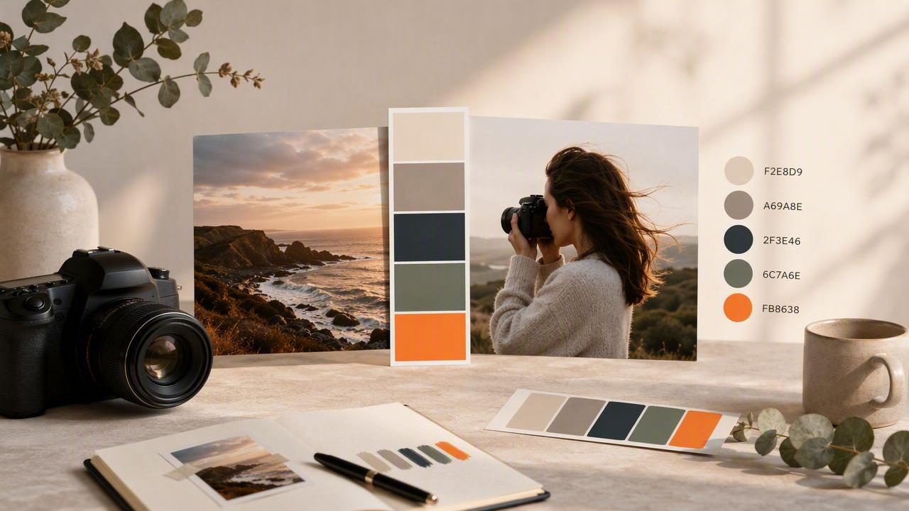
A brand palette maker for photographers helps turn the colors already present in your best images into a practical visual system. Rather than selecting colors at random, photographers can extract inspiration from their editing style, favorite locations, client work, props, wardrobe, and portfolio images.
The goal is not to make every photo look identical. It is to identify a repeatable set of colors that supports your visual identity across a website, Instagram templates, client guides, pricing PDFs, presentation decks, packaging, and other creative materials.
This process is especially useful when your photography already has a recognizable mood. A warm wedding photographer may repeatedly use muted ivory, rose, terracotta, and deep espresso. A commercial travel photographer may lean on mineral blue, sunlit sand, cloud white, and charcoal. Those recurring color relationships can become the foundation of a usable brand palette.
Why Photographers Need a Brand Color Palette
Photography is visual communication, so a disconnected brand can create friction even when the images themselves are excellent. If your logo uses bright neon colors while your portfolio is soft, earthy, and understated, the viewer receives mixed signals. A cohesive palette helps your supporting design materials feel like a natural extension of your photography.
A photographer’s palette can guide decisions such as:
- Website backgrounds, buttons, links, and headings
- Social media post templates and Story graphics
- Client welcome guides, questionnaires, and pricing documents
- Portfolio cover images and PDF presentations
- Business cards, packaging inserts, and thank-you cards
- Studio styling references and mood boards
Importantly, a brand palette is not a replacement for good photo editing. It is a framework for the surrounding visual materials. Your image colors may vary by season, location, or client, while your core palette remains consistent enough to make your business recognizable.
Start With Images That Represent Your Real Work
The strongest palette starts with a deliberate photo selection. Avoid building a brand around one unusually edited image, a temporary trend, or a scene that does not reflect the work you want to book. Instead, collect 12 to 20 images that represent your preferred direction.
For example, a lifestyle family photographer might choose images with:
- Natural window light and warm skin tones
- Neutral linens, wood, and soft foliage
- Relaxed clothing in cream, tan, dusty blue, and sage
- Gentle contrast rather than very dark shadows
Look for repetition across the set. Do warm off-whites appear in several photographs? Is there a muted green in foliage, textiles, or backgrounds? Do your deepest tones tend to be brown-black instead of pure black? Repeated colors are often more useful than the most dramatic color in a single frame.
Choose Images Based on Your Future Positioning
Your portfolio should reflect both current work and the work you want to attract. If you are shifting from colorful event coverage to editorial food photography, build the palette from images that support the new direction. A brand palette maker is most useful when it captures your intended visual territory rather than your entire archive.
It can help to sort images into three groups: “definitely on-brand,” “possibly on-brand,” and “not for this direction.” Extract colors primarily from the first group. This reduces the chance that one unrelated shoot introduces colors that weaken the overall system.
How to Extract a Useful Photo Color Palette
Color extraction gives you exact digital values from areas within an image. Rather than describing a tone as “warm beige,” you can record a HEX value such as #D8C5AE and reuse it consistently in design software or CSS.
Follow this practical workflow:
- Select your hero images. Begin with three to five images that best represent the intended brand mood.
- Sample large, stable areas. Look at walls, fabric, sky, foliage, wood, shadows, or repeated background colors. Avoid tiny highlights and isolated details at first.
- Record candidate color values. Save HEX values, and keep RGB, HSL, or HSB values when your workflow requires them.
- Group similar colors. If you collect six nearly identical creams, choose one representative cream instead of using all six.
- Assign a role to each final color. Decide whether it is a background, main brand color, accent, dark neutral, or light neutral.
- Test the colors in real layouts. A palette that looks attractive as swatches may not work for headings, buttons, or readable text.
Sampling a photo is an informed starting point, not an automatic final answer. Images contain lighting shifts, compression, color grading, reflections, and shadows. Reviewing extracted values in context is what transforms raw samples into a brand system.
A Concrete Brand Palette Example
Imagine a documentary wedding photographer whose strongest portfolio images include golden-hour portraits, historic venues, neutral florals, and dark tailored clothing. After comparing several representative photos, they might create this five-color palette:
| Palette Role | Color Name | HEX Value | Suggested Use |
|---|---|---|---|
| Light neutral | Warm Linen | #F3EEE5 | Page backgrounds and spacious layouts |
| Primary neutral | Stone Beige | #CDBCA8 | Cards, dividers, subtle sections |
| Signature accent | Muted Rose | #A96F68 | Buttons, icons, calls to action |
| Natural supporting tone | Olive Gray | #737665 | Labels, illustrations, secondary accents |
| Dark neutral | Espresso | #302824 | Headings and body text |
The palette is not intended to reproduce every color in every wedding image. It captures the overall visual language: warm, restrained, romantic, and editorial. Warm Linen provides breathing room, Espresso gives the brand contrast, and Muted Rose adds personality without overwhelming the photographs.
On a website, the photographer could use Warm Linen as the page background, Espresso for text, and Muted Rose sparingly for buttons. Stone Beige and Olive Gray could support section backgrounds, icons, quote cards, or social post frames.
Build Roles, Not Just a Collection of Swatches
A common mistake is collecting many attractive colors without deciding how they work together. A usable palette has hierarchy. Assigning roles prevents every element from competing for attention.
- Primary color: The recognizable brand tone used for key emphasis.
- Accent color: A secondary highlight for small details or occasional variation.
- Light neutral: A soft foundation for backgrounds and negative space.
- Dark neutral: A dependable color for text and contrast.
- Supporting color: An optional tone for flexible layouts, charts, or seasonal content.
For most photographers, five colors are enough. A smaller palette is easier to remember, easier to apply consistently, and less likely to distract from the imagery. You can create tints and shades of your core colors when needed, but begin with a focused base set.
Check Contrast Before Using Colors on a Website
Brand colors must work functionally as well as aesthetically. A pale beige may be beautiful in a mood board but unreadable for small text. Likewise, muted rose may not provide enough contrast for white button text.
Use dark neutral text on light backgrounds whenever possible. Test headings, paragraph text, navigation labels, button text, and links at their actual sizes. If a sampled color does not meet the readability needs of a design, keep it as a decorative tone rather than forcing it into a text role.
Practical rule: Let your photographs supply the emotional color, while your typography and interface colors protect clarity.
For web projects, you can store the final palette in CSS custom properties:
:root {
  --linen: #F3EEE5;
  --stone: #CDBCA8;
  --rose: #A96F68;
  --olive: #737665;
  --espresso: #302824;
}
This makes it easier for a web designer to apply consistent colors throughout a site and update a single value later if the brand evolves.
Use Color Formats That Fit Your Workflow
Different tools use color values in different ways. Knowing the formats prevents confusion when moving a palette from a photo to a website or design file.
| Format | Best For | Example |
|---|---|---|
| HEX | Web design, CSS, many graphics tools | #A96F68 |
| RGB | Screen-based design and digital interfaces | 169, 111, 104 |
| HSL | Adjusting hue, saturation, and lightness logically | 5°, 27%, 53% |
| HSB | Comparing visual brightness and intensity | 5°, 38%, 66% |
HEX is usually the simplest choice for sharing colors with a web designer. HSL and HSB are useful when refining a palette: you may want a slightly lighter version of a color without changing its basic hue. Keep the original sampled value documented, then note any deliberate adjustment you make for accessibility or layout.
Limitations of Sampling Colors From Photos
Photo color extraction is valuable, but it has limits. A color visible on a phone or laptop is influenced by screen settings, ambient light, image editing, file compression, and the original lighting conditions. The same cream wall can look cool in shade and warm at sunset.
For that reason, extracted digital values should be treated as design references, not as guaranteed real-world material or paint matches. Do not assume a HEX value will reproduce identically in print, on fabric, or on a painted wall. If a project includes physical production, use appropriate proofs, manufacturer samples, and production-specific color processes.
You should also avoid sampling colors directly from faces for core brand colors. Skin tones change significantly across lighting conditions and subjects. It is usually better to draw palette inspiration from the atmosphere around the portrait: fabric, architecture, foliage, shadows, or background tones.
Turn Your Palette Into a Repeatable Photography Brand System
Once your palette is finalized, create a short reference sheet. Include each color name, HEX code, role, and a few rules about use. For example: “Muted Rose is for calls to action only,” or “Espresso is the default text color.” This document makes collaboration easier when working with a website designer, virtual assistant, print vendor, or social media manager.
Review the palette every so often, especially after a major shift in editing style or target audience. Small refinements are normal. However, frequent full changes can make recognition harder, so update intentionally rather than reacting to every trend.
For photographers who want to sample colors directly from portfolio images on iPhone or iPad, Color Viewfinder’s guide to creating a color palette from a photo explains a mobile approach for inspecting values and organizing palette ideas.
A thoughtful brand palette gives your photography room to lead while ensuring the rest of your business looks considered, cohesive, and unmistakably yours.
