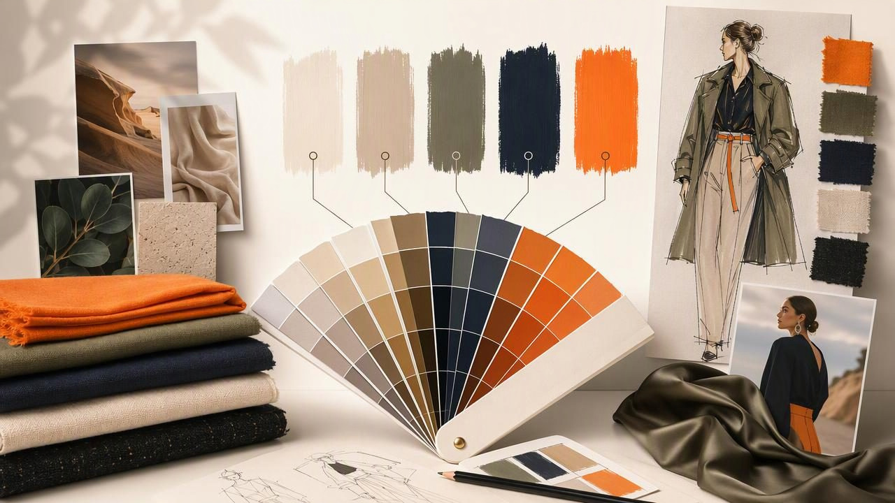
A strong fashion brand is recognizable before a customer reads the label. Color helps create that immediate recognition across lookbooks, ecommerce pages, social posts, packaging, presentation decks, and seasonal campaign materials. A deliberate brand palette gives every visual touchpoint a shared identity while leaving room for changing collections and trends.
For fashion designers, building a palette is more nuanced than choosing a few attractive swatches. Colors must support the clothing, communicate the brand’s personality, work in digital layouts, and remain flexible enough for photography, typography, accessories, and editorial imagery. This brand palette maker guide explains how to extract colors from visual references, organize them into a usable system, and apply them consistently.
Why Fashion Brands Need More Than Seasonal Colors
A collection palette and a brand palette serve different purposes. A seasonal collection may be built around a particular story: sun-faded coastal tones, vivid athletic brights, muted tailoring neutrals, or jewel-toned eveningwear. A brand palette, however, needs to work beyond one season.
Your long-term visual colors should support the identity of the label even when the garments change. For example, a contemporary womenswear brand might use warm ivory, graphite, dusty rose, and a restrained bronze accent throughout its website and packaging. Its spring collection could introduce mint and coral, while the core brand colors remain stable in navigation, email templates, hang tags, and campaign graphics.
Separating these two systems makes it easier to evolve creatively without making the brand feel inconsistent.
| Palette type | Main purpose | Typical lifespan | Examples |
|---|---|---|---|
| Core brand palette | Creates recognition and consistency | Long term | Logo, website UI, packaging, templates |
| Seasonal palette | Supports a collection or campaign story | One season or launch | Lookbook accents, campaign graphics, collection pages |
| Editorial palette | Sets the tone for a specific shoot or story | Short term | Social carousel, magazine spread, launch email |
Start With the Brand Story, Not the Color Picker
Before extracting a single HEX value, define what the fashion label should feel like. A palette becomes more effective when it is based on decisions about audience, positioning, materials, and mood rather than personal preference alone.
Write down three to five attributes that describe the brand. For instance:
- Minimal and architectural: cool whites, mineral grays, inky navy, controlled accent colors.
- Romantic and artisanal: faded florals, warm cream, clay, berry, soft charcoal.
- Technical and performance-driven: black, steel, optic white, electric accents, high contrast.
- Premium and timeless: deep neutrals, restrained metallic-inspired tones, rich earth colors.
These words act as filters. If a sampled color is visually appealing but does not fit the brand’s intended character, it may belong in a campaign mood board rather than the permanent palette.
Build a Fashion-Ready Reference Board
Fashion color inspiration rarely comes from one image. Build a reference board that includes a mixture of visual material, then look for repeating tones. Useful sources include:
- Fabric close-ups, trims, knits, embroidery, and garment details
- Runway images and prior campaign photography
- Architecture, landscapes, travel images, and art references
- Vintage print, fashion editorial, and packaging inspiration
- Material samples such as leather, metal hardware, paper, or stone
- Typography samples and existing logo applications
Choose images that represent the emotional world of the brand, not just the garments. A pale blue dress may be part of a collection, but a reference board can reveal whether the larger visual direction is airy and coastal, crisp and urban, or soft and nostalgic.
Look for Repetition Instead of Chasing Every Color
Most inspiration boards contain more colors than a practical system needs. The goal is to identify recurring families. Perhaps charcoal appears in architecture, type references, and tailoring details; perhaps a muted terracotta appears in leather, sunsets, and vintage editorial. Repeated colors often have more strategic value than one-off accents.
As you review photos, notice both hue and behavior. Is the color primarily used as a background? Does it appear as a small contrast detail? Does it make light type hard to read? These observations matter when moving from a mood board to brand assets.
Extract Colors From Photos With Intent
A photo palette can provide a useful starting point, but an automated set of swatches is not a finished identity system. Sampling helps translate visual references into digital values such as HEX, RGB, HSL, and HSB. Use these values to compare colors accurately across design files and web interfaces.
When extracting colors, sample deliberately from meaningful areas: a fabric weave, the shadow on a tailored jacket, the backdrop of a campaign shot, or the finish of a clasp. Avoid sampling accidental elements such as strong glare, compression artifacts, tiny reflections, or unrelated background objects unless those colors are genuinely part of the intended direction.
For a more detailed mobile workflow, Color Viewfinder’s guide to creating a color palette from a photo explains how to turn image references into inspectable digital swatches.
Understand the Color Values You Save
Different values serve different design tasks. Keeping them together reduces confusion when passing colors between fashion, marketing, web, and graphic design teams.
| Value | Best use | Example |
|---|---|---|
| HEX | Web design, ecommerce, social graphics | #B76E5D |
| RGB | Digital design software and screens | 183, 110, 93 |
| HSL | Comparing hue, saturation, and lightness | 10°, 39%, 54% |
| HSB | Fine-tuning visual brightness and intensity | 10°, 49%, 72% |
HEX and RGB are practical for digital production. HSL and HSB can be especially helpful when you want a more muted version of an accent color, a darker UI state, or a lighter editorial background without shifting the hue too far.
Create a Palette With Clear Roles
A fashion brand palette should not be a flat list of unnamed swatches. Give each color a role. This makes the palette easier to apply consistently, particularly when multiple people create content.
A useful structure includes five categories:
- Primary dark: A grounding color for logos, headlines, navigation, and body text.
- Primary light: A neutral background color that supports product photography.
- Secondary neutral: A supporting shade for borders, muted copy, or packaging details.
- Signature accent: The color that adds recognizable character in small, intentional amounts.
- Seasonal accent: A flexible color that can change by collection or campaign.
Concrete Example: A Modern Resortwear Label
Imagine a resortwear label inspired by limestone villas, woven raffia, sea shadows, and sun-washed textiles. After reviewing its reference board, the designer chooses this digital brand palette:
Ink Navy        #1F2D38  — primary dark
Shell White     #F4F0E8  — primary light
Limestone       #C8BFB1  — secondary neutral
Raffia Tan      #A97B52  — signature accent
Sea Glass       #6D9E9A  — seasonal accent
Ink Navy could be used for the wordmark, headings, and footer. Shell White becomes the main ecommerce background, keeping attention on product imagery. Limestone supports dividers and secondary panels. Raffia Tan appears sparingly on packaging seals, buttons, or event invitations. Sea Glass can lead a summer launch but may be replaced next season without changing the core identity.
This approach avoids a common problem: using every sampled color at equal strength. The brand remains calm and recognizable because each color has a job.
Test the Palette in Real Fashion Applications
A palette can look balanced in a grid of swatches and still fail in a real layout. Test it in the contexts your audience will actually see.
- Place product photography against the primary light background.
- Test the logo in the primary dark and on the signature accent.
- Create an ecommerce product card with prices, size labels, and call-to-action buttons.
- Mock up an Instagram story, a launch email, and a printed-style hang tag layout.
- Check whether text remains readable over campaign imagery.
For digital accessibility, high-contrast text combinations are usually safer. Dark text on a very light background is often easier to read than light text on a soft pastel or mid-tone accent. Do not rely on color alone to communicate sale status, sizing, navigation states, or other important information.
Practical rule: Let product photography carry much of the fashion expression. Brand colors should frame, organize, and amplify the imagery rather than compete with it.
Document Your Palette for Team Consistency
Once the palette is approved, create a concise color guide. It does not need to be a large brand book, but it should answer routine questions quickly. Include the name, role, HEX, RGB, HSL or HSB values, and typical use for every color.
You can also add simple rules such as:
- Use the signature accent for no more than one primary action per screen.
- Keep the primary light background dominant in ecommerce templates.
- Use seasonal colors in campaign assets, not in the permanent logo.
- Pair the primary dark with the primary light for standard text and background use.
Export the palette in the file type your collaborators need. CSS variables can help web teams, CSV can support planning and documentation, JSON can assist digital systems, and ASE can be useful in compatible Adobe workflows.
:root {
  --brand-ink: #1F2D38;
  --brand-shell: #F4F0E8;
  --brand-limestone: #C8BFB1;
  --brand-raffia: #A97B52;
  --campaign-sea-glass: #6D9E9A;
}
Important Limitations When Sampling Fashion Colors
Digital color extraction is valuable for visual planning, but it has limits. A sampled color from a phone photo is influenced by lighting, camera processing, shadows, reflections, display settings, and image editing. The same silk, knit, or dye can look very different in direct sunlight, studio lighting, and indoor retail environments.
For that reason, digital HEX, RGB, HSL, and HSB values should be treated as references for screens and creative direction. They are not guarantees of physical fabric dye, paint, ink, or print color accuracy. For production decisions, consult approved material standards, physical strike-offs, supplier specifications, and appropriate proofing processes.
Make the Palette Evolve Without Losing Recognition
The best brand palettes are stable but not rigid. Review your system after major campaigns, new product categories, or a meaningful change in audience positioning. If a color repeatedly causes readability issues, clashes with product photography, or feels disconnected from the collection, adjust its role rather than forcing it into every asset.
Keep the core palette small, name colors clearly, and use seasonal shades as controlled variation. With a structured approach to photo-based color extraction and a clear system for application, fashion designers can build a visual identity that feels cohesive from the first mood board to the final customer touchpoint.
