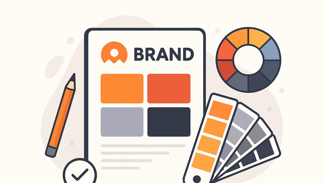
For small teams, color is one of the fastest, most affordable ways to look professional, be remembered, and communicate brand personality. A clear, consistent set of colors makes social posts instantly recognizable, keeps your website coherent, and simplifies every design decision. This guide shows you how to create a reliable branding palette for small businesses—from choosing a hero color to testing accessibility, documenting color tokens, and rolling your palette out across web, print, and social.
Brand consistency is not about being rigid; it’s about being reliably recognizable.
Step-by-Step Workflow to Build Your Palette
1) Write a mini brand brief
Before picking colors, clarify strategy in 10 minutes. List 3–5 adjectives, primary audience, and key differentiators. Examples: “approachable, modern, eco-minded” for a local café; “precise, trustworthy, efficient” for a bookkeeping service. These words will steer color choices.
- Audience: demographics, motivations, pain points
- Adjectives: the vibe you want (e.g., playful, premium, calm)
- Context: where colors will appear most (site, app, print, storefront)
2) Choose a hero color
Pick one color that best expresses your attributes and appeals to your audience. The hero color will dominate logos, CTAs, and highlights. Apply these quick heuristics:
- Wellness, calm, nature: greens and soft neutrals
- Urgency, energy, promotions: reds and saturated oranges
- Trust, professionalism, tech: blues and teals
- Luxury, boutique, editorial: deep neutrals, muted jewel tones
3) Add supporting colors
Round out your scheme with 2–4 supporting colors that work harmoniously with the hero:
- Accent color: for highlights, badges, data points
- Neutral(s): background, surfaces, borders (often off-white, warm gray, or inky charcoal)
- Feedback states: success, warning, error (green, amber, red families)
4) Define text and background pairs
Establish at least two safe pairs that pass contrast requirements:
- Dark text on light background (e.g., #1F2937 on #FAFAFA)
- Light text on dark brand color (e.g., #FFFFFF on your hero color)
5) Name and document color tokens
Use semantic names so colors can evolve without breaking meaning. Example:
--color-brand,--color-brand-600--color-accent--color-bg,--color-surface--color-text,--color-text-muted--color-success,--color-warning,--color-error
Color Psychology at a Glance
Use psychology as guidance, not rules. Test with your actual audience.
| Color | Signals | Works Well For | Use Carefully When |
|---|---|---|---|
| Blue | Trust, calm, reliability | Finance, tech, healthcare | When you need urgency or excitement |
| Green | Growth, wellness, nature | Eco, wellness, food, outdoor | When sterile or clinical is expected |
| Red | Energy, passion, alert | Promotions, food, sports | In healthcare or calm contexts |
| Orange | Friendly, value, creativity | Retail, startups, education | When luxury minimalism is needed |
| Purple | Premium, imaginative | Beauty, boutique, creative | Where high readability is critical |
| Black/Charcoal | Elegant, modern, bold | Luxury, editorial, tech | On low-quality print stocks |
Harmony Methods That Keep Palettes Consistent
- Monochromatic: one hue, multiple tints/shades. Clean and cohesive.
- Analogous: neighbors on the color wheel. Natural flow; use contrast for buttons.
- Complementary: opposites. High contrast; great for CTAs. Avoid 50/50 splits.
- Split-Complementary: complement plus its neighbors. Balanced yet dynamic.
- Triadic: three evenly spaced hues. Vibrant; pick one dominant, others as accents.
Example mini-palettes
- Coffee shop: #6B3E2E (hero), #D6C3A5 (neutral), #E3A86B (accent), #12100E (text)
- Tech startup: #2563EB (hero), #0EA5E9 (accent), #0B1220 (text), #F8FAFC (bg)
- Wellness studio: #2E7D6B (hero), #B8E0D2 (tint), #F7F3EB (bg), #1F2937 (text)
- Real estate: #0F766E (hero), #F59E0B (accent), #111827 (text), #F3F4F6 (bg)
- Bakery: #E879F9 (accent), #FDE68A (accent 2), #7C3AED (hero), #111827 (text)
HEX, RGB, HSL, and CMYK: When to Use Which
| Model | Best For | Notes |
|---|---|---|
| HEX | Web, CSS, HTML | Compact web standard (#2563EB). Easy to copy and share. |
| RGB | Screens, digital ads | Precise for UI; supports alpha in rgba(). Use for light/dark modes. |
| HSL/HSB | Design tuning | Intuitive for adjusting lightness and saturation; great for generating tints/shades. |
| CMYK | Converts from RGB; colors can shift on paper—ask printers for proofs. | |
| Pantone/Spot | Exact brand inks | Optional for premium print or tight color control. |
Accessibility: Make Colors Work for Everyone
Follow WCAG contrast ratios to keep text readable:
- Normal text: at least 4.5:1
- Large text (18pt+ or 14pt bold): at least 3:1
- UI components and icons: at least 3:1 against adjacent colors
Test common pairs in your palette and document pass/fail.
| Foreground | Background | Contrast | WCAG |
|---|---|---|---|
| #111827 | #F9FAFB | ~12.6:1 | AAA |
| #FFFFFF | #2563EB | ~5.6:1 | AA |
| #6B7280 | #FFFFFF | ~4.8:1 | AA |
Quick contrast checker (JavaScript)
// Compute WCAG contrast ratio between two HEX colors
function luminance(hex) {
  const rgb = hex.replace('#','').match(/.{2}/g).map(h => parseInt(h, 16) / 255)
    .map(v => v <= 0.03928 ? v/12.92 : Math.pow((v+0.055)/1.055, 2.4));
  return 0.2126*rgb[0] + 0.7152*rgb[1] + 0.0722*rgb[2];
}
function contrast(hex1, hex2) {
  const L1 = luminance(hex1), L2 = luminance(hex2);
  const lighter = Math.max(L1, L2), darker = Math.min(L1, L2);
  return ((lighter + 0.05) / (darker + 0.05)).toFixed(2);
}
console.log(contrast('#FFFFFF', '#2563EB'));
Implementing Your Palette in Code and Design Tools
CSS variables (recommended)
:root {
  --color-brand: #2563EB;
  --color-brand-600: #1D4ED8;
  --color-accent: #F59E0B;
  --color-bg: #F9FAFB;
  --color-surface: #FFFFFF;
  --color-text: #111827;
  --color-text-muted: #6B7280;
  --color-success: #16A34A;
  --color-warning: #D97706;
  --color-error: #DC2626;
}
.button-primary {
  background: var(--color-brand);
  color: #fff;
}
.card {
  background: var(--color-surface);
  color: var(--color-text);
  border: 1px solid #E5E7EB;
}
Tailwind (example)
// tailwind.config.js
module.exports = {
  theme: {
    extend: {
      colors: {
        brand: {
          DEFAULT: '#2563EB',
          600: '#1D4ED8'
        },
        accent: '#F59E0B',
      }
    }
  }
}
Design files
- Create shared Color Styles in Figma/Sketch
- Document usage: primary/secondary backgrounds, CTA colors, text pairs
- Export a one-page brand sheet for partners and vendors
Common Mistakes to Avoid
- Too many colors: Limit to 1 hero, 1–2 accents, 2–3 neutrals.
- Ignoring contrast: Pretty but illegible is unusable. Test WCAG.
- Misusing saturation: Keep strong saturation for CTAs and highlights.
- Not testing in context: Check on mobile, in low light, and in grayscale print.
- Skipping documentation: Without tokens and rules, consistency breaks fast.
Testing Across Web, Social, and Print
Small businesses need colors that survive every channel:
- Web/UI: Verify focus states, link colors, states (hover/active/disabled).
- Social: Test text over photos; keep a consistent overlay color for reels/stories.
- Email: Dark mode flips backgrounds; ensure brand buttons remain legible.
- Print: Convert to CMYK; get a proof. Avoid heavy blacks on absorbent paper.
- Signage: View colors at distance and under natural/fluorescent light.
Converting for print
RGB colors can shift when converted to CMYK. Slightly desaturate intense blues and reds to reduce banding. Ask your printer for a CMYK build recommendation or a spot color equivalent if your budget allows.
Make Your Palette Flexible, Not Fragile
- Create a scale of tints/shades: 50–900 steps for brand and accent colors.
- Specify usage ratios: e.g., brand 60%, neutrals 30%, accent 10%.
- Define do/don’t rules: no gradients on logos, no red-on-green text, etc.
- Bundle assets: logo files (SVG/PNG), color tokens, sample layouts.
A Simple Template for Your Brand Sheet
- Brand essence: 3–5 adjectives, audience notes
- Palette: hero, accent, neutrals with HEX/RGB/CMYK
- Accessibility: approved text/background pairs
- Usage: buttons, headlines, backgrounds, charts
- Examples: one web section, one social post, one flyer
- Assets: CSS variables, Tailwind config, print swatches
Quick Checks Before You Launch
- Does the hero color suit your adjectives and audience?
- Are at least two text/background pairs AA or better?
- Do the accent colors stand out from the hero color?
- Does the palette look good in grayscale?
- Is the palette easy to implement with named tokens?
Budget-Friendly Ways to Build and Refine Your Palette
- Start with inspiration boards (photos, packaging, competitors’ gaps).
- Use a color wheel to draft complementary or analogous options.
- Pull colors from your own product photos and refine in HSL for consistency.
- Validate contrast with a free WCAG checker before you commit.
- Version your palette: v1 (launch), v1.1 (print fixes), v1.2 (dark mode).
If you prefer to work from real-world inspiration, a lightweight mobile tool like Color Viewfinder can quickly extract HEX, RGB, HSL, and HSB values from photos so you can build palettes on the go and export them into your design workflow.
Conclusion
A strong branding palette for small businesses doesn’t require a big budget—just a clear hero color, a few supportive tones, accessibility-tested pairs, and simple documentation. Start with strategy (adjectives and audience), use harmony rules to keep things coherent, validate contrast for usability, and express your palette as reusable tokens to stay consistent across every channel. Done right, your colors become an asset that speeds up decisions, strengthens recognition, and grows with your brand.
