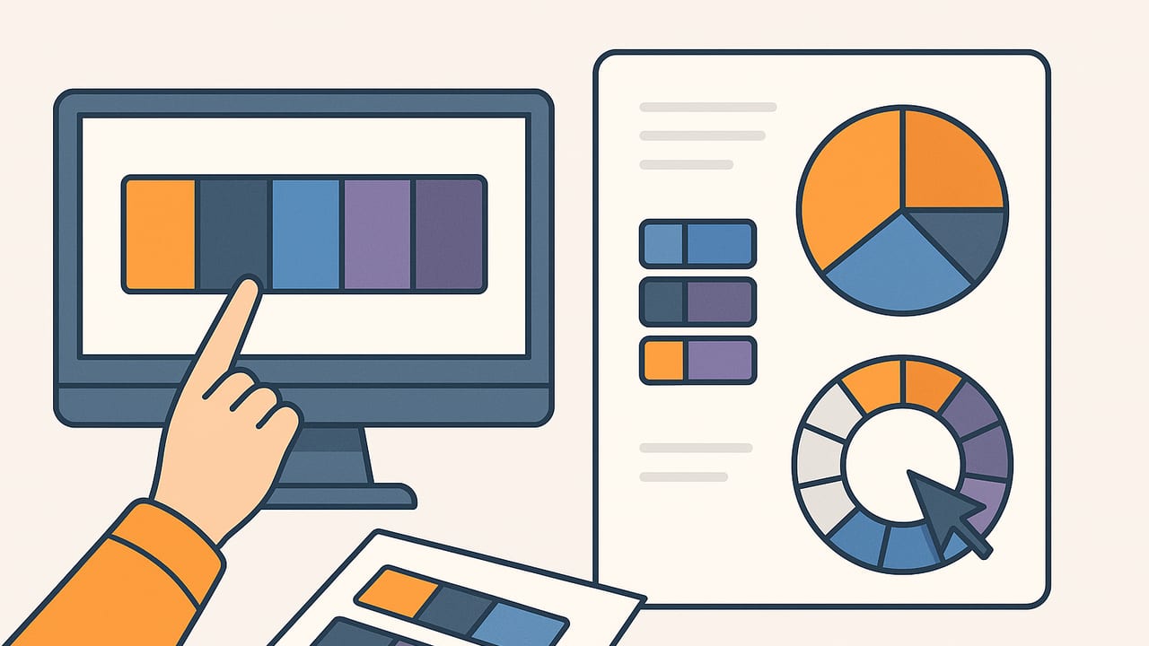
When the clock is ticking and you need a quick color palette for last minute pitch slides, the goal isn’t perfection—it’s clarity, contrast, and cohesion. The right palette communicates mood in seconds, improves readability, and makes your deck feel intentional. This guide gives you fast, repeatable workflows, ready-to-use palette archetypes, lightweight code for extracting colors from an image, and slide-ready tips that work under pressure.
What a strong emergency palette looks like
Great pitch palettes are simple and flexible. Aim for 4–6 colors arranged into roles you can reuse across slides:
- Base: Your main brand or theme color. Visible in titles, key shapes, and charts.
- Secondary: Supports the base without competing. Use for subheads and UI-style elements.
- Accent: A high-impact color for calls to action, key metrics, and highlights.
- Neutral: Backgrounds and body text (often gray, off-white, or charcoal).
- Status (optional): Green/Red for growth vs. risk, if your story includes metrics.
A simple ratio keeps things clean: 60% neutral, 30% base/secondary, 10% accent. If you’re uncertain, use the accent sparingly and let whitespace do the heavy lifting.
Time-boxed workflows: 5, 15, and 30 minutes
5-minute fix: Tints, shades, and one accent
- Start with one known color (brand blue, event color, or the product UI). If you have nothing, pick a confident base: #1D4ED8 (bold blue) or #166534 (trustworthy green).
- Create a light tint and a dark shade of that color for variety (e.g., 20% lighter and 20% darker).
- Add a high-contrast accent: choose a hue roughly opposite on the color wheel. For blue, a warm orange like #F59E0B works.
- Pick a neutral: #0B0F14 (charcoal) for dark text or #F7F7F7 (soft gray) for backgrounds.
Slide-ready example:
- Base: #1D4ED8
- Secondary (tint): #93C5FD
- Shade: #1E3A8A
- Accent: #F59E0B
- Neutral: #0B0F14 or #F7F7F7
Usage: titles and shapes in base; body text in charcoal; key metrics in accent; charts use base + secondary, with accent for the hero metric.
15-minute flow: Photo-driven palette
- Pick a high-quality photo that represents the pitch: product shot, market scene, or audience setting.
- Extract 5 colors (dominant, two complements, one accent, one neutral). Aim for at least one dark and one light color for contrast.
- Tweak saturation to keep text readable. Slightly desaturate backgrounds and keep accents punchy.
- Assign roles (Base/Secondary/Accent/Neutral/Status) and lock them into your slide master.
Example palette from an evening city skyline:
- #0B132B (deep navy) – Base
- #1C2541 (steel blue) – Secondary
- #3A506B (desaturated blue) – Tertiary
- #5BC0BE (teal) – Accent
- #FAF3DD (warm light) – Neutral
Result: confident, modern, and readable on light or dark backgrounds.
30-minute polish: Audience-tuned HSL
- Pick a mood (e.g., Trust, Innovation, Wellness, Luxury).
- Start with HSL values to quickly generate tints/shades: adjust Lightness for subtle hierarchy, Saturation for restraint.
- Choose a complementary accent (hue ± 150–210°) with higher saturation.
- Check contrast for body text against backgrounds (see contrast checker below).
Example (Trust/Fintech): Base hsl(210, 70%, 40%), tint hsl(210, 70%, 70%), shade hsl(210, 70%, 25%), accent hsl(35, 90%, 55%), neutral hsl(210, 10%, 10%).
Palette archetypes that work under pressure
If you’re starting cold, these proven sets map mood to color roles. Adjust lightness to fit your slide backgrounds.
| Mood / Use Case | Base | Secondary | Accent | Neutral | Notes |
|---|---|---|---|---|---|
| Trust & Finance | #1D4ED8 | #60A5FA | #F59E0B | #0B0F14 | Blue body, warm accent for KPIs |
| Tech & Innovation | #0EA5E9 | #22D3EE | #F43F5E | #111827 | Futuristic; use lots of whitespace |
| Health & Wellness | #16A34A | #86EFAC | #F97316 | #F9FAFB | Clean, fresh; orange for action |
| Luxury & Lifestyle | #111827 | #374151 | #D97706 | #F3F4F6 | Dark base, metallic accent vibe |
| Climate & Sustainability | #166534 | #34D399 | #10B981 | #ECFDF5 | Greens with soft eco neutral |
| Education & Nonprofit | #7C3AED | #C4B5FD | #EF4444 | #F1F5F9 | Friendly yet serious |
Extract a palette from any image in minutes (code)
Prefer a quick script? This Python snippet grabs 5 dominant colors from an image using K-Means clustering. It’s handy for a rapid, data-driven palette before your pitch.
# pip install pillow scikit-learn numpy
from PIL import Image
import numpy as np
from sklearn.cluster import KMeans

def image_palette(path, k=5):
    img = Image.open(path).convert('RGB')
    img = img.resize((300, 300))  # speed-up
    pixels = np.array(img).reshape(-1, 3)
    km = KMeans(n_clusters=k, n_init=5, random_state=42)
    km.fit(pixels)
    centers = km.cluster_centers_.astype(int)
    hex_colors = [f'#{r:02X}{g:02X}{b:02X}' for r, g, b in centers]
    return hex_colors

print(image_palette('your-image.jpg', k=5))
Tip: Choose a photo that matches the pitch mood (market, product, or user context) so extracted colors feel intentional.
Accessibility in seconds: contrast you can trust
Even under deadline, ensure text is readable. Aim for WCAG AA contrast: 4.5:1 for body text and 3:1 for large text. Use a quick function to test hex pairs.
def luminance(rgb):
    def srgb(c):
        c = c/255.0
        return c/12.92 if c <= 0.03928 else ((c+0.055)/1.055)**2.4
    r, g, b = [srgb(v) for v in rgb]
    return 0.2126*r + 0.7152*g + 0.0722*b

def hex_to_rgb(h):
    h = h.lstrip('#')
    return tuple(int(h[i:i+2], 16) for i in (0, 2, 4))

def contrast_ratio(h1, h2):
    L1 = luminance(hex_to_rgb(h1))
    L2 = luminance(hex_to_rgb(h2))
    L1, L2 = max(L1, L2), min(L1, L2)
    return (L1 + 0.05) / (L2 + 0.05)

print(contrast_ratio('#0B0F14', '#F7F7F7'))  # e.g., 13+:1
If contrast fails, darken text, lighten backgrounds, or pick a stronger neutral. Remember: accent colors are for highlights, not paragraphs.
How to present your palette inside the pitch
- Use role labels: Name swatches Base, Secondary, Accent, Neutral directly on a slide for internal clarity.
- Keep slides consistent: Lock colors into your master theme; avoid manual color picks per slide.
- Emphasize with restraint: Use the accent sparingly—headline numbers, arrows, or the most important chart line.
- Neutral backgrounds: Light neutral for data-heavy slides; dark gray for hero visuals with light text.
- Charts: Base and secondary for series; accent for the hero series or last-series overlay.
- Callouts and annotations: Use the accent color uniformly for callouts to train the audience’s attention.
Export quickly: the formats that actually matter
When you hand off assets or reuse colors in other tools, stick to these formats.
| Format | Where it’s used | Why it’s useful |
|---|---|---|
| HEX (e.g., #1D4ED8) | Slides, web, design tools | Compact, ubiquitous, easy to share |
| RGB (e.g., 29, 78, 216) | Digital design, CSS, charts | Precise on-screen color control |
| HSL (e.g., hsl(221, 72%, 48%)) | Design systems, quick tints/shades | Intuitive lightness/saturation edits |
| ASE/ACO/Swatches | Adobe/Procreate/Sketch imports | One-click palette sharing |
Pro tip: store final HEX codes in your slide theme; keep an appendix slide with swatches and roles for teammates.
Common mistakes (and fast fixes)
- Too many colors: Limit to 4–6. Add subtle hierarchy with tints/shades, not more hues.
- Low contrast text: Always test text vs. background. If in doubt, use near-black text (#0B0F14) on light backgrounds.
- Accent overload: If everything pops, nothing does. Keep accent to key moments.
- Unclear color roles: Assign roles and stick to them. This speeds creation and improves consistency.
- Overly saturated backgrounds: Desaturate or lighten backgrounds to reduce eye strain and improve readability.
- Ignoring audience expectations: Finance expects stability (blues), wellness expects calm (greens), luxury expects restraint (dark neutrals + metallic accents).
Ready-to-use emergency palettes
Copy one set and go. Adjust lightness if you prefer dark or light mode slides.
- Data-first Pitch: #0B0F14 (Neutral), #1D4ED8 (Base), #60A5FA (Secondary), #F59E0B (Accent), #10B981 (Positive), #EF4444 (Negative)
- B2B SaaS: #0EA5E9, #0369A1, #94A3B8, #111827, #F43F5E
- Consumer App: #7C3AED, #C084FC, #22C55E, #111827, #FDE68A
- Climate Tech: #166534, #34D399, #10B981, #ECFDF5, #1F2937
5-slide color application template
- Cover: Base background, title in neutral or white, one accent line or badge.
- Problem: Neutral background, base headlines, accent for key stat.
- Solution: White or very light background, product visual framed in base, accent for callouts.
- Traction: Chart uses base + secondary; accent highlights the top line.
- Ask: Minimalist slide—neutral background, base for text, accent for the ask amount or CTA.
Lightning checklist: quick color palette for last minute pitch
- Choose a mood (trust, innovation, wellness, luxury).
- Pick base + neutral; add one accent.
- Test contrast for text vs. background (AA target).
- Lock colors into the slide master.
- Use the accent only for critical highlights.
- Keep a swatch/roles slide in the appendix for handoff.
Clarity beats complexity. In a pitch, color is a signal: use it to guide attention, not to decorate.
Final note: if you’re working from photos on iPhone or iPad and want HEX, RGB, HSL, or HSB values instantly with quick export options, the Color Viewfinder app can help you move from image to coherent palette in a few taps.
