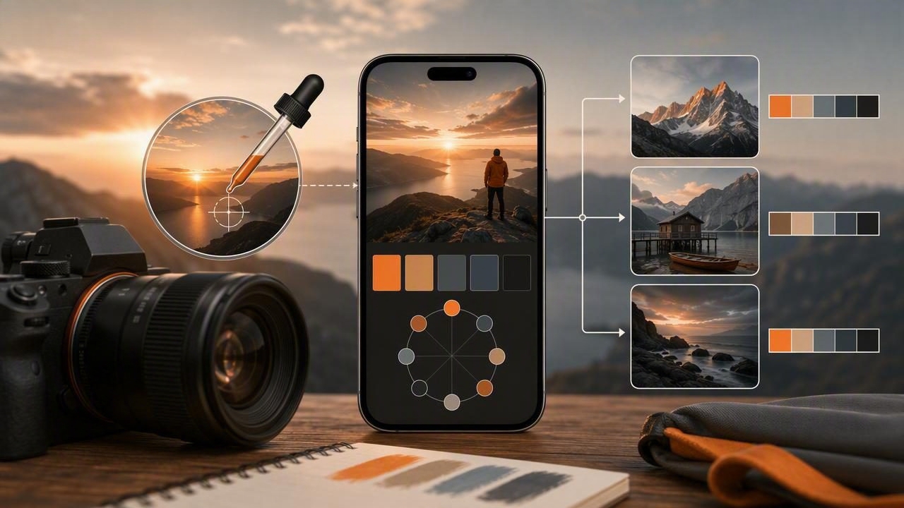
Color is one of the fastest ways to make a photograph feel intentional. Before viewers notice composition, lens choice, or technical settings, they often respond to the warmth of a sunset, the cool shadows of a city street, or the muted tones of a quiet interior. A camera palette app helps photographers identify, save, and reuse those visual cues by extracting accurate color values from photographs.
This camera palette app guide for photographers explains how to turn images into useful color palettes, why color extraction improves editing decisions, and how to use palettes for portraits, travel photography, product images, and creative projects. Whether you work with a phone camera, mirrorless camera, or DSLR, the same color workflow can make your work more consistent.
What Is a Camera Palette App?
A camera palette app is a mobile design tool that lets you sample colors from a photo, camera image, screenshot, or saved reference. The app converts visual color information into values such as HEX, RGB, HSL, and HSB. Those values can then be organized into palettes for later use in photo editing, graphic design, interior design, client presentations, or social media planning.
For photographers, the key benefit is not simply knowing that a wall is blue or a dress is red. It is understanding which blue or red appears in the image and how that color relates to nearby tones. A palette can reveal the warm beige in skin highlights, the teal cast in window light, or the deep charcoal that anchors a moody scene.
Why Color Palettes Matter in Photography
A strong photograph does not need to use only a few colors. However, it usually has a clear color relationship. Complementary colors can add energy, analogous colors can feel harmonious, and neutral colors can give a scene space to breathe. Extracting a palette helps you see those relationships objectively.
- More consistent editing: Use sampled colors as reference points when adjusting white balance, saturation, split toning, or color grading.
- Stronger series cohesion: Compare images from a shoot to make sure their visual direction remains consistent.
- Better client communication: Share a concise palette alongside mood boards or creative briefs.
- Faster location planning: Save colors from scouting photos before a portrait, wedding, editorial, or product session.
- Improved branding: Match photo accents to a publication, business, or personal brand color system.
In short, color extraction transforms a photograph from a single visual reference into a reusable creative resource.
How to Extract a Useful Palette From a Photo
The easiest palette is not always the most useful one. Sampling random pixels can produce distracting colors from noise, reflections, compression, or tiny background details. Instead, begin with the visual story you want the palette to represent.
1. Choose a photo with a clear color direction
Look for an image that already has an intentional mood. This could be a golden-hour landscape, a fashion portrait with a bold outfit, a café interior, or an urban scene with striking signage. Photos with controlled light and recognizable color groups usually create the best starting palettes.
For example, a coastal image may contain soft sand, pale aqua water, deep navy shadows, and a warm coral accent. Those four to six colors describe the scene more effectively than every small color variation in the frame.
2. Sample the major visual areas first
Start by selecting colors from the largest or most important regions of the image. These are often the background, subject, dominant light source, and darkest shadow. Then add one or two accent colors that provide contrast or personality.
- Sample the dominant background color.
- Capture the main subject color, such as clothing, foliage, architecture, or product packaging.
- Select a highlight color from bright light or reflective surfaces.
- Select a shadow color to establish depth.
- Add an accent color only if it supports the image’s mood.
3. Avoid misleading pixels
Small bright reflections, digital noise, and blown highlights can create color values that are technically accurate but creatively unhelpful. Zoom into the image when possible and sample a stable area rather than a single edge pixel. A broad section of fabric, sky, painted wall, or foliage will generally be more reliable than a tiny specular highlight.
4. Limit the palette
Most photography workflows benefit from a palette of five to eight colors. Fewer colors make it easier to identify the image’s visual hierarchy. If you need more detail, create separate palettes for highlights, midtones, shadows, wardrobe, or environmental elements.
Understanding Color Values for Editing and Design
Different color formats serve different purposes. Knowing which format to use helps photographers move from inspiration to practical implementation.
| Color Format | Best Use | Example |
|---|---|---|
| HEX | Web design, portfolios, social graphics, templates | #C98268 |
| RGB | Screen-based creative work and digital displays | 201, 130, 104 |
| HSL | Understanding hue, saturation, and lightness | 14°, 47%, 60% |
| HSB/HSV | Adjusting color visually in many editing tools | 14°, 48%, 79% |
HEX and RGB values are especially useful when creating matching title cards, website elements, highlight covers, or client presentation documents. HSL and HSB can be more intuitive when comparing the perceived brightness or intensity of two similar colors.
Use a Palette Before, During, and After a Shoot
A camera palette app is valuable at every stage of a photography project. It is not only a post-production tool.
Before the shoot: create a visual brief
Start with reference images from magazines, saved locations, artwork, or past work. Extract key colors and build a palette that guides wardrobe, props, backdrops, and lighting choices. If a portrait session aims for earthy warmth, your palette may include olive green, clay orange, cream, espresso brown, and muted gold.
This approach is especially useful when several people are involved. Stylists, makeup artists, art directors, and clients can all understand a palette quickly, even if they use different descriptive language for color.
During the shoot: evaluate what the camera sees
Lighting conditions can change quickly. A planned neutral background may turn green under nearby trees, while window light may introduce a blue cast into shadows. Capture a test image, sample important regions, and compare the palette with your intended direction.
You do not need to chase exact values in every frame. The purpose is to notice major shifts early enough to adjust background placement, wardrobe, white balance, gels, or exposure.
After the shoot: guide your editing workflow
During editing, use the extracted palette as a visual compass. Rather than applying a preset and hoping it suits every photo, compare the resulting tones with your target colors. This is particularly helpful when editing a gallery captured across different times of day or under mixed lighting.
Practical rule: preserve the colors that define the story, and reduce the colors that compete with it.
For a warm editorial series, you may preserve amber highlights and terracotta accents while reducing overly green shadows. For a crisp architectural set, you may protect cool grays and clean whites while controlling distracting color casts.
Palette Ideas for Common Photography Styles
Portrait photography
Build palettes around skin tone, wardrobe, background, and light quality. Avoid using skin color as a fixed universal value; skin is influenced by undertones, exposure, white balance, and surrounding colors. Instead, sample several subtle tones from the specific image and use them to judge whether your edit remains natural.
Travel and street photography
Travel images often contain many competing colors. Focus on the tones that communicate the place: terracotta facades, rainy asphalt, market textiles, desert sand, neon signs, or coastal blues. A smaller extracted palette can help you create a coherent carousel, photo book spread, or gallery selection.
Product photography
Accuracy matters when photographing products. Sample packaging, labels, textiles, and backdrop colors to maintain consistency across product pages and promotional graphics. Remember that a sampled screen color is a digital reference, not a substitute for calibrated print or manufacturer-approved color standards.
Interior and architecture photography
Interior photographers can extract colors from paint, wood, stone, upholstery, and natural light. These palettes are helpful for editorial layouts and for showing how materials interact within a room. They can also support collaboration with decorators who need a quick visual color reference.
Common Mistakes When Building Photo Color Palettes
- Sampling only saturated colors: Neutrals often provide the structure that makes accent colors effective.
- Ignoring shadows: Shadow color strongly affects the mood of an image, especially in cinematic edits.
- Creating too many palettes: Save only references you can name, revisit, and use.
- Treating sampled colors as absolute: Screens, export settings, and ambient light can change how colors appear.
- Forgetting the final destination: A palette for an Instagram graphic, printed album, website, and client proof may need different handling.
Build a Repeatable Color Workflow
A simple system makes color palettes more useful over time. Name palettes by project, location, season, client, or mood. Add a short note such as “late-afternoon window light,” “muted hotel lobby,” or “coastal editorial blues.” When you return to the project months later, context will matter as much as the individual color values.
For a practical mobile workflow, photograph or import a reference image, extract five to eight essential colors, arrange them from light to dark, and export the values for your editing notes or design files. A tool such as Color Viewfinder can make this process convenient by capturing color values and organizing photo-based palettes on iPhone or iPad.
Final Takeaway
Using a camera palette app does not replace photographic instinct. It gives that instinct a clearer framework. By extracting colors from your own images and references, you can plan more confidently, edit more consistently, and create a recognizable visual language across every creative project. Start with one strong photograph, identify its dominant tones, and let the palette reveal the color story already present in the frame.
Put the workflow into practice
For a repeatable photography-to-design workflow, follow the color palette from photo guide. Keep the original image so lighting or white-balance changes can be traced when a palette looks different later.
See Color Viewfinder on the App Store for current availability and details.
