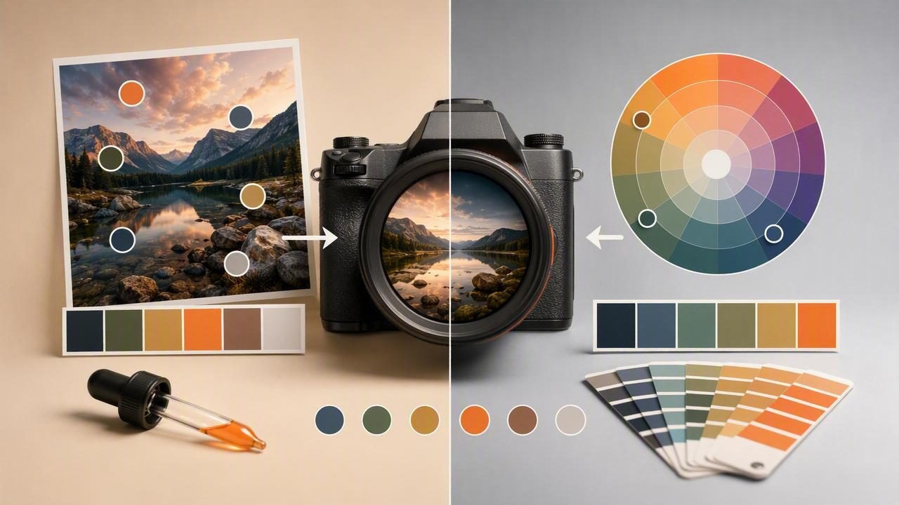
Choosing between a camera palette app vs Adobe Color is less about finding a universal winner and more about understanding how you discover, inspect, and reuse color. Both approaches can help designers turn visual inspiration into usable color palettes, but they start from different places: one is built around colors found in your immediate surroundings, while the other is often used for deliberate palette exploration and color-harmony work.
For graphic designers, interior designers, photographers, and creative teams, the best choice depends on the project at hand. Are you standing in a café, gallery, or client space and need to record colors from a photo? Are you developing a brand system from a single anchor color? Do you need exact HEX values for a website, or are you still exploring the mood of a concept?
This guide compares the workflows, explains where each option is most useful, and shows how to turn a real image into a practical palette without confusing digital color references with physical paint or print specifications.
The Core Difference: Capture Colors vs Explore Color Relationships
A camera palette app is primarily a color extraction tool. You use an existing photograph—or capture a new image—to identify colors already present in a scene. This makes it useful when inspiration is environmental: a fabric detail, a sunset, a storefront, a piece of packaging, a landscape, or a room with a distinctive atmosphere.
Adobe Color is commonly associated with building and refining color themes through color-wheel relationships, rules, and digital palette exploration. It can be valuable when your starting point is a chosen brand color, a design brief, or a desired harmony such as complementary, analogous, or triadic colors.
Neither workflow is limited to one stage of a project. Many designers begin with photo color extraction to collect authentic source colors, then refine contrast, saturation, and balance in a broader design system. The important distinction is the question each tool helps answer:
- Camera palette app: “What colors are actually in this image or scene?”
- Color harmony workflow: “Which colors should work together in my final design?”
Side-by-Side Comparison
| Consideration | Camera Palette App | Adobe Color Workflow |
|---|---|---|
| Typical starting point | A photo, camera image, or saved visual reference | An existing color, color wheel, or palette concept |
| Best for | Capturing real-world inspiration and extracting values | Exploring intentional color relationships |
| Useful color data | HEX, RGB, HSL, and HSB values from sampled pixels | Theme and harmony decisions for digital design |
| Ideal context | On-site work, travel, mood boards, photography, interiors | Brand systems, illustrations, campaign concepts, UI themes |
| Primary benefit | Fast visual reference from imagery you already have | Structured palette ideation and refinement |
| Main limitation | Photo lighting and camera processing affect sampled color | Generated harmony may not reflect colors found in a real scene |
When a Camera Palette App Is the Better Choice
A mobile color extraction workflow is especially effective when the source material is physical, temporary, or location-specific. You may not have time to recreate a scene later, and you may need more than a rough memory of its color.
1. You Need to Capture Inspiration on Location
Imagine an interior designer visiting a boutique hotel. The lobby combines muted terracotta walls, deep green upholstery, warm timber, and brass fixtures. A photo can preserve the overall scene, while color sampling can identify a working set of digital references from it. Instead of writing “earthy red” in a project note, the designer can save a palette containing concrete values such as:
Terracotta: #B9654D
Upholstery Green: #355B4A
Warm Wood: #8A6248
Soft Cream: #E9DFCF
Dark Accent: #252B29
These values can guide a mood board, presentation deck, social graphic, or digital concept board. They should not be treated as a guaranteed formula for matching wall paint, upholstery dye, or a printed sample. Lighting, camera white balance, screen calibration, material texture, and finishing processes all change how a physical color appears.
2. Your Palette Begins With Photography
Photographers, content creators, and brand designers often work from images before they work from a color wheel. A camera palette app lets them derive a color direction from the visual language already present in a photograph. This is helpful for creating coordinated title cards, portfolio pages, presentation slides, or social templates that support rather than compete with the image.
For example, a coastal photograph may contain a pale blue-gray sky, a desaturated ocean blue, off-white foam, sandy beige, and charcoal rock. Extracting those colors gives the designer a starting palette that feels connected to the source image. The next step is still design judgment: choose which color becomes the background, which provides readable text contrast, and which should remain a small accent.
3. You Need Exact Digital Values Quickly
Names such as “sage,” “coral,” or “navy” are useful conversational labels, but they are not enough for a digital handoff. HEX and RGB values are more actionable for web and interface work, while HSL and HSB can be useful for adjusting lightness, saturation, or brightness with greater intention.
When evaluating a camera palette tool, look for the ability to inspect the actual value behind a sampled color and copy it easily. A useful palette is not merely a row of attractive swatches; it is a reusable set of color information that can move into your next creative project.
When Adobe Color May Be a Better Starting Point
If your work begins with a single known brand color or a required visual relationship, a color-wheel workflow may be more direct. Say a client has approved a vivid blue logo. The question is no longer “What colors exist in this photo?” It is “What secondary and accent colors can support this blue while keeping the identity coherent?”
That is where intentional harmony exploration is useful. You can compare neighboring hues, opposite hues, and more complex relationships, then test the results in a real layout. This approach is often stronger for projects that need a planned system rather than a palette documented from a scene.
However, an aesthetically balanced color wheel does not automatically produce an accessible interface or a strong visual hierarchy. A palette still needs testing in context: text on backgrounds, buttons in active states, charts, large-format headings, and image overlays all create different contrast requirements.
A Practical Hybrid Workflow for Graphic and Interior Design
The most productive answer to the camera palette app vs Adobe Color question is often to use photo extraction and palette refinement as complementary stages. Here is a realistic workflow for a café rebrand inspired by an interior photograph.
- Capture the reference image. Photograph the space in even, neutral light when possible. Avoid relying on heavily filtered social images because filters can shift hue and saturation.
- Extract a broad palette. Sample the major surfaces and details: wall color, chair fabric, wood grain, plants, menu board, and shadow areas.
- Remove duplicates. A photograph may produce several nearly identical warm neutrals. Keep only the values that serve a distinct visual role.
- Assign roles. Decide which colors are primary, secondary, background, text, and accent colors. A palette becomes more usable when each swatch has a job.
- Refine relationships. Adjust the set as needed to create visual balance. You may preserve the mood of the photo while slightly changing a color for better readability or stronger differentiation.
- Test in actual deliverables. Build a menu header, Instagram post, landing page section, and signage mockup. Colors that look harmonious as isolated swatches may fail when placed in a real composition.
How to Sample Colors From Photos More Reliably
Photo-based color extraction is fast, but it is not color measurement in a controlled production environment. Follow these practices to make your results more useful:
- Sample a clean area: Choose a large, evenly lit part of the surface instead of a highlight, reflection, or deep shadow.
- Check several pixels: Fabric, stone, foliage, and wood are naturally varied. Take multiple samples before selecting a representative color.
- Watch white balance: Warm indoor bulbs can make neutral walls look yellow or orange, while cool daylight can add blue.
- Keep an image reference: A HEX code alone loses context. Save the original photo with the palette so you remember what each color represented.
- Use contrast checks: Do not assume two extracted colors are readable together simply because they appeared together in a photograph.
Useful rule: Extracted values are excellent for digital inspiration, visual documentation, and palette development. For paint, textiles, packaging, or print production, verify with appropriate physical samples and production specifications.
What to Export for Your Next Project
The right export format depends on where the palette is going. For a web project, CSS variables or copied HEX values can be the most direct option. For collaboration or documentation, CSV and JSON can make color data easy to share and archive. For workflows involving compatible design applications, ASE can be useful where supported.
A compact CSS palette might look like this:
:root {
  --cafe-terracotta: #B9654D;
  --cafe-forest: #355B4A;
  --cafe-cream: #E9DFCF;
  --cafe-charcoal: #252B29;
}
This structure is more practical than leaving colors scattered in screenshots or chat messages. It gives developers, designers, and clients a shared reference while preserving the ability to revise individual colors later.
How to Choose the Right Tool for Your Workflow
Choose a camera palette app when your strongest inspiration exists in a photograph, a physical space, or a visual detail you encounter in the world. Choose a color-harmony tool when you need to construct a palette from an intentional starting color and explore its relationships systematically. Use both when you want real-world authenticity plus deliberate design control.
For iPhone and iPad users who want to sample photo colors, inspect HEX/RGB/HSL/HSB values, organize swatches, and export palette data, Color Viewfinder’s guide to creating a color palette from a photo explains the photo-to-palette process in more detail.
Ultimately, the best palette is not the one with the most swatches or the most complex harmony rule. It is the one that gives your creative project a clear, consistent, and usable color direction.
