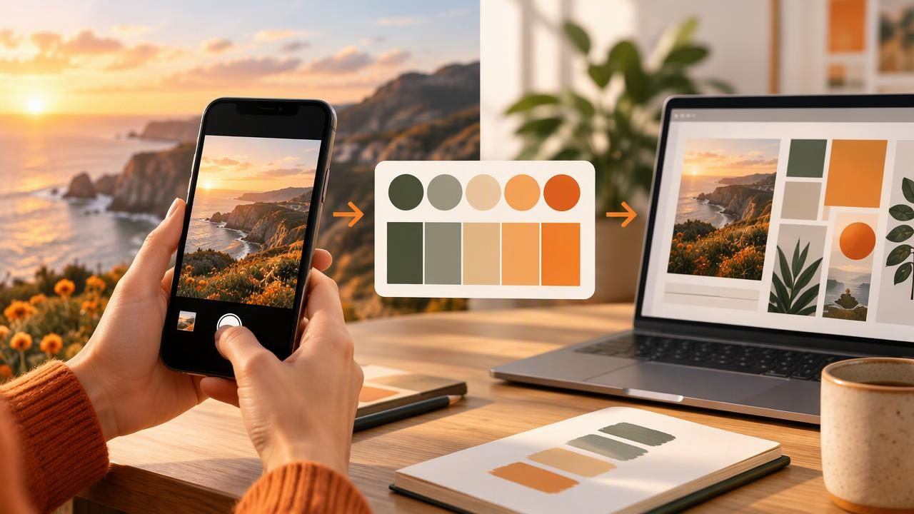
A color idea can appear anywhere: in a tiled café wall, a market display, a landscape, or the packaging on a shelf. The challenge is turning that moment into colors you can use in a design file without slowing down to guess each shade. A camera palette app for faster creative workflows can help bridge that gap by letting you work from a photo, inspect the colors it contains, and carry useful values into your next project.
The key is to treat a photo palette as a starting point, not a finished design decision. A few thoughtful steps—choosing a useful image, checking the sampled colors, and exporting values in the right format—can make color exploration more efficient for graphic design, interiors, and other creative work.
What a camera palette app does
A camera palette app uses an image as the source for color exploration. Depending on the app, you may select a photo from your library or use an image captured with your phone. The app identifies colors in the image so you can inspect their values and build a palette from them. This is different from relying on memory or manually estimating a shade from a scene.
Many workflows involve more than simply picking the most vivid color. You might look for a background neutral, a supporting shade, and one or two accents. Once selected, colors can be reviewed in formats such as HEX, RGB, HSL, or HSB. Those values make it easier to reuse a color in compatible design software, share it with a collaborator, or keep a consistent reference across project materials.
“Camera palette” does not necessarily mean that an app continuously analyzes a live camera view. Check how a specific tool works: some are designed around existing photos, while others may offer different capture options. A photo-based workflow is still useful when you want to revisit a scene, compare several images, or keep a record of where an idea came from.
A practical example: a palette from a café photo
Imagine photographing a café corner with a warm terracotta planter, cream-colored wall, dark wooden table, and green leaves. You want a small palette for a social graphic promoting a seasonal menu. Instead of trying to recreate the scene from memory, use the photo as a visual reference and make deliberate selections.
- Choose a clear source photo. Use an image where the key surfaces are visible and not hidden by strong reflections or deep shadows. If the wall is your intended background color, make sure enough of it appears in the frame.
- Identify roles before choosing shades. Plan for a light background, a dark text color, a supporting natural tone, and an accent. For this example, cream could provide the background, dark wood could inform the text color, leaf green could be a supporting color, and terracotta could become the accent.
- Sample more than one candidate. A single surface may vary across the photo because of lighting. Compare a few points within the planter or wall rather than assuming every pixel represents the same color.
- Review the values and appearance. Inspect the selected colors as a group. A palette can faithfully reflect a photo yet still need adjustment for readable text, clear hierarchy, or the mood of the graphic.
- Copy or export the values you need. Use the format supported by your next tool or handoff. Keep the original photo alongside the palette so you can remember the visual context.
The result is not automatically a ready-made design system. It is a compact, reusable set of references grounded in a real scene. You still decide which shade should dominate, whether the accent is too strong, and whether the text contrast is suitable for the intended layout.
How this approach can speed up creative work
The main time saving comes from reducing repeated decisions. Rather than hunting through unrelated swatches, you begin with colors that already share a visual context. That can be helpful during early concept work, when you need to explore a direction before polishing every detail.
- Capture inspiration at the source: Save a photo when a color combination catches your eye, then return to it when you are ready to work.
- Reuse a shared reference: A palette and its source image give collaborators a common starting point for discussion.
- Move values between tools: Copyable color codes can reduce manual transcription when moving from research into a design application.
- Keep experiments organized: Separate palettes by project, location, mood, or deliverable so promising ideas are easier to find again.
Speed does not mean accepting every extracted shade without review. Sampling and organizing colors can be quick; choosing the right combination still requires design judgment. A restrained palette may need just three or four colors, while a more exploratory board can hold additional options for later editing.
Which color format should you use?
Different formats serve different parts of a design workflow. If an app provides several values for each selected color, choose the one that matches the destination rather than treating the formats as interchangeable labels.
| Format | Useful for | What to know |
|---|---|---|
| HEX | Web design and many digital design tools | A compact code commonly written with a leading hash, such as #B85C3E. |
| RGB | Digital screens and applications that request red, green, and blue channels | Values are typically represented as three channel numbers. |
| HSL | Thinking about hue, saturation, and lightness when comparing or adjusting colors | Separates the color family from its saturation and lightness dimensions. |
| HSB | Exploring hue, saturation, and brightness in workflows that use that model | Brightness describes a different model dimension from HSL lightness. |
For a web graphic, HEX may be convenient to paste into a stylesheet or design tool. For a handoff that requests channel values, RGB may be a better fit. HSL and HSB can help you reason about adjustments, but a color’s numeric values should be checked in the software and color model you actually plan to use.
Limitations to keep in mind
A photo records a scene under particular conditions; it is not a neutral measurement of every surface. Daylight, indoor bulbs, camera processing, exposure, reflections, and shadows can all affect the pixels in an image. A cream wall photographed at sunset may look warmer than it does at midday. A glossy object can contain highlights that are much lighter than its base color.
For that reason, extracted values should be treated as digital references from the image, not guaranteed descriptions of a physical material. They do not promise an exact paint match, and they cannot guarantee that a printed result will look identical. Displays, print processes, paper, lighting, and other production conditions can change how a color appears. For physical finishes or critical production work, consult the relevant manufacturer or print provider and assess samples using an appropriate process.
There is also a difference between picking a color and building an accessible, effective palette. A photo may contain several appealing shades that are too similar in value for readable text. Check contrast in the intended design, particularly for small type, interface controls, and important information. Consider the audience, viewing conditions, and any brand guidelines before settling on a final combination.
Tips for a more reliable photo-to-palette workflow
- Keep the image context: Save the photo with the palette rather than retaining codes alone.
- Look for even lighting: When possible, avoid making a strong shadow or reflection the only sample of a key surface.
- Sample the intended area: Pick from the material or object that inspired you, not from an unrelated highlight nearby.
- Test colors in their actual layout: A shade that looks balanced in a palette preview may feel different next to text, imagery, or a large background.
- Use descriptive names: Labels such as “background cream” or “menu accent” are easier to understand later than a string of codes alone.
- Export for the next step: Formats such as ASE, JSON, CSS, or CSV can suit different software and documentation needs when supported by your tool.
Make color capture part of the process
A camera palette workflow works best when it fits naturally into how you already collect ideas. Save promising photos during research, review them in batches, and keep only the colors that support the project’s purpose. This approach can help a graphic designer develop a visual direction, give an interior designer a digital reference for a mood board, or help a creative team discuss color using consistent values.
For a photo-based workflow on iPhone or iPad, Color Viewfinder’s guide to creating a color palette from a photo explains the basic process. Whatever tool you choose, remember that extracting colors is the beginning of the decision—not a substitute for testing the palette in context. Capture the inspiration, inspect the codes, and refine the colors where the final design will be seen.
