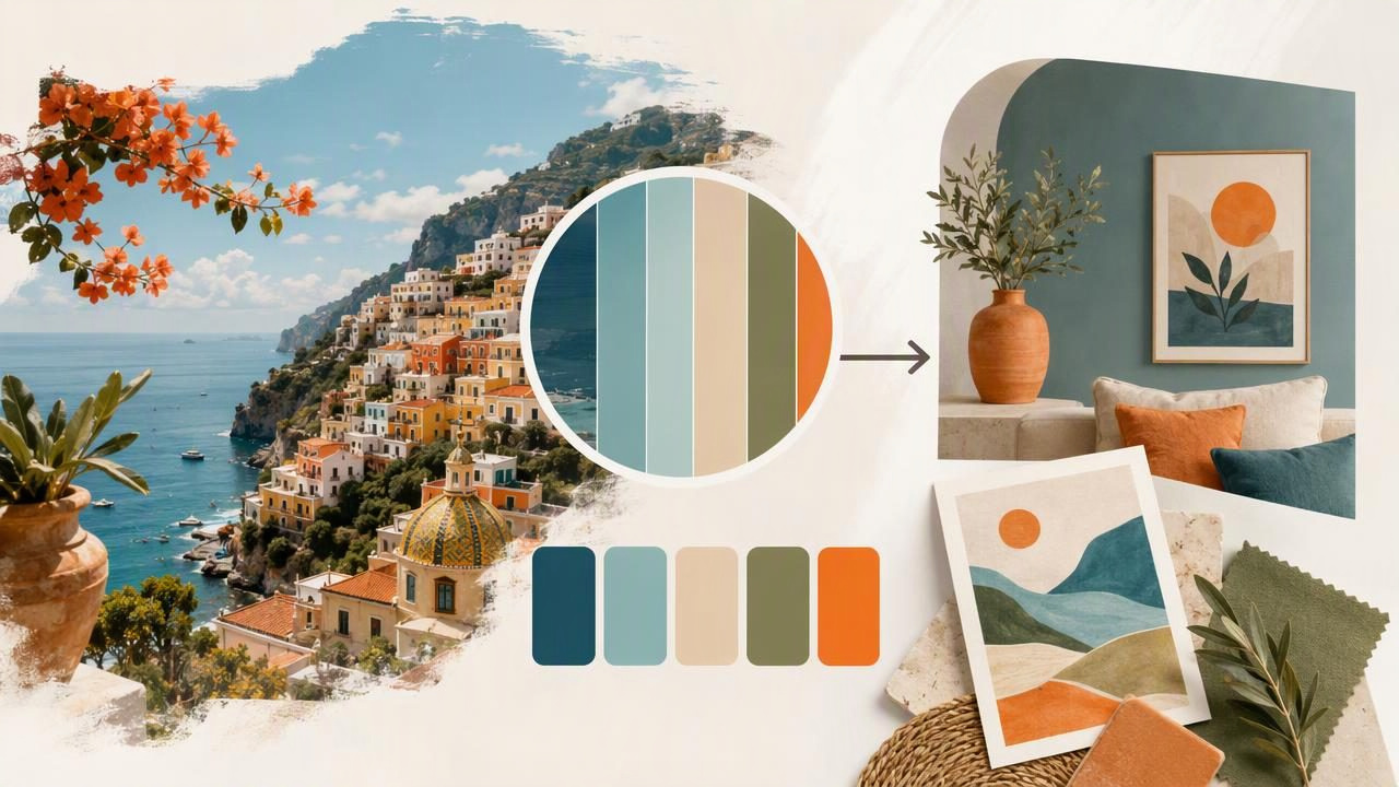
Travel is one of the best sources of fresh color inspiration. A weathered blue doorway in Lisbon, warm sandstone in the desert, neon signs in Tokyo, or layered greens from a rainforest can all suggest memorable color combinations. The challenge is turning those visual moments into a usable palette before the details fade from memory.
An image palette generator helps you capture travel color inspiration by extracting color values directly from photographs. Rather than guessing at a shade later, you can inspect the colors already present in an image, save the most useful tones, and translate them into a palette for graphic design, interior design concepts, social content, illustrations, or personal creative projects.
This guide explains how to build stronger travel-inspired color palettes from photos, what to look for while taking pictures, and how to use extracted HEX, RGB, HSL, and HSB values responsibly.
Why Travel Photos Create Better Color Palettes
Travel scenes often contain color relationships that would be difficult to invent from a blank canvas. Natural light, local materials, regional architecture, food, textiles, landscapes, and street signage create combinations with an authentic sense of place.
A single photograph may include more colors than you need, but it can still reveal a useful visual hierarchy. For example, an image of a coastal town might contain:
- A pale sky blue as the dominant background color
- A sun-faded coral accent on shutters or painted walls
- A warm off-white from stone or pavement
- A deep navy from shadows, railings, or water
- A muted olive green from plants or aged details
These colors work together because they were shaped by the same scene, lighting conditions, and materials. An extracted palette does not have to copy the photo exactly. Instead, it gives you a starting point for identifying a mood, balancing warm and cool tones, and selecting colors with a real-world visual connection.
Start With Photos That Have Clear Color Information
Good palette extraction begins before you open a design tool. The most useful travel images have enough visual clarity to distinguish the important colors in a scene.
Look for color groups, not isolated objects
A dramatic red umbrella may be visually interesting, but it does not automatically make a complete palette. Look for scenes with several related color areas: a building facade, surrounding shadows, foliage, pavement, sky, and small accent details. These scenes give you more options for creating a balanced set of colors.
Photograph in consistent light when possible
Lighting strongly changes how colors appear in photos. Golden-hour sunlight can make neutral stone look orange, while shade can shift white walls toward blue or gray. Neither result is wrong; it simply represents the color as captured under that specific light.
If your goal is to document a mood, embrace the lighting. If you need a palette that represents materials more neutrally, take an additional photo in softer, more even daylight. Avoid relying on heavily filtered images when accurate digital color values are important.
Capture details as well as wide scenes
Wide photos are excellent for overall atmosphere, while close-up images are often better for selecting precise colors. Photograph painted doors, tile patterns, market fabrics, menus, flower stalls, natural textures, and architectural details. A close crop can make it easier to sample a color without interference from shadows, reflections, or unrelated objects.
A Practical Travel Palette Example
Imagine you are visiting a Mediterranean harbor and photograph a row of boats against pale stone buildings. The image includes blue water, cream walls, a faded red buoy, dark ropes, and green-blue painted trim.
Instead of extracting every visible shade, choose five colors that each have a clear role in a design palette:
| Palette role | Example color | HEX value | How to use it |
|---|---|---|---|
| Light neutral | Sun-washed limestone | #E8DDC9 | Page backgrounds, spacious layouts, walls in a digital mood board |
| Primary cool | Harbor blue | #4E91A6 | Main UI color, headings, large graphic areas |
| Deep anchor | Rope navy | #263B4A | Body text, contrast, borders, shadows |
| Warm accent | Faded buoy red | #C96758 | Buttons, highlights, labels, small decorative elements |
| Supporting accent | Sea-glass teal | #6EAAA0 | Secondary graphics, charts, or subtle patterns |
This is not a rule that every travel palette must contain five colors. It is a method for moving from a complex photograph to a practical system. The light neutral establishes breathing room, the navy maintains readability, the blue defines the palette’s identity, and the red and teal provide controlled variation.
How to Extract a Useful Palette From a Travel Photo
- Choose one focal image. Start with a photograph that clearly communicates the place or feeling you want to preserve. Avoid selecting an image only because it has many colors.
- Identify the dominant visual areas. Look for large surfaces such as sky, water, buildings, clothing, vegetation, or ground. These often provide the best base colors.
- Sample intentional accents. Pick one or two smaller details that bring energy to the scene, such as a flower, sign, door, ceramic tile, or fabric.
- Inspect the values. Record the extracted color in the format your project needs: HEX for web work, RGB for digital graphics, HSL for adjusting lightness and saturation, or HSB for quick visual tuning.
- Remove near-duplicates. A photo may generate several similar blues or beiges. Keep the version that has the clearest role in your palette.
- Test the palette in context. Place the colors into a layout, mood board, slide, illustration, or room concept. A palette is only useful when its colors work together in the intended application.
Use HEX, RGB, HSL, and HSB for Different Tasks
Extracted colors become more flexible when you understand the value systems behind them. Each format describes the same digital color differently.
- HEX: A compact code such as
#4E91A6, widely used for websites, interface design, and CSS. - RGB: Red, green, and blue channel values, such as
RGB(78, 145, 166), useful in many digital design applications. - HSL: Hue, saturation, and lightness. This format is helpful when you want to create lighter, darker, or less saturated variations of a travel color.
- HSB: Hue, saturation, and brightness. It can be useful for quickly evaluating how vivid or bright a sampled color feels.
For instance, if your harbor blue is too intense for a large website background, keep its hue but lower saturation or raise lightness. That preserves the travel reference while making the color more appropriate for the design.
:root {
  --harbor-cream: #E8DDC9;
  --harbor-blue: #4E91A6;
  --harbor-navy: #263B4A;
  --harbor-coral: #C96758;
  --harbor-teal: #6EAAA0;
}

.travel-card {
  background: var(--harbor-cream);
  color: var(--harbor-navy);
  border-left: 6px solid var(--harbor-coral);
}
Turn One Palette Into Several Creative Directions
A travel photo can support more than one design direction. The same source image may create a bright editorial palette, a subdued interior mood board, or a high-contrast social graphic depending on which colors you prioritize.
For graphic design
Use a restrained set of three to five colors. Assign clear jobs: one background, one text color, one primary visual color, and one accent. If you use travel colors in branding or editorial work, check text contrast before publishing. A beautiful pale yellow or teal may not be readable when used for small type.
For interior design concepts
Extracted image colors can help communicate a direction for a room, especially in a digital mood board. Use them alongside photos of materials, furniture, artwork, and textiles. Treat the values as visual references rather than exact paint specifications. Screen displays, photography, lighting, finishes, and manufacturing processes can all change how a color appears in the physical world.
For social media and travel journals
Create a palette per destination, then use the same colors for cover images, map graphics, captions, and story templates. This provides visual continuity without making every image look identical. A palette can also help you organize a photo book or digital scrapbook around a consistent atmosphere.
Common Mistakes When Building a Palette From Travel Photos
- Keeping too many colors: Ten sampled colors may describe the photograph, but they can make a design feel unfocused. Start with five or fewer.
- Ignoring contrast: Colors that look harmonious in a photo can become unreadable in text, buttons, or navigation.
- Sampling shadows as material colors: A dark area may be a lighting effect rather than the local color of an object. Compare multiple areas before deciding.
- Using every color at equal strength: Let neutral and dark anchoring colors do more of the work. Save bright accents for small, purposeful moments.
- Assuming screen values equal physical results: Digital color extraction is valuable for visual planning, but it does not guarantee paint matching or print accuracy.
A travel palette should capture a visual memory, not trap you into reproducing a photograph exactly.
Build a Repeatable Travel Color Workflow
To make travel color inspiration easier to use later, create a simple organization system. Name each palette by location, subject, and mood, such as “Porto Tiles – Cool Morning” or “Desert Market – Warm Earth.” Save the original photo with the palette so you can revisit the context behind the colors.
When you return from a trip, review your saved palettes and look for recurring themes. You may notice that you repeatedly photograph muted greens, terracotta, deep indigo, or soft gray-blue shadows. These patterns can become a valuable source of direction for future creative projects.
For a straightforward way to inspect photo colors and build a palette on iPhone or iPad, Color Viewfinder’s guide to creating a color palette from a photo explains the process of selecting colors from an image and working with their digital values.
Final Thoughts
Travel photographs hold more than memories: they contain ready-made color stories. With an image palette generator, you can turn a fleeting scene into HEX codes, RGB values, and a practical set of colors for design work. Focus on scenes with strong relationships, select colors with clear roles, and test them in the real context of your project.
The result is not simply a collection of sampled shades. It is a flexible visual reference that can carry the atmosphere of a place into your next graphic design piece, interior concept, illustration, website, or creative journal.
