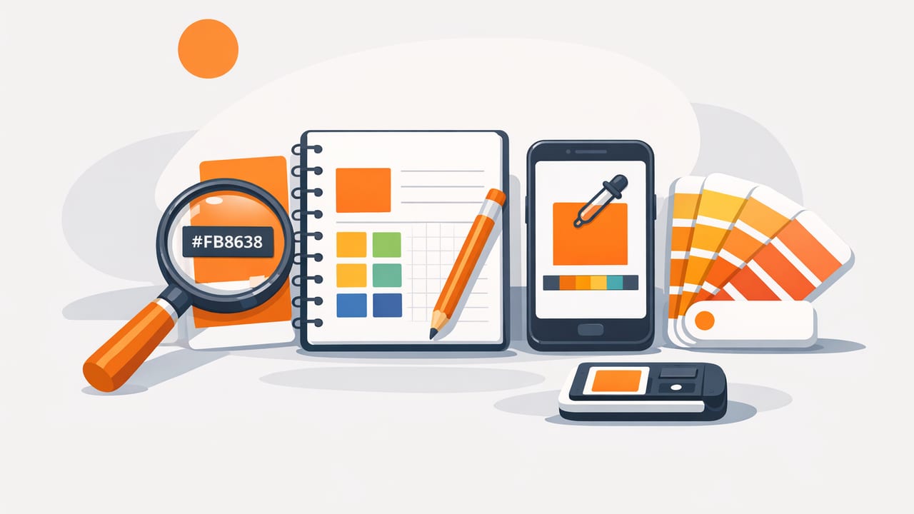
If you’ve ever tried to match a color from a photo, a product label, a room snapshot, or a screenshot, you’ve probably hit the same problem: you don’t need an expensive studio setup—just a cheap way to capture hex codes that’s accurate enough to trust. The good news is that modern phones and tablets can do this remarkably well, as long as you follow a few practical steps to avoid lighting and compression mistakes.
This guide walks through a reliable, budget-minded workflow for extracting HEX colors, validating them, and turning them into usable palettes for UI, branding, illustration, and even paint or decor planning.
What “capturing a HEX code” actually means
A HEX color is a six-digit code (like #2F6FED) that represents an RGB color in web and digital design. Capturing one from an image is essentially a two-step process:
- Sampling: picking a pixel (or an averaged region of pixels) and reading its RGB values.
- Encoding: converting those RGB values into HEX.
The catch: images aren’t “pure color.” Camera processing, lighting, shadows, glare, JPEG compression, and color profiles can all shift what you sample. A cheap workflow can still be excellent—if you control the variables that matter.
Why a cheap way to capture hex codes is often “good enough”
For many projects, you’re not matching a lab-measured pigment. You’re matching an on-screen impression or building a cohesive palette. If you can keep your samples consistent, you can produce professional-looking results with minimal spend.
Typical use cases where budget sampling works well:
- UI/UX: extracting colors from screenshots, mood boards, or competitor apps (for reference, not copying).
- Brand exploration: starting a palette from product photography, packaging, or a hero image.
- Content design: matching thumbnail colors, social templates, or illustrations.
- Decor direction: getting a digital “target color” to guide paint/fabric selection (then validating physically).
Cheapest setup that works
You can get very far with:
- A phone or tablet camera (or existing photos)
- A free or inexpensive color sampler app
- Optional: a small sheet of plain white paper (for quick exposure/white-balance reference)
That’s it. The “upgrade” isn’t a pricey device—it’s better capture habits.
Step-by-step: capture HEX codes from a photo (without getting fooled)
-
Choose a source image that’s not fighting you
Prefer images that are sharp, well-lit, and minimally filtered. Avoid heavy Instagram-style edits, strong HDR, or extreme shadows. If you’re photographing something in real life, try indirect daylight near a window rather than mixed indoor lighting.
-
Reduce glare and hotspots
Glare turns a “real” color into a bright highlight that samples incorrectly. Tilt the object slightly, move your light source, or change your angle until the surface looks even.
-
Fill the frame with the color area
If the colored region is tiny, you’re more likely to sample edge pixels (where anti-aliasing and compression distort values). Get closer or crop tightly before sampling.
-
Sample multiple points (not just one)
A single pixel can be an outlier. Sample 5–10 spots in the same region and look for a consistent cluster of values. If your tool supports it, use an averaged sampler (a small area rather than one pixel).
-
Pick “representative” midtone areas
Avoid the darkest shadow areas and the brightest highlights. Midtones typically represent the intended color more reliably.
-
Save both HEX and context notes
When you store a color, label where it came from (e.g., “box label blue / midtone / no glare”). This saves time later when you’re reconciling near-duplicate swatches.
Screenshot sampling: the cheapest way to capture hex codes for digital work
If your goal is digital design (web, app UI, slides), screenshots can be the most dependable input because you’re sampling already-rendered pixels. A few tips:
- Capture at native resolution (avoid messaging apps that downscale images).
- Disable “Night Shift” / True Tone while evaluating colors. These features change the display’s appearance, which can influence decisions even if the pixel values remain the same.
- Sample from solid areas (buttons, background blocks), not from gradients or compressed video frames.
Rule of thumb: If you’re designing for screens, sampling from a screenshot is usually more reliable than sampling from a photo of a screen.
Accuracy pitfalls (and how to avoid them)
Most color mismatches come from a handful of predictable issues:
1) Auto white balance shifts
Your camera tries to “correct” warm or cool lighting. That changes the color you’re trying to capture. If possible, use consistent lighting and avoid mixed sources (e.g., daylight + yellow lamp).
2) JPEG compression and “color noise”
Compressed images can introduce small blocks and ringing artifacts. Solution: sample a slightly larger area and average, or sample multiple points and choose the median-like value.
3) Texture and material reflectance
Fabric, paint, matte vs glossy packaging—materials reflect light differently. Sample from the flattest-looking area and avoid specular highlights.
4) Gradients pretending to be solids
Many “solid” areas are subtly gradiented. If your samples vary a lot, you may be looking at a gradient. Decide whether you want the midpoint or build a gradient pair (start/end) intentionally.
Quick validation: check if your sampled HEX is usable
Once you have a candidate HEX code, do a fast sanity check:
- Contrast check: will text sit on it? (Especially for UI.)
- Palette harmony: does it fight your other swatches or does it fit?
- Repeatability: if you resample, do you get something close?
For UI work, you’ll often want a small ramp (lighter/darker versions). Here’s a simple starting table you can use to plan a palette structure:
| Palette Role | What to Sample | Common Use |
|---|---|---|
| Primary | Main brand/object midtone | Buttons, links, key accents |
| Secondary | Supporting color from same image | Badges, highlights, charts |
| Neutral | Background/stone/metal/negative space | Backgrounds, borders, UI chrome |
| Dark | Deep shadow area (carefully) | Text, headers, overlays |
| Light | Bright area (not a glare hotspot) | Cards, surfaces, subtle fills |
RGB to HEX: a tiny snippet to verify conversions
Most tools show HEX instantly, but it helps to know how conversion works so you can sanity-check results (especially if you’re copying values between apps).
// Convert RGB (0–255) to HEX (#RRGGBB)
function rgbToHex(r, g, b) {
  const toHex = (n) => n.toString(16).padStart(2, '0');
  return `#${toHex(r)}${toHex(g)}${toHex(b)}`.toUpperCase();
}

rgbToHex(47, 111, 237); // #2F6FED
If your sampled RGB is (47, 111, 237) and a tool outputs something wildly different than #2F6FED, you’ve likely copied the wrong value format (e.g., HSL vs RGB) or encountered rounding/bit-depth differences.
Practical example: extracting a palette from a single object photo
Let’s say you photograph a ceramic mug on a table and want a cohesive digital palette.
- Primary: sample the mug’s midtone (avoid glossy highlight).
- Secondary: sample the label or a stripe/detail color.
- Neutral: sample the tabletop midtone (wood/stone tones are great neutrals).
- Dark: sample the deepest true shadow under the mug (not black; look for colored shadow).
- Light: sample the brightest area of the background wall (avoid blown-out white).
Then do a quick “repeatability” test: sample each region again after cropping closer. If your HEX codes stay close (within a small range), your capture is stable.
When you should not rely on cheap sampling alone
There are a few situations where you’ll want a more controlled process:
- Print-critical branding: you may need Pantone/CMYK targets and calibrated proofs.
- Paint matching: physical pigments vary by sheen, substrate, and lighting. Use the HEX as a direction, then confirm with swatches in the real room.
- Compliance/accessibility: for UI contrast, verify with contrast ratio tools and test across devices.
Checklist: the cheapest way to capture hex codes reliably
- Use screenshots for screen-based targets whenever possible
- For photos: avoid glare, mixed lighting, and heavy filters
- Sample multiple points and prefer midtones
- Label swatches with context so you can retrace decisions
- Validate by resampling and by checking contrast/harmony
Final thoughts
You don’t need premium hardware to get dependable color values. In most real design workflows, the most cost-effective approach is simply a consistent sampling method: start from clean inputs, sample thoughtfully, and validate quickly. That combination is the real cheap way to capture hex codes—and it scales from quick social graphics to serious UI palette building.
If you prefer doing this directly on iPhone or iPad, an app like Color Viewfinder can help extract HEX/RGB values from photos and organize them into palettes without adding much friction to your workflow.
