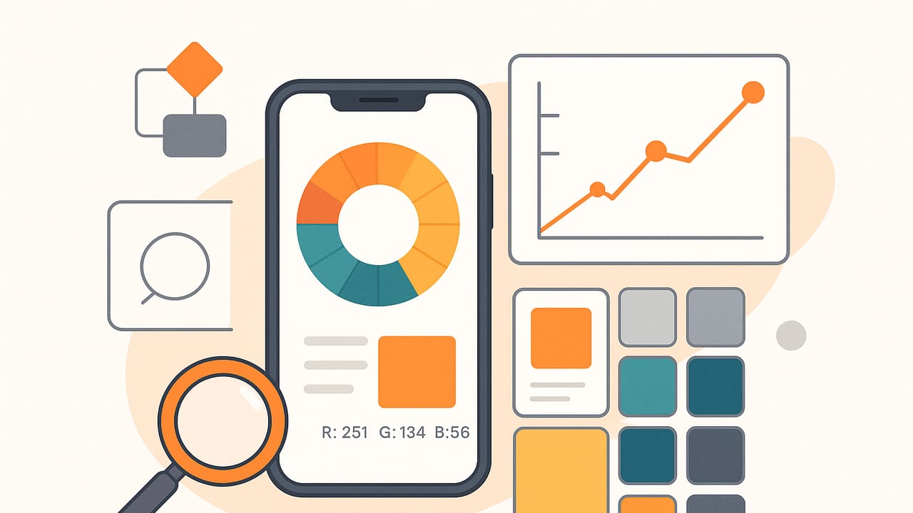
A great color analyzer app does more than pick a swatch off a photo—it measures light in a consistent color space, extracts meaningful palettes, and helps you ship designs that look right on real screens and in real rooms. This guide explains how these apps work under the hood, how to test their accuracy, and the best workflows for designers, decorators, photographers, and developers.
What Is a Color Analyzer App?
A color analyzer app is a tool that samples pixels from images or live camera input and returns color values in formats like HEX, RGB, HSL, and HSB/HSV. Many also generate palettes, compute contrast ratios, and export swatches to design tools. Think of it as a bridge between the physical world (photos, scenes) and digital color systems.
- Inputs: photos, screenshots, live camera, imported files
- Outputs: HEX, RGB, HSL, HSB/HSV, LAB, swatch files, CSS variables
- Extras: palette generation, contrast checks, layout previews, batch export
Key Features to Evaluate
Not all color tools are equal. Use this checklist as you compare:
- Sampling controls: eyedropper radius/averaging, zoom loupe, image gamma handling
- Color spaces: sRGB, Display P3, Adobe RGB, CIE LAB; conversions with correct transfer functions
- Palette algorithms: K-means, median cut, octree, CIEDE2000 clustering, outlier filtering
- Contrast analysis: WCAG 2.2 AA/AAA with text size handling and alpha compositing
- Export options: CSS variables, JSON, ASE/ACO, Procreate/Sketch/Figma-friendly formats
- Workflow helpers: naming schemes, layout previews, batch processing, favorites
- Privacy & performance: on-device processing, no analytics on images, smooth on large photos
Platform Comparison at a Glance
| Platform | Best For | Strengths | Trade-offs |
|---|---|---|---|
| iOS/iPadOS | On-the-go capture, decorators, photographers | Camera access, P3 displays, haptics, offline processing | Export formats vary by app; smaller screen for complex edits |
| Desktop | Developers, brand teams | Batch workflows, file automation, color-managed apps | Less convenient for field capture |
| Web | Quick conversions, sharing | Instant access, easy collaboration | Browser color management quirks, privacy considerations |
How Color Analyzer Apps Work: Core Algorithms
1) Pixel Sampling and Averaging
Precise sampling starts with consistent color management. Pixels should be interpreted in their embedded color profile (often sRGB or Display P3), linearized for math, averaged, then converted back. A good app provides a radius so you can average noisy pixels.
// Pseudocode: accurate eyedropper average (sRGB example)
function sampleAverageSRGB(image, x, y, radius):
  pixels = getPixelsInRadius(image, x, y, radius)
  linear = []
  for p in pixels:
    // convert 0..255 sRGB to 0..1 linear
    c = p / 255.0
    linear.append( c <= 0.04045 ? c/12.92 : ((c+0.055)/1.055)^2.4 )
  avg = mean(linear)
  // back to sRGB
  srgb = avg <= 0.0031308 ? avg*12.92 : 1.055*avg^(1/2.4) - 0.055
  return round(srgb*255)
2) Palette Extraction via Clustering
To summarize an image, many apps use clustering. Popular methods:
- K-means: fast, flexible; works better in perceptual spaces like LAB
- Median cut: simple, good for limited palettes, can miss small accents
- Octree: memory-efficient for real-time extraction
// Pseudocode: K-means in LAB for 5 swatches
function kmeansPalette(pixelsRGB, k=5):
  labPoints = RGB_to_LAB(pixelsRGB)
  centers = initPlusPlus(labPoints, k)
  repeat until convergence:
    clusters = assignToNearest(centers, labPoints, distance=CIEDE2000)
    centers = recomputeMeans(clusters)
  // Convert centers to desired output (HEX, HSL)
  return convertLABToHex(centers)
Using LAB and a perceptual distance metric like CIEDE2000 improves the quality of clusters, because distances better reflect human vision.
3) Color Difference and Delta E
Delta E quantifies how different two colors appear. Typical thresholds:
| ΔE (CIEDE2000) | Perceptual Meaning | Use Case |
|---|---|---|
| 0–1 | Indistinguishable | High-fidelity reproduction |
| 1–2 | Perceptible on close inspection | Brand-critical work |
| 2–5 | Noticeable difference | General design, web UI |
| 5+ | Clear mismatch | Avoid for identity colors |
Run Your Own Accuracy Tests
You can evaluate any color analyzer app with a few quick experiments.
- Control sample: Create a PNG with known HEX swatches (e.g., #FF0000, #00FF00, #0000FF, #777777). Sample them. Values should match within rounding.
- Gamma sanity check: Draw a gradient from #000000 to #FFFFFF. Sample midpoints. In sRGB, the midpoint is not exactly 50% linear; correct tools will reflect perceptual mid-grays properly.
- Small target: Add a 1–2 px accent color on a contrasting background. Use a sampling radius to ensure you can isolate it without contamination.
- Profile awareness: Export an image in Display P3. Does the app maintain the profile or convert to sRGB consistently? Check by comparing to a color-managed desktop app.
- Lighting realism: Photograph colored objects under warm and cool lights. The measured hues should shift predictably (yellower under warm, bluer under cool). A reliable app will reveal rather than flatten these differences.
“Measure colors where they live: on the pixels, not in your head.”
Accessibility: Contrast and Readability
Modern UI requires accessible contrast. A color analyzer app should compute WCAG contrast correctly, including alpha blending over backgrounds.
// Contrast ratio per WCAG for opaque sRGB colors
function contrast(hexA, hexB):
  L1 = relativeLuminance(hexA)
  L2 = relativeLuminance(hexB)
  lighter = max(L1, L2)
  darker  = min(L1, L2)
  return (lighter + 0.05) / (darker + 0.05)

function relativeLuminance(hex):
  rgb = hexToSRGB(hex) // 0..1
  linear = rgb.map(c => c <= 0.04045 ? c/12.92 : ((c+0.055)/1.055)**2.4)
  return 0.2126*linear.r + 0.7152*linear.g + 0.0722*linear.b
- AA normal text: 4.5:1 or higher
- AA large text (≥18 pt or 14 pt bold): 3:1 or higher
- AAA (enhanced): 7:1 for normal, 4.5:1 for large
For semi-transparent overlays, blend the foreground alpha over the background first, then compute contrast on the result.
Pro Workflows by Role
UI/UX Designers
- Capture a screenshot or brand photo.
- Extract a 5–8 color palette with K-means in LAB.
- Name swatches semantically (e.g., Primary/Secondary/Accent/Neutral-100..900).
- Run contrast on text/background pairs; adjust lightness in HSL as needed.
- Export CSS variables and a JSON palette for design tokens.
Interior Designers & Decorators
- Photograph the room under daylight and warm indoor light.
- Sample wall, floor, and key fabrics using a radius to average texture.
- Create a palette with 3 neutrals, 2 accents, and a highlight.
- Compare samples against paint swatches using ΔE; keep under 2–3 for close matches.
- Export a printable sheet or share a PNG palette with clients.
Photographers & Colorists
- Shoot a color checker in the scene.
- Measure patches to validate your camera profile or LUT.
- Extract skin tone ranges; ensure consistency across shots.
- Use LAB lightness (L*) to balance exposures while protecting chroma.
- Archive palettes with metadata for each session.
Developers
- Define brand tokens in JSON.
- Use the app to validate real-world screenshots for contrast regressions.
- Export CSS variables and test across light/dark themes.
- Automate snapshots; compare with ΔE thresholds in CI.
Exporting and Integrating
Look for flexible exports that align with your stack.
- Design tools: ASE/ACO, Procreate swatches, SVG palettes
- Dev: CSS variables, JSON tokens, Swift/Android resources
- Docs & sharing: PNG/JPG palette sheets with labels
/* Example: CSS variables from a measured palette */
:root {
  --color-primary: #2B6CB0;
  --color-accent:  #ED8936;
  --neutral-900:   #1A202C;
  --neutral-700:   #2D3748;
  --neutral-100:   #EDF2F7;
}
.btn { background: var(--color-primary); color: var(--neutral-100); }
.btn--accent { background: var(--color-accent); color: var(--neutral-900); }
If your app supports HSL/HSB, exporting in those spaces can simplify dynamic theming (e.g., adjusting lightness for dark mode without shifting hue).
Privacy and Performance Considerations
- On-device processing: Prefer apps that analyze locally, without uploading your photos.
- No hidden metadata export: Check that exports strip sensitive EXIF unless you choose to keep it.
- Profile handling: Accurate conversions between sRGB and P3 prevent color shifts on wide-gamut displays.
- Large image handling: Downsample for analysis without losing small accent colors (adaptive sampling helps).
Practical Tips for Better Measurements
- Use a sampling radius: Average over 3–9 pixels to reduce noise on textured surfaces.
- Mind the light: Natural light yields truer colors than mixed lighting; capture reference shots in both.
- Check gamut: If you sample P3-saturated colors, convert carefully to sRGB for the web to avoid clipping.
- Name systematically: Semantic names (Primary-600, Accent-500) beat ad hoc labels when teams grow.
- Version palettes: Store palettes with project and date; small ΔE improvements matter later.
Choosing the Right Color Analyzer App: A Quick Checklist
- Accurate sampling with color profile awareness
- Perceptual clustering (LAB + CIEDE2000) for palettes
- WCAG contrast with alpha compositing support
- Exports that match your toolchain (CSS/JSON/ASE/Procreate)
- On-device privacy and fast performance
- Intuitive UI: zoom loupe, layout previews, batch export
FAQ
Is HEX enough, or should I use HSL/HSB too?
HEX is perfect for exact color storage and web use. HSL/HSB shines when you need to tweak lightness or saturation consistently across a palette, or generate themes programmatically.
Why do my sampled colors look different on another device?
Display gamut (sRGB vs P3), brightness, and color profiles affect appearance. Use color-managed tools and test on target devices. Convert to sRGB for web consistency.
How many colors should a palette have?
For UI, 5–8 core colors plus neutrals often suffices. For branding, maintain a primary, secondary, 1–2 accents, and a neutral scale with 5–9 steps.
Wrap-up
Whether you’re distilling a photo into a palette, validating brand hues, or checking contrast, the right color analyzer app turns subjective guesses into measurable, repeatable results. Evaluate tools by their sampling fidelity, perceptual clustering, and export options. If you’re on iPhone or iPad and want a fast, privacy-friendly option that extracts HEX, RGB, HSL, and HSB from photos with customizable palettes and flexible exports, you might try Color Viewfinder.
