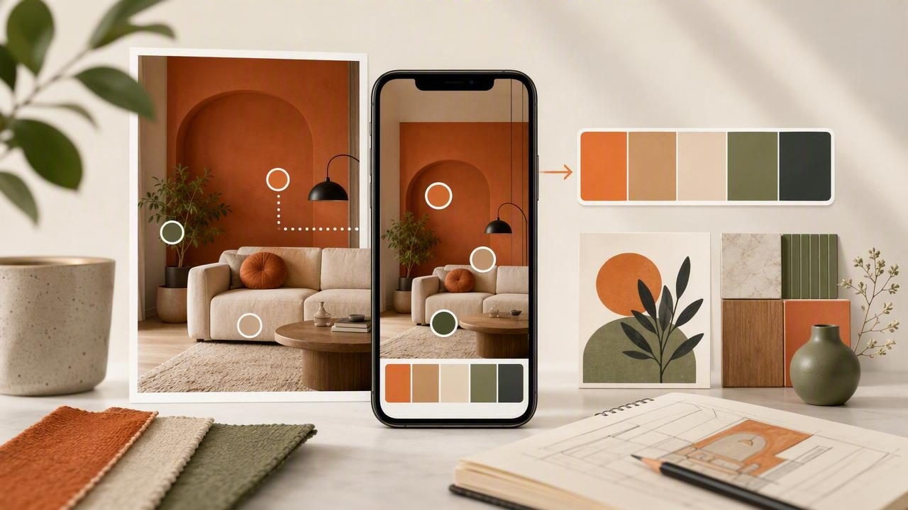
Color decisions can quietly consume a surprising amount of time. A graphic designer may need to match a brand accent from a product photo. An interior designer may want to identify the undertones in a fabric sample. A content creator may be building a consistent visual style from travel photography. In each case, the challenge is not simply finding a color that looks close enough—it is capturing, organizing, and applying color information accurately.
A color extraction app for faster creative workflows turns visual inspiration into usable color data. Instead of guessing at shades or manually recreating them, you can sample colors directly from photos, record their values, arrange them into palettes, and move forward with more confidence. This process supports better consistency across graphic design, interior design, digital content, and personal creative projects.
Why Color Selection Slows Down Creative Work
Creative work often begins with an image: a photographed room, a magazine spread, a landscape, a piece of packaging, or a screenshot. These references contain useful color relationships, but they are difficult to translate into an organized system without the right tools.
Manual color selection creates several common problems:
- Inaccurate matching: Colors selected by eye can look different across screens, lighting conditions, and materials.
- Lost inspiration: A compelling reference image may be saved, but its key colors are never documented.
- Inconsistent files: Color codes are copied into notes, messages, design files, and spreadsheets with no central source of truth.
- Slow revisions: When feedback calls for a warmer neutral or deeper accent, teams must search for the original reference again.
- Weak palette balance: Individual colors may look good alone but fail to work together as a complete visual system.
Color extraction solves the first stage of this problem: it makes the colors inside an image measurable. Once a color is represented as HEX, RGB, HSL, or HSB data, it becomes easier to reuse in the appropriate creative environment.
What a Color Extraction App Actually Does
A color extraction app analyzes an image and lets you sample pixels or areas within it. Rather than relying only on visual judgment, you can tap a color in a photo and view its numerical values. Those values can then be saved as part of a color palette.
Depending on your project, different color formats matter for different reasons:
| Color Format | Best Use | Example |
|---|---|---|
| HEX | Web design, UI design, CSS, digital brand guidelines | #2D6A4F |
| RGB | Screen-based artwork and digital graphics | 45, 106, 79 |
| HSL | Adjusting hue, saturation, and lightness systematically | 146°, 40%, 30% |
| HSB/HSV | Exploring brightness and creating tonal variations | 146°, 58%, 42% |
The important advantage is speed with structure. Instead of seeing a muted sage green and trying to recreate it from memory, you can capture the exact digital value, name it, group it with related colors, and export or reference it later.
A Practical Workflow: From Photo to Color Palette
An efficient color workflow does not require extracting every color in an image. The goal is to identify the colors that have a clear role in the final project. Use the following process to turn an image into a useful palette.
- Choose a high-quality reference image. Use a photo with even lighting and a clear subject. Blurry, heavily filtered, or dramatically shadowed images can distort sampled colors.
- Identify the visual priority. Decide whether you are looking for a dominant base, a supporting neutral, an accent color, or a full palette.
- Sample intentionally. Tap areas that represent real materials, surfaces, or key graphic elements. Avoid glare, deep shadows, compression artifacts, and tiny distracting details.
- Capture five to seven useful colors. This is often enough to establish a flexible palette without creating decision fatigue.
- Assign a role to every color. Label colors as background, primary, secondary, text, highlight, trim, or accent.
- Test the palette in context. Place the colors in a layout, mood board, room visualization, or social graphic before finalizing them.
This approach is faster than collecting random swatches because each extracted color has a purpose. A palette becomes a working decision tool rather than a folder of attractive screenshots.
How to Build Better Palettes From Extracted Colors
Image-based palettes are valuable because photographs naturally contain color relationships. However, a successful palette usually needs editing. A photo may include hundreds of color variations caused by texture, light, reflection, and shadows. Your job is to simplify those variations into a system that fits the project.
Start With a Dominant Color
The dominant color sets the overall mood. In an interior project, this could be the largest wall, flooring tone, or upholstery color. In graphic design, it may become the primary background or major brand color. Select a dominant color that supports the intended feeling: calm, energetic, premium, playful, natural, or technical.
Add Supporting Neutrals
Neutrals keep a palette usable. White, charcoal, warm gray, cream, taupe, and soft beige are not interchangeable; each has an undertone that affects the colors around it. Extract neutral samples from the image rather than choosing generic defaults. A warm cream can make terracotta feel cohesive, while a cool gray may make it look disconnected.
Use Accents With Restraint
Accent colors provide contrast and draw attention. In a user interface, an accent may guide the eye to buttons or alerts. In a room, it may appear in cushions, art, or a painted detail. Extract one or two accents, then use them sparingly so they retain their visual impact.
A strong palette is not a collection of favorite colors. It is a set of colors with defined jobs.
Color Extraction for Graphic Design Projects
For graphic designers, color extraction can speed up the move from concept to composition. A reference image can become the foundation for a campaign, presentation, poster, social media template, or digital interface.
For example, imagine a designer creating promotional graphics for an outdoor event. A photograph of a forest at golden hour might yield deep pine green, moss, sunlit amber, muted bark brown, and a soft fog gray. Rather than copying the entire photograph, the designer can use those colors to create a cohesive visual direction across posters, stories, banners, and email headers.
When applying extracted colors in digital work, consider accessibility as well as aesthetics. Text needs sufficient contrast against its background. A color that works beautifully as a large background block may be difficult to read when used behind small text. Test key combinations before production, especially for buttons, links, labels, and calls to action.
/* Example palette variables for a digital project */
:root {
  --forest: #244B3A;
  --moss: #6E8B5B;
  --amber: #D89A36;
  --bark: #6A5141;
  --mist: #EDF0EA;
}
Color Extraction for Interior Design Decisions
In interior design, color extraction is especially useful when working from existing materials. A client may want to coordinate a new rug with a favorite artwork, match paint to tile undertones, or build a room around patterned fabric. Sampling colors from photographs provides a practical starting point for these choices.
Still, digital values should be treated as references rather than final paint or fabric specifications. Physical materials respond to natural light, artificial light, texture, gloss level, and surrounding colors. A wall color that looks balanced on a tablet may appear cooler in a north-facing room or warmer under incandescent bulbs.
Use extracted palettes to narrow the possibilities, then confirm the final choices with physical samples. Compare swatches at different times of day and place them beside existing flooring, cabinetry, trim, and textiles. This two-step method combines the speed of digital color tools with the realism required for material decisions.
Common Color Extraction Mistakes to Avoid
Even the best design tools cannot fully correct for weak source material or unclear goals. Avoid these common mistakes when building a palette from photos:
- Sampling highlights: Bright reflections often look nearly white and do not represent the actual surface color.
- Ignoring lighting: Sunset, colored LEDs, and strong window light can shift colors dramatically.
- Collecting too many swatches: More colors do not automatically create more flexibility. Start with a focused system.
- Using every extracted color equally: Establish hierarchy so the palette feels intentional.
- Forgetting output requirements: A palette for a website, print brochure, and painted room will need different testing and conversion steps.
Create a Repeatable Color Workflow
The greatest benefit of color extraction is not just faster sampling. It is the ability to create a repeatable process for future projects. Save source images with their palettes, use clear names, record the intended role of each color, and keep approved versions separate from experiments.
A simple naming convention can make palettes easier to search later:
[Project]-[Role]-[Color]
CafeBrand-Primary-DeepGreen
LivingRoom-Accent-SoftTerracotta
SummerCampaign-Background-WarmCream
Over time, this creates a reliable library of visual references. You will spend less time recreating past decisions and more time refining ideas. For designers, decorators, and other visual thinkers, a mobile tool such as Color Viewfinder can make capturing those useful color references from everyday images more convenient.
Final Takeaway
A color extraction app helps transform inspiration into action. By sampling accurate values from photos, organizing them into purposeful color palettes, and testing those palettes in context, you can reduce guesswork throughout the creative process. Whether you are building a brand system, planning a room, designing content, or collecting visual ideas, a structured color workflow makes decisions faster, clearer, and more consistent.
