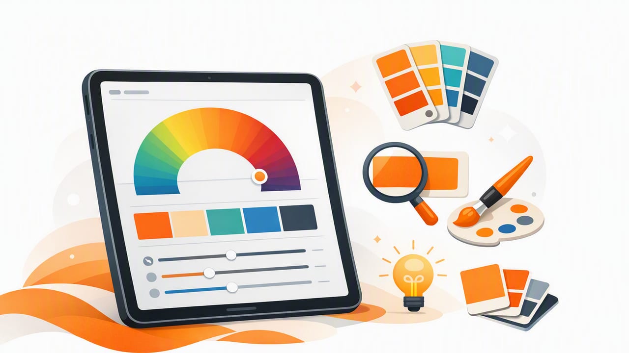
An iPad is more than a sketchbook—it’s a powerful color workstation. With the right color palette generator for iPad, you can capture colors from real-world inspiration (a room, a product package, a landscape photo), turn them into clean swatches, and export them into a workflow that actually holds up in design tools.
This guide walks through a repeatable, designer-friendly process: capture → extract → curate → check → export → apply. Whether you work in graphic design, UI, illustration, or interior decorating, the goal is the same: build palettes you can trust and reuse.
Why generate palettes on an iPad?
Designers often start with a mood image, but translating that inspiration into a usable palette can be messy. iPad-based palette generation helps because it’s fast, portable, and visual. A few practical advantages:
- Instant iteration: try multiple palette sizes (5, 8, 12 colors) in minutes.
- On-site capture: extract color while you’re at a client location, showroom, or outdoors.
- Better judgment on a bigger screen: you can evaluate harmony, contrast, and neutrals more comfortably than on a phone.
- Split View workflows: keep references open (Pinterest board, PDF brief, Figma screenshots) while refining swatches.
Step 1: Start with a strong reference image (your palette is only as good as your input)
Palette extraction tools can only sample what’s in the image—so choose references that represent the true materials and lighting you want to match.
Tips for better photo-based color extraction
- Use natural light when possible to reduce color casts from warm bulbs.
- Avoid heavy filters (they distort hue relationships and push saturation).
- Include neutrals in the frame (white wall, gray card, wood tone) if your project needs realistic balancing colors.
- Crop intentionally: remove irrelevant areas so the generator focuses on the dominant story.
Rule of thumb: if your reference photo has a clear “hero color,” a supporting color, and at least one neutral, it’s usually a good palette candidate.
Step 2: Extract colors—then curate them (don’t stop at “auto”)
Most palette generators will produce a set of swatches automatically. That’s a starting point, not the finish line. The best workflow is to treat the auto palette as a draft and then edit it for usability.
What to look for in the first extraction
- Duplicates: multiple swatches may be near-identical (especially in shadows).
- Accidental colors: tiny highlights or noise can produce odd outliers.
- Missing neutrals: auto extraction may over-prioritize saturated colors.
- Unbalanced value range: too many mid-tones, not enough light/dark anchors.
Curate with a purpose: palette roles
Instead of thinking “I need 8 colors,” think “I need 8 roles.” Here’s a practical set that works for many projects:
- Primary (brand/hero color)
- Secondary (supporting accent)
- Tertiary (optional accent or highlight)
- Background light
- Surface (cards, panels)
- Text primary
- Text muted
- Border/line (subtle separators)
If you’re working on interiors, translate those roles into paint, trim, flooring, metal finish, textile accent, and so on. The concept—assigning jobs to colors—stays the same.
Step 3: Understand the color values you’re exporting (HEX, RGB, HSL, HSB)
A good iPad palette tool typically provides multiple color models. Each is useful in different situations. Use this quick reference to avoid common handoff mistakes.
| Format | Best for | What to watch out for |
|---|---|---|
| HEX (e.g., #2F6FED) | UI design, CSS, design tokens, most brand guides | HEX hides luminance relationships; verify contrast separately |
| RGB (e.g., 47, 111, 237) | Screen work, motion graphics, image editing | Same color can feel different across displays; keep references |
| HSL | Systematic palette tuning (light/dark variants) | Perceptual uniformity isn’t perfect; small hue shifts can surprise you |
| HSB/HSV | Adjusting saturation/brightness quickly | Brightness ≠ accessibility contrast; still test with real text sizes |
Step 4: Refine harmony (without losing realism)
Photo palettes feel “real” because they contain imperfect, natural relationships—tiny shifts in hue and value. The trick is refining them for design clarity without sanding off the character.
Three quick refinement moves
- Consolidate neutrals: keep 1–2 warm neutrals and 1–2 cool neutrals rather than five similar grays.
- Create a value ladder: ensure you have at least one very light and one very dark swatch for layout structure.
- Control saturation: if everything is vivid, nothing is. Keep one hero accent and let the rest support it.
Optional: build light/dark variants for UI
If you’re building a UI system, consider generating variants from your base palette (e.g., primary-600, primary-700, etc.). Many designers do this by adjusting HSL lightness in small steps and then checking contrast.
Step 5: Check accessibility and contrast (non-negotiable for digital design)
A palette can be beautiful and still fail in real usage—especially with text, icons, and charts. At minimum, check:
- Text on background (primary text and muted text)
- Interactive states (buttons, links, focus outlines)
- Color-only meaning (error/success states should have labels/icons too)
Even if you don’t run full WCAG testing in the palette app, you can catch obvious issues by pairing swatches and previewing them as real UI (not just isolated squares).
Step 6: Export in a format your workflow will actually use
The best palette is the one you can reuse consistently. Export choices typically fall into a few buckets:
- Copy/paste values (fast for quick comps)
- Images (great for mood boards and client approvals)
- Design-tool friendly formats (depending on your pipeline)
- Code-ready tokens (CSS variables, JSON tokens)
Example: turn a palette into CSS variables
Once you have stable HEX values, you can store them as tokens. Here’s a simple example:
:root {
  --color-primary: #2F6FED;
  --color-secondary: #F26B5B;
  --color-bg: #F7F7F5;
  --color-surface: #FFFFFF;
  --color-text: #15171A;
  --color-text-muted: #5C6168;
  --color-border: #E3E6EA;
}

.button {
  background: var(--color-primary);
  color: var(--color-surface);
}

.card {
  background: var(--color-surface);
  border: 1px solid var(--color-border);
  color: var(--color-text);
}
This is where an iPad palette generator becomes a real production tool: you’re not just picking colors—you’re building a system others can implement.
Common mistakes when using a color palette generator for iPad
- Trusting the first extraction: always remove duplicates and define roles.
- Ignoring lighting bias: warm indoor photos can push everything yellow/orange.
- No darkest dark: without a near-black, typography and hierarchy suffer.
- Too many accents: choose one hero accent; keep others quieter.
- Skipping contrast checks: a palette must work at real sizes, not just as swatches.
Mini workflow examples (so you can apply this today)
Example A: Brand palette from product photography
- Start with a sharp product shot on a neutral background.
- Extract 8–10 colors, then keep: 1 hero, 1 secondary, 2 neutrals, 1 dark text, 1 subtle border, 1 highlight.
- Export HEX and create simple tokens for marketing pages.
Example B: Interior palette from a room photo
- Use a wide shot that includes wall color, flooring, and textiles.
- Extract and prioritize materials (wood tone, paint, fabric accents) over tiny decor highlights.
- Present the palette as a clean grid image for client sign-off, then keep the numeric values for ordering paint/fabric samples.
What to look for in a good iPad palette tool
If you’re choosing or evaluating a palette generator, prioritize workflow features over gimmicks:
- Accurate sampling with zoom/picker precision
- Multiple color models (HEX, RGB, HSL/HSB)
- Palette layouts that help you compare swatches quickly
- Flexible exporting so colors don’t get trapped in one app
- Fast editing (reorder, replace, fine-tune)
Bring it all together: your repeatable iPad palette checklist
- Choose a reference photo with clear lighting and relevant materials.
- Extract colors, then delete duplicates and outliers.
- Assign roles (primary, secondary, neutrals, text, borders).
- Balance values (light to dark) and control saturation.
- Check contrast with real text/usage contexts.
- Export in the format your workflow needs (swatch image + HEX/tokens).
If you want a simple way to do photo-based extraction and palette exporting directly on iOS/iPadOS, Color Viewfinder is one option designers use to pull HEX/RGB/HSL/HSB values from images and assemble palettes for creative projects.
