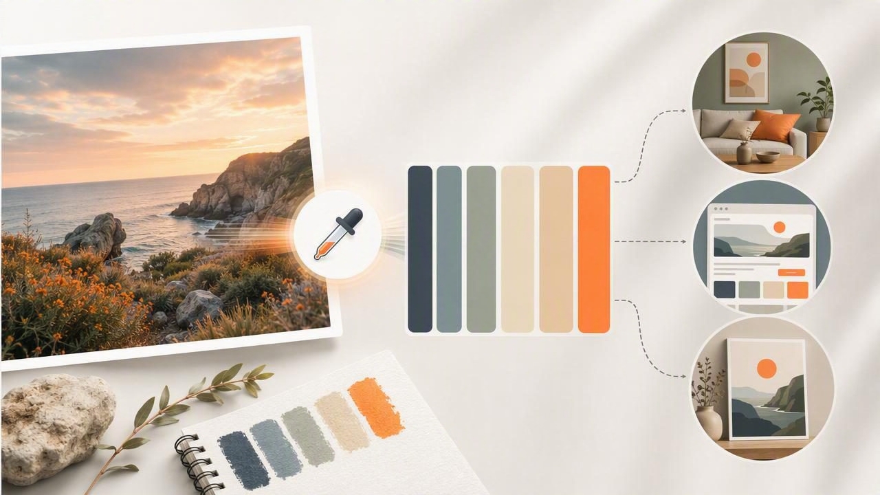
A color palette generator from photos helps turn visual inspiration into usable color information. Instead of estimating a shade from memory or manually recreating it with sliders, you can sample colors directly from a photograph and organize them into a palette for a creative project.
This process is useful for graphic design, interior design, branding, social media, web design, illustration, and personal creative work. A sunset image can inspire a warm campaign palette. A hotel lobby photograph can reveal a calm, layered interior scheme. A product photo can provide a starting point for an interface or presentation that feels visually connected to the subject.
However, extracting colors is only the first step. A successful palette needs thoughtful selection, contrast checks, and context. The most common mistake is treating every sampled color as equally important. The better approach is to use a photo as evidence of a visual mood, then refine the colors for the job at hand.
What Does a Color Palette Generator From Photos Do?
A photo palette tool identifies colors found in an image and expresses them as digital values. Depending on the workflow, those values may include:
- HEX: A six-character code commonly used for websites and digital design, such as
#D97852. - RGB: Red, green, and blue numerical values used by screens, such as
217, 120, 82. - HSL: Hue, saturation, and lightness values that make it easier to reason about color relationships.
- HSB/HSV: Hue, saturation, and brightness values often used in visual editing workflows.
The generator may find dominant colors across the whole image, while an eyedropper-style workflow lets you inspect specific areas. Both methods are helpful, but they answer different questions. Dominant-color extraction is useful for quickly understanding the overall mood. Point sampling is better when you need the color of a particular wall, textile, logo detail, shadow, or highlight.
Why Photos Are Powerful Sources of Color Ideas
Photographs contain color relationships that already exist together in a real scene. This makes them useful for creating palettes that feel natural, cohesive, or emotionally specific. A single image can include a main color, quieter supporting tones, a dark grounding neutral, a light background color, and a small accent.
For example, consider a photograph of a coastal café: faded blue chairs, terracotta planters, cream stucco, charcoal table frames, and pale sand in the background. Rather than choosing “blue and orange” in the abstract, the photo provides several variations of those hues plus practical neutrals that help them work together.
A photo-inspired palette does not need to duplicate every pixel. Its purpose is to capture a usable visual direction.
That distinction matters. The colors in a photograph are affected by lighting, camera processing, reflections, compression, and editing. Use the image as a creative reference, not as a guarantee of how a physical material, printed item, or painted surface will appear.
A Concrete Example: Turning a Travel Photo Into a Website Palette
Imagine you are designing a website for a small travel journal. Your source image shows a late-afternoon street scene with warm stone buildings, deep green shutters, a faded blue sky, and a person wearing a rust-colored jacket.
At first, the image may appear to contain hundreds of colors. For a practical website palette, reduce it to five roles:
| Color role | Sample value | Use in the design |
|---|---|---|
| Page background | #F4E8D3 | Warm off-white background |
| Primary dark | #263A35 | Headings, body text, navigation |
| Supporting blue | #7BA5B8 | Links, cards, subtle dividers |
| Accent rust | #B75D3D | Buttons, badges, key calls to action |
| Deep neutral | #3A312B | Footer, hover states, visual depth |
The palette is not simply a list of attractive swatches. Each color has a job. The warm background retains the atmosphere of the stone buildings. The green-black color offers readable text contrast. Blue becomes a restrained supporting color, while rust is reserved for interactive or important elements.
In CSS, the starting point could look like this:
:root {
  --background: #F4E8D3;
  --text: #263A35;
  --secondary: #7BA5B8;
  --accent: #B75D3D;
  --deep: #3A312B;
}
Before using these values widely, test text against the background and avoid relying on the rust accent alone to communicate meaning. A button should still look like a button through its label, shape, and placement, not only through color.
How to Extract a Better Palette From Any Image
- Start with a clear source image. Choose an image with the mood, material, environment, or subject you want to reference. Blurry images, heavily filtered screenshots, and extreme colored lighting can make interpretation harder.
- Identify the visual story. Ask what attracts you to the image: is it the calm neutral balance, the bold contrast, the natural warmth, or one memorable accent?
- Sample broad areas first. Pull colors from large surfaces such as sky, walls, backgrounds, foliage, fabric, or major objects. These often become the foundation of the palette.
- Add one or two detail colors. Small details can become useful accents, but do not let them overwhelm the main palette.
- Include light and dark values. A palette made entirely of midtones is difficult to use. You usually need a light base and a sufficiently dark color for text, outlines, shadows, or hierarchy.
- Remove duplicates. Five nearly identical beige values may accurately describe a photo, but they rarely improve a design. Keep the differences that serve a purpose.
- Assign roles before applying colors. Decide which colors are backgrounds, text, accents, secondary elements, and decorative details.
Choosing the Right Number of Colors
There is no universal palette size, but fewer colors are often easier to manage. For most digital projects, a practical starting point is three to six core colors. This leaves enough variation for hierarchy without making the design inconsistent.
- Three colors: Best for a minimal visual identity or a simple social graphic.
- Five colors: A flexible choice for websites, presentation templates, and content systems.
- Six or more colors: Useful when building an illustration system, editorial layout, or large design library with multiple UI states.
Remember that neutral colors count. White, off-white, charcoal, brown-gray, and muted blue-gray are often the colors that make a bright accent feel intentional rather than excessive.
Using Photo Palettes for Different Creative Projects
Graphic Design
Use an extracted palette to establish consistency across posters, social graphics, slides, packaging concepts, or editorial layouts. Pick one dominant color, one contrast color, and a neutral base. For a campaign with many assets, save the exact values so every contributor starts from the same reference.
Interior Design Planning
A room photo can help identify the undertones that make a space feel balanced. Sample colors from flooring, furniture, textiles, plants, and natural light, then group them into dominant, supporting, and accent roles. Digital values are excellent for organizing inspiration, but they should not be treated as an exact match for paint, fabric, wood, or other physical materials. Always review real samples in the intended lighting.
Brand and Social Media Work
Photographers, creators, and small businesses can use recurring imagery to find an identifiable color direction. A brand does not need to copy every photo exactly. Instead, select stable tones that can appear in templates, thumbnails, story backgrounds, highlight covers, and visual guidelines.
Common Problems and How to Avoid Them
Problem: The palette looks muddy. This often happens when all sampled colors have similar darkness and saturation. Keep one clearer accent or increase the separation between your light, middle, and dark tones.
Problem: The design does not resemble the source photo. You may have extracted individual colors without preserving their proportions. Look again at the image: perhaps 70% is pale stone, 20% is dark green, and only 10% is rust. Let those proportions influence your layout.
Problem: A beautiful color is unreadable. A pale yellow or medium blue may look attractive as a swatch but fail as text on a light background. Use it for decoration, fills, or large areas instead, and choose a darker text color.
Problem: The result feels too literal. Shift a sampled color slightly lighter, darker, less saturated, or more neutral when needed. The goal is a functional palette inspired by the image, not strict pixel replication.
Save Color Values in Formats Your Team Can Use
Once a palette is finalized, retain the values in a format that fits the project. HEX values are convenient for web work and quick sharing. RGB, HSL, and HSB values support different design decisions and software workflows. For teams, palette files may also be shared as formats such as CSS, CSV, JSON, or ASE when the receiving tools support them.
A simple palette note should include the color name, value, and intended use. For example: “Accent Rust — #B75D3D — primary button and important labels.” That small amount of documentation prevents colors from being used inconsistently later.
Build Palettes With Intention, Not Just Automation
A color palette generator from photos can make color extraction faster, but good design still depends on judgment. Select colors that support the message, create sufficient contrast, and give each shade a clear role. Refine what the image gives you rather than accepting every extracted value.
For iPhone and iPad users who want to inspect photo colors and build shareable palettes, Color Viewfinder’s guide to creating a color palette from a photo explains a practical mobile workflow for collecting HEX, RGB, HSL, and HSB values.
