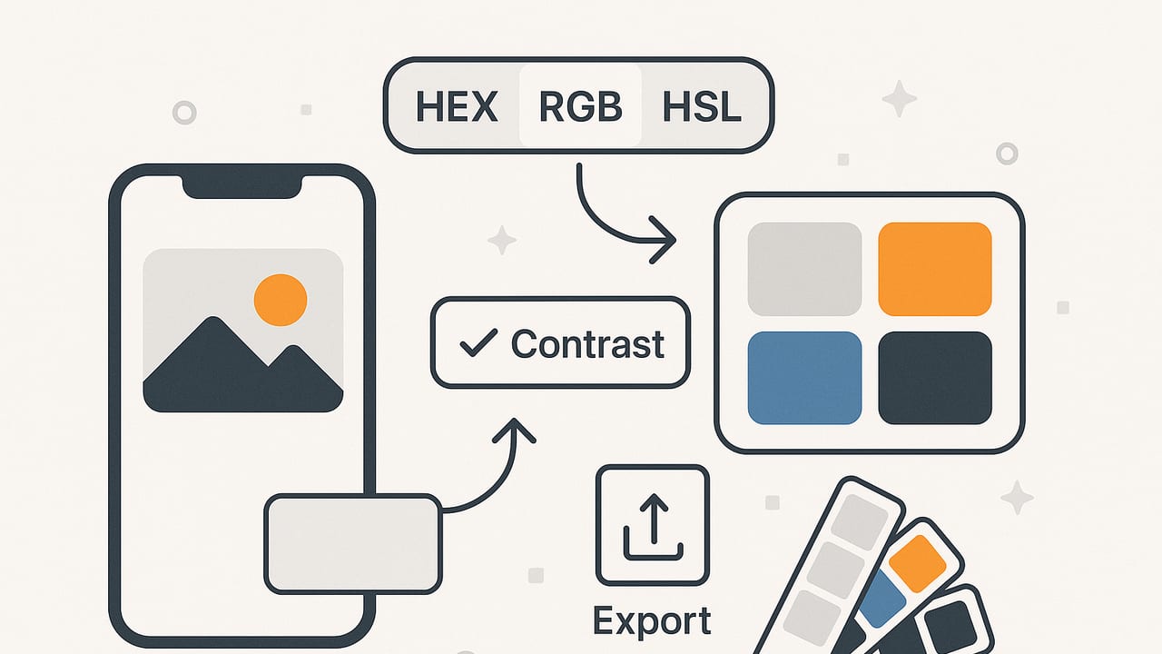
If you design on an iPhone or iPad, building a reliable color system no longer requires a desktop. The modern color palette iOS workflow covers everything from capturing hues in the real world to validating accessibility and exporting to your favorite design apps. This guide walks you through an end-to-end, mobile-first approach: extracting swatches from photos, converting across color models (HEX, RGB, HSL, HSB), naming and organizing palettes, automating repetitive tasks with Shortcuts, and exporting to formats that play nicely with web and print.
Why build your palette on iOS?
Design happens wherever inspiration strikes—at a café, a client site, or on a subway platform. iOS devices give you instant access to the camera, photo library, and share extensions, plus a rapidly improving ecosystem of design apps. Building a palette on your phone or tablet lets you capture the color “in the moment,” then refine and validate it without waiting to get back to your desk.
Capture: From photo to dependable swatches
Real-world color capture is powerful—but it’s easy to over-trust a single tap on a noisy pixel. A robust capture flow reduces noise and bias while keeping you fast.
- Shoot in good light: Prefer indirect daylight. Avoid mixed lighting (e.g., daylight + tungsten) to reduce color cast. If you must shoot indoors, white-balance your camera first.
- Frame neutrals: Include a neutral reference if possible (paper, gray card, concrete). You can visually sanity-check whether your neutrals skew warm or cool.
- Sample smartly: Instead of a single pixel, use a median/average of a small region. This smooths texture and sensor noise, yielding a more stable swatch.
- Collect context: Grab 5–8 colors: 2–3 dominant, 2 accents, 1–2 neutrals, and an optional highlight/shadow. This gives your palette contrast and hierarchy.
- Normalize exposure: If your app supports it, normalize brightness before sampling so you’re capturing hue/chroma rather than lighting extremes.
Handling tricky scenes
- High-saturation subjects: Bright flowers and signage blow out channels; use exposure compensation and resample mid-tones rather than highlights.
- Reflective surfaces: Metals and glossy paints can spike specular highlights; avoid sampling pure reflections.
- Skin tones: Sample across multiple areas to avoid hot spots; average them for a more representative base tone.
Convert: HEX, RGB, HSL, and HSB in context
iOS workflows frequently hop between web and print, so you’ll translate colors across models. Here’s how the common models map to practical decisions:
| Model | Syntax | Best for | Notes |
|---|---|---|---|
| HEX | #RRGGBB or #RRGGBBAA | Web, design tokens | Compact, widely supported; opaque by default unless using 8-digit hex. |
| RGB | rgb(255, 99, 71) | Screen previews, gradients | Channel-based; aligns with sRGB on most devices. |
| HSL | hsl(9, 100%, 64%) | Systematic palettes | Intuitive lightness and saturation controls for palette scaling. |
| HSB/HSV | hsb(9, 72%, 100%) | UI color pickers, painting apps | Brightness-centric; common in creative workflows on iOS. |
When you’re building variants (hover/press states, light/dark themes), HSL is especially helpful because you can step lightness and saturation systematically. For web tokens and handoff, HEX remains the lingua franca. Keep all forms handy so you can copy/paste into whichever app you’re using next.
Validate: Accessibility on a small screen
Mobile users contend with glare and small UI targets. Checking contrast early prevents rework later. Aim for WCAG AA at minimum: 4.5:1 for body text and 3:1 for large text or UI icons. Here’s a quick, mobile-friendly approach:
- Create text-on-background pairs for each candidate foreground color.
- Compute contrast ratios and label pass/fail.
- Adjust via HSL lightness (foreground up/down, background inverse) until you pass.
Contrast ratio calculation (Swift)
For iOS developers and tinkerers, this snippet computes WCAG contrast, useful when prototyping token systems or validating themed colors:
// Convert sRGB (0...255) to linearized luminance
func relativeLuminance(r: Int, g: Int, b: Int) -> Double {
    func toLinear(_ c: Double) -> Double {
        let cs = c / 255.0
        return cs <= 0.04045 ? cs / 12.92 : pow((cs + 0.055) / 1.055, 2.4)
    }
    let R = toLinear(Double(r))
    let G = toLinear(Double(g))
    let B = toLinear(Double(b))
    return 0.2126 * R + 0.7152 * G + 0.0722 * B
}

func contrastRatio(fg: (Int, Int, Int), bg: (Int, Int, Int)) -> Double {
    let L1 = relativeLuminance(r: fg.0, g: fg.1, b: fg.2)
    let L2 = relativeLuminance(r: bg.0, g: bg.1, b: bg.2)
    let (lighter, darker) = L1 > L2 ? (L1, L2) : (L2, L1)
    return (lighter + 0.05) / (darker + 0.05)
}
Use this to validate combinations like primary-on-surface, secondary-on-surface, and text-on-accent. Keep an eye on hover/pressed states if you darken backgrounds and lighten foregrounds.
Organize: Names, roles, and tokens
Organized palettes scale better across apps and teammates. On iOS, consistent names make it easier to search and share.
- Role-based names: primary/secondary/accent/surface/background/error/success.
- Semantic states: primary/hover, primary/pressed, surface/elevated, surface/overlay.
- Scale suffixes: primary/50, primary/100 … primary/900 for lightness ramps.
- Brand vs. UI: Separate branding hues (marketing) from functional UI tokens (app). It reduces cross-contamination.
When your tool allows it, store descriptions with each swatch (e.g., “Accessible on Surface/Default at 4.8:1”). A few words now save minutes later.
Export: Formats that travel well on mobile
Different destinations favor different formats. Keep a few ready-to-share exports on iOS for frictionless handoff:
- ASE (Adobe Swatch Exchange): Works for Adobe apps and many third-party tools.
- GPL (GIMP Palette): Lightweight text; handy for open-source tools.
- Procreate .swatches: For illustrators working on iPad.
- JSON: Ideal for design tokens; easy to version and integrate with CI.
- CSS: Drop-in for web prototypes and design systems.
- SVG palette: Visual swatch sheets for quick sharing and printing.
Sample CSS variables export
:root {
  --color-primary-500: #0EA5E9;
  --color-primary-600: #0284C7;
  --color-surface: #0B1220;
  --color-text: #F1F5F9;
  --color-accent: #F59E0B;
}

.button {
  background: var(--color-primary-600);
  color: var(--color-text);
}
Keep your variable names semantic. If your palette shifts, your component styles won’t need to change.
Automate: Shortcuts for a faster color palette iOS flow
Apple Shortcuts can stitch your palette workflow together. A simple sequence can turn an extracted set of colors into reusable files in your Files app:
- Trigger: Share Sheet from your color app with a JSON payload of HEX and roles.
- Transform: Convert HEX to RGB/HSL within Shortcuts (or pass through unchanged if already provided).
- Assemble: Build a CSS file and a JSON token file from a template variable.
- Save: Write to iCloud Drive/<Project>/Palettes with an ISO date in the filename.
- Notify: Present a preview and one-tap share to Slack, Mail, or Messages.
Advanced: Use Shortcuts to append new swatches to an existing JSON token file. Create a backup step that archives the previous version for rollback.
Case study: From café photo to brand palette in 10 minutes
Scenario: You’re branding a neighborhood café. The hero color is the teal from its hand-painted sign; the supporting tones will come from wood tables and a ceramic mug.
- Capture: Take three photos: the sign in shade, the bar area with wood, and a close-up of the mug. Avoid direct sun to reduce glare and hard shadows.
- Sample: For the sign, sample a 5×5 patch away from brush highlights to determine the teal base. Sample a second patch for a slightly darker accent.
- Neutrals: Sample the wood mid-tone for a warm neutral and find a cooler balance by sampling a neutral area (e.g., a napkin or wall) to avoid overly warm UI backgrounds.
- Accents: From the mug, grab a desaturated clay tone as an accent, and pick a complementary highlight from reflections (but avoid pure specular pixels).
- Normalize: Convert to HSL and adjust lightness: create 50/100/200 steps lighter than your primary teal for hover, outlines, and backgrounds.
- Name and role: primary-500 (teal), primary-600 (teal dark), surface (neutral cool), surface-alt (wood warm), accent (clay), text (near-white).
- Accessibility check: Validate text on primary-600 and text on surface. Nudge lightness until you pass 4.5:1.
- Export: Generate CSS variables and a Procreate .swatches file for the illustrator designing the menu.
Result: A cohesive palette that reflects the café’s environment while staying legible and flexible across signage, menus, and a simple website.
Common pitfalls to avoid
- Sampling highlights or shadows: Extract from mid-tones; extremes skew hue.
- Ignoring display profiles: Most iPhones are wide-gamut (Display P3), but web is commonly sRGB. Convert or at least preview in sRGB to avoid surprises.
- Overcrowding the palette: Six to ten core colors (including neutrals) is plenty for most UI systems.
- Forgetting focus states: Accessible focus/active outlines need sufficient contrast against your surfaces.
- Relying on one model: Use HSL for systematic scaling, HEX for tokens, and RGB for fine control in creative apps.
Quality checks before handoff
- Token completeness: HEX, RGB, and HSL values for each swatch, plus roles and usage notes.
- Contrast matrix: A small table that marks which foregrounds pass on which backgrounds.
- Export set: JSON tokens, CSS variables, and a visual SVG or PNG swatch sheet.
- Theme variants: Light and dark surfaces with primary/secondary adjustments validated.
- Versioning: Timestamped filenames and an index so teammates know which set is current.
Quick reference: Building a palette on iOS
- Capture colors from well-lit photos; use region averages.
- Convert and store HEX, RGB, HSL, and HSB for flexibility.
- Name by role and state; create lightness ramps with HSL.
- Validate WCAG contrast for text and critical UI elements.
- Export to JSON, CSS, and your team’s creative formats.
- Automate repeats with Shortcuts and consistent file names.
“Color is a power which directly influences the soul.” — Wassily Kandinsky
Bringing it all together
A strong color palette is equal parts capture, conversion, organization, and validation—plus a dash of automation so you can stay in flow. With an iPhone or iPad, you can build and ship a palette end-to-end: sample the world, shape it into a system, ensure it meets accessibility standards, and deliver the right files to your team. If you prefer an all-in-one tool for extracting HEX/RGB/HSL/HSB from photos, organizing swatches, and exporting to multiple formats, the Color Viewfinder app on iOS and iPadOS is a practical option to explore.
