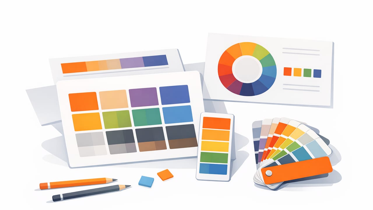
A great palette can still fail if it’s presented poorly. Designers don’t just need “nice colors”—they need usable colors. That means showing each color in a layout that makes relationships, hierarchy, and intent obvious at a glance. The right presentation also reduces handoff errors (think: wrong hex, wrong usage, wrong contrast) and makes palettes easier to reuse across brand, UI, print, and interiors.
This guide focuses on color palette layouts for designers: practical formats you can use for moodboards, brand systems, UI design, client presentations, and creative projects. You’ll learn when each layout works best, how to structure palettes for clarity, and how to turn colors into a repeatable system.
Why palette layout matters (beyond aesthetics)
A palette layout is a communication tool. It answers questions like:
- Which color is primary vs. supporting?
- What pairs well together? (text on background, accents on neutrals)
- How does it scale? (2 colors vs. 12 colors)
- What’s the usage context? (UI states, print, room accents)
When layout is unclear, people improvise—developers choose the wrong shade, stakeholders can’t “see” the concept, and future-you can’t remember why that coral existed in the first place.
The most useful color palette layouts (and what they’re best for)
There’s no single perfect layout. The best palette layout depends on your goal: inspiration, system building, accessibility, or handoff.
| Layout | Best for | Strengths | Watch out for |
|---|---|---|---|
| Swatch cards | Brand palettes, print, client decks | Easy to label with HEX/RGB and names | Relationships between colors can feel “flat” |
| Stripe bars | Mood, composition, quick comparison | Shows proportion and overall vibe fast | Harder to annotate usage rules |
| Grid matrix | Large palettes, exploration | Compact, makes patterns visible | Can hide hierarchy without labels |
| Role-based UI tokens | Product design systems | Connects colors to meaning (primary, success) | Needs governance to avoid token sprawl |
| Monochrome ramps | UI surfaces, typography, data viz | Improves consistency and contrast control | Needs careful steps to avoid muddy mid-tones |
| Context mockups | Interior boards, brand applications | Shows colors “in real life” | Can be misleading without raw values shown |
Layout #1: Swatch cards (the most universal)
Swatch cards are individual color blocks with labels. They’re the easiest way to make a palette portable across tools and teams.
How to structure swatch cards
- Include a label set: name + HEX (and optionally RGB/HSL).
- Show text samples: white and black text over the swatch reveals legibility instantly.
- Group by purpose: Neutrals, primaries, accents, and functional colors.
Pro tip: If you have more than 6–8 colors, split into sections. “One long row of 14 swatches” reads like an accidental collection rather than a system.
Layout #2: Stripe bars (fastest way to communicate mood)
Stripe layouts display colors as horizontal or vertical bands. This is one of the strongest presentation formats for showing proportion—which colors dominate and which are accents.
When stripe bars shine
- Brand vibe exploration: You can test 60/30/10 composition quickly.
- Interior palettes: Paint, textiles, and materials often behave like large fields of color.
- Photography-driven palettes: Stripe bars echo the distribution of color in the source image.
Make stripes more actionable
Stripes can be too abstract if you don’t add meaning. Add short labels under each stripe: “background,” “surface,” “accent,” “CTA,” “trim,” etc.
Layout #3: Grid matrices (best for bigger palettes)
Grids are compact, scan-friendly, and great for comparing similar hues and values. They’re ideal when you’re working with:
- multiple options in one hue family (e.g., 8 blues),
- several neutrals,
- or palette exploration for illustration and editorial design.
Two grid patterns designers rely on
- Hue-first grids: Arrange by hue across rows; value/saturation shifts down columns.
- Value-first grids: Arrange light-to-dark across columns; hue families down rows.
Rule of thumb: If the palette will inform typography and surfaces, value-first grids make contrast planning easier.
Layout #4: Monochrome ramps (the backbone of UI and editorial)
A ramp is a sequence of tints/shades of one hue (or neutral). Ramps are essential because most real-world design needs multiple steps: hover, disabled, borders, subtle backgrounds, and emphasis states.
A practical ramp recipe
- Create 5–9 steps per key hue (e.g., 100–900).
- Ensure steps are perceptually distinct, not just mathematically different.
- Test text contrast on at least two background steps.
“A palette becomes a system when it explains how to choose the next color.”
Layout #5: Role-based palettes (tokens for design systems)
In product and web design, colors should map to intent. Instead of “Blue 500,” teams use names like:
- Primary (brand actions)
- Secondary (supporting actions)
- Success / Warning / Error (system feedback)
- Surface / Background / Border (foundations)
That mapping is itself a layout: a palette organized by roles. It prevents random color usage and makes handoffs smoother.
Token layout example (as JSON)
If you’re handing off to development, a token-like structure is clearer than a screenshot.
{
  "color": {
    "brand": {
      "primary": "#1E4DFF",
      "secondary": "#6C7A89"
    },
    "semantic": {
      "success": "#16A34A",
      "warning": "#F59E0B",
      "error": "#DC2626"
    },
    "neutral": {
      "0": "#FFFFFF",
      "100": "#F5F5F5",
      "900": "#111827"
    }
  }
}
How to choose the right palette layout (a quick decision guide)
Use the goal of your palette to pick the format:
- Client presentation: Stripe bars + swatch cards (mood + detail).
- Brand guidelines: Swatch cards grouped by role (primary, accent, neutral).
- UI design: Ramps + role-based tokens (states and accessibility).
- Interior design: Context mockups + proportion stripes (dominant vs. accent).
- Exploration: Grid matrix (lots of options, easy comparison).
Best practices that make any palette layout more usable
1) Name colors for humans, not just machines
HEX codes are precise, but names help people remember intent. Good naming patterns include:
- Role naming: “Primary,” “Surface,” “Border,” “Accent.”
- Hue + value: “Blue 600,” “Warm Gray 100.”
- Material naming (interiors): “Oak,” “Linen,” “Slate.”
2) Show contrast pairings inside the layout
Make legibility visible. Even simple labels like “Text on Surface” with sample typography can prevent mistakes.
3) Limit accent colors (and prove their purpose)
Many palettes feel chaotic because they include too many accents. A practical rule:
- 1–2 primary brand hues
- 1 accent hue (used sparingly)
- 3–6 neutrals (often a ramp)
4) Include a “do not use” note when necessary
If two colors are too close in value or fail contrast for text, call it out directly. A palette layout is also a set of boundaries.
Example: building one palette into multiple layouts
Suppose you extracted five colors from a photo (for example: deep navy, muted teal, soft sand, off-white, and a burnt orange accent). Here’s how you can present the same palette in three ways:
- Stripe bar: Navy and sand as dominant bands, teal medium, orange as a thin accent stripe, off-white as breathing room.
- Swatch cards: Each color with HEX + “recommended use” (e.g., Navy = headings/backgrounds).
- UI roles: Primary = navy, Accent = orange, Surface = off-white, Neutral = sand, Secondary = teal.
That’s the core idea behind effective color palette layouts for designers: the palette stays consistent, but the layout changes to match the decision you’re trying to enable.
Quick checklist: what to include before you export or share
- All colors labeled with at least HEX (and RGB/HSL if relevant).
- Palette grouped by roles or families (not random order).
- At least one layout that shows proportion (stripes) and one that shows precision (swatches).
- Contrast sanity check for common text/background combinations.
- A consistent export format for your workflow (e.g., PNG + tokens).
Common mistakes (and how to fix them)
Mistake: the palette is “pretty” but not reusable
Fix: Add roles, ramps, and usage notes. A single accent is more powerful when it’s clearly assigned to highlights or calls-to-action.
Mistake: too many similar mid-tones
Fix: Rebuild as ramps and remove redundant steps. If two swatches look identical at normal zoom, one should go.
Mistake: layout hides the primary color
Fix: Change order and size. In stripes, give the primary more space. In swatches, place it first and label it clearly.
A gentle workflow tip for photo-based palettes
If your palette starts from photography (brand shoots, travel photos, room snapshots), extract more colors than you need first, then curate down. It’s easier to remove than to guess what’s missing. Many designers use a mobile color extraction tool to capture accurate values on the go, then reorganize them into the layouts above once back at their desk. For iOS and iPad users, Color Viewfinder is one option that can help with that extraction step.
Bottom line: treat layout as part of your design system. When your palette is presented clearly, your colors become easier to approve, easier to implement, and far more consistent over time.
