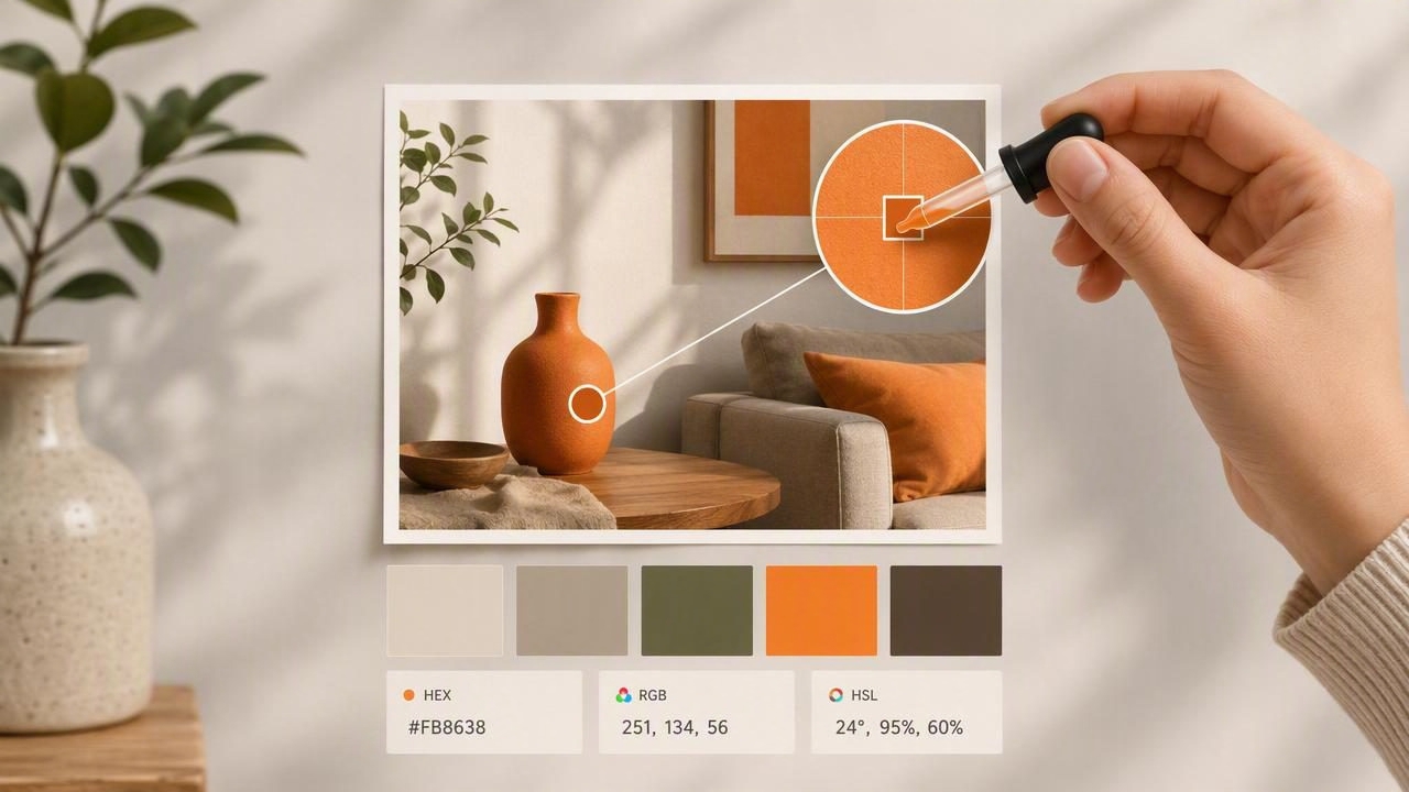
A color picker sounds simple: tap a pixel, get a HEX code, build a palette. In practice, photo-based color sampling can drift fast—one image can contain multiple versions of “the same” paint color depending on lighting, shadows, camera white balance, and compression. If you’ve ever sampled a “warm beige” and ended up with a muddy tan in production, you’ve experienced the gap between captured color and intended color.
This guide walks through a reliable, repeatable workflow for extracting colors from photos and turning them into palettes that hold up in real projects—graphic design, UI, branding, and interior mood boards. The goal is not perfection (photos aren’t color-calibrated measurements), but consistency and usefulness.
Why colors from photos are tricky (and how to plan for it)
Photos aren’t objective color data. They’re a mix of scene lighting and camera interpretation. A good workflow starts by understanding the biggest sources of error:
- Lighting temperature: Warm indoor lights push colors yellow/orange; shade pushes them blue.
- Shadows and highlights: A wall can range from near-white in highlights to gray in shadow.
- Auto white balance: Your phone guesses what “neutral” is, and that guess varies shot to shot.
- Compression and filtering: Social apps and JPEG compression can shift or block up subtle tones.
- Material reflectance: Glossy surfaces reflect surroundings, contaminating the sampled pixel.
So the right mindset is: sample for decisions. Use a color picker to identify a color family, establish a palette relationship, and create consistent working values—not to match a manufacturer’s paint chip or a Pantone book.
Step-by-step workflow: from photo to usable palette
1) Start with the best source image you can get
Before you pick a single pixel, improve your odds:
- Prefer original photos over screenshots or social reposts.
- Avoid heavy filters (especially “warm” or “vintage” presets).
- Zoom in to check for noise and compression artifacts in flat areas.
- Use multiple photos of the same subject when possible (different angles/lighting) to triangulate a stable color.
2) Identify your “sampling zones” (don’t tap randomly)
For each object or surface you want to represent (a sofa fabric, a logo color, a wall paint), pick three zones:
- Midtone zone: The most representative area (usually your primary pick).
- Shadow zone: Helps you create a darker companion color for depth.
- Highlight zone: Useful for tints, backgrounds, and spacing the palette.
Sampling only highlights makes palettes too pale; sampling only shadows makes them muddy. Midtones are typically the most transferable.
3) Take multiple samples and average with intent
Single-pixel sampling can be noisy. A practical approach:
- Sample 3–7 points within the midtone zone.
- Look for outliers caused by texture (threads, speckles) or reflections.
- Choose a representative value or slightly simplify it (move it toward the “center” of what you’re seeing).
If your tool supports it, use a larger sampling area. If not, manual multi-sampling is the next best thing.
4) Correct the palette using HSL/HSB (not just HEX)
HEX is great for implementation, but it’s not intuitive for correction. Once you’ve extracted a starting value, adjust in HSL or HSB/HSV to make the palette coherent:
- Hue: the “color family” (red, blue, green). Small hue shifts can fix sickly neutrals.
- Saturation: controls intensity. Photos often oversaturate in bright light—dial it back for UI and print.
- Lightness/Brightness: controls value. Use it to create predictable steps (e.g., 10–15% increments).
Rule of thumb: if two colors fight, they’re often too close in lightness or too similar in saturation. Push one lighter/darker or more/less saturated.
5) Build a palette with roles, not just “nice colors”
A usable palette assigns jobs to colors. Even for interiors, you can think in roles:
- Primary: the hero color (brand color, dominant wall, major object).
- Secondary: supports the primary without competing.
- Accent: used sparingly for emphasis (buttons, decor moments).
- Neutrals: background and breathing room (warm/cool whites, grays, off-blacks).
Try limiting your first pass to 5–7 colors. More than that is usually a sign you’re collecting instead of designing.
Common color picker mistakes (and what to do instead)
Mistake: sampling from shadows and calling it “the color”
Fix: sample midtones first, then deliberately create shadow/highlight companions. Your palette should include the color’s range, not confuse one lighting condition for the truth.
Mistake: trusting a single photo under warm lighting
Fix: if possible, sample from a second image with cooler or more neutral light. If you only have one image, reduce saturation slightly and check whether neutrals drift orange/green.
Mistake: extracting colors without checking contrast
Fix: test text/background combinations early. A palette that looks beautiful can still fail basic readability.
HEX, RGB, HSL, HSB: when to use which
Color values often come in multiple formats. They’re all describing the same color, but each is useful for different tasks.
| Format | Best for | What to watch |
|---|---|---|
| HEX (#RRGGBB) | Web/UI implementation, design specs | Not intuitive for adjusting hue/saturation |
| RGB (0–255) | Screen-based work, dev handoff | Hard to reason about relationships |
| HSL | Tuning palettes (lightness steps, muted variants) | Very saturated hues can behave nonlinearly |
| HSB/HSV | Artist-friendly brightness adjustments | Brightness ≠ perceived lightness in all cases |
Practical palette rules that work for both UI and interiors
Use value structure: pick 3 lightness tiers
Many palettes fail because all colors sit in the same “value band.” Create tiers:
- Light tier: backgrounds, negative space, large surfaces
- Mid tier: main surfaces, cards, secondary elements
- Dark tier: text, anchors, outlines, contrast
If you do nothing else, ensuring a clear light–mid–dark structure makes photo-derived palettes immediately more usable.
Control saturation: one loud color at a time
Photos can contain several saturated highlights (flowers, signage, packaging). In a designed palette, multiple high-saturation colors compete. Pick one true accent, then mute the rest (or push them toward neutral companions).
Protect your neutrals
Neutrals carry most layouts and most rooms. When sampling “white” from a photo, you’re often sampling light plus bounce plus camera bias. To keep neutrals functional:
- Keep at least one near-neutral with low saturation (even if the photo is warm).
- Create a warm neutral and a cool neutral so you can balance different contexts.
- Use neutrals to separate saturated colors so they don’t clash.
Quick accessibility check for color palettes (especially UI)
If your palette will be used for interfaces, run a basic contrast test before committing. Even without a dedicated checker, you can establish a simple habit:
- Ensure your darkest color is dark enough to act as text on light backgrounds.
- Avoid placing saturated midtones behind text—use them for accents, not paragraphs.
- Create a dedicated “text on color” pair (e.g., a deep navy text color and an off-white background).
Design tip: A palette can be aesthetically accurate to a photo yet still unusable if it lacks a reliable text/background pair.
Turn extracted colors into a system (export-ready)
Once you have stable colors, package them so they’re easy to reuse across tools and projects.
Use consistent naming
A practical naming scheme avoids ambiguous labels like “Blue 2.” Prefer roles and tiers:
- primary-500, primary-700
- neutral-50, neutral-900
- accent-600
Example: CSS variables from a photo-derived palette
:root {
  --neutral-50:  #F7F4EF;
  --neutral-900: #1F1C1A;

  --primary-500: #3A6F8F;
  --primary-700: #2B536B;

  --accent-600:  #D9784A;
}

body {
  background: var(--neutral-50);
  color: var(--neutral-900);
}

.button {
  background: var(--primary-500);
  color: var(--neutral-50);
}

.button--accent {
  background: var(--accent-600);
  color: var(--neutral-50);
}
This approach is portable: you can map the same palette into design tokens, brand guidelines, or a decorator’s swatch sheet.
Troubleshooting: when your picked color looks wrong elsewhere
Problem: the color looks “too dirty” on a clean background
Cause: your sample included shadow or texture noise. Fix: raise lightness slightly and reduce saturation a touch; compare against a neutral background, not the original photo.
Problem: the palette looks coherent in the photo but clashes in layout
Cause: the photo’s lighting unified the scene; your design removed that unifier. Fix: introduce a consistent neutral or a unifying tint (e.g., warm gray) and reduce saturation across secondary colors.
Problem: your “white” is yellow, your “black” is green
Cause: white balance bias. Fix: pull saturation down near zero for neutrals, and nudge hue slightly away from green/yellow until it reads neutral in context.
A simple checklist you can reuse
- Use the highest-quality image available (avoid filtered reposts).
- Sample midtones first; add shadow/highlight companions intentionally.
- Take multiple samples per surface; ignore outliers.
- Adjust in HSL/HSB to create clear value tiers.
- Assign roles (primary, secondary, accent, neutrals).
- Test at least one reliable text/background pair.
- Export/note colors with a naming system for reuse.
Closing thought
A color picker is most powerful when you treat it as the start of a palette decision—not the final answer. Extract, verify, adjust, and systematize. If you want to do this quickly on iPhone or iPad, an app like Color Viewfinder can help you sample and organize colors from photos while viewing multiple formats (HEX/RGB/HSL/HSB) in one place.
