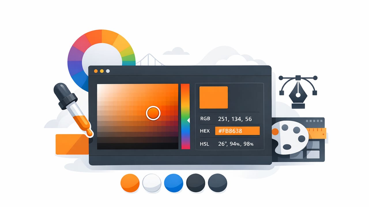
Pulling a color palette from a photo sounds simple—tap a pixel, copy a HEX code, done. In real projects, it’s rarely that clean. Lighting shifts values, compression adds artifacts, and a “perfect” sample may fail accessibility checks or look wrong in print.
This guide walks through a practical, designer-friendly workflow for using a color picker app for designers to extract colors from images, refine them into a usable system, and export them for graphic design, UI, branding, or interior design. The goal isn’t just to grab colors—it’s to build reliable palettes you can reuse across tools, screens, and materials.
Why photo-based color picking can be surprisingly inaccurate
When you sample color from an image, you’re not sampling the “true” object color—you’re sampling what the camera captured under specific conditions. A few common issues:
- White balance shifts: Indoor tungsten lighting can warm everything; shade outdoors can cool it.
- Specular highlights: Glossy surfaces (paint, ceramics, metal) contain bright reflections that skew samples.
- Shadows and gradients: The same fabric or wall may contain dozens of values depending on lighting falloff.
- Compression artifacts: JPEG blocks and noise can introduce tiny color variations, especially in mid-tones.
- Display differences: Your phone, monitor, and client’s laptop rarely show identical color.
Design rule of thumb: Don’t treat a sampled HEX value as “truth.” Treat it as a starting measurement that still needs verification and adjustment.
What to look for in a color picker app for designers
Not every picker is built for production work. A color picker app for designers should help you move from “cool color” to “usable palette.” Prioritize features that support a professional workflow:
1) Multiple color models (not just HEX)
HEX is great for web and UI handoff, but HSL/HSB helps you tune brightness and saturation more predictably. RGB is often used for screen-based graphics. Ideally, you can view and copy values in several models.
2) Palette management
You’ll want to save sets, not just single swatches. Look for the ability to name palettes, reorder colors, and create variations.
3) Sampling precision and stability
A good app lets you zoom in, sample exact pixels, and avoid accidental selection drift. Bonus points if it supports averaging (or at least helps you select consistent values).
4) Export options that match real workflows
Designers often need outputs like plain text lists, CSS variables, ASE-style palette files, or shareable images for mood boards. The more export formats, the easier it is to hand off to teammates or move between tools.
Color formats cheat sheet (and when to use each)
| Format | Example | Best for | Common pitfall |
|---|---|---|---|
| HEX | #1F6FEB | Web/UI specs, dev handoff | Harder to tweak brightness/saturation mentally |
| RGB | 31, 111, 235 | Screen graphics, many design tools | Not intuitive for systematic palette tuning |
| HSL | 212°, 84%, 52% | Adjusting lightness consistently across a system | Lightness is not the same as perceived luminance |
| HSB/HSV | 212°, 87%, 92% | Quick brightness-driven variations (tints/shades) | Can create uneven perceptual steps if overused |
A practical workflow: from photo to production palette
This is a repeatable process you can use whether you’re building a UI theme, a brand system, or a room color story.
Step 1: Start with the best possible photo
Better input means less correction later.
- Prefer natural, neutral light when possible.
- Avoid heavy filters and “enhance” modes—those often shift saturation and contrast.
- Use the highest quality file you can access (original photo over compressed screenshots).
- Watch the histogram if you have it: blown highlights and crushed shadows hide true color.
Step 2: Identify “anchor colors” before sampling
Don’t tap randomly. Decide what role each color should play.
- Primary anchor: the dominant color (brand hero, main wall, key UI accent).
- Secondary anchor: the supporting color (supporting UI, textiles, secondary brand tone).
- Neutral base: off-white, warm gray, or charcoal that will carry most text/background area.
- Utility colors: success/warning/error or small decor accents.
Step 3: Sample smart (avoid the traps)
When using your color picker app for designers, sample areas that represent the “material color,” not the lighting effects.
- Avoid edges where anti-aliasing blends colors.
- Skip highlights on glossy surfaces.
- Sample mid-tones for the truest representation (often slightly away from shadows and glare).
- Take 3–5 samples of the same object and compare values; choose the most consistent.
Step 4: Normalize your palette (make it usable)
Raw samples can be messy—too many near-duplicates, not enough contrast, or values that feel “muddy” when placed together. Normalize with a few deliberate edits:
- Reduce duplicates: keep one representative swatch per visual role.
- Create a neutral ramp: at least 3 neutrals (light, medium, dark) for backgrounds and type.
- Adjust saturation intentionally: photo colors often oversaturate; UI accents frequently need a cleaner chroma.
- Build tints and shades: define lighter/darker variants of key colors for states and hierarchy.
Step 5: Check contrast and accessibility early
A palette can look beautiful and still fail readability. Even if you’re designing decor boards, accessibility thinking improves clarity in presentations, labels, and printed materials.
At minimum, test your text/background combinations. If you’re targeting standard UI readability, a common benchmark is WCAG contrast guidance (for many body-text scenarios, designers aim around 4.5:1).
- Pair your darkest neutral with your lightest neutral and verify it’s comfortably readable.
- Test accent colors as text (links, labels) and as backgrounds (buttons, tags).
- Watch mid-tone collisions: two “different” colors can share similar luminance and blur together.
Step 6: Export in formats your tools can actually use
Once the palette is stable, export it in at least two ways:
- Human-friendly: a labeled palette image or simple list for stakeholders.
- Tool-friendly: HEX/RGB values for implementation in design tools and code.
Example: turning sampled colors into CSS variables
After you’ve extracted and refined your swatches, you can translate them into a small token system. Here’s a lightweight pattern you can copy into any project:
:root {
  --color-bg: #F7F3EE;
  --color-surface: #FFFFFF;
  --color-text: #1F1A17;

  --color-primary: #1F6FEB;
  --color-primary-600: #1A5FCC;
  --color-primary-200: #A9C7FF;

  --color-accent: #E8A13A;
  --color-border: #E7DED6;
}

.button {
  background: var(--color-primary);
  color: var(--color-surface);
}

.muted {
  color: color-mix(in srgb, var(--color-text), var(--color-bg) 55%);
}
This approach makes your photo-inspired palette easier to maintain: you can tweak a single variable without hunting through dozens of components.
Interior design tip: sample with “material thinking,” not screen thinking
If you’re extracting colors for interiors, remember you’re translating from emitted light (screens) to reflected light (paint, fabric, tile). A few practical tips:
- Expect to lighten: many wall paints appear darker once they cover a large area.
- Account for undertones: two beiges can share similar HEX values but read pink/green in different rooms.
- Use a neutral reference: sampling a known neutral object in the photo can reveal color cast.
- Create a “sun/shade pair”: one swatch tuned for warm light, one for cool light, to communicate variability.
Common mistakes (and how to avoid them)
- Mistake: Building a palette with only mid-saturation colors.
Fix: Add neutral structure (light/medium/dark) so the palette can breathe. - Mistake: Picking too many swatches from one photo.
Fix: Start with 5–8 core colors, then expand with systematic variants. - Mistake: Using a sampled accent as body text.
Fix: Reserve accents for highlights; use neutrals for long-form readability. - Mistake: Ignoring context.
Fix: Test colors inside your real layout (UI screens, slides, labels, room board).
Quick checklist: a production-ready photo palette
Before you share or implement your palette, make sure you can answer “yes” to these:
- Do I have at least three neutrals (light, mid, dark)?
- Do my key text/background pairs maintain strong contrast?
- Do I have tints and shades for primary colors (states, hierarchy, emphasis)?
- Are the swatches named by role (primary, surface, border) rather than only by hue?
- Can I export values in the formats my tools and teammates need?
Closing thoughts
A great color picker app for designers doesn’t just capture color—it supports decision-making: sampling accurately, refining systematically, and exporting cleanly. If you treat photo-based colors as raw material and apply a repeatable normalization process, you’ll end up with palettes that look intentional, work across contexts, and hold up in real production.
If you’re looking for an iOS/iPad tool that extracts HEX and other color values from photos and helps assemble palettes in different layouts, Color Viewfinder is one option to explore.
