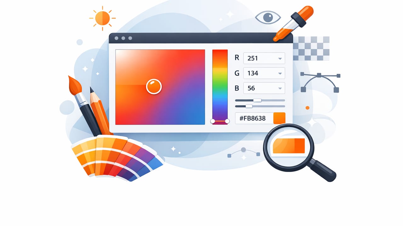
A photo-based color picker can turn everyday inspiration—fabric, signage, sunsets, product packaging—into usable color palettes for graphic design, UI, illustration, and interior design. But accurate sampling isn’t automatic. Camera sensors, lighting, compression, and screen settings can subtly (or dramatically) shift color. The result: a HEX value that looks “right” in the moment but doesn’t hold up when printed, painted, or applied to a design system.
This guide covers practical, repeatable best practices for using a color picker with photos: how to capture better reference images, where to sample, how to validate results, and how to convert a handful of sampled colors into a palette that actually works.
What a color picker really measures (and why photos can mislead)
A color picker samples pixel data from an image file. That sounds straightforward, but the pixel you see is the output of multiple transformations:
- Lighting: color temperature (warm/cool) and mixed light sources shift hues.
- Camera processing: auto white balance, HDR, noise reduction, and “vivid” modes alter color.
- Compression: JPEG artifacts and chroma subsampling can introduce color banding or muddy edges.
- Display rendering: True Tone/Night Shift, brightness, and wide-gamut handling can change appearance.
A color picker is accurate to the file you give it—not necessarily to the real-world object you photographed.
Best practice is to treat photo sampling as a starting point. Then you refine the palette using consistency checks and context (contrast, accessibility, print constraints, and material finishes).
Capture better source photos for more reliable color picking
If you can control the photo, you can dramatically improve the quality of your sampled colors. Here are the highest-impact tweaks.
1) Avoid mixed lighting
Mixed sources (window daylight + warm bulbs) create different color casts in different areas of the same image. Your color picker might return wildly different values depending on where you sample.
- Prefer indirect daylight or a single consistent artificial light source.
- If indoors, turn off competing lights and use one type of bulb.
2) Lock exposure and focus (when possible)
Auto exposure can brighten/darken between shots, shifting perceived saturation and contrast. Locking exposure helps keep a stable reference—especially useful for interiors, paint chips, and textiles.
3) Reduce glare and specular highlights
Shiny surfaces (paint with sheen, glossy packaging, polished stone) produce bright reflections that aren’t the “true” surface color.
- Change your angle slightly until reflections move away from the area you’ll sample.
- Use soft, diffused light to reduce hotspots.
4) Use higher-quality images when available
If you’re sampling from an existing file (a client photo, a screenshot, a reference online), choose the highest-resolution, least-compressed version. PNGs and original camera files generally preserve color transitions better than heavily compressed JPEGs.
Where to sample: the most common color picker mistakes
Even with a good photo, sampling strategy matters. These mistakes cause many “why does this color look wrong?” moments.
Sampling edges and anti-aliased areas
Edges contain blended pixels (anti-aliasing, motion blur, depth-of-field blur). If you sample on the border of an object, you may pick up a mix of foreground and background colors.
- Sample from flat interior areas where the color is most uniform.
- Zoom in before sampling to avoid edge contamination.
Sampling shadows as if they’re base color
A shadowed area isn’t a darker “version” of the same color—it often includes ambient color from the environment. A white wall in warm indoor light can sample as beige; the same wall in cool window light can sample as bluish.
- Sample midtones rather than highlights or deep shadows.
- If possible, take multiple samples across the surface and compare.
Sampling saturated highlights
Bright areas can clip channels (pure white or near-white), and vibrant colors can clip into flat patches on some cameras. Sampling clipped regions produces values that don’t match the real surface.
Build a usable palette (not just a handful of random HEX codes)
A strong palette usually includes roles: neutrals, primaries, accents, and supporting tones. After you sample, organize the results intentionally.
A practical 60–30–10 approach (adaptable for digital or interiors)
- 60%: base/background color (often a neutral)
- 30%: secondary/support color (midtone that pairs well)
- 10%: accent color (contrast, emphasis, calls-to-action)
When you use a color picker on a photo, you’ll often find many similar midtones. Keep only the best representatives and define roles:
- Neutral: stabilizes the palette (warm gray, cool gray, off-white)
- Anchor: dominant color that sets mood (navy, forest, terracotta)
- Accent: small-dose, high-impact (coral, chartreuse, cyan)
- Utility: text, borders, surfaces (near-black, near-white)
Understand the formats: HEX vs RGB vs HSL (and when to use each)
A color picker often shows multiple formats. Each is useful for different tasks.
| Format | Best for | Why it helps |
|---|---|---|
| HEX (#RRGGBB) | Web/UI design, design tokens | Compact, widely used in CSS and product specs |
| RGB (r,g,b) | Screen graphics, image tools | Direct relationship to display channels |
| HSL (h,s,l) | Palette refinement | Adjust lightness/saturation predictably to create tints/shades |
| HSB/HSV | Creative exploration | Fast way to push brightness without losing hue identity |
After you pick a base color, HSL is especially helpful for generating consistent variations (hover states, borders, backgrounds, and typography pairs).
Validate your picks: quick checks that prevent costly surprises
Before you commit sampled colors to a brand palette, UI theme, or room plan, run a few sanity checks.
1) Check contrast (for digital interfaces)
If you’re designing UI, accessibility contrast is non-negotiable. A beautiful sampled accent might fail as text or button color.
- Test text-on-background combinations early.
- If contrast is low, keep the hue but adjust lightness in HSL.
2) Test in context (not in isolation)
Colors change depending on neighbors (simultaneous contrast). Place your picked colors into a mock layout or mood board:
- UI: apply to buttons, surfaces, typography, and icons.
- Interior: place next to flooring, metals, textiles, and wood tones.
3) Expect material differences (for print and interiors)
A photo-derived HEX value won’t automatically match paint, fabric dye lots, or print ink behavior.
- Use sampled colors to narrow direction, then confirm with physical swatches or vendor specs.
- Account for sheen (matte vs satin) and ambient light temperature.
A repeatable workflow for photo-based color picking
If you want consistent results across projects, use the same workflow every time.
- Choose the right reference photo (good light, minimal compression, no heavy filters).
- Zoom in and sample 5–12 points from flat areas (avoid edges, glare, deep shadows).
- Cluster similar colors: keep 1–2 representatives per cluster.
- Assign roles: background, surface, text, primary, secondary, accent.
- Generate variations in HSL (tints/shades) for states and hierarchy.
- Validate: contrast checks for UI; swatches/samples for physical work.
- Export and document: store HEX/RGB/HSL and usage notes.
Example: turning one picked color into a small UI set
Let’s say your color picker samples an “anchor” color from a photo: #2F6F8E (a muted teal-blue). You can build a coherent mini-system by shifting lightness and saturation rather than changing hue randomly.
/* Example UI tokens derived from an anchor color */
:root {
  --brand-500: #2F6F8E; /* picked */
  --brand-600: #285F79; /* darker for hover */
  --brand-700: #214E63; /* darker for active */
  --brand-100: #D7E8F0; /* light tint for backgrounds */
  --text-on-brand: #FFFFFF;
  --surface: #FFFFFF;
  --text: #14212A;
}
Even if you don’t compute these values programmatically, the principle matters: keep hue relatively stable and adjust lightness/saturation to produce predictable hierarchy.
Tips for interior designers and decorators using a color picker
Photo sampling is especially popular for interiors, where inspiration comes from art, rugs, tile, and travel photos. A few extra tips help bridge the gap between screen color and real materials:
- Sample multiple zones in the same material (rug highlight, midtone, shadow) to understand its range.
- Choose an anchor from midtone, not the brightest thread or darkest shadow.
- Translate your picked color into a paint deck match by comparing undertones (warm vs cool) rather than chasing an exact HEX.
- Preview under the room’s lighting: morning vs evening can flip undertones.
FAQ: quick answers about using a color picker
How many colors should I pick from a photo?
Start with 8–12 samples, then reduce to 4–6 core colors (plus neutrals). Too many similar colors makes the palette hard to apply consistently.
Why does the picked HEX look different in my design tool?
Common causes include different color profiles, display settings (True Tone/Night Shift), or the tool rendering in a different color space. Validate on a second device and in your target environment (browser/app).
Is a color picker accurate enough for print matching?
It’s great for direction and mood, but print requires profile-aware workflows and proofs. Use the sampled palette to align stakeholders, then confirm with print specs and test outputs.
Putting it all together
A color picker is one of the fastest ways to translate inspiration into a usable palette—if you treat sampling as a craft, not a one-click truth. Control lighting when you can, sample thoughtfully (midtones, flat areas), organize colors into roles, and validate in context. With a consistent workflow, photo-based color extraction becomes a reliable bridge between the real world and your creative projects.
If you prefer doing this on iPhone or iPad, apps like Color Viewfinder can help you sample and organize colors from photos while keeping multiple formats (HEX/RGB/HSL/HSB) handy for design work.
