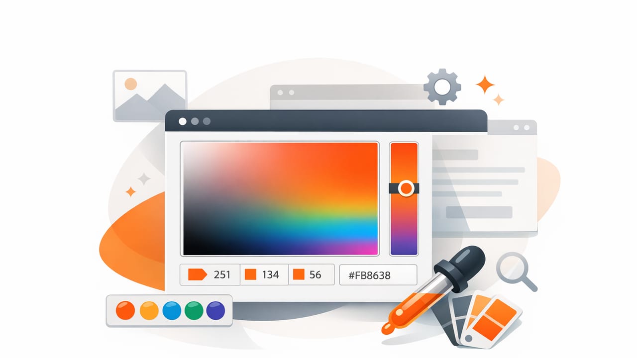
A color picker seems simple: tap or click a pixel, copy a HEX code, and you’re done. In practice, sampling color from photos can produce wildly different results depending on lighting, shadows, compression, and even which part of a textured surface you select. If you’ve ever pulled a “perfect” color from an image only to find it looks wrong in a logo, UI, or room mockup, the issue usually isn’t your taste—it’s the sampling method.
This guide explains how to use a color picker for accurate photo-based color extraction, how to validate what you sampled, and how to turn raw pixel values into a palette that stays consistent across screens, print, and real-world materials.
What a color picker actually measures (and what it doesn’t)
Most color pickers sample a pixel (or a small area) and report values like HEX and RGB. That’s the color as encoded in the image, not the “true” surface color in real life. A photo is a record of light: white balance, exposure, reflections, lens characteristics, and image processing all shape the final pixel values.
Rule of thumb: A color picker reports what the camera saw, not what the object “is.” Your job is to convert sampled values into a reliable palette.
Common photo sampling pitfalls (and how to avoid them)
1) Shadows and highlights distort the base color
Sampling a painted wall in a photo can produce three “different colors” depending on whether you tap a shadow area, a midtone, or a highlight. For palette building, the midtone is usually the most representative.
- Avoid harsh highlights (specular shine) and deep shadows.
- Sample an evenly lit area with visible texture but no glare.
- Take multiple samples and average mentally (or choose a middle value).
2) JPEG compression and noise add color artifacts
Highly compressed images can introduce blocky artifacts and subtle color shifts, especially around edges and gradients. Low-light photos add noise, causing random pixel values that don’t represent the intended hue.
- Prefer higher-resolution sources or less-compressed formats when available.
- Sample slightly inside a region (not directly on an edge) to avoid compression halos.
3) White balance changes everything
Indoor tungsten lighting can push neutrals warm; shade outdoors can skew cool. A beige couch might sample as peach under warm bulbs and as grayish tan near a window.
- If you can, sample from a photo taken under neutral light.
- If you can’t, treat your first sample as a starting point and adjust temperature/tint using HSL/HSB.
- Validate with a second reference photo under different lighting.
4) Screens aren’t standardized (your sample may look different elsewhere)
Even if your HEX values are correct, your display brightness, True Tone/Night Shift settings, and color profiles can affect what you perceive.
- Turn off blue-light filters while choosing color if accuracy matters.
- Check your palette on at least two devices (phone + laptop) before finalizing.
A practical workflow: from photo to usable palette
This workflow is designed for graphic designers, interior decorators, and anyone building color systems for creative projects.
Step 1: Define what the palette must do
Before sampling, decide the palette’s job. Examples:
- Brand/UI: needs contrast pairs, accessible text colors, and consistent neutrals.
- Interior: needs a dominant wall color, coordinating accents, and material-friendly neutrals.
- Illustration: needs harmony (analogous) or punch (complementary) without muddy midtones.
This determines how many colors you need and how you’ll balance saturation and brightness.
Step 2: Sample broadly, then narrow
Use your color picker to capture more colors than you think you need. A good starting set is 8–12 samples:
- 2–3 neutrals (light, mid, dark)
- 2 dominant colors (main subject or largest areas)
- 2 accents (small but memorable details)
- 1 “wild card” color (an unexpected hue that adds personality)
Then narrow to a final palette of 5–7 colors by removing near-duplicates and extreme outliers.
Step 3: Convert or interpret values using HSL/HSB
HEX and RGB are great for implementation, but HSL/HSB are often better for editing because they separate hue from lightness/brightness.
| Model | Best for | Common mistake |
|---|---|---|
| HEX | Sharing and implementation (CSS, design tokens) | Assuming two similar HEX codes will “feel” similar visually |
| RGB | Screen-based work, digital adjustments | Trying to “eyeball” harmony by tweaking channels |
| HSL | Creating tints/shades, balancing lightness | Over-adjusting saturation and getting neon results |
| HSB/HSV | Quickly finding lighter/darker variants | Confusing brightness changes with true contrast changes |
Step 4: Build a value ladder for readability and realism
Whether you’re designing an interface or choosing paint-adjacent colors, you’ll usually need a structured set of light-to-dark values. Create at least:
- Background light (near-white or very light neutral)
- Surface mid (cards, panels, main wall)
- Text dark (high-contrast for readability)
Then add your accent colors on top of that structure. Many palette problems come from choosing nice accents but weak neutrals.
Step 5: Test contrast (don’t skip this)
If your palette will be used for UI, editorial graphics, or presentations, contrast matters. A quick check is to test your dark text color on your light background and your light text color on your darkest surface. If it looks borderline, it probably is.
For interior and physical projects, “contrast testing” means something else: put swatches next to each other and step back. A color that looks distinct on-screen may disappear when surrounded by similar tones in a room or on packaging.
Technique tips: sampling like a pro
Use area sampling when possible
If your tool supports it, sampling an average over a small area (rather than a single pixel) reduces noise and gives more stable results—especially on textured materials like fabric, wood grain, stone, or foliage.
Sample the same material in multiple places
For a key color (say, the hero wall paint or a product’s signature blue), take 3–5 samples from different spots and choose the one that best represents the midtone. This helps you avoid accidentally locking in a shadow-tinted or highlight-washed value.
Watch out for edge contamination
Edges often contain anti-aliasing (blended pixels) that are not true to either neighboring color. When sampling, tap away from borders where two colors meet.
Turning your palette into something you can reuse
Once you have final colors, store them in a repeatable format. For digital products, CSS variables (design tokens) are a practical approach:
:root {
  --neutral-50:  #F6F3EE;
  --neutral-700: #3A342F;
  --primary-500: #2F6F8F;
  --accent-500:  #D58A4B;
  --accent-700:  #9B4E2E;
}

body {
  background: var(--neutral-50);
  color: var(--neutral-700);
}

.button-primary {
  background: var(--primary-500);
  color: var(--neutral-50);
}
If you work across tools, export or copy values in the formats you actually use (HEX for web, RGB for some video workflows, HSL/HSB for editing).
Mini case study: photo-based palette for a living space
Imagine you’re designing around a photo of a reading nook: cream walls, walnut shelf, olive plant, and a terracotta cushion. A solid palette might include:
- Cream neutral: for walls/background
- Deep warm brown: for wood accents and grounding
- Olive green: for a natural accent
- Terracotta: for warmth and focal pops
- Soft gray-beige: to bridge cream and wood
Using a color picker, you’d sample each material in a midtone region, then adjust the neutrals so they’re not too close in lightness. The key is separation: cream and gray-beige must be different enough to read as intentional layers, not accidental mismatches.
FAQ: quick answers about using a color picker
Why do my sampled HEX codes look different in another app?
Differences can come from color management (profiles), display settings, or the other app interpreting the image differently. Re-check by sampling from the same source image file and confirm you’re not sampling a scaled preview with added compression.
How many colors should I pull from one photo?
Start with 8–12 samples, then edit down to 5–7 that have distinct roles (neutrals, primary, accents). More colors can work, but only if each has a purpose.
Should I trust a single pixel sample?
Usually not. For textured or noisy images, single pixels can be misleading. Use small-area averages or multiple samples and pick a representative midtone.
Checklist: photo sampling you can repeat
- Turn off display filters that change color perception.
- Sample midtones (avoid deep shadow and glare).
- Take multiple samples per key material.
- Use HSL/HSB to fine-tune lightness and saturation.
- Build a neutral value ladder (light → dark) before accents.
- Test contrast and side-by-side separation.
- Save/export in formats you’ll reuse (HEX/RGB/HSL).
If you want to do this workflow on an iPhone or iPad, a dedicated color extraction tool such as Color Viewfinder can help you capture values quickly and organize them into palettes for export.
