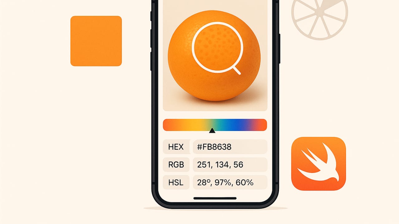
Whether you’re matching a brand’s accent tone from a snapshot, building a moodboard from interior photos, or sampling colors from artwork, a reliable color picker from photos iOS workflow saves hours and eliminates guesswork. This guide covers practical methods on iPhone and iPad, accuracy essentials (color profiles, HDR, True Tone), comparison of approaches, and developer-ready Swift code for extracting HEX, RGB, and more from images.
What makes a great color picker from photos on iOS?
A strong workflow balances accuracy, speed, and output formats. Consider these qualities when evaluating tools and methods:
- Precision: Correct handling of image color profiles (sRGB, Display P3), lens/white balance biases, and HDR tone mapping.
- Control: Ability to sample single pixels, averaged areas, or multiple swatches; adjustable sampling radius to smooth noise.
- Color models: Output in HEX, RGB, HSL, and HSB/HSV; optionally LAB for more perceptual comparisons.
- Palettes: Grouped swatches with naming, reordering, and layout options for presentation and export.
- Export: Copy/paste HEX quickly, export ASE/ACO/JSON/SVG, or share palette images for stakeholders.
- Speed: Minimal taps from photo to palette; batch sampling is a plus for large sets.
Accuracy essentials: get trustworthy colors from photos
Sampling color is easy; sampling accurate color requires attention to the full pipeline—from capture to display to export.
1) Color management and profiles
- Image profiles: iPhone photos often use Display P3. Converting to sRGB can shift vivid reds/greens if done incorrectly. Favor tools that are color-managed end to end.
- Maintain the profile: When exporting palettes or swatches, note the assumed profile. HEX targets sRGB; if you sample from a P3 image, ensure conversion is done correctly before committing the HEX.
2) Device display conditions
- Disable True Tone and Night Shift during critical sampling. They alter the display’s white point and warmth, which can mislead your visual judgment.
- Set consistent brightness (e.g., 70–80%). Extreme brightness exaggerates perceived saturation.
3) Capture best practices
- Even lighting: Avoid mixed color temperatures and heavy shadows. If possible, shoot near a window on overcast days for soft, neutral light.
- Reference gray card: Include a neutral gray card in one frame. Later, white-balance that frame and reuse the correction for related shots.
- RAW when needed: If critical accuracy matters, capture in ProRAW and correct white balance/exposure before sampling.
Pro tip: Sample multiple nearby pixels with an averaged radius (e.g., 3×3 or 5×5). This smooths sensor noise and texture, producing more representative colors.
Built-in and quick methods on iPhone/iPad
Using the system color picker (eyedropper)
Many iOS apps that adopt the Apple color picker expose an eyedropper you can drag over an image displayed in the app. Open your photo, summon the color picker, and use the eyedropper to sample. This is fast, but some apps only return a UI color without showing HEX or HSL values.
Markup on screenshots or images
Another quick workaround is to open a photo, use Markup, and pick the eyedropper to sample visually. This is fine for quick matching inside the app’s canvas, but Markup typically doesn’t display numeric values like HEX/RGB. It’s best for rough, in-context color picking, not for exact specification.
Dedicated color apps
Color-focused apps provide pixel-level picking, palette building, naming, and exports. For professional deliverables (brand kits, UI specs, moodboards), this is the most efficient approach and usually the most accurate when color management is implemented correctly.
Approach comparison
| Approach | Best For | Output | Accuracy | Speed |
|---|---|---|---|---|
| System Eyedropper in Compatible Apps | Quick picks inside a design/document app | UI color; sometimes RGB | Good, varies by app | Fast |
| Markup on Photos/Screenshots | Visual reference, rough matching | No HEX/HSL in most cases | Moderate | Fast |
| Dedicated Color Picker App | Professional palettes, exports, multi-model values | HEX, RGB, HSL/HSB, palettes, formats | High (color-managed apps) | Fast once set up |
Developer corner: implement a color picker from photos on iOS
If you’re building your own tool, these snippets demonstrate key building blocks: presenting the system color picker, converting to HEX, sampling averages, and mapping a user’s tap to a pixel.
Present Apple’s color picker and read values
import UIKit

class PickerHostVC: UIViewController, UIColorPickerViewControllerDelegate {
    private var pickedColor: UIColor = .clear

    @IBAction func showPicker(_ sender: Any) {
        let picker = UIColorPickerViewController()
        picker.delegate = self
        picker.supportsAlpha = false
        present(picker, animated: true)
    }

    func colorPickerViewControllerDidSelectColor(_ viewController: UIColorPickerViewController) {
        pickedColor = viewController.selectedColor
        print("HEX:", pickedColor.hexString())
    }
}

extension UIColor {
    func hexString() -> String {
        var r: CGFloat = 0, g: CGFloat = 0, b: CGFloat = 0, a: CGFloat = 0
        getRed(&r, green: &g, blue: &b, alpha: &a)
        let R = Int(round(r * 255))
        let G = Int(round(g * 255))
        let B = Int(round(b * 255))
        return String(format: "#%02X%02X%02X", R, G, B)
    }
}
Note: The system picker returns a color in the current working color space. If you need sRGB HEX specifically, ensure you convert to sRGB before extracting components.
Compute an average color with Core Image
import CoreImage

func averageColor(of image: UIImage, in rect: CGRect? = nil) -> UIColor? {
    guard let cgImage = image.cgImage else { return nil }
    let ciImage = CIImage(cgImage: cgImage)
    let targetRect = rect ?? CGRect(origin: .zero, size: image.size)
    let extent = CIVector(cgRect: targetRect)

    guard let filter = CIFilter(name: "CIAreaAverage") else { return nil }
    filter.setValue(ciImage, forKey: kCIInputImageKey)
    filter.setValue(extent, forKey: kCIInputExtentKey)

    let context = CIContext(options: [.workingColorSpace: CGColorSpace(name: CGColorSpace.sRGB)!])
    var bitmap = [UInt8](repeating: 0, count: 4)

    if let output = filter.outputImage,
       let outputCG = context.createCGImage(output, from: CGRect(x: 0, y: 0, width: 1, height: 1)) {
        let context2 = CGContext(data: &bitmap,
                                 width: 1, height: 1, bitsPerComponent: 8, bytesPerRow: 4,
                                 space: CGColorSpace(name: CGColorSpace.sRGB)!,
                                 bitmapInfo: CGImageAlphaInfo.premultipliedLast.rawValue)!
        context2.draw(outputCG, in: CGRect(x: 0, y: 0, width: 1, height: 1))
        return UIColor(red: CGFloat(bitmap[0]) / 255.0,
                       green: CGFloat(bitmap[1]) / 255.0,
                       blue: CGFloat(bitmap[2]) / 255.0,
                       alpha: 1.0)
    }
    return nil
}
Using CIAreaAverage with an sRGB working space stabilizes results and produces consistent HEX values for export.
Map a user tap to an exact pixel
func color(at point: CGPoint, in imageView: UIImageView) -> UIColor? {
    guard let image = imageView.image, let cg = image.cgImage else { return nil }

    // Convert tap point in view coordinates to image pixel coordinates
    let size = image.size
    let viewSize = imageView.bounds.size
    let scaleX = size.width / viewSize.width
    let scaleY = size.height / viewSize.height

    // Account for contentMode = .scaleAspectFit
    let imageAspect = size.width / size.height
    let viewAspect = viewSize.width / viewSize.height

    var drawRect = CGRect.zero
    if imageAspect > viewAspect {
        let height = viewSize.width / imageAspect
        drawRect = CGRect(x: 0, y: (viewSize.height - height) / 2, width: viewSize.width, height: height)
    } else {
        let width = viewSize.height * imageAspect
        drawRect = CGRect(x: (viewSize.width - width) / 2, y: 0, width: width, height: viewSize.height)
    }

    guard drawRect.contains(point) else { return nil }
    let relative = CGPoint(x: (point.x - drawRect.minX) / drawRect.width,
                           y: (point.y - drawRect.minY) / drawRect.height)
    let pixelX = Int(CGFloat(cg.width) * relative.x)
    let pixelY = Int(CGFloat(cg.height) * (1 - relative.y))

    guard let data = cg.dataProvider?.data, let ptr = CFDataGetBytePtr(data) else { return nil }
    let bytesPerPixel = cg.bitsPerPixel / 8
    let offset = pixelY * cg.bytesPerRow + pixelX * bytesPerPixel

    let r = CGFloat(ptr[offset]) / 255.0
    let g = CGFloat(ptr[offset + 1]) / 255.0
    let b = CGFloat(ptr[offset + 2]) / 255.0
    return UIColor(red: r, green: g, blue: b, alpha: 1)
}
Combine this with a small neighborhood average (e.g., 3×3) for smoother, less noisy picks.
A reliable designer workflow
- Prepare your device: Turn off True Tone and Night Shift, set consistent brightness.
- Correct the image: If needed, adjust white balance and exposure in Photos or a RAW editor. Keep the image in its native color space until the final export.
- Sample with a radius: Use a small sampling radius to average texture and noise.
- Create a palette: Group swatches by function (primary, secondary, neutrals, accents). Name them clearly.
- Export formats: Share HEX/RGB for digital teams; consider LAB or Pantone approximations for print, noting that device-derived colors won’t always map 1:1 to inks.
- Document context: Save the reference image and note lighting conditions or adjustments you made. This helps downstream consistency.
Validate your choices
- Compare on multiple devices: View your palette on at least two calibrated displays to catch outliers.
- Print a test: If the palette will be printed, produce a quick proof; tweak saturation/lightness as needed.
- Accessibility check: Run contrast checks (WCAG) for UI colors and verify distinguishability in grayscale or color-blind simulations.
Common pitfalls and how to avoid them
- HDR surprises: Some iPhone photos use HDR/HLG with extended dynamic range. If your tool tone-maps differently than iOS Photos, sampled colors can shift. Prefer apps that display consistent, color-managed previews.
- Profile mismatches: Sampling a Display P3 image and exporting HEX without sRGB conversion yields unexpected web colors. Convert to sRGB before generating HEX.
- Over-sampling shadows: Noise in deep shadows causes unstable values. Use larger sampling radii or sample midtones.
- Judging by eye: Don’t rely on visual matching alone, especially with True Tone/Night Shift on. Always capture numeric values.
Quick checklist
- Disable True Tone/Night Shift; set stable brightness.
- Respect the image’s color profile; convert to sRGB for HEX.
- Use averaged sampling (3×3 or 5×5) for reliability.
- Export in multiple models (HEX, RGB, HSL/HSB) for team needs.
- Document adjustments and keep the source photo with your palette.
If you prefer a streamlined, color-managed workflow that extracts HEX/RGB/HSL from photos, builds palettes, and exports in common formats on iPhone and iPad, consider trying Color Viewfinder.
