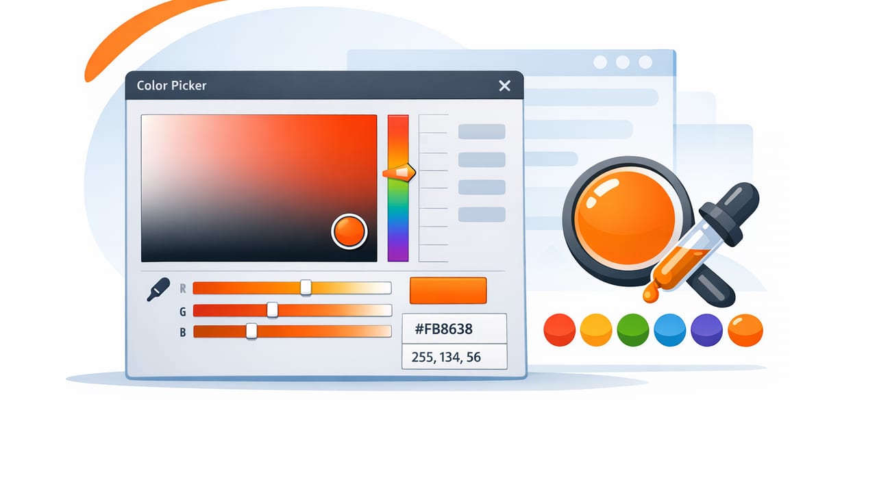
A color picker is one of the simplest design tools—and one of the easiest to misuse. Whether you’re sampling a paint color from a room photo, matching a brand accent from a logo, or pulling a palette from a moodboard, the quality of your picks determines how “intentional” your final work feels. A few small choices (where you sample, which color values you export, how you check contrast) can be the difference between a cohesive palette and a frustrating round of tweaks.
This guide explains how a color picker works, how to sample colors accurately from photos, and how to turn raw picks into palettes that hold up across screens, print, and real spaces.
What a color picker actually does (and why it matters)
At a basic level, a color picker reads the color value of a pixel (or an averaged area) and returns a numeric format such as HEX (#RRGGBB) or RGB (R, G, B). More advanced tools also provide HSL and HSB/HSV values, which are often easier for humans to adjust.
Why does this matter? Because the moment you move from “I like that shade” to “I can reuse that shade consistently,” you need dependable numbers. Consistent values help you:
- Match UI components across screens and states
- Keep brand colors consistent across assets
- Coordinate interiors (paint, textiles, materials) with fewer surprises
- Build palettes with predictable contrast and hierarchy
Color isn’t just decoration—it’s a system of relationships. A color picker gives you the data to manage those relationships consistently.
When to use a color picker (and when not to)
A color picker is ideal when you need a starting point anchored in something real: a photograph, a product shot, an illustration, or an existing brand asset. It’s especially useful for:
- Graphic design: matching accent colors, creating social templates, extracting brand-safe variants
- UI/UX: deriving tints/shades for states (hover, pressed, disabled), establishing a neutral scale
- Interior design: capturing undertones from materials (wood, stone, fabric) to guide paint and decor choices
- Creative projects: posters, collages, and moodboards where palette cohesion matters
When it’s not enough on its own: if you’re trying to match physical paint exactly from a photo. Lighting, camera processing, and white balance can shift colors dramatically. In that case, use a color picker to capture a direction (undertone + value), then verify with real samples or manufacturer swatches.
How to pick accurate colors from photos: a practical workflow
Photos are messy: shadows, glare, compression artifacts, and color casts can trick your eye and distort your picks. Use this workflow to get cleaner results.
1) Start with the best source image you can
- Prefer daylight or neutral lighting when possible.
- Avoid images with heavy filters, HDR effects, or aggressive “vivid” processing.
- If you’re shooting the photo, tap to focus and lock exposure on the subject (not the bright window behind it).
2) Sample from the right area (not the obvious one)
Most people sample the brightest, cleanest-looking spot. That often captures glare—not the material color. Instead:
- For fabrics: sample midtone areas (avoid specular highlights on threads).
- For walls: sample away from corners (corner shadows skew cooler/darker).
- For objects: sample multiple points: highlight, midtone, and shadow.
3) Take 3–5 samples and average mentally (or with a tool)
A single pixel can be an outlier. A better approach is to pick several nearby points and choose the value that best represents the “center” of those picks. If your tool supports an averaging sampler or magnifier, use it—this reduces noise from JPEG artifacts and texture.
4) Validate with context
Once you’ve picked a candidate color, drop it next to neutrals (white, off-white, charcoal) and check whether it behaves as expected. If it looks too neon or too muddy, your sample likely came from a problematic region (glare/shadow) or the photo has a strong color cast.
Understanding the color formats you’ll see in a color picker
Different formats are useful for different tasks. Here’s a quick reference you can bookmark.
| Format | What it represents | Best for | Common pitfall |
|---|---|---|---|
| HEX (#RRGGBB) | RGB color encoded as hex | Web/UI handoff, design tokens, CSS | Hard to “think in” for adjustments |
| RGB (0–255) | Red/Green/Blue channel intensities | Digital screens, image work | Edits can shift hue unexpectedly |
| HSL | Hue, Saturation, Lightness | Creating tints/shades systematically | Lightness isn’t perceived brightness |
| HSB/HSV | Hue, Saturation, Brightness/Value | Quick intuitive tweaks, palette exploration | “Brightness” can mislead for contrast |
Rule of thumb: pick with HEX/RGB for precision and handoff; adjust with HSL/HSB for speed and consistency.
Turning picks into a usable palette (not just a list of colors)
Extracted colors are raw ingredients. A usable palette usually has roles: background, surface, text, primary accent, secondary accent, and a warning/success color if you’re building UI. For interiors, roles might be wall, trim, floor, textile, metal, and accent.
Step-by-step: build a balanced palette from a photo
- Choose 1 anchor color (the “why” of the palette): the dominant wall tone, the main product color, or a key brand hue.
- Add 1–2 supporting neutrals sampled from shadows/highlights in the same image (these often harmonize naturally).
- Select 1 accent that contrasts in hue or saturation (small but intentional).
- Create 2–4 variants: lighter and darker versions of the anchor (great for hierarchy and depth).
- Test combinations (text over backgrounds, buttons over surfaces, etc.).
Simple harmony patterns you can apply
- Monochromatic: one hue, multiple lightness levels (clean and modern; easy to maintain).
- Analogous: neighboring hues (comfortable, “natural,” great for interiors and lifestyle brands).
- Complementary: opposite hues (high energy; use accents sparingly to avoid noise).
- Split complementary: a safer version of complementary (contrast without harshness).
If you’re unsure, start monochromatic with one accent. It’s the easiest way to look cohesive fast.
Accessibility and readability: the contrast check you shouldn’t skip
A color picker helps you choose colors—but it won’t automatically guarantee readability. If you’re designing for screens, contrast is a functional requirement, not a preference.
Quick contrast habits
- Avoid placing mid-saturation colors as text on mid-lightness backgrounds.
- Test your palette in grayscale to see whether hierarchy still holds.
- Keep a “text” color that is clearly dark (near charcoal) and a “reverse text” color that is clearly light (near white).
Even if you don’t calculate ratios manually, you can use a contrast checker later in your workflow. The key is to avoid palettes where everything lives in the same lightness band.
Example: exporting picked colors into CSS variables
If you’re handing off a palette to development (or building your own site), CSS variables are a clean way to keep colors consistent. Here’s a simple example using HEX values you might pick from an image.
:root {
  --color-bg: #F6F3EE;
  --color-surface: #FFFFFF;
  --color-text: #1F2428;
  --color-primary: #2F6F7E;
  --color-primary-600: #255B66;
  --color-accent: #D48A5F;
}

body {
  background: var(--color-bg);
  color: var(--color-text);
}

.button {
  background: var(--color-primary);
  color: #FFFFFF;
}

.button:hover {
  background: var(--color-primary-600);
}
This is where a reliable color picker workflow pays off: fewer “close enough” guesses, fewer mismatched hex codes across files, and faster iteration.
Common color picker mistakes (and how to fix them)
- Sampling highlights: if your pick looks washed out, resample from a midtone area.
- Trusting one pixel: take multiple samples; textures and compression can skew results.
- Ignoring white balance: if everything looks too warm/cool, the photo lighting is affecting your picks—correct the photo or compensate with a neutral reference.
- Overusing saturated accents: keep one strong accent and support it with calmer tones.
- No role assignment: rename or group colors by function (Background, Text, Accent) so the palette stays usable.
Interior vs graphic design: the key difference in color picking
In digital design, the color picker output is often the end of the story: that HEX value is what ships. In interiors, it’s the beginning: the extracted color helps you identify undertones and relationships, but real-world conditions (light temperature, paint finish, material texture) will change perception.
For interior workflows, consider capturing:
- A highlight pick to represent how the material reads in bright light
- A shadow pick to represent undertone and depth
- A midtone pick as your “true” reference
This trio is often more useful than chasing a single “perfect” value.
A quick checklist for better color picker results
- Use the best, most neutral source image available
- Sample midtones; avoid glare and deep shadow
- Take 3–5 samples and choose the representative value
- Export in the format your workflow needs (HEX for web, HSL/HSB for adjustment)
- Assign roles (background, text, primary, accent) to make the palette usable
- Do a contrast/readability pass before finalizing
Choosing a color picker tool: what to look for
If you’re evaluating a color picker (especially on mobile), prioritize features that reduce friction and improve reliability:
- Magnifier/zoom sampling for pixel-level accuracy
- Multiple color models (HEX, RGB, HSL, HSB) for flexible use
- Palette layouts so you can organize colors by role
- Export options that match your workflow (images, swatches, copy-to-clipboard values)
- Fast iteration: duplicate, reorder, and tweak colors without rebuilding from scratch
Many designers keep a color picker on their phone because inspiration happens away from the desk: in a cafe, a store display, a gallery, or a client site visit. If you want an iOS option that focuses on extracting values from photos and organizing them into clean palettes, Color Viewfinder is one example worth exploring.
