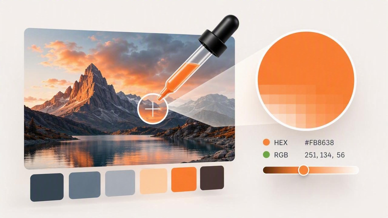
A color picker is one of the most useful design tools for turning visual inspiration into practical color decisions. Whether you are creating a brand identity, designing an interface, planning a room, or building a digital illustration, a color picker helps you identify the exact colors you see in a photograph, screenshot, artwork, or moodboard.
At first glance, selecting a color from an image seems simple: tap or click a pixel, copy its code, and use it. In practice, lighting, image compression, screen settings, shadows, and neighboring colors can all affect the result. Using a color picker well means understanding what the sampled values represent, deciding which areas of an image to sample, and turning individual color values into a balanced palette.
This guide explains how to use a color picker accurately, compare common color formats, and apply sampled colors to graphic design, interior design, and other creative projects.
What Is a Color Picker?
A color picker is a tool that identifies the color of a selected pixel or area. It is commonly found in design software, browser tools, image-editing apps, and mobile color palette applications. After sampling a color, the tool usually displays one or more color formats, such as:
- HEX: A six-digit code used widely in web design, such as
#2F6B72. - RGB: Red, green, and blue values used for screens, such as
47, 107, 114. - HSL: Hue, saturation, and lightness values that help describe a color visually.
- HSB/HSV: Hue, saturation, and brightness/value, often useful for adjusting digital colors.
The best color picker tools allow you to sample colors precisely, zoom into a photo, save selections, organize them into palettes, and export values for use in other software.
Why Accurate Color Sampling Matters
A color value is more than a technical detail. It can affect readability, mood, consistency, accessibility, and how polished a finished design appears. A slightly incorrect blue may make a brand color look dull. An overly bright wall color may feel entirely different once it is placed next to warm flooring. A low-contrast button color can make an interface harder to use.
Accurate sampling is especially important when you need to:
- Match an existing brand color from approved visual assets.
- Create a UI palette from a reference image or moodboard.
- Identify paint-like colors from interior inspiration photos.
- Build a social media template with consistent visual styling.
- Extract accent colors from photography, packaging, or art.
- Document color decisions for clients and collaborators.
However, it is important to remember that a sampled screen color is not always a perfect real-world match. A photo of fabric, paint, or wood is influenced by lighting and camera processing. Treat image-based samples as a useful starting point, then test them in their final context.
How to Use a Color Picker From an Image
A reliable process helps you get useful results rather than a random collection of isolated pixel values. Follow these steps when extracting colors from a photo or screenshot.
1. Start With the Best Source Image Available
Use a clear, well-lit image whenever possible. High-resolution photos give you more detail and make it easier to avoid sampling blur, JPEG artifacts, reflections, or tiny shadows. If you are working from a screenshot, capture it at its original resolution instead of photographing a screen.
For interior images, choose photos taken in reasonably neutral daylight. For product images, use official brand assets when available. For web projects, sample from the original design file rather than a compressed social media image.
2. Zoom In Before Selecting a Pixel
Most images contain subtle color variation. What appears to be one solid beige may include dozens of slightly different pixels because of texture, noise, shadows, and camera processing. Zooming in lets you select an intentional area instead of accidentally choosing a transition between two colors.
If the subject has texture, such as stone, linen, leaves, or painted wood, sample several nearby points. Then choose the value that best represents the overall visual impression rather than relying on a single pixel.
3. Avoid Highlights, Deep Shadows, and Reflections
Bright highlights often make a color look washed out, while shadows make it look deeper and less saturated. Reflections can add unexpected blue, yellow, or gray tones. For the most representative result, sample the middle-toned section of the material or object.
Sample the color you want people to perceive, not the brightest or darkest pixel the camera happened to capture.
4. Save Multiple Candidates
When choosing a main color, save two or three nearby options. For example, a muted green wall might produce slightly different values across the image. Comparing candidates side by side makes it easier to select the color that works best with the rest of your palette.
5. Name Colors by Their Role
Instead of saving every sample as “Green 1” or “Blue 2,” give colors functional names. This makes a palette more useful later, especially when shared with a team.
- Primary brand color
- Dark background
- Warm neutral
- Button hover state
- Accent coral
- Light wall reference
Understanding HEX, RGB, HSL, and HSB
A color picker may show several different formats for one selected color. They all describe the same digital color, but each format is useful in different situations.
| Format | Example | Best Use |
|---|---|---|
| HEX | #2F6B72 | Web design, CSS, design handoffs |
| RGB | 47, 107, 114 | Screen-based design and software settings |
| HSL | 187°, 42%, 32% | Adjusting lightness and creating color variations |
| HSB | 187°, 59%, 45% | Visual color adjustment in creative tools |
HEX is the most commonly shared format for websites and digital design systems. It begins with a hash symbol and includes values for red, green, and blue. RGB expresses those same channels as numbers from 0 to 255.
HSL and HSB are often easier to reason about creatively. Hue identifies the color family, such as blue or orange. Saturation controls intensity, while lightness or brightness determines how dark or light the color appears. If you need a softer version of an accent color, adjusting saturation or lightness may be more intuitive than changing RGB numbers individually.
Build a Usable Palette, Not Just a List of Colors
Extracting colors is only the first step. A strong palette gives each color a job. Most practical palettes include a mix of dominant colors, supporting neutrals, accents, and contrast options.
A simple five-color structure may include:
- Primary color: The main recognizable hue used for key visual elements.
- Secondary color: A supporting color that adds range without competing.
- Accent color: A high-impact color for buttons, highlights, or focal points.
- Light neutral: A background, surface, or spacious base tone.
- Dark neutral: A text, outline, or grounding color.
For example, a coastal photograph may provide a deep blue-gray, soft sand, faded seafoam, pale sky, and warm coral detail. Rather than using every color equally, use the blue-gray and sand as the foundation, seafoam as support, coral sparingly as an accent, and a dark neutral for readable text.
Check Contrast Before Using Sampled Colors
A beautiful palette can still fail if important text or controls are difficult to see. Contrast is particularly important in websites, mobile apps, presentations, and signage. Before finalizing a color pair, test dark text on light surfaces and light text on dark surfaces.
For normal-sized body text, aim for a contrast ratio of at least 4.5:1. Large text can use a lower threshold, but higher contrast is generally safer and easier to read. Do not assume that two colors with an obvious visual difference will pass accessibility checks; similar brightness levels can create weak contrast even when hues differ.
Here is a basic CSS example using sampled colors in a way that keeps roles clear:
:root {
  --primary: #2F6B72;
  --accent: #D56B4C;
  --surface: #F3EBDD;
  --text: #1E2A2C;
}

.button {
  background: var(--primary);
  color: #FFFFFF;
}

.card {
  background: var(--surface);
  color: var(--text);
}
Testing the final combination in its actual layout matters because font weight, size, spacing, and surrounding colors can all influence perceived readability.
Common Color Picker Mistakes to Avoid
- Sampling a single pixel from a textured object: Take multiple samples and look for a representative middle value.
- Using every extracted color: Keep only the colors that support a clear visual hierarchy.
- Ignoring lighting conditions: A warm indoor photo may make neutral paint appear yellow or orange.
- Forgetting color context: Colors change visually when placed beside different colors.
- Using image colors as exact print specifications: Screen-based RGB and HEX values should be converted and proofed for print production.
- Skipping accessibility checks: An attractive palette still needs readable text and visible interactive elements.
Using a Color Picker for Different Creative Projects
In graphic design, a color picker can extract visual cues from a client’s photography, logo, or campaign art. In interior design, it can help organize inspiration from textiles, furniture, landscapes, and architectural details. For digital product design, it can turn a moodboard into a starting point for UI tokens and interface states.
The key is to move from observation to intention. A sampled color does not have to be used exactly as found. You can reduce its saturation, adjust its lightness, or pair it with a neutral to make it more practical. The original image supplies direction; your design decisions create the system.
Final Thoughts
A color picker is most valuable when it helps you make repeatable, informed decisions. Start with a high-quality image, sample carefully, compare nearby values, label colors by purpose, and test the final palette in context. This approach turns a quick color sample into a flexible resource for websites, branding, rooms, illustrations, and other creative projects.
For a mobile workflow that supports color extraction, palette organization, and multiple color value formats, Color Viewfinder can be a practical option for collecting inspiration wherever you find it.
