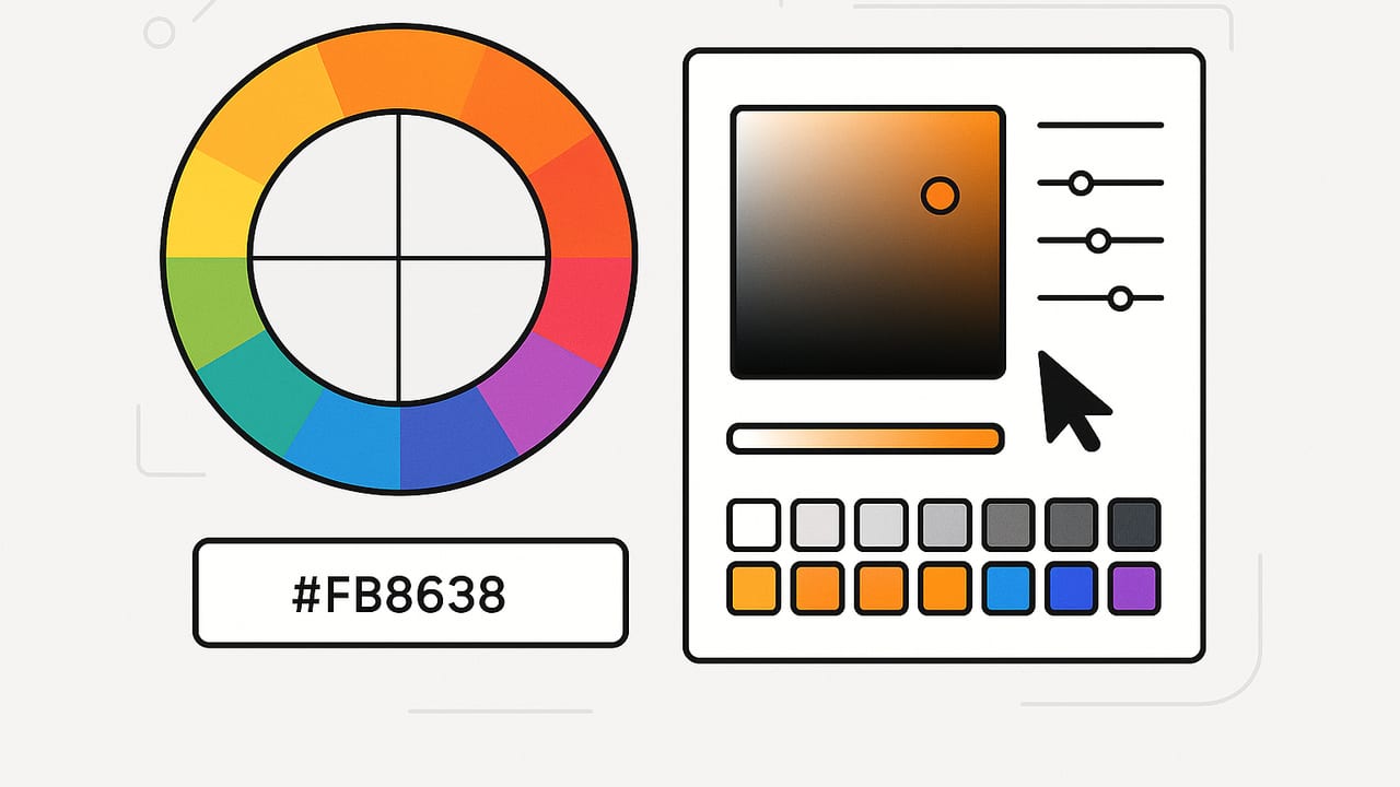
Whether you design interfaces, brand identities, interiors, or data visualizations, a reliable color picker is one of the most used tools in your kit. Yet picking a color is rarely as simple as clicking a pixel. Between color models, screen gamuts, accessibility constraints, compression artifacts, and export formats, there’s plenty to master if you want consistent, accurate palettes that travel well from screen to print and back again.
This guide distills the essentials: how a color picker works, the color models you’ll actually use, practical workflows for the web, tips for avoiding common pitfalls, and lightweight code examples to integrate picking into your projects.
What a color picker actually does
At its core, a color picker samples pixel values and presents them in different color models so you can understand, compare, edit, and save them. The most common outputs you’ll see are HEX (for web), RGB, HSL, and HSB/HSV. Depending on your workflow, you might also encounter CMYK (print), Lab/LCH (perceptual editing), and P3 (wide-gamut) values.
| Model | Best for | Pros | Gotchas |
|---|---|---|---|
| HEX | Web/CSS | Compact, universal in HTML/CSS | Implied sRGB; no alpha channel |
| RGB(A) | Screen design, CSS, canvas | Direct relation to device pixels; supports alpha | Not perceptually uniform; hard to tweak by eye |
| HSL / HSB | UI palettes, theming | Intuitive hue/saturation/lightness editing | Still tied to RGB gamut; naming varies (HSB/HSV) |
| Lab / LCH / OKLCH | Perceptual color matching | Uniform adjustments feel natural | Browser support varies; needs careful fallbacks |
| CMYK | Print production | Links to ink behavior | Device/profile-dependent; not for screens |
Pro tip: A color picker shows values based on the color-managed context where you sample. If you’re sampling from a photo tagged with a wide-gamut profile (e.g., Display-P3) on a wide-gamut display, the numeric values can differ from the same image converted to sRGB. Know your source profile and your target medium.
Types of color pickers (and when to use each)
- System pickers (macOS Digital Color Meter, Windows Color Picker): Good for quick sampling anywhere on screen. Often let you average a few pixels to reduce noise.
- Browser-based pickers (web apps, dev tools): Ideal for web workflows. Many include contrast checkers and CSS exports. Some browsers offer an eyedropper API for on-page sampling.
- Design-tool pickers (inside Figma, PS, etc.): Stay color-managed within a document; great for asset consistency and palette building.
- Image-linked pickers: Extract colors from photos or mood boards to build palettes; useful for branding and interiors.
- Hardware devices (colorimeters, spectrophotometers): Calibrate displays and measure physical samples under controlled light. Use when accuracy is mission-critical.
| Picker Type | Strengths | Limitations |
|---|---|---|
| System-wide | Quick, available everywhere | Limited palette tools; depends on OS color settings |
| Browser/Web | CSS-ready outputs, dev-friendly | Sampling API support varies by browser |
| Design app | Project-level palettes, tokens | Requires opening assets in the app |
| Image extractors | Palette discovery from photos | Photo lighting and white balance can skew results |
| Hardware | Highest accuracy for calibration and print | Cost, setup, controlled conditions needed |
Reliable web workflow: from pick to production
1) Calibrate and consider gamut
Calibrate your display (even a built-in tool helps), then decide on a working gamut. For broad compatibility, sRGB is the baseline on the web. Modern devices and browsers increasingly support Display-P3, which contains richer reds/greens. If you design in P3, plan conversions and fallbacks for sRGB-only environments.
2) Use modern CSS color with fallbacks
Modern browsers support advanced color spaces and perceptual models. Provide a safe fallback first, then layer richer color when available.
/* Fallback first (sRGB) */
.button {
  background: #e63946; /* sRGB hex */
}

/* Wide-gamut when supported */
@supports (color: color(display-p3 1 0 0)) {
  .button {
    background: color(display-p3 0.9 0.2 0.2);
  }
}

/* Perceptual color (check support matrix) */
@supports (color: oklch(0.7 0.12 25)) {
  .button:hover {
    background: oklch(0.72 0.13 25);
  }
}
3) Add an in-browser color picker
The quickest option is the native HTML color input. Pair it with a preview and a text field.
<input type="color" id="picker" value="#e63946">
<input type="text" id="hex" value="#e63946">
<script>
const p = document.getElementById('picker');
const h = document.getElementById('hex');
p.addEventListener('input', () => h.value = p.value.toLowerCase());
h.addEventListener('change', () => {
  const v = h.value.trim();
  if (/^#([0-9a-f]{3}|[0-9a-f]{6})$/i.test(v)) p.value = v;
});
</script>
For on-page sampling, the EyeDropper API lets users click anywhere on the screen to pick a color (supported in many Chromium-based browsers; provide fallbacks for others):
async function pickFromScreen() {
  if (!window.EyeDropper) return alert('Eyedropper not supported.');
  const result = await new EyeDropper().open(); // { sRGBHex: '#rrggbb' }
  console.log(result.sRGBHex);
}
4) Sample from an image with canvas
When you need precise sampling from an image you control, use a canvas. Average a small area to reduce noise and compression artifacts.
function avgColor(ctx, x, y, r = 2) {
  const d = ctx.getImageData(x - r, y - r, 2*r + 1, 2*r + 1).data;
  let R = 0, G = 0, B = 0, n = d.length / 4;
  for (let i = 0; i < d.length; i += 4) { R += d[i]; G += d[i+1]; B += d[i+2]; }
  R = Math.round(R / n); G = Math.round(G / n); B = Math.round(B / n);
  return '#' + [R,G,B].map(v => v.toString(16).padStart(2,'0')).join('');
}
Accessibility: contrast before charisma
Color that looks great but fails contrast requirements will harm usability and may violate policy. Target the following WCAG contrast ratios:
- AA normal text: 4.5:1
- AA large text (≥18pt regular, ≥14pt bold): 3:1
- AAA normal text: 7:1
Use your color picker to adjust lightness/saturation until you meet or exceed the target ratio. Prefer checking contrast on actual UI states (hover, disabled, focus) and on the backgrounds they’ll sit on most often. Test both light and dark modes.
Color-vision considerations: About 8% of men and 0.5% of women have some color-vision deficiency. When crafting palettes, ensure distinctions aren’t encoded by hue alone—use value/shape/texture, and verify with simulators where available.
Practical tips for accurate picking
- Avoid single-pixel picks on noisy or compressed images. Average a small area to reduce JPEG artifacts and anti-aliasing fringes.
- Check overlays. Many apps and browsers overlay selection or zoom elements. Pick in a clean area and zoom to 200–400% for precise edges.
- Beware of transparency. If the pixel blends with a background via alpha, the sampled color may not match the source asset.
- Mind white balance. Photo-based picks vary with lighting. For neutral references, use a gray card or pick from calibrated assets.
- Clamp rounding consistently. Conversions between RGB, HSL, and HEX can differ by rounding. Decide on a rule (e.g., round-half-up) and automate it.
- Keep profiles intact. Stripping embedded ICC profiles from images can shift colors—especially in wide-gamut workflows.
Choosing the right color picker for your project
Match the tool to the job:
- Rapid web UI tweaks: Browser dev tools + native input color + CSS tokens.
- Brand palette development: Design-tool picker with Lab/LCH support for perceptual adjustments.
- Photography-derived palettes: Image extractor with batch sampling and export to HEX/RGB/HSL.
- Color-critical print: Calibrated monitor + spectrophotometer + CMYK proofing under controlled light.
- Mobile-first ideation: Camera-based pickers to capture real-world color inspiration on the go.
Color conversions: quick reference
Most developers need just a few conversions. Here’s concise, readable JavaScript you can adapt.
// HEX -> RGB
function hexToRgb(hex){
  hex = hex.replace('#','');
  if (hex.length === 3) hex = hex.split('').map(c => c + c).join('');
  const num = parseInt(hex, 16);
  return { r:(num>>16)&255, g:(num>>8)&255, b:num&255 };
}

// RGB -> HEX
function rgbToHex(r,g,b){
  return '#' + [r,g,b].map(v => v.toString(16).padStart(2,'0')).join('');
}

// RGB -> HSL  (r,g,b in 0..255)
function rgbToHsl(r,g,b){
  r/=255; g/=255; b/=255;
  const max=Math.max(r,g,b), min=Math.min(r,g,b);
  let h,s,l=(max+min)/2;
  if (max===min){ h=s=0; }
  else {
    const d=max-min;
    s = l > 0.5 ? d/(2-max-min) : d/(max+min);
    switch(max){
      case r: h=(g-b)/d + (g<b?6:0); break;
      case g: h=(b-r)/d + 2; break;
      case b: h=(r-g)/d + 4; break;
    }
    h/=6;
  }
  return { h: Math.round(h*360), s: Math.round(s*100), l: Math.round(l*100) };
}
A simple, repeatable palette workflow
- Collect sources: Brand assets, UI mocks, photography, or real-world snapshots.
- Sample broadly: Use your color picker to capture candidates across highlights, midtones, and shadows. Average noisy regions.
- Normalize: Decide on your working space (sRGB for web), then convert values as needed. Keep original references with profiles intact.
- Shape the palette: Organize by role: primary, secondary, accent, neutrals, semantic (success, warning, error, info).
- Test accessibility: Check contrast for text-color pairs and key UI states. Adjust lightness first, then saturation.
- Tokenize: Export as design tokens. For the web, CSS custom properties keep things maintainable:
:root {
  --brand-50:  #ffeff1;
  --brand-500: #e63946;
  --brand-700: #b3212a;
  --text:      #0b0b0b;
  --bg:        #ffffff;
}
.button { background: var(--brand-500); color: var(--bg); }
.button:focus-visible { outline: 3px solid var(--brand-700); }
- Validate in context: Spot-check on multiple displays and in both light/dark themes. If you use P3 or OKLCH, ensure adequate sRGB fallbacks.
Troubleshooting: why did my picked color drift?
- Display not calibrated: What you see isn’t what’s encoded; recalibrate and retest.
- Profile mismatch: Sampling from a P3-tagged image but exporting as sRGB changes the perceived color on non-P3 screens.
- Alpha blending: You sampled a semi-transparent pixel composited over a background.
- Compression artifacts: JPEGs introduce blockiness and chroma subsampling; pick from lossless assets when possible.
- Different lighting: For real-world captures, mixed lighting alters perceived hue; correct white balance first.
Final thought
A great color picker does more than report numbers—it anchors a repeatable, accessible, and color-managed workflow. If you capture inspiration on the go, an iOS option like Color Viewfinder can extract HEX, RGB, HSL, and HSB values from photos and help you shape export-ready palettes.
Make the color picker your starting point, not the finish line: sample broadly, convert carefully, test for accessibility, and document as tokens.
With a consistent approach, your colors will look intentional, legible, and on-brand—no matter where they appear.
