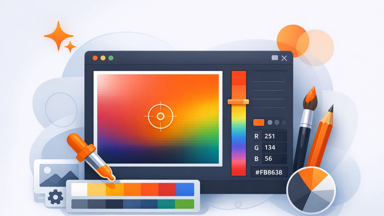
A photo can be a goldmine for color inspiration—if you can extract colors accurately and turn them into a palette that actually works in real projects. That’s where a color picker becomes more than a tool for grabbing random HEX codes. With the right workflow, you can sample the right pixels, control for lighting, organize colors by role, and export values you can trust for graphic design, UI, branding, or interior design mood boards.
This guide walks through an end-to-end, practical process for using a color picker on photos—without ending up with muddy neutrals, inconsistent hues, or “why does this look different on my screen?” surprises.
Why photo-based color picking can go wrong
Photos are not “pure color.” They’re a mix of:
- Lighting color (warm indoor bulbs, cool shade, neon signage)
- Shadows and highlights that shift saturation and brightness
- Camera processing (auto white balance, HDR, compression)
- Texture (fabric weave, grain, reflections) that changes pixel-to-pixel values
The result: two taps a few pixels apart can produce very different HEX codes. A strong workflow helps you sample representative color instead of accidental noise.
“A good palette isn’t a list of colors you found—it’s a set of colors that behave well together.”
Step 1: Choose the right source photo (and prep it)
If you have multiple photos, pick the one that best represents the real-world look you want. Before using a color picker, do quick prep:
- Prefer natural, even light over harsh mixed lighting. Overcast daylight is surprisingly reliable.
- Avoid heavy filters unless you want the filtered aesthetic.
- Crop distractions so sampling focuses on the subject (product, room, outfit, artwork).
- Zoom in when sampling textured surfaces (wood, linen, stone) to reduce “pixel roulette.”
Quick check: is white actually white?
In many photos, “white” objects skew yellow or blue due to lighting. If your photo has a known neutral (white wall, gray card, paper), sample it first. If it’s clearly tinted, plan to correct for that tint in later steps by adjusting temperature/neutrality (or by choosing colors from midtones rather than highlights).
Step 2: Sample smart—target midtones, not extremes
The most common beginner mistake is sampling highlights and shadows. Highlights are washed out; shadows are overly dark and often color-contaminated.
- Best target: midtones on the subject (the “true” surface color under light)
- Avoid: specular shine (glossy reflections), deep shadow creases, blown-out white
- Use multiple samples: take 3–5 picks in nearby areas and average visually (or choose the most representative)
If your color picker supports different readouts, capture at least HEX and RGB. For palette balancing, HSL/HSB is extremely helpful because it exposes lightness/brightness and saturation directly.
Step 3: Build a palette by roles (not by “pretty colors”)
A functional palette assigns each color a job. For most creative projects, start with five roles:
- Base (background / wall / canvas)
- Surface (cards, panels, large secondary areas)
- Primary (brand or hero color)
- Accent (small pops: buttons, decor objects)
- Text/Ink (high-contrast readable color)
A practical method: the 60–30–10 rule
Borrowed from interior design, the 60–30–10 distribution helps palettes feel intentional:
- 60% base (quiet, low-saturation often works best)
- 30% supporting color (related hue or neutral)
- 10% accent (higher saturation or contrast)
When using a color picker, don’t aim for five equally loud colors. Pick one or two “stars,” and let the rest support them.
Step 4: Harmonize hue and saturation (the “make it usable” step)
Photo-picked colors often need slight adjustments to behave together. This is normal and not “cheating.” Think of sampling as starting points.
Use HSL/HSB to correct common issues
- Too many saturated colors: reduce saturation on supporting colors so the accent can shine.
- Muddy neutrals: many neutrals are slightly tinted; decide whether you want warm neutrals or cool neutrals and align them.
- Palette feels random: nudge hues so they cluster (analogous) or intentionally contrast (complementary).
A helpful trick: if two colors are meant to be in the same “family,” keep their hue similar and vary lightness/saturation instead. This creates cohesion without becoming monotone.
Step 5: Verify contrast and readability
A palette that looks great in swatches can fail in real use—especially for text and UI. You don’t need to memorize accessibility standards to improve outcomes; you just need a repeatable contrast check.
Fast contrast checklist
- Text on base: does body text feel effortless to read at normal size?
- Accent on base: do buttons/links stand out without vibrating?
- Light-on-dark: if you use dark backgrounds, confirm text isn’t too dim (avoid low-contrast grays).
If your chosen text color fails, don’t immediately change the hue—try adjusting lightness first. Often, the same hue can work perfectly once it’s darker or lighter.
Step 6: Decide the best color format for the job
A color picker may show multiple formats. Here’s how to choose:
| Use case | Best format to think in | Why it helps |
|---|---|---|
| Web / UI design | HEX (or RGB) | Directly usable in CSS and design tools |
| Palette balancing | HSL / HSB | Easy to adjust lightness/brightness and saturation |
| Print workflows | CMYK (via conversion) | Print uses ink; expect shifts from screen colors |
| Interior design / paint matching | HEX as a reference, then match to real samples | Physical materials vary; use swatches to confirm |
Note: HEX is great for consistency, but it doesn’t guarantee the same appearance across devices. Always validate on the target medium.
Step 7: Export in a way your future self will thank you for
Once you’ve finalized colors, name them by role (not by vague adjectives). “Sunset Orange” is fun, but “Accent / CTA” is actionable.
Example: export as CSS variables
This is a clean way to apply a photo-based palette to a website or prototype:
:root {
  --color-base:   #F4F1EA;
  --color-surface:#E6DED1;
  --color-primary:#2F6F73;
  --color-accent: #E07A5F;
  --color-ink:    #1B1B1B;
}

body { background: var(--color-base); color: var(--color-ink); }
.button { background: var(--color-accent); color: #FFFFFF; }
If you’re working with multiple deliverables (branding + social + UI), keep one “source of truth” palette and derive variants (tints/shades) rather than re-picking from the photo each time.
Common color picker mistakes (and how to fix them)
1) Picking from JPEG artifacts
Compressed images can introduce blocky color noise. Fix: sample from larger, smoother regions; take multiple readings; prefer higher-resolution photos.
2) Sampling reflective highlights
Glossy surfaces (tiles, cars, lipstick) reflect the environment color. Fix: sample adjacent midtone areas that represent the material color.
3) Building a palette with no neutrals
All accents = visual chaos. Fix: add at least one calm base and one ink/text color. Neutrals make bold colors feel intentional.
4) Ignoring “temperature drift”
If every neutral is warm except one cool gray, the palette can feel off. Fix: decide warm vs cool direction and align supporting colors.
A mini workflow you can reuse in any project
- Pick a clean source photo and crop to the subject.
- Use a color picker to sample 8–12 candidates from midtones.
- Choose 5 role colors: base, surface, primary, accent, ink.
- Adjust in HSL/HSB for cohesion (saturation and lightness).
- Check contrast for text and key UI elements.
- Export + name colors by role; save a single master palette.
When you should re-pick instead of adjust
Adjustments are normal—but sometimes you’re fighting the wrong source. Consider re-picking if:
- The photo’s lighting is heavily tinted (club lights, colored LEDs).
- Your palette is consistently dull or grayish, even after tweaks.
- Key colors come from tiny areas (a logo in the corner) and aren’t representative.
In those cases, find a better reference photo or use a second image for supplemental accents.
Final tip: save your “why,” not just your HEX
Alongside the codes, note what each color is meant to do (background, trim, headline, CTA, etc.). Palettes stay consistent when their purpose is clear. If you use an iPhone or iPad, apps like Color Viewfinder can make it easy to pick colors from photos and export palette values in formats designers commonly need.
