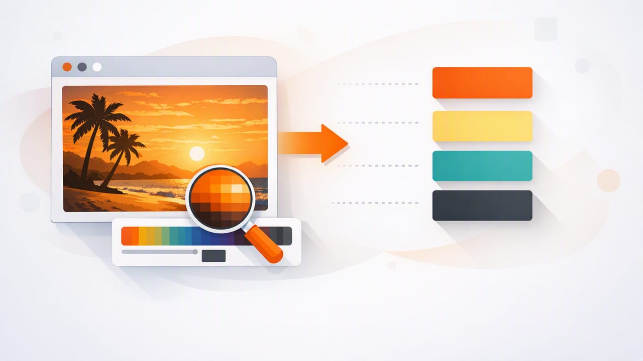
When you spot a perfect color in a photo—paint on a wall, a product shot, a sunset gradient—the next step is making it usable in real projects. For most digital workflows, that means you need to convert photo colors to HEX so you can apply them in CSS, UI kits, brand guidelines, or moodboards with consistency.
This guide walks through a reliable, designer-friendly process to convert photo colors to HEX accurately. You’ll learn what affects color readings, how to sample in a way that represents the “true” color you intend, and how to turn a handful of sampled HEX values into a functional palette (not just random swatches).
Why HEX is the most practical “final format”
HEX (hexadecimal) color codes like #2F6BFF are widely used because they’re compact, readable, and supported across web and many design tools. Even when you work in other formats (RGB, HSL, HSB), HEX is often the easiest way to document, share, and implement color choices.
- Web and UI implementation: CSS, design tokens, and component libraries commonly rely on HEX.
- Consistency: A single HEX code is an unambiguous target color in an sRGB workflow.
- Portability: Easy to paste into tools, docs, and specs.
What makes “photo-to-HEX” tricky (and how to avoid common errors)
A photo is not a color chart. It’s a captured interpretation of a scene, influenced by camera processing and environment. Before you convert photo colors to HEX, it helps to understand what can skew results:
- Lighting & white balance: Warm indoor lighting can push neutrals toward orange; shade can skew blue/green.
- Specular highlights: Glossy surfaces contain bright reflections that are not the surface color.
- Shadows: Shadows can shift hue and reduce saturation, creating “muddy” samples.
- Compression & filtering: Social platforms often compress images; filters alter color curves significantly.
- Color management: Some images embed profiles; some apps ignore them. Results can vary by tool.
Rule of thumb: sample the color you want to design with, not necessarily the “brightest” or “most obvious” pixel in the photo.
A repeatable workflow to convert photo colors to HEX
Use this step-by-step approach whether you’re working on graphic design, interior design moodboards, or digital product UI.
1) Start with the best possible source image
Your HEX output can only be as good as the input. If you’re taking the photo yourself:
- Prefer natural, neutral light when possible.
- Avoid mixed lighting (e.g., daylight + tungsten) that creates inconsistent color zones.
- Tap-to-focus and avoid motion blur; blur blends pixels and shifts averaged color.
- If available, use a photo mode that reduces aggressive “beauty”/tone adjustments.
If you’re using an existing photo, try to get the highest-resolution version available and avoid screenshots of compressed images.
2) Decide what “the color” actually is
Most objects don’t have one color—there are highlights, midtones, and shadows. To convert photo colors to HEX in a way that’s useful, decide which region represents your intended design color:
- Midtone sampling: best for “base paint” or primary brand color inspiration.
- Shadow sampling: useful for darker UI states (hover/pressed) or depth colors.
- Highlight sampling: useful for light tints, but often contaminated by reflections.
3) Sample multiple points, then choose or average
Single-pixel sampling is fragile. A tiny change in where you tap can produce a different HEX value. Instead:
- Sample 3–7 points in the same material area (e.g., the wall paint region).
- Compare the results and discard obvious outliers (usually reflections or deep shadows).
- Choose the most representative midtone, or compute a simple average in RGB for a stable base.
Many color picker tools effectively do a small-area average—if yours supports it, enable that for smoother results.
4) Validate the HEX on a neutral background
Context changes perception. Once you have a candidate HEX value, preview it on:
- White (#FFFFFF) and near-white backgrounds (common in UI).
- Dark gray (#111111) backgrounds (common in dark mode).
- A neutral mid-gray (#808080) background to check hue bias.
This is how you catch issues like “it looked beige in the photo, but it’s actually peach” after sampling.
5) Build a small, usable palette (not just a pile of swatches)
A practical palette usually includes roles. Once you convert photo colors to HEX, organize them into:
- Primary: the dominant color from the photo (or your main brand color inspiration).
- Secondary: a supporting color (often from a different region of the image).
- Accent: a high-contrast pop (often small in the photo, big in design impact).
- Neutrals: 2–4 light-to-dark neutrals for backgrounds and typography.
If the photo is very colorful, limit yourself: too many saturated colors can reduce clarity in UI and branding.
Common pitfalls when converting photo colors to HEX (and fixes)
| Pitfall | What it looks like | How to fix it |
|---|---|---|
| Sampling a highlight | HEX is too light/washed out | Sample midtones away from reflections; average multiple points |
| Sampling in shadow | HEX is too gray or too dark | Move to a brighter area of the same material; increase exposure in a copy |
| Mixed lighting | Same surface gives wildly different HEX values | Choose one lighting zone; correct white balance before sampling |
| Compressed/social image | Colors look slightly “off,” banded, or oversharpened | Use the original file if possible; avoid screenshots |
| Over-relying on a single swatch | Palette feels inconsistent in real layouts | Add neutrals and test combinations in a mock layout |
How to use your HEX values in real projects
Once you’ve extracted colors and you’re happy with them, put them to work quickly—ideally in the environment where they’ll live.
Example: CSS variables (design tokens)
Use CSS custom properties to keep palettes consistent across pages and components:
:root {
  --color-primary: #2F6BFF;
  --color-secondary: #18B7A4;
  --color-accent: #FFB020;
  --color-bg: #F7F7F8;
  --color-text: #111318;
}

.button {
  background: var(--color-primary);
  color: var(--color-bg);
}

.badge {
  background: var(--color-accent);
  color: var(--color-text);
}
Example: quick contrast sanity check (what to look for)
If you’re designing interfaces, verify that text on your chosen backgrounds is readable. Even without running a formal accessibility test, look for these warning signs:
- Bright accent colors used behind small text often fail readability.
- Mid-saturation colors can be deceptive: they look “strong,” but may not provide enough contrast.
- Neutrals matter: strong palettes still need stable background and text colors.
Tips for interior design and decor workflows
Interior designers and decorators often convert photo colors to HEX as a bridge between inspiration and planning—moodboards, client presentations, or matching textiles. A few extra considerations help:
- Paint vs. pixels: HEX is an on-screen representation. Real paint depends on substrate and lighting.
- Capture in consistent light: photograph swatches in the same room lighting where they’ll be used.
- Keep a neutral reference: including a white sheet of paper in the shot can help you judge color casts.
Use HEX to communicate the “direction” (warm vs. cool, saturated vs. muted), then validate final material choices with physical samples.
A quick checklist: convert photo colors to HEX with confidence
- Use the highest-quality, least-compressed image you can.
- Identify the region you mean (midtone vs. highlight vs. shadow).
- Sample several points; discard outliers.
- Preview the HEX on white, dark gray, and mid-gray backgrounds.
- Build a role-based palette (primary, secondary, accent, neutrals).
- Test the palette in a real layout (a simple UI frame, poster, or room moodboard).
Choosing a tool: what features matter most
Many tools can pick a color, but if you want a smooth workflow, look for:
- Multiple color formats: HEX plus RGB/HSL/HSB for tuning.
- Palette layouts: grid, strips, and role-based arrangements for presentation.
- Export options: copy as text, export images, or share palette files.
- Sampling precision: zoom, loupe, and/or area averaging for more stable picks.
If you prefer doing this on iPhone or iPad, an app like Color Viewfinder can extract HEX values from photos and help you organize them into exportable palettes—handy when you want inspiration-to-implementation without returning to a desktop.
