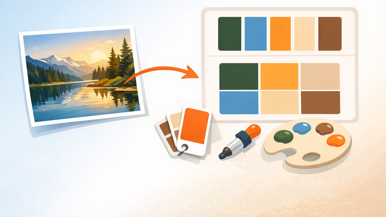
When you create a color palette from a photo, you’re borrowing color relationships that already “work” in the real world: a sunlit wall against a cool shadow, a neutral background that supports a bright accent, or the subtle contrast between materials like wood, stone, and fabric. The challenge is translating those pixels into a palette you can reliably use in graphic design, UI, illustration, or interior design.
This guide walks through a repeatable, designer-friendly process: how to choose the right photo, sample colors accurately, refine the palette into roles (backgrounds, accents, text), and export values that fit real workflows.
1) Start with the right photo (your palette is only as good as the input)
Not every image makes a good palette source. Before you sample any colors, evaluate the photo for conditions that can distort hue and contrast.
Choose images with clear lighting and stable color
- Prefer soft, even light (overcast outdoors, shaded areas, diffused indoor light). Harsh sunlight can cause clipped highlights and overly warm casts.
- Avoid heavy filters (Instagram-style grading) if you want true-to-life paint, fabric, or brand colors.
- Look for a “hero accent” (a flower, sign, chair, artwork) plus supporting neutrals (walls, sky, stone, paper).
- Use high-resolution photos. More pixels generally means cleaner sampling and less compression noise.
Quick pre-check: does it have usable contrast?
A palette isn’t just a set of pretty swatches; it needs readable pairings. If everything in the photo sits in the same mid-tone range, you may struggle to find a strong background and a legible text color without heavy editing.
2) Decide what kind of palette you’re building
Before extracting anything, define the goal. This keeps you from ending up with 12 random colors that don’t behave well together.
- Brand/graphic palette: 1–2 primary colors, 1–2 secondary colors, neutrals, and semantic colors (success/warning/error).
- UI palette: surfaces (backgrounds), text colors, border colors, interactive states, and one strong accent for CTAs.
- Interior palette: dominant wall/large-surface color, secondary (upholstery/rug), wood/metal neutral, and one small bold accent.
- Illustration palette: a controlled set (often 6–10 colors) plus a value plan (lights/mids/darks).
3) Extract colors with intent: sample groups, not single pixels
Color extraction works best when you treat each “color” as a small cluster of related pixels. A single pixel can be an outlier caused by noise, reflections, or texture. When you create a color palette from a photo, sample representative areas:
- Dominant color: the largest area (sky, wall, table surface).
- Secondary color: the second-largest area (flooring, foliage, cabinetry).
- Accent color: a small but attention-grabbing element (signage, clothing, flowers).
- Neutral(s): off-whites, greiges, charcoals—these make palettes usable.
- Shadow and highlight versions: pick a darker and lighter variant of the dominant or neutral for depth.
Sampling tips that prevent “muddy” palettes
- Avoid specular highlights (glare on glossy surfaces). They skew toward near-white and can trick you into choosing the wrong tint.
- Beware mixed lighting (warm lamp + cool daylight). If you must use it, sample from areas lit by the same light source.
- Don’t ignore neutrals. Many palettes fail because they lack a calm background and strong text option.
Rule of thumb: If you can’t confidently assign a sampled color to a job (background, text, accent), it probably doesn’t belong in the final palette.
4) Convert raw picks into a structured palette (the part most people skip)
Extraction gives you candidates. A functional palette gives each candidate a role and a relationship to other colors. Aim for 6–9 core swatches for most projects:
- 2–3 neutrals: light background, dark text, and an optional mid-tone for borders/secondary text.
- 2–3 chromatic colors: primary, secondary, and optional tertiary.
- 1–2 accents: high-attention colors used sparingly (buttons, highlights, decor pops).
Create light/dark variants (tints and shades)
Once you have your core swatches, create variants. This is especially useful for UI states (hover/pressed) and interior coordination (trim vs wall).
- Tint: mix with white (lighter).
- Shade: mix with black (darker).
- Tone: mix with gray (less saturated, more flexible).
If your palette feels “too loud,” reducing saturation (tone) is often more effective than changing hue.
5) Understand the numbers: HEX vs RGB vs HSL/HSB
When you extract colors, you’ll often see multiple value formats. Each is useful in different contexts.
| Format | Best for | What to watch |
|---|---|---|
| HEX (#RRGGBB) | Web design, handoff, style guides | Not intuitive for adjusting lightness/saturation |
| RGB (r,g,b) | Screen-based work, digital imaging | Hard to “think” in harmony; small changes can shift feel |
| HSL (h,s,l) | Systematic tweaks (lighter/darker variants) | Perceptual uniformity isn’t perfect, but it’s practical |
| HSB/HSV (h,s,b) | Choosing vivid accents and controlling brightness | Very saturated colors can become harsh in UI |
For many designers, the winning combo is: extract in HEX for easy sharing, then refine in HSL/HSB to build variants and fix contrast.
6) Make it usable: contrast and accessibility checks
A palette drawn from photography can be subtle, which is beautiful—until you try to place text on it. Do a quick contrast review before you commit.
Practical contrast checklist
- Pick one near-white background and one near-black text (or at least very dark).
- Test your primary color as a button with white text and as text on a light background.
- If an accent color fails for text, reserve it for icons, borders, tags, or small decor elements.
If you need a fast fix, adjust lightness first, then saturation. Most contrast problems are value problems, not hue problems.
7) Build a mini “palette spec” (so you can actually reuse it)
To move from inspiration to production, document your swatches with names and roles. Here’s a simple structure you can copy into a design doc.
Example naming scheme
- Neutral-50 (background)
- Neutral-900 (primary text)
- Neutral-500 (borders/secondary text)
- Primary-500 (brand/primary actions)
- Primary-600 (hover/pressed)
- Accent-500 (highlights)
Optional: turn your swatches into CSS variables
This makes the palette portable for web projects and easy to maintain.
:root {
  --neutral-50:  #F7F5F2;
  --neutral-500: #9A948C;
  --neutral-900: #1E1D1B;

  --primary-500: #2F6F8F;
  --primary-600: #255A73;

  --accent-500:  #D97A3A;
}

.button-primary {
  background: var(--primary-500);
  color: var(--neutral-50);
}

.text-default {
  color: var(--neutral-900);
}
Tip: Even if you don’t code, this “token” mindset helps you keep palettes consistent across pages, screens, or rooms.
8) Common problems (and quick fixes) when you create a color palette from a photo
Problem: The palette looks dull compared to the photo
- Cause: Photos often rely on contrast and composition, not pure saturation.
- Fix: Add one intentional accent (slightly higher saturation) and deepen your dark neutral for stronger anchors.
Problem: Everything clashes once you apply it
- Cause: Too many mid-saturation colors competing.
- Fix: Reduce saturation on secondary colors, and keep only one “loud” hue as the hero.
Problem: The dominant color is beautiful but unusable for text
- Cause: Mid-tone colors rarely pass contrast standards as backgrounds.
- Fix: Use a tint of that color for backgrounds and reserve the original for accents or larger shapes.
Problem: The palette shifts between devices
- Cause: Display differences and wide-gamut imagery.
- Fix: Work in standard color spaces when exporting for web, and sanity-check on more than one screen when possible.
9) A fast workflow recap (bookmark this)
- Pick a well-lit, minimally filtered photo with clear neutrals and one accent.
- Extract candidates by sampling representative areas (not single pixels).
- Reduce to 6–9 swatches with roles: neutrals, primary/secondary, accent.
- Create tints/shades for depth and UI states.
- Check contrast and adjust lightness before hue.
- Document names/roles and export values (HEX + HSL/HSB if you iterate).
10) Tools: what to look for in a mobile color extractor
If you prefer building palettes on an iPhone or iPad, look for tools that offer:
- Accurate sampling with a zoomed picker
- Multiple color formats (HEX, RGB, HSL, HSB)
- Palette layouts so you can see relationships at a glance
- Export options that fit your workflow (copy values, files, tokens)
For example, Color Viewfinder is one iOS/iPadOS option that can extract HEX and other color values from photos and help you assemble export-ready palettes.
