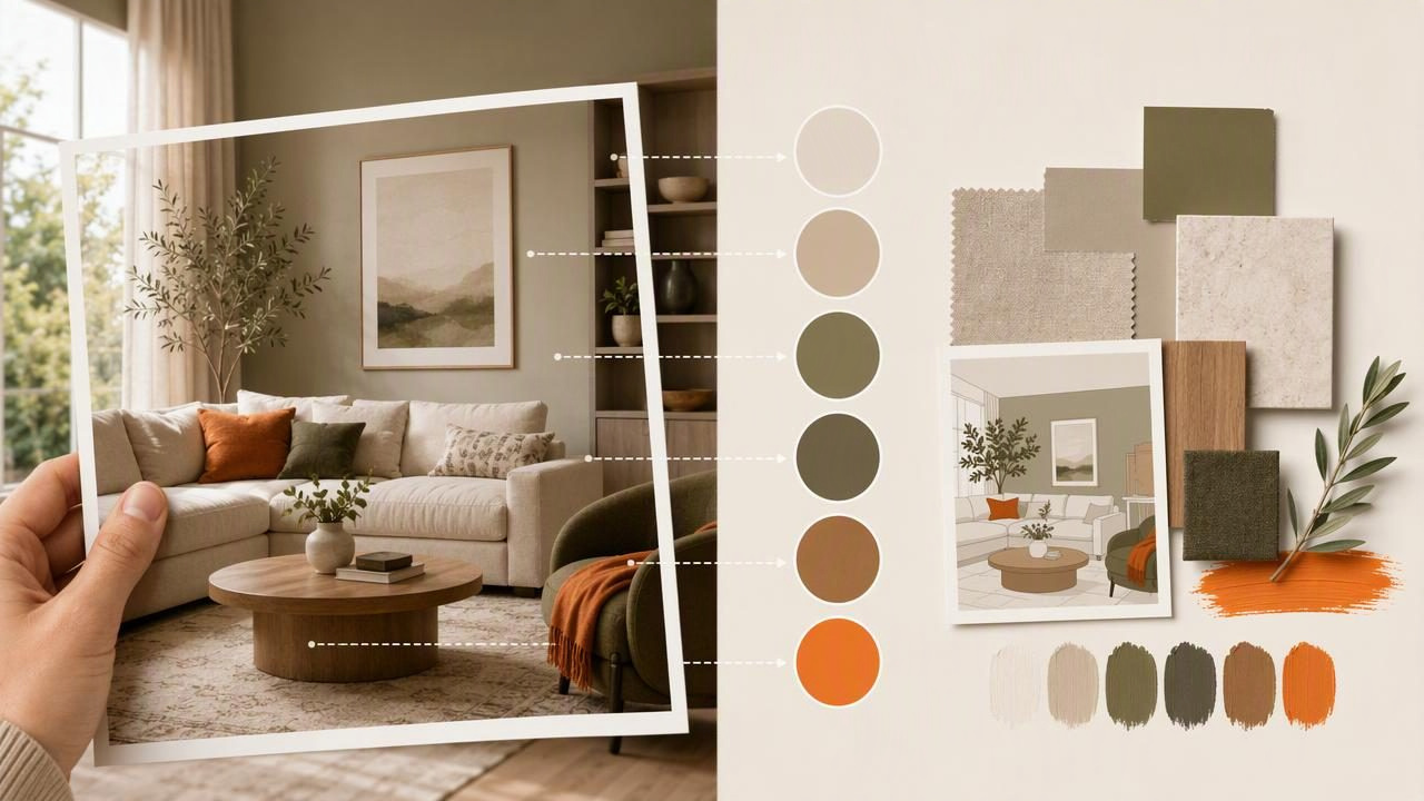
When you want to create color palettes for interior design, inspiration is often easier to find than it is to organize. A hotel lobby, a garden at dusk, a favorite textile, or a well-styled living room can all suggest a mood—but turning that image into a usable room color scheme takes more than choosing five attractive swatches.
A successful interior palette needs hierarchy, balance, and a clear connection to the materials already in the room. It should account for large surfaces, fixed finishes, natural light, and the way colors change from morning to evening. Extracting colors from a photo can give you a helpful starting point, but the most useful palette is one that translates visual inspiration into practical design decisions.
This guide explains how to use photos to build an interior color palette, how many colors to select, where to place them, and how to avoid common color-planning mistakes.
Why Use a Photo to Create an Interior Color Palette?
Photos capture color relationships that already feel cohesive. Rather than beginning with a single paint chip and guessing what belongs with it, you can study a complete scene and identify the colors that create its atmosphere.
For example, a photograph of a coastal landscape may include:
- A muted blue-gray sky
- Soft sand or warm beige tones
- Weathered driftwood brown
- Deep charcoal rocks
- A restrained green-blue accent from water or grasses
Individually, these colors may seem ordinary. Together, they create a calm, natural interior design direction. The photo provides a built-in sense of proportion: large areas of sky may suggest a wall color, darker rocks may become a grounding accent, and small notes of sea glass can inspire cushions, ceramics, or artwork.
The goal is not to reproduce every pixel from the image. Instead, use the image to understand the relationship between warm, cool, light, dark, muted, and saturated colors.
Start With the Room, Not Just the Inspiration Image
Before extracting colors, identify the parts of the room that are difficult or expensive to change. These elements should influence every palette decision.
List the fixed finishes
Fixed finishes are the colors and materials that will remain in place for a long time. They often include:
- Wood flooring
- Stone, tile, brick, or fireplace surrounds
- Kitchen cabinetry and countertops
- Large upholstered furniture
- Window frames, doors, and built-in shelving
For instance, a warm honey-oak floor may conflict with a palette built around icy blue-grays and cool white walls. That does not mean you cannot use blue, but you may need a softened blue-gray with a slight green or warm undertone rather than a stark, blue-violet shade.
Think of fixed finishes as part of the palette, even if they do not appear in your inspiration photo.
Extract Colors With a Purpose
When you create color palettes for interior design from a photo, avoid sampling every color that catches your eye. A room needs fewer colors than an image contains. Select colors according to the role they will play in the space.
A practical interior palette commonly includes five color roles:
| Color role | Typical use | What to look for in a photo |
|---|---|---|
| Dominant neutral | Walls, large rugs, major upholstery | Sky, sand, plaster, pale stone, soft background areas |
| Secondary neutral | Trim, curtains, wood tones, layered textiles | Shadows, weathered wood, warm stone, muted foliage |
| Grounding dark | Furniture frames, hardware, lamps, contrast details | Dark branches, rock, deep shadows, charcoal elements |
| Supporting color | Chairs, bedding, curtains, painted furniture | Noticeable but not dominant landscape or architectural tones |
| Accent color | Pillows, art, vases, small decor | Small, vivid highlights such as flowers, tiles, or sunset tones |
Sampling a color from the largest area of an image is usually more useful than choosing only the most vibrant detail. A bright orange flower may be beautiful, but it may work better as a small accent than as a full-room wall color.
A Concrete Example: Turning a Desert Photo Into a Living Room Palette
Imagine a photograph of a desert landscape at late afternoon. It contains pale clay ground, sun-bleached rock, dusty sage plants, reddish terracotta formations, and deep brown shadows.
After inspecting the image, you might identify these approximate digital reference colors:
Warm plaster:    #D9CCBA
Soft sand:       #BCA68B
Dusty sage:      #8B947C
Terracotta:      #A95F43
Deep umber:      #44362E
These values are useful for comparing digital colors and documenting your palette. They are not instructions for exact paint matching, fabric matching, or print reproduction.
To apply this palette in a living room, assign each tone a job:
- #D9CCBA warm plaster: Main wall direction or a light neutral rug.
- #BCA68B soft sand: Linen curtains, woven baskets, a secondary upholstery tone, or a wood-adjacent neutral.
- #8B947C dusty sage: An occasional chair, botanical textiles, or a muted painted cabinet.
- #A95F43 terracotta: Small cushions, ceramics, artwork, or a single upholstered ottoman.
- #44362E deep umber: Lamp bases, picture frames, coffee-table details, or dark furniture legs.
The room would not need equal amounts of each color. The clay wall color and soft sand neutral could occupy most of the visual field, while terracotta might appear in only a few small objects. This balance keeps the space warm without making it feel overly orange or theme-driven.
Use the 60-30-10 Principle as a Starting Point
The 60-30-10 rule is a useful shorthand for interior color distribution. It is not a strict formula, but it helps prevent accent colors from taking over a room.
- 60% dominant color: Usually walls, a large rug, or the room’s main background.
- 30% secondary color: Often upholstery, curtains, cabinetry, or a significant furniture piece.
- 10% accent color: Small decor, art, cushions, throws, and other changeable details.
In the desert example, warm plaster might make up 60% of the palette, soft sand and dusty sage could fill the next 30%, and terracotta plus deep umber would form the remaining visual accents. The dark color can be used in small quantities while still giving the room structure.
For a more layered home, you can treat this principle as 60-25-10-5, with the final 5% reserved for a high-contrast detail such as blackened metal, brass, navy, or a brighter art color.
Check Undertones Before Committing
Two colors may look similar on a screen but behave very differently in a room. This is often because of undertones—the subtle warm, cool, green, pink, yellow, blue, or violet influence beneath the surface color.
A beige can lean pink, yellow, gray, or green. A white can feel creamy, blue, peachy, or neutral. A gray can read warm and taupe-like in one room but cool and lavender in another.
When comparing your extracted palette to existing finishes, ask:
- Does the floor lean orange, red, yellow, gray, or brown?
- Does the countertop look creamy, cool gray, bright white, or speckled?
- Is the inspiration image warm because of sunset lighting?
- Will the palette still make sense under the room’s natural and artificial lighting?
A photo taken in golden hour light can make cool surfaces appear warmer than they are in reality. Likewise, a heavily edited online image may not show the original material colors accurately. Use extracted values as visual references, then compare physical samples in the actual room.
Test the Palette in Different Lighting Conditions
Lighting is one of the biggest reasons an interior palette changes character. North-facing rooms often receive cooler, softer daylight, while south-facing rooms may receive stronger, warmer light. East- and west-facing rooms can shift dramatically throughout the day.
Before finalizing a wall color or large textile, review samples in:
- Morning daylight
- Midday daylight
- Evening light
- Your usual artificial lighting
Place samples near the floor, furniture, trim, and any stone or tile. A color that looks balanced against a white background may appear too yellow beside a cool countertop or too gray next to warm wood.
Important: Digital HEX, RGB, HSL, and HSB values are excellent for organizing visual ideas, sharing a palette, and maintaining consistency across digital design files. They cannot guarantee how paint, fabric, wood, or printed materials will look in person.
Build Depth With Materials, Not More Colors
One common mistake is adding extra colors when a room feels flat. Often, the better solution is to repeat the existing palette across different materials and finishes.
A warm neutral room can become richer through:
- Matte painted walls
- Textured linen curtains
- Woven wool upholstery
- Natural wood furniture
- Unglazed ceramic accessories
- Brushed metal lighting
These variations create contrast in texture, sheen, and scale without disrupting the color story. A palette with only three or four main colors can feel far more sophisticated than one with eight unrelated shades.
Common Mistakes When Creating Interior Color Palettes
Choosing only colors you love individually
A favorite color is not automatically a useful room color. Consider its role, scale, undertone, and relationship to the finishes already present.
Using the accent color too widely
Strong colors usually have more impact when they are limited. If terracotta is the visual spark in your photo, reserve it for moments rather than painting every wall in it.
Ignoring contrast
A palette of only mid-tone beige, gray, and tan can feel visually flat. Add a dark grounding color, a pale highlight, or a controlled accent to improve definition.
Relying on the phone screen alone
Screen brightness, display settings, image editing, and ambient light all affect color perception. Always verify large purchasing decisions with physical samples where possible.
Document Your Palette for Easier Decisions
Once your palette is established, keep the colors in one place. Label each color by its room role rather than only by its code. For example, write “main wall neutral,” “curtain neutral,” “accent textile,” or “dark metal reference.” This makes decisions easier when shopping for furniture, art, rugs, or accessories.
For a photo-based workflow on iPhone or iPad, Color Viewfinder’s guide to creating a color palette from a photo explains how to inspect image colors and organize palette references. Use the extracted HEX, RGB, HSL, or HSB data as a consistent digital record, while treating in-person material samples as the final authority for interior selections.
Final Thoughts
To create color palettes for interior design effectively, begin with an image that captures the mood you want, then edit its colors down to a practical system. Include the room’s fixed finishes, assign each selected color a clear role, and use accents with restraint. Most importantly, test large color decisions in the lighting where the room will actually be lived in.
A photo can provide the creative direction. Thoughtful proportions, undertones, materials, and real-world sampling turn that inspiration into an interior that feels cohesive and personal.
