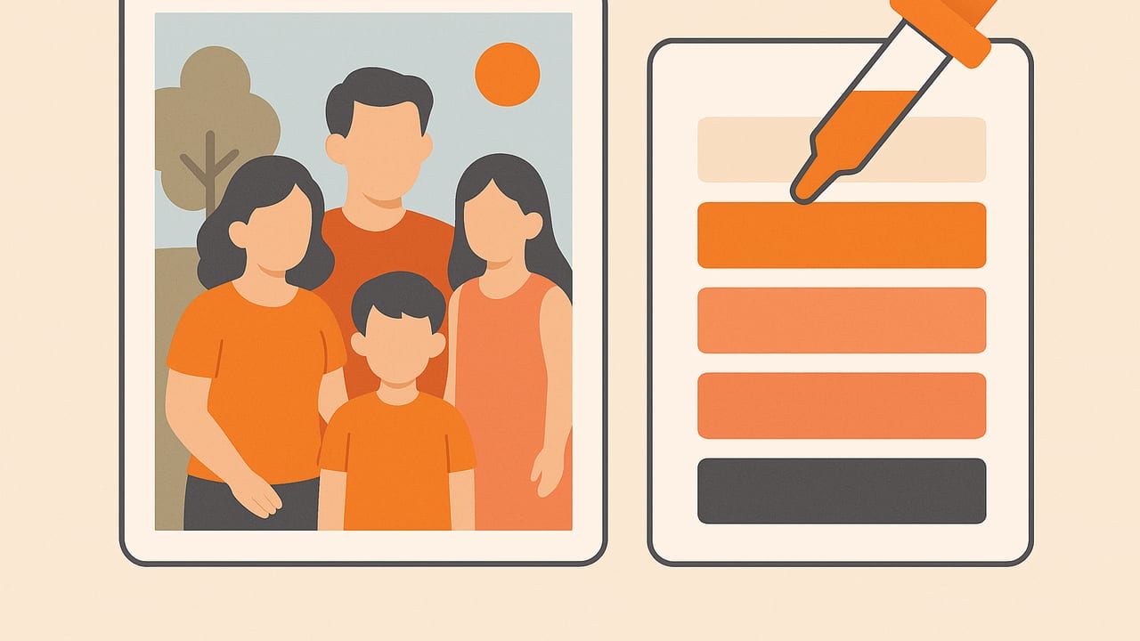
Few sources of color are as meaningful as the hues found in your family album. Whether it’s the warm tones of a vintage print or the vibrant clothes from a reunion, learning how to create color palettes from family photos turns memories into design-ready assets. In this guide, you’ll learn practical workflows, accuracy tips, and creative applications—so your palettes look beautiful and carry real sentimental value.
Why Family Photos Make Exceptional Palettes
Family photos capture more than faces—they preserve eras, places, and moods. A grandparent’s sepia portrait delivers muted warmth; a beach vacation yields airy, sunlit blues; a holiday dinner packs rich reds and golds. When you create color palettes from family photos, you’re curating a visual story that can inform interior schemes, brand accents, wedding graphics, or a printed heirloom book that feels personal, not generic.
- Authenticity: Real-world hues grounded in memories.
- Timelessness: Classic color relationships often appear naturally.
- Versatility: Works for decor, digital design, gifts, and keepsakes.
Color Models 101 (What You’ll Export and Why)
Before you start sampling, understand which color models matter. You’ll likely extract HEX, RGB, HSL, and HSB/HSV for different use cases.
| Model | Example | Best For | Notes |
|---|---|---|---|
| HEX | #7A5C4B | Web, mobile UI | Compact, widely supported in CSS. |
| RGB | 122, 92, 75 | Digital graphics | Good for fine-tuning with sliders. |
| HSL | 24°, 24%, 39% | Design iteration | Intuitive for adjusting hue, saturation, lightness. |
| HSB/HSV | 24°, 39%, 48% | Illustration, photo workflows | Brightness-oriented; helpful for balancing vividness. |
Prep Your Photo for Accurate Colors
Accurate palettes start with accurate pixels. A little preparation goes a long way.
1) Correct Lighting and White Balance
- Avoid mixed lighting. If reshooting, aim for consistent daylight or a single artificial source.
- Use a neutral reference. A gray card or white paper in one shot helps you correct white balance later.
- Fix color casts. Use your editor’s white balance tool to remove harsh yellow or green tints.
2) Clean and Crop
- Remove distractions. Crop out neon toys, branded shirts, or bright objects that don’t represent the memory you want.
- Retouch noise and dust. For scans of old prints, lightly denoise to prevent speckles from becoming palette colors.
Pro tip: Create two versions—one with minimal edits for authenticity, another with gentle corrections for color accuracy. Generate palettes from both and compare.
Three Reliable Methods to Create Color Palettes from Family Photos
Method A: Manual Sampling (Creative Control)
- Open the photo in your preferred editor or color picker.
- Zoom 200–300% to sample larger areas, avoiding isolated pixels.
- Pick anchors: a skin tone, a background hue (wall/sky), a clothing color, a neutral (wood, stone), and an accent (flowers, jewelry).
- Refine saturation and lightness in HSL to balance the set.
- Limit to 5–7 colors for clarity; store alternates for flexibility.
This approach preserves storytelling. If the memory is “cozy afternoon,” favor warm neutrals and soft highlights; if it’s “joyful picnic,” lift saturation and emphasize greens and reds.
Method B: Automatic Extraction (Fast + Consistent)
Automated methods cluster similar colors and return dominant swatches. K-means clustering and median cut are common approaches. Here’s a compact Python example using Pillow and scikit-learn to extract five dominant colors:
from PIL import Image
import numpy as np
from sklearn.cluster import KMeans

# Load and downsample for speed
img = Image.open('family_photo.jpg').convert('RGB')
img = img.resize((400, int(400 * img.height / img.width)))

# Convert to array
pixels = np.array(img).reshape(-1, 3)

# Optional: remove very dark/bright outliers
mask = (pixels >= 10).all(axis=1) & (pixels <= 245).all(axis=1)
pixels = pixels[mask]

# Cluster
k = 5
km = KMeans(n_clusters=k, n_init=8, random_state=42)
km.fit(pixels)
centers = km.cluster_centers_.astype(int)

# Convert to HEX
def rgb_to_hex(r, g, b):
    return '#' + ''.join(f'{v:02X}' for v in (r, g, b))

palette = [rgb_to_hex(*c) for c in centers]
print(palette)
Adjust k to taste, and consider sorting results by perceived lightness for a pleasing sequence.
Method C: Hybrid Curation (Best of Both)
Start with an automatic palette to surface dominant colors, then manually swap one or two hues to better reflect the memory. Keep a “hero” color from the subject and a “setting” color (environment), then add a neutral and a small pop for contrast.
Accuracy Tips: Skin Tones, Fabrics, and Old Prints
- Skin tones: Sample from midtones (cheek or forehead in soft light), not highlights or shadows. Reduce saturation slightly if the photo is oversaturated.
- Fabrics: Patterned clothing can skew a palette. Sample a larger patch or average multiple points from the same garment.
- Vintage photos: Sepia and fade can be charming. If you want truer colors, use a gentle color-restore tool first; if nostalgia matters, embrace the patina as your palette’s signature.
- Noise handling: Light denoising or outlier masking prevents single-pixel artifacts from becoming swatches.
Check Accessibility and Real-World Contrast
If you’ll use the palette for print, UI, or signage, verify contrast. A quick luminance-based check helps you choose readable pairs.
# WCAG contrast ratio (Python)
def rel_lum(c):
    # c: 0-255 RGB tuple
    srgb = [v/255 for v in c]
    def f(u):
        return u/12.92 if u <= 0.04045 else ((u+0.055)/1.055)**2.4
    r, g, b = [f(u) for u in srgb]
    return 0.2126*r + 0.7152*g + 0.0722*b

def contrast(rgb1, rgb2):
    L1, L2 = rel_lum(rgb1), rel_lum(rgb2)
    L1, L2 = max(L1, L2), min(L1, L2)
    return (L1 + 0.05) / (L2 + 0.05)

# Example usage:
# contrast((122, 92, 75), (245, 241, 236))  # >= 4.5 recommended for body text
For body text, aim for contrast ratios of 4.5:1 or higher; for large text (18pt+), 3:1 can be acceptable.
Design Applications: Turn Palettes into Meaningful Projects
- Wall paint schemes: Use a neutral base from the photo (e.g., beach sand) with an accent wall echoing a dress or bouquet.
- Photo books and invitations: Build backgrounds, borders, and typography from a shared family palette to unify layouts.
- Textiles and prints: Order throw pillows or canvas prints using your palette; subtle gradients can mirror the photo’s mood.
- Digital products: Apply the palette to a family website, slideshow, or screensaver for a cohesive, personal feel.
Exporting and Naming Your Palette
Consistency matters when you revisit a palette months later. Save multiple formats and include meaningful names.
- Formats: Export HEX and RGB for digital; include HSL for iterative design tweaks. Consider ASE/ACO/CLR or plain JSON for portability.
- Naming: Use context-rich names—“Nonna’s Kitchen Basil,” “Lakehouse Dawn Sky,” “Autumn Scarf Red.” Names help you recall intent.
- Order: Arrange from light to dark or by hue for faster design decisions.
Common Mistakes (and How to Fix Them)
- Overfitting to a single subject: If the background sets the mood, include it. Balance subject colors with environmental tones.
- Too many near-duplicates: Collapse similar mid-browns or greens; keep one representative and add a contrasting accent.
- Ignoring neutrals: A strong palette needs rest. Add a soft gray, off-white, or warm wood tone to anchor vivid hues.
- Clipping extremes: If your photo has blown highlights or crushed shadows, slightly recover detail first for more nuanced colors.
- Forgetting real-world materials: A perfect digital blue might print differently on matte paper or fabric. Order a proof or test swatch.
Curating Story-Driven Palettes (Three Examples)
1) Vintage Wedding Portrait
Focus on soft cream, muted sepia, antique gold, and a hint of floral blush. Keep saturation low and add a warm neutral for balance. Use for stationery or wall art with elegant serif typography.
2) Summer Beach Day
Anchor with sky and sea blues, add sun-warmed sand, a coral accent from a swimsuit, and a crisp white highlight. This translates beautifully into breezy interior accents and web headers.
3) Cozy Winter Gathering
Pull deep burgundy from a sweater, pine green from decor, firelight amber, and soft charcoal from shadows. Works well for holiday cards and living room textiles.
Workflow Checklist
- Pick the memory and mood you want to convey.
- Correct white balance; reduce noise; crop distractions.
- Choose a method: manual, automatic, or hybrid.
- Ensure skin tones and neutrals are represented.
- Check contrast for text and small elements.
- Export in HEX/RGB/HSL; name swatches meaningfully.
- Test in real contexts: on paper, fabric, or UI prototypes.
FAQ
How many colors should I include?
Five to seven is a practical sweet spot: enough variety for hierarchy, not so many that the scheme feels chaotic.
Can I combine multiple photos?
Yes—generate palettes from each photo, then merge. Keep one photo as the anchor to maintain coherence, and remove near-duplicate swatches.
What about black-and-white photos?
You can embrace their grayscale beauty or colorize them first. Alternatively, extract tonal values (light to dark grays) and add one accent color inspired by the era or story.
How do I avoid trendy colors that age quickly?
Lean on neutrals and midtones from the environment (wood, stone, sky) and let one or two accents carry the personality. Memory-driven palettes naturally resist fads.
Bringing It All Together
When you create color palettes from family photos, you’re doing more than sampling pixels—you’re translating emotion into a practical toolkit for design. With careful prep, a clear method, and a light touch for curation, your palette will feel both personal and professional. If you prefer a streamlined mobile workflow, an iOS app like Color Viewfinder can extract HEX, RGB, HSL, and HSB from photos and export neat, customizable palettes—handy when you’re building keepsakes on the go.
