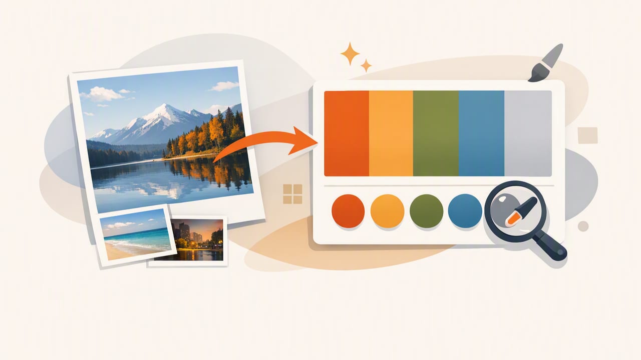
Photos are one of the fastest ways to find color combinations that already “work” in the real world—because lighting, materials, and atmosphere naturally create harmony. Whether you’re designing a UI, building a brand kit, or planning a room refresh, learning to create color palettes from photos gives you a repeatable starting point that feels cohesive instead of random.
This guide walks through an end-to-end workflow: choosing the right image, extracting usable colors, organizing them into a palette with roles (not just swatches), and validating for readability and consistency. You’ll also get a practical export approach for design tools and code.
Why palettes from photos tend to look “right”
A strong palette is usually a mix of:
- Dominant colors (what you notice first)
- Supporting colors (secondary surfaces and mid-tones)
- Accents (small, high-attention pops)
- Neutrals (whites, grays, blacks, wood tones—what lets accents breathe)
Photos often contain this structure inherently. Your job is to extract it intentionally and translate it into something functional for design.
Step 1: Pick the right photo (it matters more than you think)
Not every image is a good palette source. Use these criteria to avoid muddy, unusable results:
- Clear subject + limited noise: Busy images add too many similar pixels and produce cluttered swatches.
- Consistent lighting: Mixed light sources shift hues unpredictably (e.g., daylight + warm bulbs).
- Good exposure: Overexposed highlights can wash colors out; underexposed shadows hide saturation.
- Color story: Choose images with a distinct mood (coastal, industrial, earthy, neon) so your palette has direction.
Tip: If you’re photographing a room or product, take two shots: one “mood” photo and one neutral, evenly lit reference shot. Use the reference for accuracy and the mood shot for inspiration.
Step 2: Extract colors with intention (not just the top 5)
Many tools can sample colors, but the key is choosing the right ones. Start by extracting 8–12 candidates, then narrow to a working set of 5–7. As you sample, aim for variety across:
- Hue: are you capturing distinct color families?
- Saturation: do you have both muted and vivid options?
- Value/lightness: do you have usable lights, mids, and darks?
Where to sample in the photo
- Largest areas (walls, sky, fabric fields): good candidates for backgrounds.
- Mid-sized elements (furniture, clothing, UI-like panels): good for surfaces and components.
- Small highlights (signage, flowers, product labels): perfect accent colors.
- Natural neutrals (stone, paper, wood, shadow): anchors that keep palettes usable.
Step 3: Turn swatches into roles (the part most people skip)
A pile of HEX codes isn’t a palette yet. A palette becomes useful when each color has a job. Use a role-based approach so the same set of colors scales across screens, layouts, or rooms.
| Role | What it’s for | Common traits |
|---|---|---|
| Background | Page/room base, negative space | Low saturation, very light or very dark |
| Surface | Cards, panels, secondary walls | Close to background but slightly contrasted |
| Primary | Primary actions, main brand color | Recognizable hue, medium-high saturation |
| Secondary | Secondary actions, supporting elements | Related hue or adjacent on color wheel |
| Accent | Highlights, badges, decor pops | High contrast, used sparingly |
| Text | Readability across backgrounds | Near-black or near-white, not fully pure |
When you create color palettes from photos with roles, you reduce decision fatigue: you’re not picking colors each time, you’re applying a system.
Step 4: Improve harmony with simple adjustments
Photo-extracted colors often need small tweaks to become “design clean.” Common fixes:
- Reduce saturation for large areas: backgrounds and surfaces usually look better slightly muted.
- Unify undertones: if you have both warm and cool grays, pick one direction for consistency.
- Snap to a shared lightness ladder: define light, mid, and dark steps so components feel intentional.
- Keep accents rare: if everything is saturated, nothing stands out.
A quick “lightness ladder” method
Choose 4–6 lightness levels (from very light to very dark). Then adjust extracted colors so your surfaces and text reliably land on these steps. This creates a consistent rhythm across layouts or spaces.
Step 5: Validate contrast and accessibility (especially for UI)
Beautiful palettes fail when text becomes hard to read. After extraction and role assignment, test contrast for your most common pairs:
- Text on background
- Text on primary button
- Primary on background (for links, icons)
- Accent on background (for badges/alerts)
If contrast is weak, you have three safe options:
- Shift lightness (most reliable): make the background lighter/darker rather than changing hue.
- Reduce saturation: highly saturated colors can vibrate against certain backgrounds.
- Add a neutral buffer: place text on a surface color instead of directly on a busy or colorful background.
Design reality: The “perfect” extracted color might only work as an accent. That’s not a failure—it’s how palettes become functional.
Step 6: Export and apply your palette (design tools + code)
Once you’ve finalized 5–7 core colors (plus text neutrals), export them in formats that fit your workflow: HEX for UI, RGB for certain print pipelines, and HSL/HSB when you want to tweak lightness and saturation predictably.
Example: turn your palette into CSS variables
Using variables makes your palette easy to maintain and scale into a design system:
:root {
  --color-bg: #F6F2ED;
  --color-surface: #FFFFFF;
  --color-text: #1D1B18;
  --color-primary: #2F6F8E;
  --color-secondary: #6E8F5B;
  --color-accent: #D98A2B;
  --color-border: #E4DDD4;
}

.button-primary {
  background: var(--color-primary);
  color: #FFFFFF;
}

.card {
  background: var(--color-surface);
  border: 1px solid var(--color-border);
  color: var(--color-text);
}
Even if you’re not coding, this “token mindset” helps you name colors by function (primary, surface, text) rather than by vague labels (blue-1, blue-2).
Two practical examples (UI and interior)
Example A: Mobile UI from a travel photo
Imagine a coastal photo: pale sand, deep teal water, sunlit white buildings, and a warm orange door. A usable UI palette could be:
- Background: sand off-white (reduces glare vs pure white)
- Surface: clean white for cards
- Primary: deep teal for buttons/links
- Secondary: muted seafoam for toggles/secondary states
- Accent: warm orange for highlights and badges
- Text: near-black with slight warmth
This keeps the “place” of the photo while remaining readable and scalable.
Example B: Room palette from a fabric + wood photo
For interiors, your roles translate differently:
- Background: wall color (largest plane)
- Surface: trim/ceiling or large textiles
- Primary: dominant furniture or rug color
- Accent: pillows, art, ceramics, a single statement piece
- Neutral anchor: wood tone or stone tone (ties everything together)
If the extracted colors feel too intense for a room, lower saturation first before changing hue—this preserves the inspiration while making it livable.
Common mistakes when you create color palettes from photos
- Only picking saturated colors: you’ll struggle to find backgrounds and readable text pairings.
- Ignoring neutrals: neutrals are what make accent colors look intentional.
- Sampling from shadows/highlights: these areas often shift hue because of lighting, not material color.
- Using too many “almost the same” swatches: reduce duplicates; keep one representative color per role.
- No naming system: if you can’t tell what a color is for, you’ll misuse it later.
A simple checklist to finalize your palette
- Do you have at least one usable background and one surface?
- Do you have a primary that feels on-theme and works for key actions?
- Do you have a controlled accent (used sparingly) that draws attention?
- Do text and UI states maintain clear contrast?
- Are colors defined by roles (names) instead of only values?
- Can you export in the formats you need (HEX/RGB/HSL/HSB)?
Final thoughts
When you treat photos as structured color data—not just inspiration—you get palettes that feel natural and behave predictably across real projects. The most reliable approach is role-based: extract more than you need, narrow to a functional set, adjust for harmony, and validate contrast before you commit.
If you prefer doing the sampling on mobile, apps like Color Viewfinder can help you grab HEX/RGB/HSL/HSB values directly from photos and organize them into exportable palettes.
