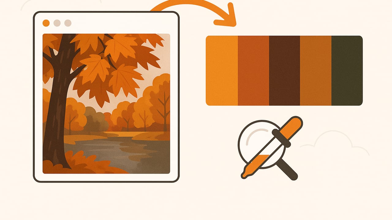
Few seasons deliver color like fall. Think rusted leaves against slate skies, pumpkin orange beside deep forest greens, and the warm glow of late-afternoon light. If you want to translate that atmosphere into consistent palettes for branding, interiors, illustration, or web design, learning to build fall inspired color schemes from photos is a skill that pays off year-round.
This guide teaches you how to pick the right photos, extract dependable colors, shape harmonious palettes, keep them accessible, and export them cleanly into your workflow. You’ll find practical steps, example palettes, and short code snippets if you prefer a programmable approach.
What Makes a Palette Feel Like Fall?
Autumn palettes aren’t just “orange and brown.” They’re a whole spectrum with nuanced temperature shifts and muted complements. Consider these characteristics:
- Warm, earthy bases: Burnt orange, terracotta, brick red, ochre, mustard, chestnut, walnut, espresso.
- Smoky, muted complements: Sage, eucalyptus green, olive, dusty teal, midnight blue, plum.
- Natural neutrals: Cream, oatmeal, sand, warm gray, charcoal, off-black.
- Textural influence: Wood grain, wool, leather, stone, fog, and overcast skies add low-saturation anchors.
In color theory terms, fall often leans on analogous warms (reds–oranges–yellows) balanced by cool complements (blue/green) and neutrals that prevent the palette from feeling candy-bright.
Start with Photos That Yield Great Palettes
Palettes are only as good as your source image. Choose or capture photos that:
- Feature consistent lighting: Golden hour or bright overcast give softer contrasts and richer midtones.
- Preserve detail: Avoid clipped highlights (blown-out skies) and crushed shadows.
- Include a range of tones: Aim for a balance of warms, cools, and neutrals in the same frame.
- Use correct white balance: “Cloudy” or custom white balance keeps warms believable without oversaturation.
- Shoot RAW when possible: You can gently adjust exposure and color temperature before extraction.
- Reduce glare and haze: A polarizing filter helps with foliage and wet surfaces.
Pre-edit your photo lightly if needed: correct white balance and exposure, and reduce noise. Avoid heavy filters that skew hue.
Three Reliable Ways to Extract Fall Colors
1) Manual Eyedropper (Curated)
Open your image in a design tool (Figma, Photoshop, Affinity). Sample colors from highlights, midtones, and shadows across the focal elements (leaves, bark, sky). Curate 5–8 swatches. Manual curation is slow but yields palettes with intentional balance.
2) Automatic Clustering (Fast and Consistent)
Algorithms like k-means cluster pixels into representative colors. This is great for consistency across a photo set (e.g., a series of park shots). You can run it in Python or use apps that implement similar methods.
3) Hybrid (Best of Both)
Run a clustering algorithm and then tweak the results: remove odd outliers, nudge saturation in HSL/HSB, and add a neutral for grounding.
Minimal Python Example for Palette Extraction
# pip install pillow scikit-learn numpy
from PIL import Image
import numpy as np
from sklearn.cluster import KMeans

def image_to_palette(path, k=6, resize=600):
    img = Image.open(path).convert('RGB')
    w, h = img.size
    scale = resize / max(w, h)
    if scale < 1:
        img = img.resize((int(w*scale), int(h*scale)), Image.LANCZOS)
    data = np.array(img).reshape(-1, 3)

    # Optional: subsample for speed on large images
    if data.shape[0] > 200000:
        idx = np.random.choice(data.shape[0], 200000, replace=False)
        data = data[idx]

    kmeans = KMeans(n_clusters=k, n_init='auto', random_state=42)
    kmeans.fit(data)
    centers = kmeans.cluster_centers_.astype(int)

    def to_hex(rgb): return '#%02x%02x%02x' % tuple(rgb)
    return [to_hex(c) for c in centers]

print(image_to_palette('pumpkin_patch.jpg', k=7))
Tip: After extraction, convert to HSL and reduce saturation slightly for a sophisticated, lived-in fall look.
A Step-by-Step Workflow from Photo to Palette
- Choose the photo: Favor shots with warm foliage, wood, stone, textiles, and a cool counterbalance (sky, river, denim).
- Pre-edit gently: Adjust white balance and exposure. Avoid strong LUTs or high vibrance.
- Extract 5–8 core colors: Include two warms, one cool complement, one neutral, one dark anchor, and one highlight.
- Name your swatches: “Burnt Maple,” “River Slate,” “Wool Oat,” etc., to keep intent clear.
- Check contrast: Validate pairs for text/background and UI elements.
- Export in needed formats: HEX for web, RGB for digital art, HSL/HSB for adjustments, and swatch files for design tools.
How Many Colors Do You Need?
- 3–4 colors: Great for logos, icons, and simple posters.
- 5–7 colors: Ideal for websites, UI themes, and cohesive room palettes.
- 8–12 colors: Editorial spreads, illustration systems, or complex data viz with careful hierarchy.
Assign roles:
- Base (Primary): The dominant warm tone (e.g., burnt orange).
- Accent: A cool complement (e.g., dusty teal) for buttons or decor pops.
- Neutral: Cream, warm gray, or taupe for backgrounds.
- Dark Anchor: Charcoal or espresso for text and outlines.
- Highlight: Soft butter or linen for hover states and light accents.
Fall Color Harmonies That Always Work
Analogous Warmth
Reds–oranges–yellows feel quintessentially autumnal.
- Burnt Orange: #C4572B
- Maple Red: #9E3B2C
- Harvest Gold: #D7A024
- Warm Oat: #DDD1BE
Split Complement Balance
Pair a warm base with two neighbors of its complement for subtle tension.
- Base (Terracotta): #B45E37
- Accent 1 (Dusty Teal): #3C6F73
- Accent 2 (Sage): #8E9F84
- Neutral (Linen): #EAE3D8
Bold Complement
Mustard with deep blue reads modern yet seasonal.
- Mustard: #C79C2C
- Deep Blue: #24425B
- Walnut: #5A3B2E
- Warm Gray: #B9B3A9
From Scenes to Swatches: Practical Examples
| Fall Scene | Dominant HEX | Accent HEX | Neutral HEX | Suggested Use |
|---|---|---|---|---|
| Pumpkin patch at golden hour | #C9642A (Pumpkin) | #2E5668 (Blue Spruce) | #E6DCCF (Cream) | CTA buttons + warm hero background |
| Maple forest after rain | #9A3F2C (Maple) | #6F7F6A (Moss) | #D0C8BC (Oat) | Editorial spreads + muted UI |
| Mountain lake with larch trees | #D59E38 (Larch) | #2B4B5C (Lake) | #E3DFD7 (Fog) | Data viz hues + dashboards |
| Coffee + leather + wool | #5A3A2D (Espresso) | #A67E56 (Saddle) | #D9D2C6 (Wool) | Branding + packaging systems |
Use these as starting points; refine by nudging saturation down 5–10% in HSL for a more sophisticated look.
Ensure Accessibility and Readability
Fall palettes can skew low-contrast if everything is warm and mid-toned. Check contrast with WCAG 2.1 guidelines: 4.5:1 for normal text, 3:1 for large text, and higher for UI essentials.
Quick Contrast Function (JavaScript)
// Returns contrast ratio between two hex colors per WCAG
function contrast(hex1, hex2) {
  function toRGB(hex) {
    const n = hex.replace('#','');
    return [
      parseInt(n.substring(0,2), 16),
      parseInt(n.substring(2,4), 16),
      parseInt(n.substring(4,6), 16),
    ];
  }
  function lum([r,g,b]) {
    const srgb = [r,g,b].map(v => v/255).map(c => c <= 0.03928 ? c/12.92 : Math.pow((c+0.055)/1.055, 2.4));
    return 0.2126*srgb[0] + 0.7152*srgb[1] + 0.0722*srgb[2];
  }
  const L1 = lum(toRGB(hex1)) + 0.05;
  const L2 = lum(toRGB(hex2)) + 0.05;
  const ratio = L1 > L2 ? L1/L2 : L2/L1;
  return Math.round(ratio*100)/100;
}
console.log(contrast('#C9642A', '#1F2933')); // Pumpkin on charcoal
If a text/background pair fails, try:
- Darken anchors: Replace warm browns with near-black charcoals (#1F2933) that still feel organic.
- Cool the background: A dusty blue or slate backdrop can raise contrast with warm text.
- Reduce saturation: Over-saturated warms can feel “glowy” and lose edge definition.
Export Formats and When to Use Them
- HEX: Ideal for web and UI. Example: #C9642A.
- RGB: Useful for screen graphics and blending. Example: 201, 100, 42.
- HSL/HSB: Best for controlled adjustments; set brand hue, vary saturation/lightness per use.
- Swatch files: ASE (Adobe), ACO (Photoshop), .swatches (Procreate), or GPL (GIMP) for team sharing.
Pro tip: Standardize on a brand hue (e.g., H=22°) and define a systematic scale, like H22 S30 L92 (Background), H22 S55 L55 (Primary), H22 S60 L35 (Pressed), so your fall palette behaves predictably across components.
Common Pitfalls (and Fast Fixes)
- Problem: Everything looks orange.
Fix: Add a cool counterbalance (dusty teal #3C6F73 or slate #2B3B49) and a true neutral. - Problem: Muddy mixes after compression.
Fix: Extract before heavy JPEG compression; gently increase contrast and clarity pre-extraction. - Problem: Colors shift between devices.
Fix: Work in sRGB for web, embed profiles in exported imagery, and test on multiple displays. - Problem: Low contrast on mobile.
Fix: Reserve a near-black anchor (#111418–#1F2933) and a light neutral (#F3EFEA) for text/background combinations. - Problem: Over-saturated reds print badly.
Fix: Prefer deeper, slightly desaturated reds (e.g., #8E3B2C) and proof in CMYK if printing.
Mini Case Study: One Photo, One Palette
Source: A path through a maple grove after rainfall. The scene includes wet bark, orange-red leaves, mossy stones, and a gray sky.
- Extraction: k = 7 clusters; curated to 6 swatches.
- Adjustment: Reduced saturation of reds (-8%) and lifted lightness of neutrals (+6%) in HSL.
- Final Palette:
- Maple Leaf: #A2432E
- Wet Bark: #4A2F27
- Moss: #6E7F6B
- Fog Gray: #D9D6CF
- River Slate: #2E4B5A
- Wool Oat: #E7E0D6
Usage: Maple Leaf as primary UI color; River Slate for links and CTAs; Fog Gray and Wool Oat for backgrounds; Wet Bark for headings and icons; Moss for badges and secondary accents. All key text pairs meet AA contrast.
Naming Your Colors (So Teams Use Them Correctly)
Descriptive names tie color to intent and memory. Prefer names like “Maple Leaf 500” or “Saddle 700” over generic “Orange 1.” Layer in a scale (100–900) to map lightness for systematic UI use.
Building a Reusable Fall Palette System
- Define roles: Primary, Secondary, Accent, Background, Surface, Border, Text.
- Set states: Hover, Active, Disabled with predictable HSL shifts (e.g., -10 lightness on active).
- Document tokens: color.primary = #A2432E, color.text = #1F2933, etc.
- Test in context: Place colors on real components, rooms, or layouts, not just swatches.
Quick Checklist for Fall-Inspired Color Schemes from Photos
- Photo has warm/cool/neutral balance and soft lighting.
- Extraction yields 5–8 curated swatches with defined roles.
- At least one high-contrast text/background pair passes WCAG AA.
- Exported as HEX, RGB, and HSL/HSB; swatch file prepared if needed.
- Names and tokens documented so the palette scales.
Where This Fits into Real Workflows
- Branding: Build a seasonal variant that still aligns with your core hue.
- Web/UI: Dark anchor + warm primary + cool accent keeps things legible and fresh.
- Interior design: Translate swatches to paint, fabric, and wood finishes; always test under the space’s lighting.
- Illustration: HSL tweaks let you keep hue consistent while creating atmospheric depth.
Gentle Tool Suggestion
If you prefer doing this on iPhone or iPad, an app like Color Viewfinder can extract HEX, RGB, HSL, and HSB values from photos and export tidy palettes. It’s handy when you’re composing palettes on the go after a hike through the leaves.
Final Thoughts
Fall’s magic comes from contrast: warm foliage versus cool air, texture versus glow, nostalgia versus clarity. Choose photos that carry that balance, extract intentionally, keep accessibility in mind, and document your palette as a system. With a few reliable techniques and a repeatable workflow, you’ll turn seasonal photos into palettes that feel timeless—long after the leaves have fallen.
