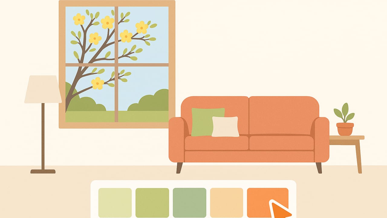
Looking for a quick, authentic way to refresh your space for the season? Try building a spring living room palette from a window photo. The view you already have—fresh greens, soft skies, budding blossoms, and warm natural materials—can become a ready-made, location-specific color guide you can translate into paint, textiles, and finishes.
This guide walks you through capturing the right image, extracting usable colors, and converting them into a balanced palette that looks great in real rooms under real light. You’ll also see sample swatches, a practical application plan, and a quick CSS mockup for digital previews.
Why a Window Photo Works for Spring Palettes
- Real-world harmony: Nature’s spring hues (new foliage, soft blues, blossom pinks) naturally coordinate. Your window view aligns your palette with local light and environment.
- True lighting context: Photographing through your actual window captures your space’s orientation, glazing tint, and ambient tone—details paint chips rarely reflect.
- Instant mood: Spring is both color and contrast: tender greens beside weathered bark, crisp sky against diffused clouds. Your photo brings that mood straight into the palette.
Capture the Right Photo: Setup and Shooting
- Pick the time: Aim for bright overcast or golden-hour light. Midday sun can push colors toward high contrast and glare.
- Kill reflections: Turn off interior lights near the window. Step slightly to the side so your reflection isn’t in the glass.
- Set exposure: If your highlights blow out, tap and hold to lock exposure on the brightest sky area, then slightly increase brightness so mid-tones aren’t crushed.
- Mind white balance: If your camera allows manual white balance, choose ‘daylight’ to avoid a warm or cool cast. Otherwise, correct later when sampling.
- Frame variety: Include a mix of elements: sky, greenery, blossoms, distant structures, and a bit of window frame or sill wood. Variety equals richer swatches.
Extracting Colors: From Pixels to Palette
Once you have your photo, it’s time to sample colors. Plan to capture a balanced set that includes a soft neutral, a main mid-tone, one or two accents, a grounding deep tone, and a couple of material-inspired hues (wood, stone, metal).
- Sample across zones: Pull from highlights (sky), mid-tones (foliage), and shadows (tree bark, distant hedges). Avoid only sampling bright leaves; it skews too green.
- Use cluster sampling: Take multiple picks in a small region (e.g., a blossom cluster) to average a believable accent rather than a single pixel outlier.
- Check consistency in HSL/HSB: For harmonious sets, your accent hues can vary in saturation while sharing similar lightness, or vice versa, depending on the look you want.
Example Spring Palette From a Window Photo
Use the following as a starting point—adjust to match your own scene:
| Role | Sample HEX | Sample Source | Notes |
|---|---|---|---|
| Soft wall neutral | #F3EFE6 | Cloud highlights | Warm off-white; won’t go sterile under daylight. |
| Secondary neutral | #E8E3D9 | Diffused sky/sill | Layered neutral for trim, textiles, or built-ins. |
| Main mid-tone green | #84BDA0 | Sunlit new leaves | Fresh but soft; ideal for cushions or a feature wall. |
| Blossom accent | #F2A7C2 | Flower petals | Spring pop; use sparingly in art or throws. |
| Sky accent | #A6C9E2 | Blue patches | Cool contrast to greens; good for ceramics or rugs. |
| Grounding deep | #2E4A3F | Shaded evergreens | Balances pastels; consider for cabinetry or frames. |
| Wood/rope tone | #B68C5A | Window frame/bark | Connects palette to natural materials. |
Tip: If your photo skews cool (blue cast), cautiously warm the neutrals (nudge toward red/yellow) so the room doesn’t feel chilly on overcast days.
Build a Balanced Palette: Proportions and Pairings
Use the 60/30/10 rule as a baseline for a spring-forward scheme that doesn’t feel sugary or flat.
- 60% Base: #F3EFE6 (walls/large areas) with #E8E3D9 for trim or upholstery basics.
- 30% Secondary: #84BDA0 mid-tone green on textiles, a feature wall, or a statement armchair.
- 10% Accents: Split between #F2A7C2 (blossom) and #A6C9E2 (sky), with #2E4A3F as a strategic deep (frames, side tables).
- Materials: Thread #B68C5A through baskets, frames, or a light-stained coffee table to ground the palette.
Pro tip: If the room gets strong morning sun, consider making the sky blue the dominant accent. For north-facing rooms, lean into the warm wood tone to keep the vibe cozy.
Adjust for Interior Lighting and Materials
- Color temperature: Most living rooms use 2700–3000K bulbs. Warm light deepens reds/yellows and mutes blues. Expect #A6C9E2 to read slightly grayer at night.
- Metamerism: A color that looks great by day can drift under LEDs. Test paint swatches vertically on multiple walls and evaluate morning, noon, and evening.
- Finish matters: Matte paints hide imperfections and reduce glare; satin enhances color depth. For darker tones like #2E4A3F, matte keeps reflections under control.
- LRV check: Balance light reflectance values. Your base neutral should sit high (reflective), with mid-tones and accents stepping down. This preserves airiness.
Apply the Palette: Paint, Textiles, Finishes
Translate your swatches into tangible choices:
- Paint selection: Start with the base neutral (#F3EFE6). Order sample pots from two close alternatives—one slightly warmer, one slightly cooler—to test alongside your actual swatch from the photo.
- Textiles: Build texture variety: linen in #E8E3D9, a boucle or cotton in #84BDA0, a silk or velvet cushion in #F2A7C2, and a woven throw mixing #A6C9E2 with natural flax.
- Rug and art: Choose a rug with a dominant neutral field and a subtle botanical or geometric that includes the mid-tone green and a hint of blossom. For art, reverse the proportion: more sky blue, light blossom accents, framed in #2E4A3F.
- Wood and metal: Keep wood near #B68C5A (light oak, ash) and metals brushed nickel or soft brass. Avoid overly cool chrome if your palette leans warm.
- Plants: Real foliage bridges the palette. Pick plant varieties whose leaf tone approximates your mid-tone (#84BDA0) to reinforce cohesion.
Preview Digitally: CSS Variables for Mockups
If you mock up mood boards, simple CSS variables can help you preview proportions and contrast in a browser or presentation:
:root {
  --spring-wall: #F3EFE6;
  --spring-trim: #E8E3D9;
  --spring-green: #84BDA0;
  --spring-blossom: #F2A7C2;
  --spring-sky: #A6C9E2;
  --spring-deep: #2E4A3F;
  --spring-wood: #B68C5A;
}

body { background: var(--spring-wall); color: #333; }
.header { background: var(--spring-green); color: var(--spring-wall); }
.accent { color: var(--spring-blossom); }
.card { background: var(--spring-trim); border: 2px solid var(--spring-deep); }
.button { background: var(--spring-sky); color: #0C2230; }
.frame { border: 8px solid var(--spring-deep); }

/* Test contrast for legibility and adjust if needed */
On wide-gamut displays (P3), colors can appear more saturated than in print. If you’re printing mood boards, convert to a print profile (e.g., coated stock) and expect a touch of desaturation.
Common Pitfalls and How to Fix Them
- Everything looks too green: Pull a neutral with a red or yellow undertone to counterbalance, and increase the presence of #A6C9E2 (sky blue) to cool the mix strategically.
- Palette feels washed out: Add a deeper anchor (increase usage of #2E4A3F) and introduce texture (nubby weaves, matte ceramics) to bring back depth.
- Photo was taken in harsh sun: Re-shoot in softer light or sample from shaded areas of the same image. Use multiple sampling points and average to avoid clipped brights.
- Night lighting kills the vibe: Switch to high-CRI bulbs (90+), which preserve hue accuracy. Consider 3000K to keep spring colors lively without turning cold.
Quick Workflow Checklist
- Photograph your window scene in soft light; avoid reflections.
- Sample a balanced set: neutral base, mid-tone green, sky blue, blossom accent, deep anchor, and a wood tone.
- Organize by role and proportion (60/30/10) before buying anything.
- Test paint on walls at different times of day; adjust warmth or depth.
- Layer in textiles and materials that echo the palette and add texture.
- Preview digitally and in print; tweak saturation for nighttime lighting.
FAQ
How many colors should I include?
Six to seven is a sweet spot: two neutrals, two accents, one main mid-tone, one deep anchor, and one material tone. Fewer can feel flat; too many dilute the concept.
What if my window view is mostly gray or urban?
Look for subtle color cues: warm masonry, moss on stone, painted doors, or distant signage. Pull a warm neutral from sunlit concrete and pair it with a restrained green or blue accent sourced from tiny natural elements (planters, trees).
Can I combine multiple window photos?
Yes—so long as they share similar light and direction. Sample each, then unify by choosing one base neutral and one anchor that work across both. Keep accents consistent.
How do I get HEX, HSL, or HSB values from my photo?
Use a reliable color picker on mobile or desktop to sample pixels and export values. Many tools provide HEX for digital, plus HSL/HSB for easy lightness and saturation tuning.
Creating a spring living room palette from a window photo is fast, personal, and seasonally grounded. Start with a good capture, sample thoughtfully, balance your proportions, and test under your real lights. You’ll end up with a palette that feels designed for your space—because it is.
Note: If you prefer doing this on iPhone or iPad, an app like Color Viewfinder can extract HEX, RGB, HSL, and HSB values from your photo and let you organize swatches for quick export.
