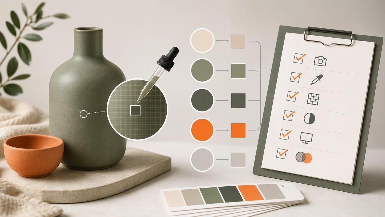
Product photography is one of the most useful sources of visual color inspiration. Whether you are building a product page, planning a social campaign, creating packaging mockups, or organizing a brand style guide, extracting colors from product photos can turn visual references into usable design information.
A HEX color finder helps you inspect pixels in an image and identify values such as HEX, RGB, HSL, and HSB. But choosing a color code is not simply a matter of tapping the most obvious area of a photo. Lighting, reflections, shadows, image compression, and camera processing can all change what appears on screen.
This checklist explains how to extract colors from product photos thoughtfully, with a concrete example and clear limitations. Use it to build palettes that are practical for digital design rather than relying on a single sampled pixel.
Why Extract Colors From Product Photos?
Product photos often contain more than the product itself. They include background colors, materials, accents, labels, props, shadows, and reflected light. Together, these elements can help define the visual direction of a campaign or design system.
For example, a photo of a sage-green ceramic bottle on a warm cream backdrop may suggest a palette with:
- A primary sage green for buttons or key graphic elements
- A light cream for page backgrounds
- A darker olive or charcoal for text and contrast
- A muted terracotta accent from the product label
The goal is not to copy every color in the photograph. Instead, identify the colors that support the intended design outcome. A product image can become a starting point for a landing page, email template, editorial layout, mood board, or presentation.
Before You Start: Know What a Photo Can and Cannot Tell You
A photo-based color picker reads the colors displayed in the image file. It does not reveal a product manufacturer’s official color specification, physical material formula, or paint match. A photographed navy fabric, for instance, can look lighter under daylight, more violet under indoor lighting, and nearly black in a deep shadow.
Use extracted values as digital reference points. They are particularly helpful for screen-based creative projects, but they should not be treated as a guarantee of physical paint, textile, packaging, or print color accuracy.
| Good use for extracted colors | Use caution when |
|---|---|
| Creating web UI accents | Ordering physical paint or finishes |
| Building a social media palette | Approving print production colors |
| Making a mood board | Matching fabric, wood, or ceramics in person |
| Preparing design handoff references | Assuming the photo shows the official product color |
Product Photo Color Extraction Checklist
Follow this workflow before committing extracted colors to a project. It is designed to reduce common sampling mistakes while keeping the process fast.
1. Start With the Best Available Image
Choose a high-resolution product photo with a clear subject. A large image gives you more pixels to inspect and makes it easier to avoid blurry edges, compression artifacts, and mixed-color areas.
Whenever possible, use the original campaign image or product asset rather than a screenshot from a social platform. Screenshots and heavily compressed images can shift color and introduce blocky artifacts that create misleading samples.
- Prefer well-lit images with visible detail.
- Avoid images with strong filters unless the filter is part of the intended visual direction.
- Use several photos if the product appears under different lighting conditions.
- Check that the image is not being viewed through a display setting such as Night Shift or a strong color filter.
2. Identify the Color You Actually Need
Before opening a HEX color finder, define the role of the color. Are you trying to capture the product’s main surface color, a supporting background tone, a label accent, or a dark neutral for typography?
This matters because the visually dominant color in a photo may not be the most useful design color. A glossy blue bottle may occupy most of an image, but a small coral label could be the stronger call-to-action accent for a campaign layout.
3. Sample Flat, Evenly Lit Areas
For the most representative result, sample a portion of the product that looks flat and evenly illuminated. Avoid the outer edge of an object, because edge pixels often blend the product color with the background. Also avoid bright highlights and deep shadows.
On a metallic, glossy, translucent, or textured object, there may be no single “true” image color. In that case, sample multiple areas and use the range of results to choose a balanced digital approximation.
4. Take Multiple Samples, Not One
A single pixel can be an outlier. Sample at least three to five locations across the same material or product surface. Compare the values and look for the middle ground.
Imagine extracting green from a matte skincare tube. You may find these samples:
#8E9E7A  /* lighter area */
#778963  /* center area */
#5F704D  /* shadowed area */
Rather than choosing the brightest or darkest sample automatically, #778963 is likely to be a more useful starting point because it sits near the visual middle. You can then create lighter and darker supporting shades for interface states or layout depth.
5. Inspect HEX and RGB Values for Digital Work
HEX and RGB are common formats for websites, apps, and digital graphics. A HEX value such as #778963 is concise and easy to copy into CSS, Figma, presentation tools, and many creative applications. RGB expresses the same screen color through red, green, and blue channels.
Keep a consistent naming convention as you collect colors. Clear names make palettes easier to use later:
Product Sage: #778963
Warm Background: #F1EBDD
Label Clay: #B86C51
Text Olive: #34402F
6. Use HSL or HSB to Understand Relationships
HEX values are efficient for implementation, but HSL and HSB can make palette decisions easier. These formats help you think in terms of hue, saturation, and lightness or brightness.
For example, if a sampled olive green feels too dull for a button, you might preserve its hue while increasing saturation slightly and adjusting brightness. This is often more controlled than selecting an unrelated green by eye.
- Hue describes the color family, such as green, blue, or red.
- Saturation describes intensity, from muted to vivid.
- Lightness/brightness describes how light or dark the color appears.
7. Build a Working Palette Around the Product Color
A product sample should usually be one part of a larger palette. A useful working palette often includes a primary color, one or two neutrals, a dark contrast color, and an accent. This gives you enough flexibility for hierarchy without making every element compete for attention.
For the sage bottle example, a balanced palette could look like this:
| Role | Sample HEX | Suggested use |
|---|---|---|
| Primary product tone | #778963 | Buttons, icons, headings |
| Light neutral | #F1EBDD | Backgrounds and cards |
| Dark neutral | #34402F | Text and strong contrast |
| Warm accent | #B86C51 | Badges, links, small highlights |
8. Check Contrast Before Using Colors in an Interface
A color can look beautiful in a photo and still fail as text or a button background. Check contrast between text and its background, especially for navigation, labels, form controls, and calls to action.
Do not assume white text will work on every product-derived color. A mid-value green, yellow, or orange may need darker text for clearer reading. Likewise, a dark neutral may provide better accessibility and visual stability than a saturated product color.
9. Document the Source and Context
Record where each color came from: product surface, label, backdrop, or prop. Include the image name and a brief note about lighting if relevant. This prevents confusion when collaborators ask why a particular color was chosen.
Practical rule: Save the source image with the palette, not just a list of codes. Context helps teams understand whether a color is a direct sample, a refined design choice, or a supporting neutral.
Common Mistakes When Using a HEX Color Finder
- Sampling reflections: A bright white glare on glossy packaging is a lighting artifact, not the package color.
- Picking edge pixels: Anti-aliasing mixes object and background colors around boundaries.
- Using every extracted color: A photo may contain dozens of colors, but most design systems need a smaller, intentional set.
- Ignoring image edits: Warm filters, retouching, and color grading can significantly affect samples.
- Treating screen values as physical specifications: Digital extraction is useful for visual reference, not guaranteed real-world matching.
A Faster Mobile Workflow for Creative Projects
When inspiration arrives during a client meeting, store visit, or photo shoot, a mobile color extraction workflow can be more convenient than waiting to return to a desktop workstation. Capture or import the photo, inspect several points, copy the needed codes, and save a compact palette for later refinement.
For iPhone and iPad users, Color Viewfinder’s guide to using a HEX color picker from a photo explains how to inspect image colors and work with HEX, RGB, HSL, and HSB values. Use the resulting codes as a reference set, then review contrast and project requirements before finalizing your design.
Final Checklist: Extracting Product Photo Colors With Confidence
- Choose a clear, high-quality product image.
- Define the role each extracted color should play.
- Sample flat, evenly lit areas instead of highlights, shadows, and edges.
- Collect multiple samples from the same surface.
- Save HEX values for implementation and inspect HSL or HSB for refinement.
- Build a small palette with neutrals and contrast colors.
- Check readability before using colors in interface elements.
- Keep the source image and notes with the final palette.
With this approach, extracting colors from product photos becomes more than a quick pixel-picking task. It becomes a repeatable process for translating visual references into organized, useful color palettes for graphic design, web design, interior mood boards, and other creative projects.
