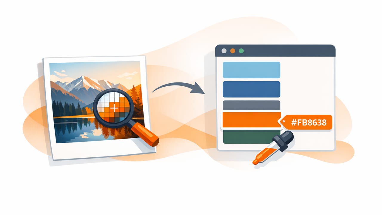
When you extract HEX color from photo, you’re doing more than “picking a nice shade.” You’re translating real-world color into a repeatable, shareable value you can use across web, print, and interiors. The challenge is that photos are messy: lighting changes, camera filters shift hues, shadows skew saturation, and compression can introduce artifacts. Without a method, you’ll end up with colors that look right on one screen but fall apart in the final design.
This guide walks through a practical, accuracy-first workflow for sampling colors from images, refining them into a usable palette, and applying them consistently across creative tools.
What HEX actually represents (and what it doesn’t)
HEX is a compact way to describe an RGB color (red, green, blue) in base-16 notation, commonly used in digital design and development. Example: #2F6FED. HEX is great for consistency in digital products, but it doesn’t automatically guarantee the same appearance everywhere because display calibration, color profiles, and ambient light affect perception.
| Format | Best for | Example | Notes |
|---|---|---|---|
| HEX | Web/UI specs | #2F6FED |
Compact; maps to RGB |
| RGB | Screen-based color | 47, 111, 237 |
Direct channel control |
| HSL | Human-friendly adjustments | 217°, 83%, 56% |
Easy to tweak lightness/saturation |
| HSB/HSV | Color picking workflows | 217°, 80%, 93% |
Common in design tools |
Why photo-based color sampling goes wrong
If you’ve ever sampled a “white wall” from a photo and got a weird gray-blue, the tool probably wasn’t wrong—the photo was. Here are the most common reasons extracted colors don’t match your intent:
- Lighting temperature: Warm bulbs push yellows/oranges; shade pushes blue.
- Auto white balance: The camera guesses “neutral,” often shifting the entire image.
- Shadows and highlights: Sampling from shadow yields darker, cooler values; highlights wash out saturation.
- Reflections: Glossy surfaces pick up surrounding colors.
- Compression and noise: JPEG artifacts create micro-variations—one pixel can differ from the next.
- Filters and HDR: Phone processing can increase contrast and saturation, distorting true color.
Accurate color picking is less about finding “the” pixel and more about finding a representative sample under consistent conditions.
Step-by-step: how to extract HEX color from photo (accurately)
Use this workflow whether you’re building a brand palette, matching a paint color vibe, or pulling UI colors from a mood image.
1) Choose the right source image
Start with the best input you can. If you’re capturing the photo yourself:
- Prefer natural, even lighting (near a window, indirect daylight).
- Avoid mixed lighting (daylight + warm lamps).
- Disable heavy filters; avoid “vivid” modes when accuracy matters.
- Capture multiple angles so you can compare samples.
If it’s an image from the web, choose a high-resolution version and avoid screenshots when possible (screenshots often include color shifts from the display).
2) Identify “sampling zones,” not single pixels
Instead of clicking one spot and trusting it, treat the surface as a zone:
- Midtones: Best for “true” object color (avoid extreme shadow/highlight).
- Edge areas: Often contaminated by background colors (avoid where colors blend).
- Textured surfaces: Sample multiple nearby points and average mentally (or pick the most representative).
3) Take 5–7 samples per key color
This is the fastest way to reduce error. For each intended color (say, “sage green” from a chair), sample multiple points and look for a cluster of similar values. If the HEX values vary wildly, lighting is dominating the photo and you may need a different area (or a different photo).
4) Convert the photo colors into a palette with roles
A usable palette is not just a bunch of pretty swatches. Assign roles so you can apply them consistently:
- Primary: the anchor color (brand/UI accent or dominant interior tone)
- Secondary: supportive accent (buttons, trim, textiles)
- Neutral base: background (off-white, warm gray, charcoal)
- Contrast color: a dark or bright option for emphasis and readability
- Highlight: small pops (icons, links, decor details)
5) Refine using HSL/HSB (not guesswork)
HEX is precise, but it’s not easy to “tune.” Once you’ve extracted values, switch to HSL/HSB adjustments:
- Increase lightness for backgrounds and large surfaces.
- Reduce saturation for neutrals and broad UI areas.
- Nudge hue slightly if lighting pushed the photo too warm/cool.
A practical trick: keep hue mostly stable, adjust saturation and lightness first. That preserves the character of the color while making it more usable.
Quality checks: make the palette functional (not just attractive)
Check contrast for readability
If your palette is for web/UI, contrast matters. A beautiful extracted color can fail accessibility when used for text. At minimum, test:
- Primary text on your background
- Button text on button fill
- Links on background and on hover states
As a rule of thumb, aim for strong contrast for body text, and don’t rely solely on color to communicate state (add underline, icons, patterns, or labels).
Test the palette in context
Colors behave differently when adjacent. Before committing, drop your palette into a simple mock:
- A basic landing page section (headline, paragraph, button, card)
- A social post template
- A room “board” with wall + floor + textiles
You’re looking for balance: not too many competing saturated colors, enough neutrals, and at least one reliable dark tone.
Practical examples: turning extracted HEX into design assets
Example: CSS variables for a photo-derived palette
Once you’ve extracted and refined your values, store them as design tokens. Here’s a simple pattern:
:root {
  --color-bg: #F6F2EA;
  --color-surface: #FFFFFF;
  --color-text: #1E1E1E;
  --color-muted: #6B6B6B;
  --color-primary: #2F6FED;
  --color-accent: #F05A28;
  --color-border: #E6E0D6;
}

body {
  background: var(--color-bg);
  color: var(--color-text);
}

.button {
  background: var(--color-primary);
  color: #FFFFFF;
}
Example: a quick interior “role map”
If you’re extracting from a room photo, a role map keeps choices coherent:
- Wall/base: light, low-saturation neutral
- Large furniture: midtone (more forgiving for wear and scale)
- Trim/metal: dark neutral or warm metallic tone
- Textiles/art: 1–2 accent colors for rhythm
Even when the original photo is vibrant, the “real” palette you apply often needs more neutrals than you think.
Troubleshooting: common issues when you extract HEX from photos
“My samples are all different—what’s the real color?”
Pick a midtone zone, avoid highlights/shadows, and sample multiple points. If values still vary widely, the surface may be reflective or the image is heavily processed. Find another reference image or use a flatter-lit shot.
“The color looks right on my phone but wrong on my laptop.”
This is often display calibration and brightness. Reduce your screen brightness to a consistent level and compare on at least two devices. For professional work, consider a calibrated monitor.
“I extracted a neutral, but it looks pink/green when applied.”
Neutrals are extremely sensitive to surrounding colors. Slightly reduce saturation and adjust hue by a degree or two. Also check what it’s next to—your “neutral” may be picking up contrast effects from a strong adjacent color.
“The palette feels muddy.”
Photo palettes often have too many similar midtones. Add structure by:
- Including a clear dark anchor (for text/contrast)
- Adding a clean light background
- Limiting saturated accents to 1–2 key colors
Best practices for repeatable photo-to-HEX workflows
- Name your colors by role and intent (e.g., “Primary 600,” “Surface warm,” “Text strong”).
- Save the source image alongside your palette for traceability.
- Keep variants: create light/dark or 100–900 ramps if you’re building a UI system.
- Export consistently: HEX list for developers, swatches for design tools, and a simple PDF/PNG for sharing.
Conclusion
To extract HEX color from photo in a way that holds up in real projects, focus on repeatability: start with a good image, sample zones (not single pixels), collect multiple readings, refine with HSL/HSB, and validate contrast in context. The goal isn’t to capture a photo’s exact pixel values—it’s to build a palette that behaves consistently across screens, materials, and layouts.
If you prefer doing this on iPhone or iPad, an app like Color Viewfinder can help you sample colors quickly and view HEX/RGB/HSL values while you build and export a palette.
