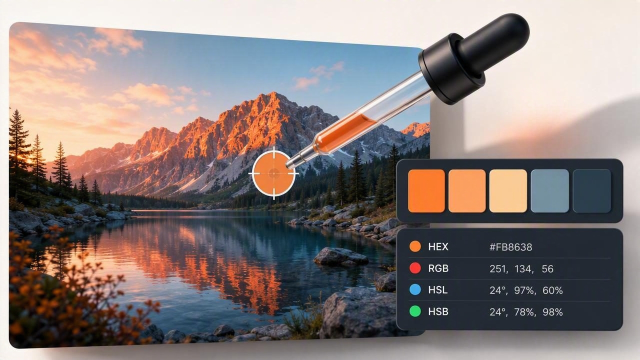
An eyedropper app turns a photo, screenshot, or saved inspiration image into a practical source of color data. Instead of estimating a shade by eye, you can tap a pixel and identify its precise HEX, RGB, HSL, or HSB value. This simple process is useful for graphic design, branding, web design, decorating, illustration, and nearly any creative project where visual consistency matters.
Color sampling may sound technical, but it is one of the fastest ways to make better color decisions. A photo of a coastal landscape can become a calm blue-and-sand palette. A picture of a fabric swatch can provide a starting point for a room scheme. A screenshot of a website can reveal the accent color behind a button or heading. The key is knowing how to sample colors accurately and how to turn raw values into a usable palette.
What Is an Eyedropper App?
An eyedropper app is a mobile or desktop design tool that lets you select a point in an image and read the color at that location. The tool works much like a digital pipette: it captures the color information from one pixel, or sometimes an averaged group of nearby pixels, and displays the result in common color formats.
Most useful color extraction tools can show several values at once:
- HEX: A six-character code used widely in web design, such as
#2F6F8F. - RGB: Red, green, and blue channel values, typically from 0 to 255.
- HSL: Hue, saturation, and lightness, which can make color adjustments easier to understand.
- HSB/HSV: Hue, saturation, and brightness/value, often preferred in visual design software.
While an eyedropper can identify a single color, the best workflow goes further. It helps you collect multiple samples, compare them, organize them into color palettes, and export the final choices for use in other tools.
Why Accurate Color Sampling Matters
Small color differences can have a large visual effect. A blue-gray that looks neutral in a photo may become noticeably green when placed next to a warm cream. A brand color copied from a compressed screenshot may be slightly duller than the original. Sampling exact values reduces guesswork and gives teams a consistent reference point.
Accurate color extraction is especially valuable when you need to:
- Match a digital layout to an existing logo or brand asset.
- Create a palette from a photograph, painting, product image, or mood board.
- Record paint, textile, furniture, or material inspiration for an interior design project.
- Build coordinated social media graphics from a campaign image.
- Communicate precise colors to developers, clients, printers, or collaborators.
Important: A sampled screen color is a reliable digital reference, not a guarantee of how ink, paint, fabric, or a physical material will appear under every lighting condition.
How to Use an Eyedropper App Step by Step
The basic process is straightforward, but a deliberate method produces cleaner, more useful results.
- Choose a high-quality image. Start with the clearest source available. High-resolution photos preserve more color detail and reduce the risk of sampling blocky compression artifacts.
- Open or import the image. Use a photo from your library, a screenshot, a camera image, or an inspiration board.
- Zoom into the target area. Zooming is essential when sampling thin lines, small objects, lettering, or subtle gradients. It helps you avoid selecting a neighboring pixel by accident.
- Tap with the eyedropper. Place the picker on the area you want to inspect. Read the resulting HEX, RGB, HSL, or HSB values.
- Take several nearby samples. Natural surfaces, shadows, and textured materials rarely contain one perfectly uniform color. Sampling more than one point reveals the range.
- Save intentional selections. Keep the colors that support your project, rather than saving every interesting pixel you find.
- Name and export the palette. Label colors by role, such as “primary blue,” “wall neutral,” or “button accent,” then export in a format your workflow supports.
How to Avoid Common Color Sampling Errors
An eyedropper app is precise, but the image itself may be misleading. Before treating a sampled value as final, consider the conditions under which the image was created.
Watch for shadows and highlights
A photograph of a yellow chair may include bright yellow, muted mustard, and dark olive-looking shadows. If you want the material’s representative color, sample a well-lit middle area rather than its brightest highlight or deepest shadow. For a palette inspired by the whole image, however, those variations may be useful as supporting shades.
Account for image compression
Images downloaded from social platforms are often compressed. Compression can create faint blocks, banding, and altered color values, particularly in smooth gradients. When possible, use the original image file, a high-resolution export, or a well-lit photograph taken directly from the subject.
Do not sample anti-aliased edges
Text, icons, and curved shapes often have softened pixels around their edges. These anti-aliased pixels blend the foreground and background colors together. To capture the intended color, sample from the center of a solid area rather than the edge.
Consider display and lighting differences
A phone display, laptop screen, printed proof, and painted wall do not reproduce color in the same way. Digital values are excellent for screen-based creative projects, but physical color matching should include real-world swatches and viewing under the lighting where the final material will live.
Understanding the Color Values You Collect
| Format | Example | Best Use |
|---|---|---|
| HEX | #C97854 | Web design, CSS, quick sharing |
| RGB | 201, 120, 84 | Digital graphics and screen-based assets |
| HSL | 18°, 52%, 56% | Adjusting lightness and saturation systematically |
| HSB | 18°, 58%, 79% | Visual editing and selecting brighter or softer variants |
Each format describes the same underlying color from a different perspective. HEX and RGB are practical when you need exact digital implementation. HSL and HSB are often more intuitive when refining a palette because they separate hue from intensity and lightness or brightness.
For example, if a sampled terracotta feels too intense for a background, you can retain its hue while lowering saturation or increasing lightness. This creates a related shade instead of introducing an unrelated color.
/* Sample palette translated into CSS variables */
:root {
  --terracotta: #C97854;
  --sand: #E9D8BE;
  --slate-blue: #385A6C;
  --charcoal: #263238;
}
From Individual Samples to a Functional Color Palette
Collecting colors is only the first stage. A functional palette assigns jobs to colors so a design feels organized rather than random. Aim for a mix of light, medium, and dark values, plus one or two accents with a clear purpose.
A simple five-color palette can include:
- Primary color: The dominant brand or mood-setting shade.
- Secondary color: A supporting color that adds variety.
- Light neutral: Useful for backgrounds, negative space, or large surfaces.
- Dark neutral: Useful for text, outlines, contrast, and grounding a composition.
- Accent: A high-impact color for calls to action, details, or focal points.
When extracting from a photo, avoid choosing five nearly identical mid-tone colors. Instead, look for contrast across the image: a dark shadow, a light highlight, a muted base, a dominant color, and a small vivid detail. This creates a palette with more flexibility for graphic design and interior design applications.
Using an Eyedropper App for Different Creative Projects
Graphic and web design
Sample colors from a logo, campaign photograph, or product image to establish a consistent visual system. Use the darkest palette color for readable text and test lighter colors as backgrounds. If an accent color is used for buttons or links, verify that its contrast against the background is sufficient for comfortable reading.
Interior design and decorating
Capture colors from flooring, a rug, tile, artwork, or an existing sofa before shopping for complementary materials. Build a palette that includes both the exact sampled color and nearby alternatives. Because photographs are influenced by lighting, compare your digital palette against physical samples before making a final purchase.
Illustration, photography, and social content
Creative professionals can use photo-derived palettes to maintain a consistent atmosphere across multiple assets. A sunset photo, for example, may suggest a warm gradient of peach, coral, dusty rose, violet, and deep navy. Sampling those colors gives you a repeatable visual language without copying the photograph itself.
Best Practices for Organizing Exported Palettes
A saved palette becomes more valuable when it is easy to find and understand later. Give every palette a descriptive name based on the project, location, client, or mood. Add notes about where the source image came from and whether the colors are final, exploratory, or approved.
Before exporting, check these details:
- Are the color values in the format required by your next tool?
- Have colors been named by function rather than only by appearance?
- Do your chosen colors include enough light-dark contrast?
- Have you removed duplicates and accidental samples?
- For print or physical work, have you marked digital values as references rather than final production specifications?
Make Color Sampling Part of Your Design Process
An eyedropper app is more than a way to identify a color code. It is a fast bridge between visual inspiration and structured creative decisions. By sampling carefully, checking image quality, collecting a range of tones, and assigning each selected color a role, you can produce palettes that are both accurate and practical.
For designers who want to capture colors on the go, organize custom palettes, and view multiple color formats from photos, Color Viewfinder offers a focused mobile workflow for color extraction and palette building.
