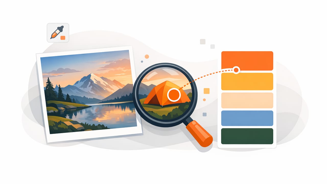
When you find color from photo, you’re doing more than grabbing a pretty swatch—you’re translating a real-world (or camera-captured) impression into reusable, consistent color values. That’s useful for graphic design, interior design, product mockups, social content, brand guides, and any creative project where you want to match what you saw.
The challenge: photos lie. Lighting, camera processing, shadows, reflections, white balance, and compression can all shift colors. This guide explains how to sample colors more accurately, validate what you picked, and turn your picks into palettes that hold up across apps and outputs.
Why colors from photos can be “wrong” (and how to plan for it)
Before you sample, it helps to know what can distort color in a photo:
- White balance shifts: Warm indoor bulbs, cool daylight, and auto-white-balance can push neutrals toward yellow/blue.
- Exposure and HDR: Brightness changes alter perceived saturation; HDR can brighten shadows and change contrast.
- Specular highlights: Shiny surfaces contain blown-out “white” reflections that are not the base color.
- Shadows and color cast: A colored wall nearby can bounce tint into the subject.
- Compression and filters: Social platforms and camera apps may apply tone mapping, sharpening, and color boosts.
The goal is rarely “perfect truth.” It’s consistent, usable values that match your intent. That might mean sampling from midtones instead of highlights, or adjusting saturation after you pick.
Best practices to find color from photo accurately
1) Use the highest-quality image you can
Whenever possible, sample from:
- Original photos (not screenshots or re-saved images)
- RAW or HEIF sources rather than heavily compressed JPGs
- Unfiltered images (avoid Instagram-style filters when the goal is matching)
If you only have a compressed image, you can still extract a useful palette—just expect more variance in smooth gradients and dark tones.
2) Zoom in and sample “representative” pixels
To find color from photo reliably, don’t sample the brightest highlight or darkest shadow unless that’s the color you want. Instead:
- Zoom in until individual pixels (or a small area) are visible.
- Sample from a midtone area that looks even and free of glare.
- If the surface is textured (fabric, wood, paint), sample multiple nearby points and compare.
Many “mystery mismatches” come from accidentally sampling a reflection or a shadow edge.
3) Take multiple samples and average mentally
A practical approach is to grab 5–10 candidate swatches from the same object/area, then pick the one that best represents the material under neutral light. If the values vary widely, that’s a sign the surface is affected by lighting or reflection—and you may want to correct white balance or pick from a different photo.
4) Watch for camera sharpening and color noise
In low light, phones introduce color noise, which can produce weird pixel values (especially in shadows). If your swatch looks “muddy” or oddly saturated:
- Try sampling a brighter part of the same area.
- Use a second photo taken in better light.
- Prefer images shot at lower ISO / brighter conditions when possible.
5) Correct the image first (when accuracy matters)
For brand work, print matching, or interior paint coordination, consider quick corrections before extracting colors:
- Neutralize white balance using a known neutral (white paper, gray object, or a “neutral” part of the scene).
- Reduce extreme contrast so midtones are easier to sample.
- Avoid heavy saturation boosts that create unrealistic values.
This doesn’t need to be complicated—small adjustments often make sampling more dependable.
Understanding the values you’ll extract (HEX, RGB, HSL, HSB)
When you pull color from an image, you typically get several formats. Each helps with a different task.
| Format | Best for | What to watch for |
|---|---|---|
| HEX (e.g., #2F6DAA) | Web design, UI specs, handoff | HEX is compact but not intuitive for edits |
| RGB (47, 109, 170) | Screen-based workflows, digital tools | Changes can be hard to “predict” visually |
| HSL (Hue/Sat/Light) | Making systematic variants (tints/shades) | Very useful for palette building and contrast tweaks |
| HSB/HSV (Hue/Sat/Brightness) | Creative adjustments and quick exploration | Brightness isn’t the same as perceived luminance |
If your aim is a coherent palette, HSL/HSB are often easier to refine after you find color from photo, because you can adjust lightness/brightness without “breaking” hue relationships.
A step-by-step workflow: from photo to usable palette
Step 1: Decide what the palette needs to do
Ask a simple question: Where will these colors be used?
- UI / web: You’ll need neutrals, accessible text/background pairs, and consistent hover/active states.
- Brand: You’ll want primary, secondary, and accent colors plus clear rules for usage.
- Interior decor: You’ll want a dominant, secondary, and trim/accent approach—plus material context.
This determines how many colors you should extract and how you should edit them.
Step 2: Extract a wide set first, then curate
Start broad: pull 8–15 candidates from the image (dominant colors, accents, neutrals). Then narrow down to a purposeful set, such as:
- 1–2 dominant colors
- 2–3 supporting colors
- 1–2 accent colors
- 2–3 neutrals (light, mid, dark)
Tip: A good palette usually includes at least one “boring” neutral. Without it, everything competes.
Step 3: Normalize lightness and saturation
Photos often contain overly dark versions of colors due to shadows. For a practical palette, create a “design-normalized” version of key colors:
- Increase lightness slightly for colors sampled in shadow.
- Reduce saturation for colors sampled from small, highly saturated pixels (like neon signage or screen elements).
- Keep hue stable unless the lighting clearly shifted it.
Step 4: Check contrast (especially for UI)
If you’re using extracted colors for text, buttons, or overlays, test contrast early. Even if you don’t run full accessibility tooling, do a basic check by pairing:
- dark text on the lightest neutral
- light text on the darkest neutral
- accent color as a button with readable label text
If contrast is weak, adjust lightness first (not saturation), then re-check.
Step 5: Create consistent naming and export-ready formats
Once you’ve curated the palette, name colors by function, not by vague descriptions. For example:
- Primary / Primary Dark / Primary Light
- Surface / Surface Alt / Background
- Text / Text Muted / Border
- Accent / Accent Soft
This makes palettes reusable across projects and easier to hand off to collaborators.
Practical example: turn extracted swatches into CSS variables
After you find color from photo and choose a final set, you can store it in a format that’s easy to reuse. Here’s a simple CSS variables block you can adapt:
:root {
  --color-primary: #2F6DAA;
  --color-primary-dark: #245582;
  --color-accent: #E7A93C;

  --color-bg: #F6F4EF;
  --color-surface: #FFFFFF;
  --color-border: #D8D2C7;

  --color-text: #1E1E1E;
  --color-text-muted: #5A5A5A;
}

.button {
  background: var(--color-primary);
  color: var(--color-surface);
}

.badge {
  background: var(--color-accent);
  color: var(--color-text);
}
If you maintain multiple palettes, you can store each under a class (e.g., .theme-ocean, .theme-sand) and swap themes without rewriting component styles.
Troubleshooting: common issues when you find color from photo
“My extracted color looks dull compared to the photo”
Often the photo’s vibrancy comes from contrast, surrounding colors, and local saturation—not one single pixel value. Try building a palette that includes:
- a slightly more saturated accent
- a deeper dark neutral for contrast
- a warmer or cooler off-white background (instead of pure white)
“I sampled the wall paint, but it doesn’t match in real life”
Paint matching is sensitive to lighting and camera processing. Improve reliability by sampling from:
- areas with minimal glare
- midtones (not corners/shadows)
- a photo taken in neutral daylight
Also remember that a phone photo is not a calibrated color measurement device. Use extracted values as a starting point, then compare physical swatches in the actual room lighting.
“The palette is chaotic—too many competing colors”
Reduce to roles: choose one dominant hue family, keep accents limited, and lean on neutrals. A quick fix is to keep only:
- 1 dominant color
- 1 accent color
- 3 neutrals (light/mid/dark)
Checklist: a reliable photo-to-palette process
- Start with the highest-quality, least-filtered image.
- Zoom in and avoid highlights, glare, and deep shadows.
- Sample multiple points and compare.
- Curate: dominant, supporting, accent, and neutrals.
- Adjust lightness/saturation for usability.
- Check contrast for text and UI states.
- Name by function and export in formats you’ll actually use.
Choosing a tool to extract color on mobile
To find color from photo efficiently on iPhone or iPad, look for tools that can sample precisely (with zoom), show multiple color models (HEX/RGB/HSL/HSB), and help you organize picks into palettes you can export. If you already work on iOS, a dedicated palette extractor like Color Viewfinder can streamline the capture-to-palette step without interrupting your creative flow.
