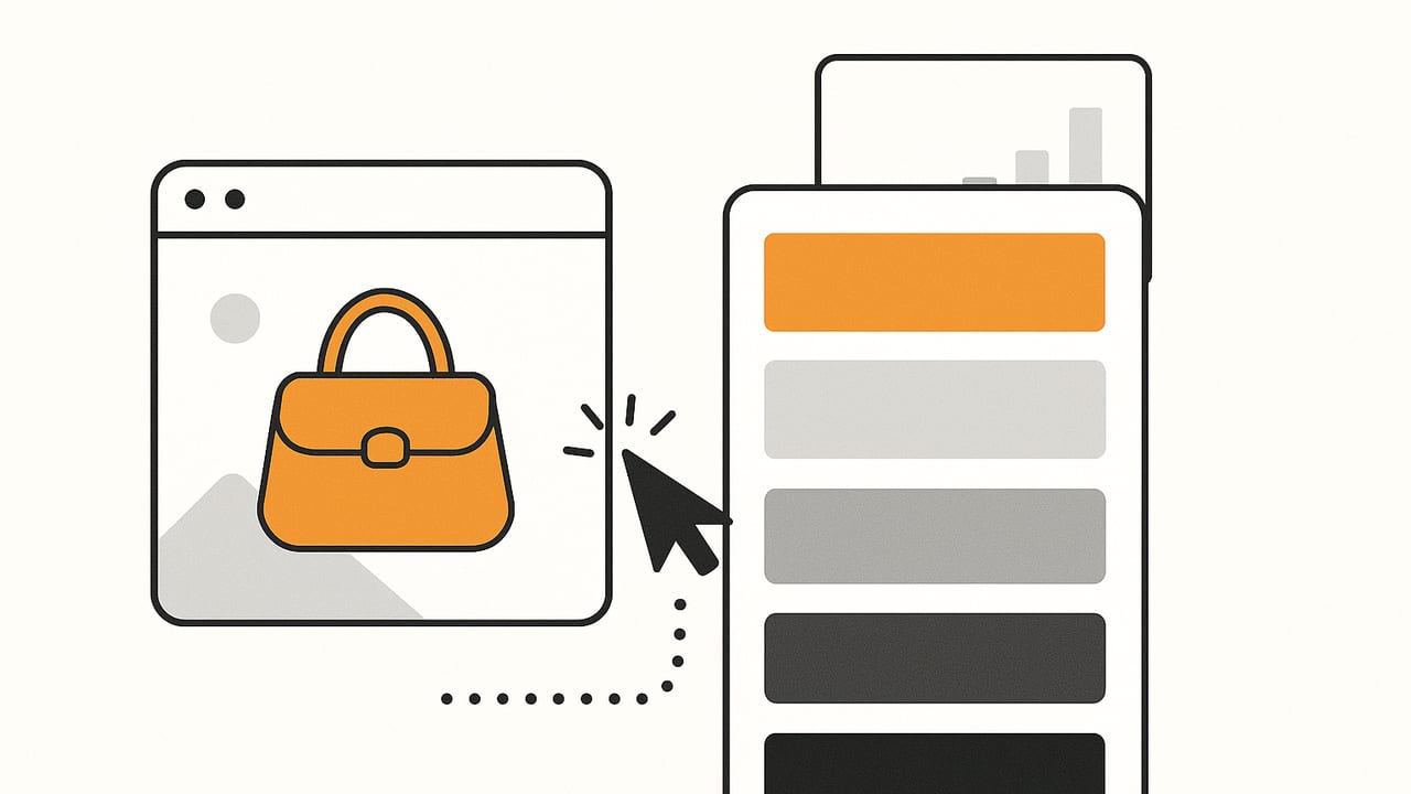
If your products already embody the essence of your brand, your palette is hiding in plain sight. Learning how to generate a brand palette from product images transforms real-world materials—bottles, textiles, packaging, screens—into a scalable color system for marketing, UI, and print. This guide walks through a professional workflow: preparing photos for color fidelity, extracting and classifying hues, validating accessibility, and exporting your palette to the tools your team uses daily.
Core Principles Before You Start
Before you extract a single pixel, align on the principles that make a photo-derived palette practical and consistent across channels.
- Color fidelity beats speed: A fast extraction from a poorly lit image yields the wrong palette. Good lighting and white balance come first.
- Work in the right color space: RGB is fine for extraction, but clustering benefits from a perceptual space like CIELAB to avoid bias toward saturated hues.
- Represent all key materials: Photograph every finish that matters—primary surface, secondary surfaces, labels, metals, fabrics, and neutrals (paper, plastics, foam).
- Reduce to roles, not just swatches: A brand palette should map to roles (Primary, Accent, Neutral, Support) that guide usage in UI, print, and packaging.
- Accessibility is part of the palette: Check contrast ratios early; adjust lightness or add neutrals rather than compromising legibility later.
Step-by-Step: From Product Photos to Brand Colors
1) Prepare and standardize your images
- Lighting: Shoot in soft, even light (light tent or diffused daylight). Avoid mixed color temperatures.
- White balance: Include a gray card in one frame; use it to set white balance and apply the same correction to all images.
- Format & size: Use high-resolution images, then downscale to ~1200–1600px on the long edge for extraction to balance speed and detail.
- Background: Neutral, matte background reduces glare and color contamination.
2) Extract candidate colors
You can use automatic clustering or manual sampling. A hybrid approach often works best.
- Automatic: quantize colors (e.g., k-means) to find dominant hues across the image set.
- Manual: sample known brand-critical areas (e.g., the bottle body, cap, label type) using eyedropper tools.
3) Cluster and reduce in a perceptual space
After gathering candidates, cluster in CIELAB or OKLAB to merge near-duplicates while preserving perceptual distances. Aim for 6–12 core swatches, then expand with tints/shades if needed.
4) Assign roles and names
- Primary: The hero hue from the product (e.g., bottle body, flagship fabric).
- Secondary/Support: Materials that frequently appear (caps, trims).
- Accents: Sparingly used high-contrast hues for CTAs or highlights.
- Neutrals: Backgrounds, surfaces, and text colors.
Name colors for clarity and governance (e.g., “Sage 600,” “Copper 500,” “Cloud 050”). Consistent naming helps developers and designers align.
5) Validate contrast and adjust
Test typical text-on-background pairs. If contrast fails WCAG guidance, adjust L (lightness) within your perceptual space or introduce complementary neutrals.
Quick Start Code: Extract and Cluster Colors in the Browser
The snippet below demonstrates a simple k-means approach in JavaScript using a canvas to sample pixels. It’s intentionally compact; for production, prefer robust quantization libraries and LAB conversion.
// Minimal color extraction with k-means (RGB space for brevity)
// 1) Draw image to canvas, 2) sample pixels, 3) cluster, 4) return hex
async function extractPaletteFromImage(imgEl, k = 8, samples = 5000) {
  const canvas = document.createElement('canvas');
  const ctx = canvas.getContext('2d');
  const w = canvas.width = imgEl.naturalWidth;
  const h = canvas.height = imgEl.naturalHeight;
  ctx.drawImage(imgEl, 0, 0, w, h);
  const data = ctx.getImageData(0, 0, w, h).data;
  // Random sample pixels for speed
  const px = [];
  for (let i = 0; i < samples; i++) {
    const idx = (Math.floor(Math.random() * w * h)) * 4;
    const r = data[idx], g = data[idx + 1], b = data[idx + 2], a = data[idx + 3];
    if (a < 200) continue; // ignore transparent/edge pixels
    px.push([r, g, b]);
  }
  // Init centroids
  const centroids = [];
  for (let i = 0; i < k; i++) {
    centroids.push(px[Math.floor(Math.random() * px.length)].slice());
  }
  // K-means iterations
  for (let iter = 0; iter < 12; iter++) {
    const groups = Array.from({length: k}, () => []);
    for (const p of px) {
      let best = 0, bestD = Infinity;
      for (let c = 0; c < k; c++) {
        const d = dist2(p, centroids[c]);
        if (d < bestD) { bestD = d; best = c; }
      }
      groups[best].push(p);
    }
    for (let c = 0; c < k; c++) {
      if (groups[c].length === 0) continue;
      const mean = [0,0,0];
      for (const g of groups[c]) { mean[0]+=g[0]; mean[1]+=g[1]; mean[2]+=g[2]; }
      centroids[c] = mean.map(m => Math.round(m / groups[c].length));
    }
  }
  return centroids.map(rgbToHex);
}
function dist2(a,b){const dr=a[0]-b[0],dg=a[1]-b[1],db=a[2]-b[2];return dr*dr+dg*dg+db*db;}
function rgbToHex([r,g,b]) {
  const h = (n) => n.toString(16).padStart(2,'0');
  return '#' + h(r) + h(g) + h(b);
}
// Usage:
// const img = document.querySelector('img.product');
// extractPaletteFromImage(img, 8).then(console.log);
Note: For higher fidelity, convert RGB to LAB before clustering, then convert back to RGB for output. This reduces the bias toward saturated colors.
Recommended Palette Sizes and Roles
| Team/Use Case | Core Palette | Roles | Notes |
|---|---|---|---|
| Startup landing + socials | 6 colors | 1 Primary, 1 Accent, 2 Neutrals, 2 Support | Keep usage rules simple; prioritize contrast. |
| Retail + packaging + web | 8–10 colors | 1–2 Primary, 1–2 Accent, 3 Neutrals, 2–3 Support | Include a warm and cool neutral for print/web. |
| Enterprise design system | 10–14 colors | Primary scale, Accent scale, Neutrals scale | Add tints/shades for states and data viz. |
Handling Lighting, Reflections, and Variability
- Control reflections: Polarizing filters and matte backgrounds reduce hotspots that skew sampling.
- Shoot multiple angles: Curved or textured surfaces produce micro-variations; averaging across angles yields truer base hues.
- Derive substrate neutrals: Paper labels, recycled cardboard, and natural fabrics often provide your best background neutrals. Sample them separately.
- Normalize exposure: Consistent exposure across your set avoids clustering shadows as false “colors.”
Accessibility: Check Contrast Early
Follow WCAG guidance for contrast:
- Normal text: 4.5:1
- Large text (≥18pt or 14pt bold): 3:1
- UI components and graphics: 3:1 (recommended)
Use a quick function to calculate contrast between two hex colors:
// WCAG contrast ratio calculation (sRGB)
function contrastRatio(hex1, hex2){
  const L = (hex) => {
    const [r,g,b] = [1,3,5].map(i => parseInt(hex.slice(i,i+2),16)/255)
      .map(u => u <= 0.03928 ? u/12.92 : Math.pow((u+0.055)/1.055, 2.4));
    return 0.2126*r + 0.7152*g + 0.0722*b;
  };
  const L1 = L(hex1), L2 = L(hex2);
  const [hi, lo] = L1 >= L2 ? [L1, L2] : [L2, L1];
  return (hi + 0.05) / (lo + 0.05);
}
// Example: contrastRatio('#1F3A2E', '#FFFFFF') // >= 7 is excellent
If a key text pair fails, adjust only the lightness (L) of your neutral or primary in small increments until it passes, or define a dedicated “text on primary” color token.
Export and Handoff: Make It Useful, Not Just Pretty
- Design tokens (JSON): Store names, roles, and hex (plus RGB/HSL) for automation.
- CSS variables: Ship primary tokens to web quickly.
- Swatch files: Export ASE/ACO for Adobe, .clr for macOS, and palette files or plugins for Figma/Sketch.
- Prototyping: Provide tints (e.g., 50–900 scale) for UI states and data visualization.
Example CSS variables for a product-driven palette:
:root {
  /* Roles */
  --color-primary-600: #1F3A2E; /* Bottle body */
  --color-accent-500:  #C46B2A; /* Copper cap */
  --color-neutral-000: #FFFFFF; /* Label white */
  --color-neutral-800: #202322; /* Text dark */
  --color-support-400: #8AA28F; /* Light sage */
}
.button-primary {
  background: var(--color-primary-600);
  color: var(--color-neutral-000);
}
.button-primary:hover {
  background: #1A3228; /* darker step or computed shade */
}
Governance tips:
- Versioning: Tag releases (e.g., palette v1.2) and log rationale for changes.
- Do/Don’t usage examples: Document accessible combinations (what’s allowed for text on Primary, etc.).
- File naming: Include palette name and version in exports (brand-palette-v1-2.ase).
Common Pitfalls (and What to Do Instead)
- Overfitting to one photo: Use a small set of representative images; average across them.
- Ignoring materials: Metallics and gloss can shift dramatically—sample the base pigment area rather than specular highlights.
- Too many colors: Limit the core set and use tints/shades to expand; otherwise usage becomes inconsistent.
- Skipping neutrals: Without neutral anchors, your hero hue has nowhere to “rest”; include light and dark neutrals.
- Forgetting print: If you print, map key colors to Pantone or specify CMYK equivalents and proof with your vendor.
Mini Case Study: Skincare Bottle to Brand System
Imagine a skincare line with a matte sage bottle, copper cap, and off-white label with charcoal text. We generate a brand palette from product images shot in a light tent with a gray card.
| Role | Sampled Area | HEX | HSL | Notes |
|---|---|---|---|---|
| Primary 600 “Sage” | Bottle body (mid-tone) | #1F3A2E | H:153 S:29% L:17% | Hero background, large blocks |
| Support 400 “Light Sage” | Bottle body (lit side) | #8AA28F | H:131 S:15% L:60% | Secondary surfaces, cards |
| Accent 500 “Copper” | Cap (non-glare region) | #C46B2A | H:26 S:65% L:46% | CTAs, highlights, icons |
| Neutral 000 “Cloud” | Label paper | #FFFFFF | H:0 S:0% L:100% | Body text on dark, backgrounds |
| Neutral 800 “Charcoal” | Label text | #202322 | H:160 S:5% L:13% | Primary text on light |
Contrast checks:
- Charcoal (#202322) on Cloud (#FFFFFF): ~15:1 (passes easily)
- Cloud (#FFFFFF) on Sage (#1F3A2E): ~12:1 (passes easily)
- Copper (#C46B2A) on Cloud (#FFFFFF): ~3.2:1 (okay for large text/UI, not small text)
Decision: keep Copper as an accent for buttons with white text at large sizes; use Sage or Charcoal for small text to maintain readability.
Advanced Tips for Robust Palettes
- Cluster by material class: Segment pixels by texture/reflectance to avoid mixing highlights into your base color cluster.
- Scale with tints and shades: Generate steps (50–900) programmatically in LAB, clamping chroma to keep brand character.
- Use deltas to keep identity: Track ΔE between versions; if your Primary shifts > 3 ΔE from last release, review with brand stakeholders.
- Create data viz variants: Derive a categorical set that harmonizes with the brand but increases separation for charts (ensure colorblind-safe alternatives).
Tooling Options
- Desktop: Photoshop/Illustrator eyedroppers, Adobe Color for quick extraction, and plugins for LAB-based clustering.
- Code: Node or Python with color libraries (e.g., colormath, scikit-learn, culori/oklab) for automated pipelines and token generation.
- Mobile: On iOS, an app like Color Viewfinder can extract HEX/RGB/HSL/HSB from photos, help you curate a palette, and export in several formats.
Bringing It All Together
To reliably generate a brand palette from product images, approach it like any design system task: standardize inputs (lighting and white balance), extract broadly, reduce perceptually, assign clear roles, validate accessibility, and export as tokens your team can actually use. Your products already carry your brand story—this workflow simply translates that story into color decisions your designers, developers, and printers can execute with confidence.
