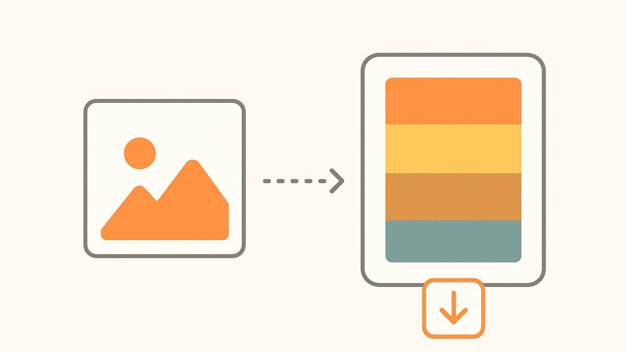
Whether you’re designing a brand system, styling a UI, or matching paint and fabrics, the ability to generate color palette from image is invaluable. Done well, it transforms the mood of a photo into a repeatable, accessible palette you can apply across print and digital. Done poorly, it yields dull, inconsistent swatches that don’t match what you saw on screen. This guide walks you through accurate methods, practical workflows, and small but critical details that elevate palette quality.
What it Really Means to Generate a Palette from an Image
Converting pixels into a compact set of representative colors is both an art and a science. The goal isn’t simply to find “most frequent” colors but to extract hues that express the image’s intent while remaining usable: perceptually distinct, contrast-safe, and exportable as HEX, RGB, HSL, or HSB.
- Branding: Preserve hero hues (e.g., signature blues), add neutrals for text/background, ensure contrast for legibility.
- UI/UX: Derive a primary, secondary, surface, and accent set, plus states (hover, pressed) with predictable deltas.
- Interior/Decor: Extract anchor colors, secondary harmonies, and soft neutrals that reflect real-world lighting.
Before You Start: Accuracy Foundations
Color extraction quality depends on input quality and color management. A few preparatory steps can dramatically improve results.
- Use high-quality images. Avoid noisy, aggressively compressed sources. If needed, downscale moderately to reduce noise while keeping edges intact.
- Normalize lighting. Apply white balance correction to remove dominant color casts (e.g., tungsten orange). Consider exposure correction to recover midtones.
- Work in the right color space. Most images are sRGB. For perceptual clustering, convert sRGB to CIELAB or OKLAB before measuring distances.
- Mask distractions. Crop or mask sky, logos, or irrelevant regions that would skew the palette.
"Downscale first, then sample—you’ll reduce noise without losing the story of the image."
Core Algorithms to Generate a Color Palette from Image
Several quantization and clustering methods can extract representative colors. Your choice depends on speed, control, and perceptual accuracy.
| Method | How It Works | Best For | Pros | Cons |
|---|---|---|---|---|
| K-means | Clusters pixels into K centroids by minimizing distance. | General-purpose palettes | Fast, intuitive, widely supported | Sensitive to initialization; Euclidean in RGB is not perceptual |
| Median cut (MMCQ) | Recursively splits color space by median to reduce colors. | Quick, balanced swatches | Predictable, efficient | May ignore subtle hues; axis-aligned splits |
| Octree | Builds a tree of color buckets, merges to target count. | Streaming/low memory | Incremental; memory-aware | Quality varies with merge strategy |
| Gaussian Mixture | Models color distribution as K Gaussians. | Complex, multi-modal images | Soft assignment; probabilistic | Slower; requires tuning |
| Hierarchical clustering | Merges similar colors progressively; cut at depth. | Fine control of merges | Interpretable dendrogram | Computationally heavy on large images |
Practical K-means Example (with Perceptual Distance)
For better visual grouping, transform pixels to CIELAB before clustering, then convert centroids back to sRGB HEX. Here’s a minimal Python example:
import numpy as np
from PIL import Image
from sklearn.cluster import KMeans
import cv2  # for color conversion; pip install opencv-python

# 1) Load and downscale for speed
img = Image.open('photo.jpg').convert('RGB')
img = img.resize((800, int(800 * img.height / img.width)))
arr = np.array(img)

# 2) Convert sRGB to LAB for perceptual clustering
lab = cv2.cvtColor(arr, cv2.COLOR_RGB2LAB)
pixels = lab.reshape(-1, 3)

# 3) Cluster
K = 6
km = KMeans(n_clusters=K, n_init=10, random_state=42)
labels = km.fit_predict(pixels)
centroids_lab = km.cluster_centers_.astype('uint8')

# 4) Convert centroids back to sRGB
centroids_lab_img = centroids_lab.reshape(1, K, 3)
centroids_rgb = cv2.cvtColor(centroids_lab_img, cv2.COLOR_Lab2RGB).reshape(K, 3)

# 5) HEX formatting
hex_colors = ['#{:02X}{:02X}{:02X}'.format(r, g, b) for r, g, b in centroids_rgb]
print(hex_colors)
Tips:
- Choose K based on usage: 5–8 for UI and branding, 8–12 for decor.
- Use
n_init> 1 for stability, and fixrandom_statefor reproducibility. - Optionally weight pixels by saliency (favor subjects over background) before clustering.
Design-Ready Workflow: From Photo to Palette
1) Define the Palette’s Job
- Brand/UI: 1 primary, 1 secondary, 1–2 accents, backgrounds (light/dark), and neutrals.
- Decor: 1 anchor, 2 supporting hues, 2 neutrals, 1 accent; consider finishes (matte vs. gloss).
2) Prepare the Image
- Crop to the region of interest to remove unrelated colors.
- Balance white and exposure to avoid cast-driven palettes.
- Downscale to 0.5–1.5 MP to reduce noise while preserving structure.
3) Extract with an Algorithm
- Try K-means in CIELAB for natural groupings of similar hues.
- Use median-cut for fast, balanced palettes when speed matters.
- Consider masking or weighting to bias toward subjects over background.
4) Post-Process for Usability
- Sort the palette by hue or by perceived lightness for quick reference.
- Quantize neutrals to clean grays/near-whites (small tints can look “dirty” on UI backgrounds).
- Tune saturation to create tints/shades for states and hierarchy.
5) Validate Accessibility and Contrast
For digital work, test text-to-background combinations. WCAG recommends a 4.5:1 contrast ratio (3:1 for large text).
# Simple WCAG contrast check in Python
# Relative luminance in sRGB

def rel_lum(rgb):
    def chan(c):
        c = c / 255.0
        return c/12.92 if c <= 0.04045 else ((c+0.055)/1.055)**2.4
    r, g, b = map(chan, rgb)
    return 0.2126*r + 0.7152*g + 0.0722*b

def contrast(a, b):
    L1, L2 = rel_lum(a), rel_lum(b)
    L1, L2 = max(L1, L2), min(L1, L2)
    return (L1 + 0.05) / (L2 + 0.05)

# Example: white on a swatch
print(contrast((255,255,255), (18, 84, 136)))  # >= 4.5 is good for body text
Handling Tricky Images
- High dynamic range (HDR): Tone-map first; otherwise, shadows/highlights dominate clusters without representing midtones.
- Skin tones: Use masks or smart sampling to protect skin clusters from being averaged away by background.
- Busy scenes: Increase K slightly, then merge similar neighbors manually by hue/lightness to reduce redundancy.
- Neutrals (whites/grays): Aim for clean neutrals; remove tiny color casts unless they’re core to the mood (e.g., warm cream).
- Product shots: Weight subject pixels more heavily so brand colors dominate over set dressing.
Export Formats: HEX, RGB, HSL, and HSB
Each format has its role:
- HEX: Compact web/default format (e.g.,
#125488). - RGB: Device-level color for digital (0–255 triplets; useful for programmatic control).
- HSL: Intuitive editing (hue, saturation, lightness) for creating tints and shades.
- HSB/HSV: Similar to HSL; better for certain painterly edits and gradient design.
Best practice is to store a master palette as RGB (plus display profile), export HEX for web, and keep HSL/HSB for editing and building states. Name colors descriptively (e.g., “Ocean 700” vs. “Blue 4”) to encode hierarchy.
Batch and Automate
If you frequently generate color palette from image assets at scale, automate:
- Downscale to a consistent size and convert to LAB.
- Cluster to K (per project standard).
- Convert to RGB and export JSON/ASE/SVG swatches.
- Optionally run a contrast matrix over text/background pairs.
Sample CLI-friendly pseudocode:
# Pseudocode
for file in images:
    img = load(file)
    roi = crop_or_mask(img)
    lab = to_lab(roi)
    centers = kmeans(lab, K=8)
    rgb = lab_to_rgb(centers)
    hexes = to_hex(rgb)
    save_swatch(file, hexes, formats=['json','svg'])
Common Mistakes (and How to Fix Them)
- Clustering in raw RGB: Switch to CIELAB/OKLAB distance for better perceptual grouping.
- Ignoring white balance: Correct casts; otherwise neutrals become tinted and unusable.
- Too many colors: Try 5–8 swatches, then derive tints/shades; more isn’t always better.
- No weighting or masks: Subject colors get overwhelmed by background. Use saliency or manual ROI.
- Skipping contrast checks: Attractive palettes can still fail accessibility. Test key pairs.
- Not naming swatches: Without semantic names, teams misuse colors and break consistency.
Quick Checklist
- Define the purpose of the palette (brand, UI, decor).
- Crop/mask to your focus area; fix white balance and exposure.
- Cluster in a perceptual space; start with K=6–8.
- Sort by hue/lightness; clean up neutrals.
- Generate tints/shades and verify WCAG contrast.
- Export HEX/RGB/HSL; name swatches and share as JSON/ASE.
Example: From Photo to Practical Palette
Imagine a beach photo: turquoise water, beige sand, cobalt sky, and white clouds. A solid, usable palette might include:
- Primary: Turquoise (HEX #2DB9B3)
- Secondary: Cobalt (HEX #1C4FA3)
- Accent: Coral (derived from minor sunset tones, HEX #FF6B57)
- Surface Light: Off-white (HEX #F7F9FA)
- Surface Dark: Deep Navy (HEX #0E2A4D)
- Neutral: Sand (HEX #D9C4A3)
Next, derive tints (add lightness) for backgrounds and shades (reduce lightness/increase saturation) for hover/pressed states. Finally, confirm contrast: deep navy on off-white for text, coral on light surfaces for callouts, turquoise on white for subtle accents.
Performance and Quality Tips
- Subsample smartly: Downscaling is usually better than random sampling; it preserves structural relationships.
- De-duplicate close colors: After clustering, merge swatches within a small ΔE (e.g., ΔE00 < 3) to reduce redundancy.
- Stabilize results: Fix random seeds and standardize preprocessing so the same image yields the same palette.
- Document settings: Store K, method, color space, and post-processing steps with each exported palette.
Subtle Harmonies and Theory
Once you extract core hues, test simple harmonies:
- Analogous: Choose neighbors around the main hue for calm, cohesive UI backgrounds.
- Complementary: Pair opposite hues for emphasis (e.g., calls-to-action), but manage contrast carefully.
- Split-complementary: Less aggressive than direct complements; good for dashboards and charts.
- Triadic: Balanced vibrancy for illustrations and infographics.
In practice, keep harmony influence subtle; let the image drive the palette, and use theory to refine, not replace, what the pixels suggest.
A Note on Tools
If you prefer a mobile-first workflow to quickly generate palettes from photos and export HEX, RGB, HSL, or HSB, the iOS and iPad app Color Viewfinder offers an approachable way to do it while keeping advanced controls available via optional features.
By combining careful preprocessing, perceptual clustering, thoughtful post-processing, and rigorous contrast checks, you can reliably generate color palette from image sources that are not only faithful to the photo but also practical, accessible, and ready for real-world design.
