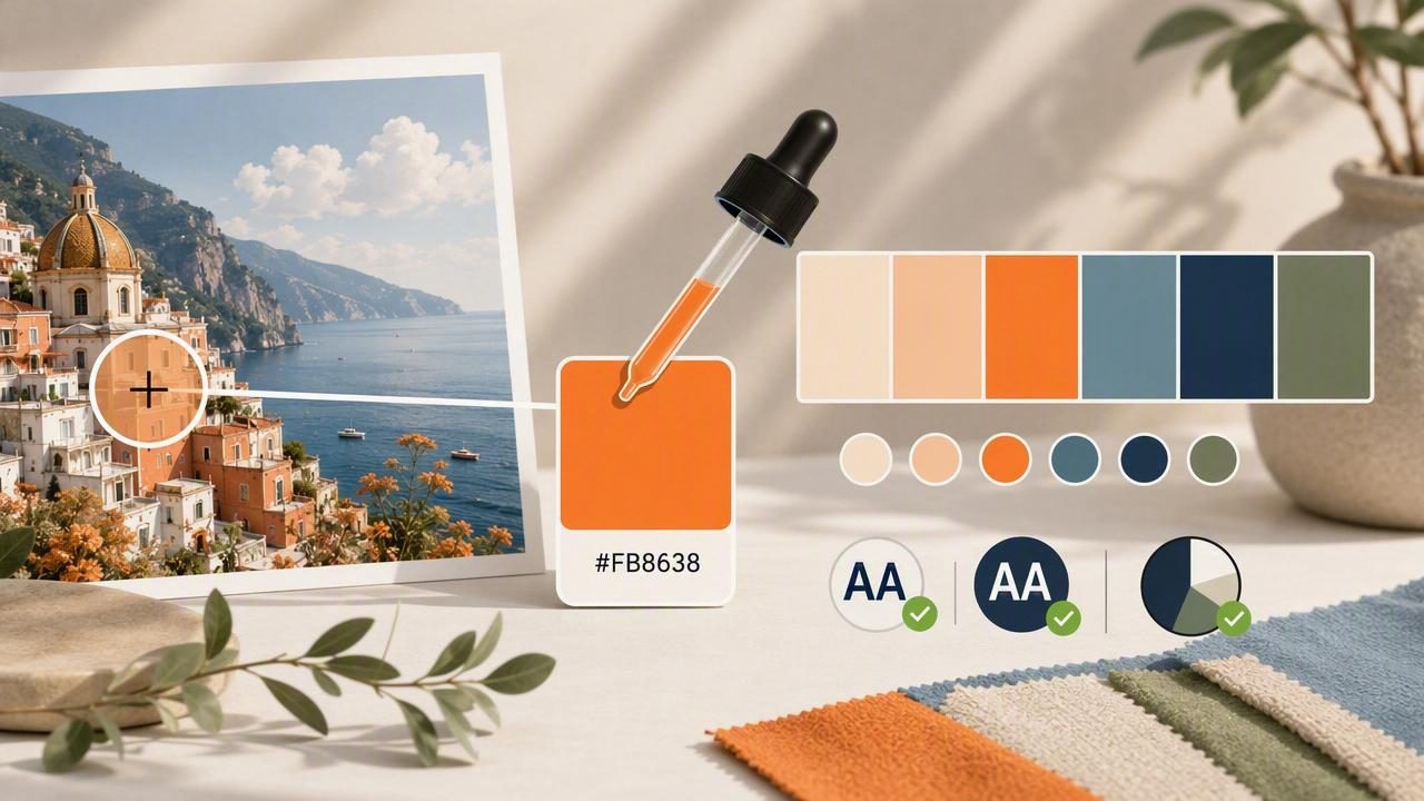
Designers, decorators, and makers often start with a photo: a brand mood image, a room snapshot, a fabric swatch, or a product shot. The challenge is turning that inspiration into reliable HEX codes you can reuse across tools and materials. If you’ve ever tried to get hex color from photo and ended up with colors that look “off” in your layout or paint samples, the issue is usually not the idea—it’s the sampling process.
This guide lays out a practical workflow for extracting HEX colors from images with better consistency. You’ll learn what affects accuracy (lighting, compression, screens), how to sample smarter, and how to turn a few picked colors into a usable palette for UI, print, or interiors.
What does “HEX color from a photo” really mean?
When you pick a color from an image, you’re sampling a pixel (or an averaged group of pixels) from a file stored in a color space (usually sRGB). The result can be represented in several formats, including HEX, RGB, HSL, or HSV/HSB.
| Format | Example | Best for | Watch-outs |
|---|---|---|---|
| HEX | #2F6F8E | Web/UI design, tokens, CSS | No built-in alpha unless using 8-digit HEX |
| RGB | 47, 111, 142 | Precise screen color values | Harder to reason about “lightness” at a glance |
| HSL | 199°, 50%, 37% | Tuning tints/shades systematically | Not identical to perceptual brightness |
| HSB/HSV | 199°, 67%, 56% | Quick adjustments to saturation/brightness | Different tools may label it differently |
HEX is popular because it’s compact and portable. But the quality of the HEX value depends on how good your source photo is and how you sample it.
Step 1: Start with the cleanest source image you can
If your goal is accuracy, the photo matters as much as the picker.
Choose images with predictable lighting
- Avoid mixed lighting (sunlight + indoor bulbs). It shifts color temperature across the scene.
- Prefer diffuse light (cloudy day, softbox, shade) to reduce harsh highlights and deep shadows.
- Watch for specular reflections on glossy surfaces—those pixels are “light color,” not object color.
Use higher-quality files when possible
- RAW or high-res images give more stable sampling than heavily compressed social media images.
- Avoid screenshots of compressed video frames when precision matters.
- If you must use a JPEG, pick one with minimal artifacts (blockiness can skew pixel values).
Step 2: Know the common reasons your sampled HEX looks wrong
When the on-screen preview doesn’t match what you expected, it’s usually one of these:
- White balance: Cameras guess what “neutral” is. A warm bulb can push everything yellow/orange; shade can push blue.
- Exposure and shadows: Sampling a shadowed area gives a darker, cooler color than the actual material.
- Compression artifacts: JPEG can create off-color pixels around edges and gradients.
- Display differences: Two screens can show the same HEX differently (brightness, calibration, True Tone/Night Shift).
- Color management: Some apps interpret embedded profiles differently; exporting can shift values if color space changes.
Rule of thumb: If you want the “true” color of an object, sample from a midtone area—not the brightest highlight or darkest shadow.
Step 3: Sample like a pro (instead of grabbing the first pixel)
To get hex color from photo in a way that’s repeatable, treat picking as a mini-measurement process.
1) Zoom in and avoid edge pixels
Edges often contain anti-aliasing and compression noise. Zoom in and sample inside the area of the color you want (e.g., inside a wall paint region, not on its boundary).
2) Take multiple samples and average mentally (or by tool)
Pick 3–7 points across the same surface. If your values vary widely, that surface is influenced by lighting or texture. Choose a value that represents the dominant midtone.
3) Identify your “anchor” colors
Instead of capturing 20 similar hues, aim for a small set of functional roles:
- Base: the main neutral/background
- Primary: the most distinctive hue
- Secondary: supporting accent
- Highlight: lighter tint used for contrast or space
- Depth: darker shade used for text, outlines, or anchors
4) Beware of “camera magic” colors
Vibrant colors in photos can be boosted by HDR, filters, or in-camera processing. If you’re matching a real-world paint or fabric, consider sampling from a photo taken with fewer enhancements, or verify against a second image.
Step 4: Turn picked colors into a usable palette (not just a list of HEX)
Random picks are inspiration. A palette is a system. Once you have a few candidates, refine them so they work together.
Normalize lightness and saturation
If two colors fight each other, try adjusting them in HSL/HSB:
- Reduce saturation for large background areas (walls, UI surfaces).
- Increase contrast by separating lightness levels (one light, one mid, one dark).
- Limit strong hues to accents—especially in UI where readability matters.
Build a small scale: tints and shades
A single HEX is rarely enough. Create a few steps for each key color (light, base, dark). For UI, this becomes a token scale; for interiors, it becomes a set of companion options.
/* Example: turning photo-picked colors into simple design tokens */
:root {
  --color-base: #F3F0EA;
  --color-text: #1F2A33;
  --color-primary: #2F6F8E;
  --color-primary-weak: #A9C9D6;
  --color-accent: #C96B4B;
}

.button {
  background: var(--color-primary);
  color: var(--color-base);
}
This approach helps you keep the “photo mood” while making the palette functional in real layouts.
Step 5: Validate for readability and real-world use
Extracted colors can look great in isolation but fail in context. Two quick checks save time later:
Accessibility contrast (for UI and print layouts)
If your palette is for interfaces or text-heavy graphics, check contrast ratios between text and background. A common baseline is WCAG AA (4.5:1 for normal text). If your picked colors don’t meet contrast, don’t abandon them—adjust lightness or choose a darker text color.
Material translation (for interiors and products)
Photos are emissive (light from a screen). Paint and fabric are reflective (light in the room). Your extracted HEX is a starting point for selecting real materials. Test with:
- Large swatches rather than tiny chips
- Lighting at different times of day
- Nearby colors (flooring, counters, adjacent walls)
Step 6: Export and share your colors without introducing shifts
Once you’ve got dependable HEX codes, keep them consistent across tools.
- Stick to sRGB for web/UI and most digital workflows.
- Name your colors by role (Primary, Surface, Text) rather than “Blue 1.” Roles survive revisions.
- Document source: keep the original image and notes on where you sampled (midtones, not highlights).
Troubleshooting: when you can’t get the HEX you want
The color looks too dull compared to the photo
You may be sampling a textured or shadowed region. Try sampling brighter midtones, then reduce lightness slightly while keeping saturation closer to the photo’s feel.
The palette feels “muddy”
Many photos contain a shared color cast (warm indoor lighting, cool shade). Neutralize by picking a true neutral (a gray/white object) and adjusting other colors away from that cast.
Two sampled colors clash in design
They may have similar lightness but different hues. Either separate their lightness (one lighter, one darker) or reduce saturation on the one used in larger areas.
Mini checklist: a repeatable method to get HEX color from photo
- Use the highest-quality, least-filtered image you can.
- Disable screen tinting features (True Tone/Night Shift) if you’re comparing across devices.
- Zoom in and avoid edges, highlights, and deep shadows.
- Sample multiple points per surface and choose a representative midtone.
- Convert picks into roles (base, text, primary, accent) and make tints/shades.
- Check contrast for readability and adjust lightness as needed.
- Save/export in consistent formats and document your palette.
FAQ
Is the HEX code from a photo the “true” color?
It’s the color of the sampled pixels in that particular image under that lighting, camera processing, and file compression. It’s useful and often close—but not a laboratory measurement of the material.
Why do I get different HEX values from different tools?
Tools may sample a single pixel vs. an averaged area, interpret color profiles differently, or apply display color management. Use the same image, same zoom level, and ideally average multiple points for consistency.
What’s the best number of colors to extract?
For most projects, start with 5–7 colors. Too many picks can dilute the concept. Expand later by creating tints/shades rather than adding more unrelated hues.
Closing thought
When you treat extraction as a workflow—good source image, careful sampling, palette roles, and validation—you’ll get HEX codes you can trust, not just random numbers. If you prefer doing this on an iPhone or iPad, an app like Color Viewfinder can help you sample and organize colors into palettes while you’re working from real-world photos.
