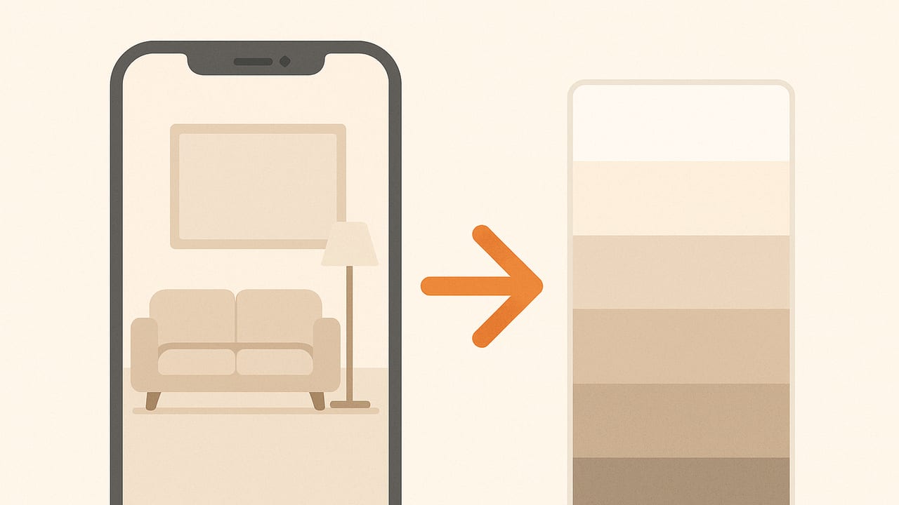
Want neutral living room colors from photo references that actually translate beautifully onto walls, trim, and textiles? You can turn almost any snapshot—your sofa, rug, vacation street, or a favorite painting—into a calm, cohesive neutral palette. This guide explains how to extract accurate neutrals, evaluate undertones, estimate brightness, and build a room-ready scheme with confidence.
What Counts as a Neutral (and Why Undertones Matter)
Neutrals aren’t simply “gray” or “beige.” Technically, a neutral is low in chroma (saturation) and varies in lightness. In color models like CIELAB, true neutrals hover near a = 0, b = 0; in HSL/HSB, they have low saturation. Real-world paints and fabrics, however, carry subtle undertones—warm (yellow/red), cool (blue/green), or balanced—that influence how they pair with woods, metals, and natural light.
Common interior neutrals and their tendencies:
- Warm beige: Soft yellow or red undertone; cozy with oak, brass, terracotta.
- Greige: Gray + beige; balanced undertone, versatile with most floors and metals.
- Taupe: Brown-gray with a violet/pink cast; elegant with walnut, black accents.
- Cool gray: Blue or green undertone; crisp with chrome, marble, black.
- Off-white: High lightness, barely-there hue; great for ceilings and trim.
For main living room walls, pros often aim for mid-to-high lightness (think “readable in low light”), then layer deeper accent pieces for depth. Trim typically runs lighter and cleaner (higher lightness, lower chroma) than the walls.
Photo-to-Palette Workflow for Neutral Living Room Colors
- Choose the right photo. Start with an unfiltered, well-lit image. Good candidates: your existing rug, stone fireplace, flooring, favorite artwork, or an inspiration interior. Avoid heavy color casts (colored lightbulbs, tinted windows).
- Capture or clean up lighting. If shooting new photos, use daytime natural light. On iPhone, tap to focus and slide down slightly to underexpose a touch (prevents blown highlights). If needed, make gentle white balance adjustments in Photos: reduce warm/cool casts; don’t over-correct.
- Extract the colors. Use a color picker to sample multiple areas—midtones, highlights, and shadows—and gather 8–12 candidates. Avoid sampling glare or deep shadows; they distort perceived hue.
- Identify neutrals. From your samples, prioritize low-saturation colors. If your tool shows HSL/HSB, look for saturation under ~15%. If it shows LAB/LCH, a chroma (C*) under ~10 often reads neutral once on a wall.
- Assign roles. From your neutral set, pick:
- 1–2 wall candidates (mid-to-high lightness, very low chroma)
- 1 trim/ceiling color (lighter, cleanest undertone)
- 1–2 deeper accents (pillows, throw, media unit; still low-to-moderate chroma)
- Stress-test the palette. Check it in AM daylight, PM warm light, and night with lamps. Print large swatches or view on a calibrated screen. If a gray goes green at night, nudge toward a red or violet undertone to balance.
- Confirm with samples. For paint, brush 2–3 coats onto poster boards and move them around the room. For textiles, order fabric swatches and compare under your actual lighting.
Quick Neutral Check: Fast Methods
- HSL/HSB: If saturation is below ~15%, it’s likely neutral in room context.
- LCH (CIELAB): If C* (chroma) < 10–12, it generally reads neutral. a* and b* close to 0 mean balanced undertone; negative/positive values nudge cool/warm.
- Black-and-white test: Temporarily desaturate the photo in an editor. Colors that maintain distinct lightness without obvious hue are good neutral candidates.
Neutral Undertones at a Glance
| Neutral Type | Typical Undertone | Pairs Well With | Sample HEX | Best Use |
|---|---|---|---|---|
| Warm Beige | Yellow/Red | Oak, brass, warm white | #D8CBB5 | Main wall in north-facing rooms |
| Greige | Balanced | Mixed woods, black metal | #CFC9BE | Walls for flexible decor |
| Taupe | Violet/Pink | Walnut, bronze, cream | #B8AFA6 | Accent walls, upholstery |
| Cool Gray | Blue/Green | Chrome, marble, bright white | #C7CED3 | Modern spaces, trim |
| Off-White | Very subtle | Everything | #F5F2EA | Ceilings and trim |
Note: HEX swatches are starting points. Always test in your lighting; paint brands publish LRV (light reflectance value) that helps you choose brightness levels.
iPhone Tips: Capture Neutrals Accurately
- Lock AE/AF: Long-press to lock exposure and focus; avoid exposure drift across frames.
- Expose for the highlights: Slightly underexpose to retain detail in off-whites.
- Neutral reference: Include a white, gray, or matte paper in-frame if possible to judge cast.
- Avoid mixed lighting: Turn off warm lamps if you’re using daylight. Mixed color temperatures create muddy undertones.
- Check shadows: Hard shadows skew colors cooler. Soften light by facing windows rather than backlighting the scene.
Accuracy Checklist: From Photo to Paint
- White balance: Correct extreme warm/cool shifts lightly; avoid overcompensation that removes character.
- Surface finish: Glossy tiles/glass reflect color; sample from matte areas instead.
- Metamerism: A color can look different under warm vs cool bulbs. Test under the bulbs you actually use (2700K vs 3000K vs 4000K).
- Screen calibration: Mobile screens are vivid by default. Favor tools that show numeric values (HEX, RGB, HSL, LAB) and verify with swatches.
- Context: Nearby colors influence perception. Isolate swatches with a white border when judging.
Estimate Brightness (LRV) from HEX
Paint LRV is measured in lab conditions, but you can estimate perceived brightness from a HEX color to rank candidates for walls vs trim. Convert sRGB to linear, then compute relative luminance:
# Python 3: estimate LRV-like luminance from HEX
from sklearn.cluster import KMeans
import numpy as np
import re

# sRGB to linear helper
def srgb_to_linear(c):
    c = c / 255.0
    return np.where(c <= 0.04045, c / 12.92, ((c + 0.055) / 1.055) ** 2.4)

# HEX to luminance (0–100)
def hex_to_lrv(hex_color):
    m = re.match(r"#?([0-9a-fA-F]{6})", hex_color)
    if not m: raise ValueError("HEX like #RRGGBB")
    h = m.group(1)
    r, g, b = int(h[0:2], 16), int(h[2:4], 16), int(h[4:6], 16)
    rl, gl, bl = srgb_to_linear(np.array([r,g,b]))
    Y = 0.2126*rl + 0.7152*gl + 0.0722*bl  # relative luminance
    return Y * 100  # LRV-style estimate

print(round(hex_to_lrv("#F5F2EA"), 1))  # ~ high, good for trim
print(round(hex_to_lrv("#B8AFA6"), 1))  # ~ mid, good wall candidate
Use higher values for trim/ceilings, mid-range for main walls, and lower values for accents or built-ins. This doesn’t replace brand LRV specs, but it’s a reliable screening tool.
From Travel Photo to Neutral Living Room: An Example
Imagine a sunlit limestone alley photo—soft cream stones, weathered taupe shutters, ironwork, and a cognac leather bag in the scene. Here’s how to translate it:
- Sample the image: Extract 8–12 swatches. Likely candidates:
- #F5F1E8 (off-white stone highlight)
- #DCD2C6 (warm beige midtone)
- #B8B0A6 (taupe shadow)
- #6B6A66 (charcoal ironwork)
- #A37C4F (cognac leather accent)
- Pick roles:
- Walls: #DCD2C6 (cozy, cohesive with oak floors)
- Trim/Ceiling: #F5F1E8 (crisp but soft)
- Accent built-in or media wall: #B8B0A6 (subtle depth)
- Textile/Metal accents: #6B6A66 (charcoal) and #A37C4F (leather)
- Check undertones: #DCD2C6 reads warm; if your room’s LED lighting is very cool (4000K+), the warmth balances it nicely. If your floors are very red, consider a slightly cooler greige instead (e.g., #CFC9BE).
- Test and refine: Paint large swatches; view morning and evening. If walls feel too yellow at night, nudge toward a balanced greige one step cooler.
Bonus: Coordinating Fabrics and Woods
Tie the palette back to your fixed elements. With the above example, pale oak or ash flooring matches beautifully; walnut adds contrast. Choose curtain fabric one step lighter than walls for an airy feel, or match walls for an enveloping look.
Common Mistakes (and Easy Fixes)
- Neutral turns green at night: Mixed bulbs or cool LEDs can push grays green. Solution: choose a greige with a slight red/violet undertone or warm up lamp color temperature.
- Walls feel dingy: Neutral is too low in lightness. Pick a higher LRV color for walls, reserving the deeper shade for accents.
- Trim looks dirty beside walls: Trim undertone conflicts. Choose a cleaner, lower-chroma off-white with similar warmth to the wall color.
- Palette fights the floor: Floors have a strong red/yellow undertone. Sample colors directly from the floor photo and harmonize undertones, then adjust lightness for walls.
- Over-reliance on screens: Always print or paint large swatches; digital previews exaggerate saturation.
Pro Tips for Building a Cohesive Neutral Scheme
- Limit chroma, vary lightness: Keep saturation low across the palette, but step lightness up and down to add dimension.
- Repeat key colors: Echo the wall color in a patterned rug or throw for unity.
- Texture is your friend: Neutrals come alive with linen, boucle, wood grain, stone, and matte ceramics.
- Metal finishes matter: Warm neutrals love brass and bronze; cooler grays pair with chrome and nickel.
- One wild card: Add a natural accent (terracotta pot, olive green plant) to avoid flatness while keeping the room calm.
When to Adjust the Photo Instead of the Color
If every extracted color feels off, fix the image first:
- Reduce color cast: Nudge temperature and tint toward neutral; re-sample.
- Crop distractions: Remove saturated items (a red toy) that bias palettes.
- Even exposure: Lift deep shadows slightly to reveal true midtones.
Wrapping Up
Creating neutral living room colors from photo inspiration is both art and method. Sample low-chroma areas, verify undertones against your fixed elements, estimate brightness for the right wall/trim balance, and always test in your real lighting. With a clear workflow, any meaningful image can become a timeless, livable palette you’ll enjoy for years.
Note: If you work on iPhone or iPad and want quick HEX, RGB, HSL/HSB values from your images with easy palette exports, consider trying Color Viewfinder—it’s designed to make this workflow fast and reliable.
