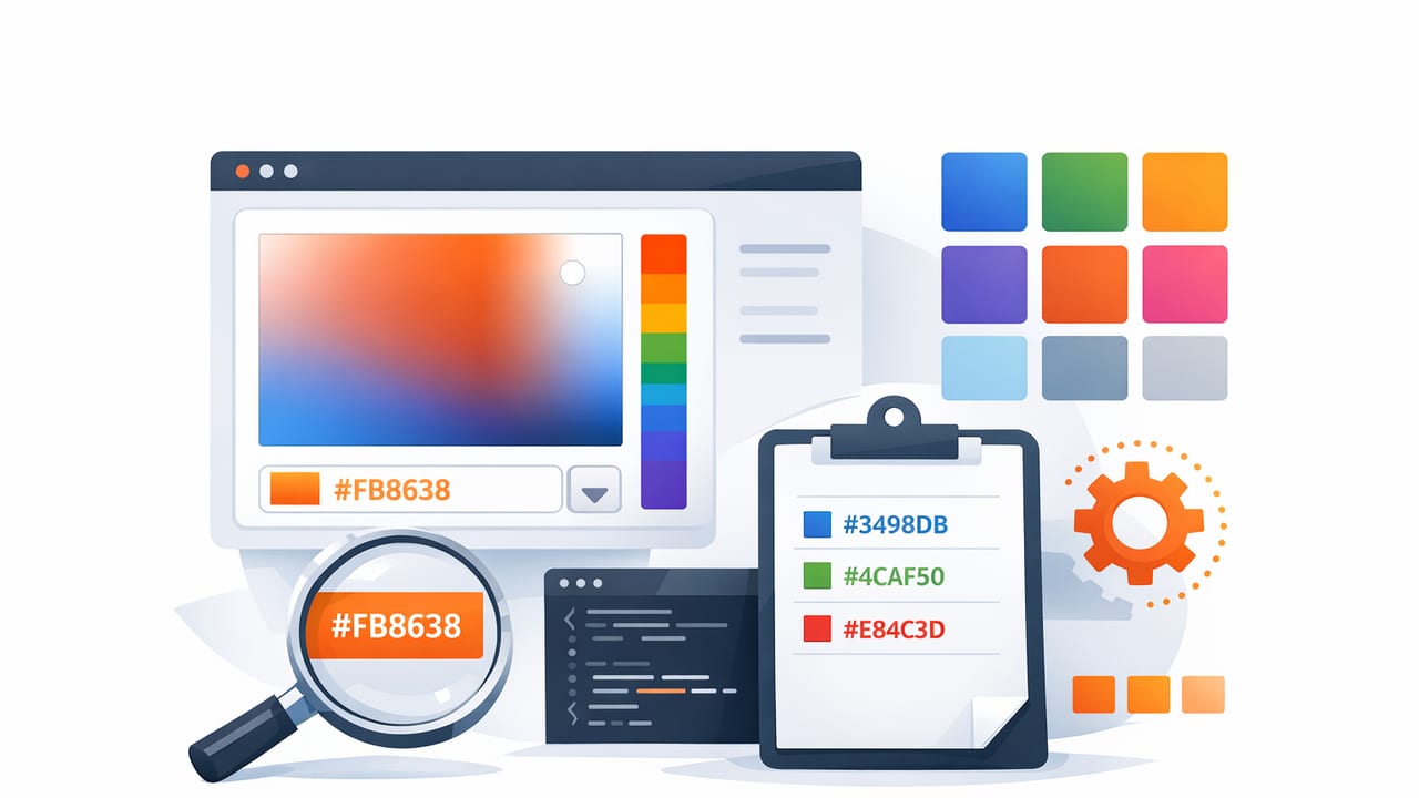
HEX codes are the shortest, most portable way to specify color in digital design. You’ll see them in CSS, design handoffs, brand guidelines, and UI libraries because they’re compact, copyable, and predictable. But many designers and developers still treat them like “magic strings” rather than a color model with rules you can use to your advantage.
This guide breaks down how HEX codes work, how to create better palettes from them, how to adjust them intentionally (instead of guessing), and how to validate choices for readability and accessibility.
What a HEX Code Actually Represents
A standard 6-digit HEX code looks like #RRGGBB. It’s a base-16 (hexadecimal) representation of three color channels:
- RR = red channel (00–FF)
- GG = green channel (00–FF)
- BB = blue channel (00–FF)
Each channel ranges from 00 (0) to FF (255 in decimal). So:
- #000000 is black (0, 0, 0)
- #FFFFFF is white (255, 255, 255)
- #FF0000 is pure red (255, 0, 0)
Shorthand HEX: #RGB
Some HEX codes use 3 digits, like #FA3. This expands to #FFAA33 by duplicating each digit:
#FA3 → #FFAA33
Shorthand is convenient for hand-writing CSS, but many teams prefer 6 digits for clarity and consistency in design systems.
8-Digit HEX: #RRGGBBAA (Alpha)
Modern CSS also supports alpha in HEX: #RRGGBBAA, where AA is opacity (00 transparent → FF opaque). Example:
background: #00000080; /* black at ~50% opacity */
Note: Some tools (and older workflows) still prefer rgba(). If you’re collaborating across apps, confirm alpha format early.
HEX vs RGB vs HSL: When HEX Codes Help (and When They Don’t)
HEX codes are essentially RGB values written differently. That’s why they’re excellent for implementation (CSS, tokens, variables) but not always ideal for thinking about relationships like “make this 10% lighter” or “rotate the hue.” For that, designers often use HSL/HSB concepts.
| Format | Best for | What it’s hard at |
|---|---|---|
| HEX (#RRGGBB) | Copy/paste, code, design tokens | Intentional adjustments (lightness/saturation) |
| RGB (255, 0, 0) | Imaging, direct channel control | Understanding “tone” and “hue” relationships |
| HSL (h, s, l) | Palette building, tints/shades | Perfect perceptual uniformity (it’s approximate) |
Practical takeaway: use HEX codes as your saved output, but consider adjusting colors with HSL-like intent (or with well-structured steps) so changes are predictable.
How to Choose Strong HEX Codes for a Palette
A palette is more than a handful of pretty swatches. It should provide reliable roles: backgrounds, text, borders, accents, and states (hover, active, disabled). Here’s a simple method for building a functional set of HEX codes.
1) Start with a “Base” and an “Accent”
- Base: neutral background and text (often near-white + near-black, or a warm/cool gray range).
- Accent: one primary brand/action color used for buttons, links, highlights.
Many palettes fail because they start with five accents and no neutrals. If your backgrounds and text aren’t solved, every other color decision becomes fragile.
2) Build a Neutral Ramp (Not Just One Gray)
UI needs multiple neutrals: page background, card background, subtle borders, disabled text, etc. A neutral “ramp” might include 6–10 steps. Example naming:
- Neutral-50, Neutral-100 … Neutral-900
Even if you store them as HEX codes, think in roles: “surface,” “surface-2,” “border,” “text-muted,” and so on.
3) Create Tints and Shades for Your Accent
Instead of one accent (e.g., #2F6BFF), you’ll typically want:
- Light tint for subtle backgrounds (badges, highlights)
- Base for normal buttons/links
- Dark shade for hover/active and high-contrast text-on-accent scenarios
If you only have one accent HEX code, designers often “eyeball” hover states and end up with inconsistent saturation or brightness. A small, intentional ramp prevents that.
How to Adjust HEX Codes (Without Guessing)
Because HEX is just RGB, naive adjustments (like adding 10 to each channel) can shift the hue in surprising ways. Here are safer approaches.
Approach A: Convert to HSL, Adjust Lightness, Convert Back
This is one of the most common workflows: you adjust lightness to create tints/shades while keeping hue relatively consistent.
/* Example intent (conceptual): */
Base:  #2F6BFF
Tint:  lighten by +12% (HSL)
Shade: darken  by -12% (HSL)
Even if you don’t do the math by hand, knowing the intent helps you judge results: tints should feel “same color, more airy,” shades should feel “same color, more grounded.”
Approach B: Mix With White/Black (Predictable Steps)
Another reliable method is mixing your accent with white (tints) or black (shades) by a percentage. Some design tools call this “blend” or “mix.”
- 10% mix with white → subtle tint
- 20–30% mix with black → strong shade
This tends to preserve the character of the color better than random RGB tweaks.
Approach C: Use CSS Color Functions (If Your Stack Supports It)
Depending on your browser targets, modern CSS can express adjustments more directly. You can still output final HEX codes for tokens, but prototypes may benefit from dynamic color math.
/* Example: keep tokens as variables, adjust in CSS (support varies) */
:root {
  --accent: #2f6bff;
}
If you need broad compatibility, keep computed results as explicit HEX codes in your design tokens.
Accessibility: Validate HEX Codes With Contrast Checks
Great color is usable color. The most common failure with HEX codes is choosing combinations that look fine on one screen but fail readability in real UI. Run contrast checks for:
- Body text on background
- Button text on button fill
- Links on background (including hover/visited)
- Muted text (often the first to fail)
General guidance (commonly used): aim for 4.5:1 contrast for normal text and 3:1 for large text. Don’t rely on “it looks okay to me” when a one-digit HEX change can make or break readability.
Tip: If a color fails contrast, try adjusting lightness first (tint/shade) before changing hue. You’ll preserve brand feel while improving legibility.
Common HEX Code Mistakes (and How to Avoid Them)
1) Treating Different Screens as Identical
HEX codes are precise numbers, but displays aren’t identical. A blue that looks clean on a wide-gamut phone can look dull on an older monitor. Mitigation:
- Test on at least two device types (phone + laptop)
- Check in light and dark environments
- Validate contrast rather than trusting appearance
2) Using Pure Black (#000000) Everywhere
Pure black can feel harsh for large text blocks. Many UI systems use near-black (e.g., #111111 or #1A1A1A) to reduce glare while staying readable.
3) Building “Random” Sets Instead of Role-Based Tokens
A list of HEX codes without purpose becomes hard to maintain. Prefer naming and roles:
- Semantic tokens:
--text,--background,--primary,--danger - Scale tokens:
--blue-100…--blue-900
You can store HEX codes either way, but tying them to roles prevents “mystery colors” from spreading across a product.
Practical Workflow: From Inspiration to Usable HEX Codes
- Collect reference (photo, screenshot, poster, fabric sample).
- Extract 5–8 candidate colors (dominant + supporting + neutrals).
- Reduce to roles: background, surface, text, border, accent, accent-hover, accent-tint.
- Create ramps (neutral ramp + 3–6 steps of your accent).
- Validate contrast for key text/background and button states.
- Freeze outputs as HEX codes in a token file or style guide.
This process keeps inspiration intact but converts it into a system you can actually ship.
Example: Storing HEX Codes as Design Tokens
Here’s a small, realistic token snippet you could use in a web project. The same approach works for Figma styles, iOS asset catalogs, or any design system documentation.
/* tokens.css */
:root {
  /* Neutrals */
  --neutral-50:  #F7F8FA;
  --neutral-200: #E6E8EE;
  --neutral-600: #5A6270;
  --neutral-900: #12141A;

  /* Accent ramp */
  --primary-100: #DCE7FF;
  --primary-500: #2F6BFF;
  --primary-700: #1F49C9;

  /* Semantic */
  --background: var(--neutral-50);
  --text: var(--neutral-900);
  --border: var(--neutral-200);
  --link: var(--primary-500);
}
Even if your team later changes the brand color, a ramp + tokens make the update controlled rather than chaotic.
FAQ: HEX Codes
Are HEX codes only for web?
They’re most common on the web, but they’re used widely in product design and handoff documentation. Many apps accept HEX codes directly, even when output is eventually converted to another color space.
Why do two HEX codes that are “close” look very different?
Because “numerically close” in RGB isn’t the same as “perceptually close.” Small channel changes can shift hue or saturation noticeably, especially in bright colors.
Should I use 6-digit or 8-digit HEX?
Use 6-digit for solid colors and 8-digit when you need alpha transparency and your platform supports it consistently.
Closing Thought
HEX codes are simple to copy and hard to master only because color has context: surfaces, text sizes, lighting, devices, and accessibility requirements. When you treat HEX codes as the final “storage format” and use a role-based workflow (ramps, tokens, contrast validation), your palettes become consistent, scalable, and easy to hand off.
If you ever need to pull accurate HEX codes from real-world photos while you’re on iPhone or iPad, a tool like Color Viewfinder can make that sampling step quicker.
