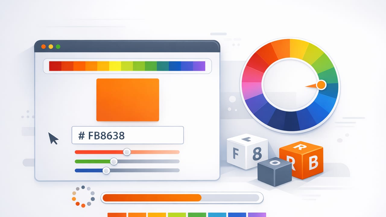
A hex color (often written as a “HEX code”) is one of the most widely used ways to identify and share color across digital tools. If you’ve ever copied #1F2937 into a design file, a website stylesheet, or a mood board, you’ve used HEX. The reason it’s so popular is simple: HEX codes are compact, consistent, and supported everywhere—from design software to no-code website builders.
This guide explains what HEX color codes mean, how they relate to other color formats, how to pull accurate HEX values from photos, and how to apply them in real projects like brand systems, UI design, and interior palettes.
What is a HEX color?
A HEX color is a six-digit code (sometimes eight digits) that represents how much red, green, and blue (RGB) are mixed to create a color on a screen.
- 6-digit HEX:
#RRGGBB(most common) - 8-digit HEX:
#RRGGBBAA(includes transparency/alpha)
Each pair of characters is written in base-16 (0–9 and A–F):
RR= red amountGG= green amountBB= blue amount
For example, #FF0000 is pure red: FF (255) red, 00 green, 00 blue.
Common shorthand
Some tools allow 3-digit shorthand when pairs repeat:
#FFFFFF→#FFF#112233cannot be shortened because pairs don’t repeat
HEX vs RGB vs HSL: when each is useful
HEX is great for sharing and implementation, but other formats can be better for editing or understanding relationships. Here’s a practical comparison.
| Format | Example | Best for | Notes |
|---|---|---|---|
| HEX | #2D6CDF |
Web/CSS, sharing exact color | Compact, widely supported |
| RGB | rgb(45, 108, 223) |
Screen-based work, dev handoff | Same info as HEX, just decimal |
| HSL | hsl(218, 72%, 53%) |
Adjusting tints/shades logically | Great for palette building (lightness) |
| HSB/HSV | hsb(218, 80%, 87%) |
Creative color picking | Often preferred in art workflows |
Rule of thumb: choose HEX when you need a reliable “ID” for a color, and switch to HSL/HSB when you need to modify color families (make it lighter, calmer, warmer, more muted).
How to extract accurate HEX color from a photo
Pulling HEX codes from imagery is a common workflow for branding, product design, and interior inspiration. But it’s easy to sample the “wrong” pixel and end up with a HEX code that feels off in real use. The goal isn’t just to grab a color—it’s to capture a usable color.
Step-by-step workflow (reliable for design)
- Start with the highest-quality image available. Avoid screenshots of compressed images when possible.
- Identify the material “truth” in the scene. For a wall paint inspiration photo, the truest reference is often a midtone area (not highlight glare or deep shadow).
- Sample multiple points. Take 3–7 samples across the same area and compare the HEX values. If they vary widely, lighting is influencing the reading.
- Average or choose the median. The “middle” value typically matches perception better than the brightest or darkest sample.
- Convert to HSL to tune. Make small adjustments to Lightness and Saturation so it performs well in layouts or UI components.
- Validate on a neutral background. Place the color on white, near-black, and mid-gray to see how it shifts.
Common sampling pitfalls (and how to avoid them)
- Specular highlights: Shiny surfaces (ceramic, glossy paint, metal) include bright reflections that are not the actual color. Sample away from glare.
- Shadows: Shadow color is often cooler and darker than the base material. Sample a midtone region instead.
- Color casts: Indoor lighting (warm bulbs) and outdoor shade (cool sky) skew color. Consider correcting white balance, or sample from a neutral reference in the photo.
- JPEG compression: Heavy compression creates artifacts—tiny blocks of off-colors. Sample a larger region or use higher-quality sources.
Practical tip: If you’re building a palette from a photo, don’t treat one HEX code as “the color.” Treat it as a starting point, then create a small range (light/mid/dark) for real-world flexibility.
How to build a usable palette from HEX colors
A single hex color can look great in isolation but fail in a full composition. Strong palettes typically include structure: neutrals, accents, and supporting tones.
A simple palette structure that works in most projects
- Base neutral (background): warm white, cool gray, charcoal
- Primary color (brand or key accent): your main hue
- Secondary color (supporting hue): adjacent or complementary
- Dark anchor (text/UI stability): near-black or deep navy
- Optional highlight (small emphasis): a bright tint used sparingly
When you extract HEX values from a photo, you can assign each sampled color to one of these roles. That step—role assignment—is what turns “pretty colors” into a working system.
Example: turning a photo-inspired blue into a UI palette
Let’s say your photo sampling gives you a primary blue: #2D6CDF. Here’s a practical set of related colors you might define for interface use (tint/shade variations):
Primary:   #2D6CDF
Light:     #E7F0FF
Mid:       #6F97EA
Dark:      #1C3F8C
Neutral:   #F5F7FA
Text:      #111827
In CSS, using these becomes straightforward:
:root {
  --color-primary: #2D6CDF;
  --color-primary-dark: #1C3F8C;
  --color-bg: #F5F7FA;
  --color-text: #111827;
}

.button {
  background: var(--color-primary);
  color: #ffffff;
}

.button:hover {
  background: var(--color-primary-dark);
}
Using HEX color in interior design and decor (without surprises)
HEX codes are screen-native, while paint, textiles, and finishes exist in the physical world. That doesn’t make HEX “wrong” for interiors—it just means you should use HEX as a directional reference, then validate with physical samples.
How to translate HEX into real materials
- Start with a mood image (room photo, fabric, artwork) and extract key HEX colors.
- Group by function: walls (large area), upholstery (mid area), accents (small area).
- Match to manufacturer swatches using the closest visual match rather than expecting a perfect numeric conversion.
- Test in your lighting: morning vs evening can dramatically change perceived warmth.
Why it matters: the same hex color can look different depending on screen calibration and surrounding colors. Using roles (wall/trim/accent) plus in-room testing prevents the “why does this look nothing like the photo?” moment.
Accessibility and contrast: making HEX colors readable
If your palette will appear on-screen (websites, apps, presentations), contrast matters. A beautiful hex color used for text can become unreadable when placed on the wrong background.
Quick checklist for readable color choices
- Don’t rely on color alone to communicate status (use icons, labels, patterns).
- Check contrast between text and background before finalizing a palette.
- Prefer darker text on light backgrounds and reserve lighter text for truly dark backgrounds.
Even without doing full compliance math, you can spot likely issues: bright mid-saturation colors (many blues, greens, oranges) often fail as text colors on white. Use them for buttons, highlights, or borders, and keep body text closer to charcoal.
Troubleshooting: when a HEX color looks “wrong”
If you copy a hex color from a photo and it doesn’t match what you expected, the issue is usually one of these:
- Context shift: colors change appearance based on neighbors (simultaneous contrast). Test your color beside the other palette colors.
- Lighting baked into the photo: your sample includes warm/cool light. Sample different areas or neutralize the image first.
- Different display profiles: colors differ across devices. Re-check on at least two screens.
- You sampled texture, not color: wood grain, fabric weave, and noise can create lots of tiny variations. Sample a broader, flatter area and compare values.
Micro-adjustments that preserve the “feel”
When your hex color is close but not usable, adjust in HSL:
- Lower saturation to reduce “neon” effects.
- Raise lightness for backgrounds; lower lightness for readable text or anchors.
- Nudge hue slightly warmer/cooler to harmonize with nearby neutrals.
Best practices for storing and sharing HEX palettes
A palette becomes more valuable when it’s easy to reuse. Keep your HEX colors organized with naming and roles, not just raw codes.
- Name by role:
Primary,Accent,Surface,Textinstead ofBlue 1,Blue 2. - Store multiple formats: keep HEX for implementation, and HSL/HSB for editing.
- Export consistently: save as PNG for sharing, and use swatch formats when moving between design tools.
For photo-based palettes, include the original image reference (or a small thumbnail) alongside your HEX list. That makes it easier to revisit intent later.
Summary: how to use HEX color like a pro
- A hex color is an RGB color written in base-16, widely used for digital design.
- Extracting HEX from photos works best when you sample multiple points and avoid glare/shadows.
- Turn raw HEX codes into a system by assigning roles (neutral, primary, secondary, anchor).
- Validate colors in context, check readability, and expect translation steps for physical materials.
If you want a lightweight way to sample HEX values from photos and organize them into palettes on iPhone or iPad, tools like Color Viewfinder can help streamline that workflow without changing how you design.
