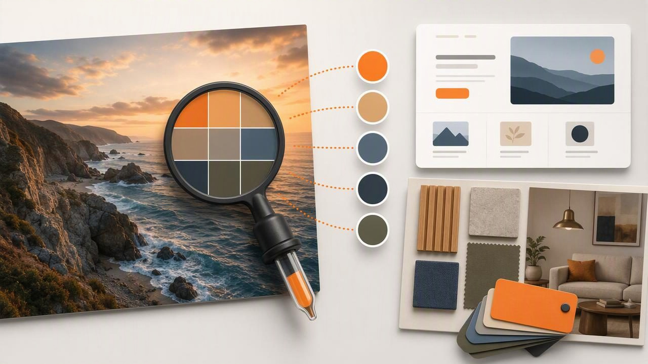
A hex color finder for better design handoff helps turn visual references into specific, reusable color values. Instead of sending a teammate a screenshot with notes such as “use the muted green from the wall,” you can provide a documented HEX code, RGB value, color role, and example use case.
This small change makes a major difference in graphic design, web projects, branding systems, and interior design presentations. A photo can communicate mood, texture, and context, but it does not automatically communicate precise digital color data. Color extraction bridges that gap by giving the team a shared reference point.
This guide explains how to use a HEX color finder effectively, what to include in a color handoff, and where photo-derived colors need additional judgment before they become final design specifications.
Why HEX Values Improve Design Handoff
HEX is a six-character color notation used widely in digital design and development. For example, #2F5D50 represents a deep green, while #F3E7D3 represents a light warm beige. Each code describes a combination of red, green, and blue light values.
In a design handoff, a HEX value gives developers, designers, clients, and collaborators a common reference. It reduces ambiguity that can occur when people use subjective names such as “dusty blue,” “terracotta,” or “warm gray.” Those descriptions can still be useful for creative direction, but they should not be the only information shared.
A well-documented palette can help teams:
- Apply consistent colors across screens, graphics, and documents.
- Reduce repeated sampling from source images.
- Separate primary, supporting, accent, and neutral colors.
- Provide developers with ready-to-use CSS values.
- Preserve the visual intent of an early mood board.
- Spot near-duplicate colors before they create inconsistency.
What a HEX Color Finder Does
A HEX color finder samples pixels from an image and reports the color as a code. Depending on the design tool, you may also see RGB, HSL, or HSB values. These formats describe the same underlying color differently, and each is useful in a different part of the workflow.
| Color format | Example | Best use in a handoff |
|---|---|---|
| HEX | #2F5D50 | Web stylesheets, design files, quick sharing |
| RGB | 47, 93, 80 | Digital graphics and interface tools |
| HSL | 163, 33%, 27% | Adjusting lightness and saturation systematically |
| HSB | 163, 49%, 36% | Visual color adjustments in many creative tools |
For most web and UI handoffs, HEX is the most practical starting point. However, color data alone does not explain how the color should be used. The strongest handoffs pair each code with a functional label and a clear usage note.
A Practical Photo-to-Handoff Example
Imagine a designer is creating a website for a small boutique hotel. The client shares a lobby photo featuring dark olive upholstery, cream plaster walls, brushed brass details, and muted clay cushions. The photo is an excellent source of atmosphere, but it is not yet a usable interface palette.
After sampling representative areas rather than shadows, highlights, or reflections, the designer might document the following digital palette:
| Role | Suggested value | Handoff note |
|---|---|---|
| Primary forest | #2F5D50 | Primary buttons, selected navigation, key headings |
| Warm surface | #F3E7D3 | Page background and large content areas |
| Clay accent | #B86B4B | Small highlights, icons, and limited calls to action |
| Deep text | #27302C | Body copy and high-priority text |
| Soft neutral | #D8CBB9 | Dividers, cards, and secondary surfaces |
This is more useful than a list of unnamed swatches because every stakeholder understands the intended role. The developer knows which value belongs in a button token. The content designer knows which color supports readable text. The client can review the palette in a meaningful structure rather than trying to compare isolated color squares.
Sample the Right Part of the Image
Photos contain more color variation than people usually notice. Lighting, camera processing, shadows, texture, reflections, and compression can all change a sampled pixel. Sampling one tiny point on a fabric weave may deliver a result that is technically accurate for that pixel but not representative of the material’s perceived color.
Use these practices when extracting colors from a photo:
- Choose broad, even areas. Sample the center of a painted wall, fabric panel, sky area, or object rather than a sharp edge.
- Take several samples. Compare values from nearby points to identify a representative middle color.
- Avoid specular highlights. Shiny metal, glass, and glossy paint may produce bright reflections that are not the object’s base color.
- Account for shadows. A shadowed corner can be useful as a tonal reference, but should not automatically become the primary color.
- Keep the source image. Include the image or a crop in the handoff so others can understand the visual origin of the palette.
Useful rule: extract the color that supports the intended design role, not merely the most unusual pixel in the photograph.
Turn Raw Codes Into a Usable Color System
A handoff often fails because it contains too many color values with no hierarchy. A photo may generate dozens of attractive colors, but a product interface, web page, or brand template generally needs a smaller system with defined decisions.
Start by grouping extracted colors into roles:
- Brand or primary: the most recognizable, frequently used color.
- Accent: a color reserved for emphasis, actions, badges, or highlights.
- Neutral surfaces: backgrounds, cards, panels, and dividers.
- Text colors: dark and light options for readable type.
- Semantic states: success, warning, error, and informational messaging, when needed.
Then document constraints. For example, “Clay accent is for icons and small interface emphasis; do not use it for long body text on the warm surface.” This instruction is often more valuable than adding another swatch.
Example CSS Variables
For a website handoff, the documented values can be converted into simple CSS custom properties:
:root {
  --color-primary: #2F5D50;
  --color-surface: #F3E7D3;
  --color-accent: #B86B4B;
  --color-text: #27302C;
  --color-neutral: #D8CBB9;
}

.button-primary {
  background: var(--color-primary);
  color: var(--color-surface);
}
This does not replace a complete design system, but it creates a clear connection between the visual palette and implementation. It also gives developers a reliable place to begin rather than requiring them to inspect screenshots for approximate values.
Include Context, Not Just a Palette
Color codes are only one layer of a design handoff. Include enough context for another person to use the palette consistently without guessing. A compact handoff package may include:
- A source image, mood board, or approved visual reference.
- Named color roles with HEX and RGB values.
- Usage examples for backgrounds, text, components, and accents.
- Notes about which colors should be used sparingly.
- Accessibility review requirements for text and interactive elements.
- A list of exports appropriate for the team’s tools, such as CSS, CSV, JSON, or ASE.
For example, a developer should not have to infer whether a pale beige is a page background, a disabled state, or a card fill. Clear labels prevent that kind of interpretation drift.
Check Contrast Before Approving the Palette
A photo-inspired color combination can look beautiful in a mood board yet be difficult to read in an interface. Before finalizing any pair for text, buttons, form controls, or status messages, check contrast with the intended font size and weight.
In the hotel example, deep text #27302C on warm surface #F3E7D3 may be a suitable starting combination, while clay accent #B86B4B on the same surface may be better reserved for decorative elements. The exact decision should be based on a contrast check and the actual component design, not appearance alone.
Also evaluate the palette in realistic layouts. Large color fields, small icon strokes, thin text, hover states, and disabled controls can all create different readability issues. A color that works in a large hero image may not work in a 14-pixel navigation label.
Know the Limits of Photo Color Extraction
Photo color extraction is a strong tool for digital inspiration and documentation, but it has limits. A sampled HEX value represents how a color appears in a particular image under particular conditions. It does not guarantee that a physical paint, textile, printed item, or product finish will match that color in real life.
Screen settings, ambient light, camera white balance, editing filters, and image compression can all influence results. For interior design, use extracted values to communicate a visual direction or build a digital presentation, then verify physical materials with appropriate samples. For print work, use a print-aware workflow and consult the relevant production specifications instead of treating a screen HEX value as a guaranteed printed result.
Make the Handoff Easy to Reuse
The best color handoff is not a one-time attachment. It becomes a reusable reference for future pages, campaigns, presentations, and creative projects. Save the palette with descriptive names, preserve its source image, and update the documentation when a role changes.
If you need to inspect a photo and capture values while working on iPhone or iPad, Color Viewfinder’s guide to picking HEX colors from photos explains a practical mobile workflow for reading and organizing digital color data.
When teams receive named roles, verified values, usage notes, and source context, color stops being a subjective handoff problem. It becomes a clear design decision that can move confidently from image reference to finished work.
