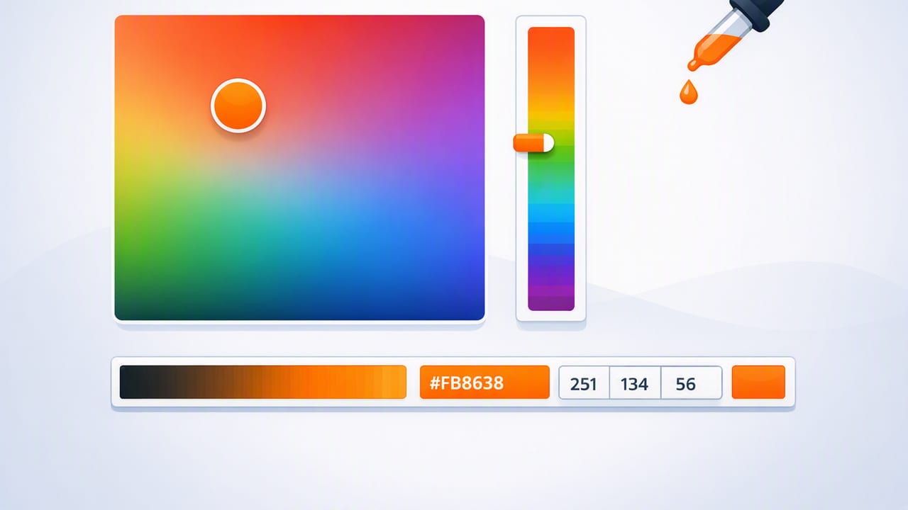
A hex color picker is one of the fastest ways to turn real-world inspiration into usable design values. Whether you’re sampling a paint color from a room photo, matching a brand accent from a screenshot, or building a UI palette from a product shot, the goal is the same: capture a reliable color value (like #1F6FEB) and translate it into a palette you can actually use across tools.
This guide walks through a practical, repeatable workflow for picking HEX colors from images, improving accuracy, building cohesive palettes, and exporting results for graphic design, web, and interior design projects.
What a hex color picker does (and why HEX is so common)
A hex color picker samples a pixel (or a small region) from an image and returns a HEX code. HEX is a compact way to represent RGB color values using base-16 notation:
- HEX:
#RRGGBB(and sometimes#RRGGBBAAfor alpha/transparency) - RGB:
rgb(31, 111, 235) - HSL/HSB: helpful for adjusting hue, saturation, and brightness in a more “human” way
HEX is popular because it’s widely supported (web, design tokens, many design tools) and easy to copy/paste. But the trick is ensuring the sampled color is the right color—especially when a photo includes shadows, glare, compression artifacts, or mixed lighting.
HEX vs RGB vs HSL/HSB: when each format helps
A good workflow uses HEX for sharing and implementation, and HSL/HSB for refining the palette (e.g., creating lighter/darker steps or correcting saturation).
| Format | Best for | Example | Common pitfall |
|---|---|---|---|
| HEX | Copy/paste, web, tokens, handoff | #1F6FEB |
Harder to “reason about” adjustments |
| RGB | Precise screen values, imaging contexts | rgb(31,111,235) |
Not intuitive for making tints/shades |
| HSL | Creating systematic palette steps | hsl(214,84%,52%) |
Lightness shifts don’t always “feel” even |
| HSB/HSV | Photography-inspired adjustments | hsb(214,87%,92%) |
Brightness can hide clipping in highlights |
How to pick an accurate HEX color from a photo
Step 1: Choose the best source image you can
Color sampling is only as good as the pixels you start with. If possible:
- Use the original photo rather than a screenshot of a compressed image.
- Avoid images with heavy filters (warm presets, cinematic LUTs, strong HDR).
- Prefer evenly lit photos; mixed lighting (window daylight + warm bulbs) creates competing color casts.
Step 2: Zoom in and sample the “representative” area
In real photos, a single object rarely has one color. A painted wall contains subtle shifts from texture, light falloff, and camera noise. Instead of sampling an edge highlight or a shadow pocket, aim for the midtone area where the material looks most consistent.
Rule of thumb: pick from midtones first, then sample highlights and shadows only to build supporting palette values.
Step 3: Sample multiple points (then pick the median)
One pixel can be misleading. A more reliable approach is to sample 5–10 points in the same material area and compare results. Choose the median value (the “middle” reading) rather than the most extreme.
If your tool supports it, use an averaged sampler (a small target area rather than a single pixel). Averaging reduces noise and compression artifacts.
Step 4: Watch for these accuracy traps
- JPEG artifacts: blocky areas can push colors slightly greener or magenta. Zoom in and sample away from edges.
- Specular highlights: shiny surfaces (tile, metal, satin paint) contain near-white reflections that are not the base color.
- Shadows: shadows often add blue or green, especially under daylight.
- Auto white balance: phones may shift the entire scene warmer/cooler. If consistency matters, compare with a known neutral area in the photo (a white paper, gray object).
Turning sampled colors into a usable palette (not just a list of HEX codes)
A strong palette is organized around roles, not just swatches. After you collect candidate colors, group them into a system you can apply across layouts or rooms.
A practical 60–30–10 palette structure
This approach works for both interior design and UI composition:
- Base (about 60%): background wall color / app background / dominant neutral
- Secondary (about 30%): supporting surface / cards / secondary neutrals
- Accent (about 10%): emphasis color for buttons, decor, artwork, calls to action
When sampling from a photo, your base and secondary colors usually come from large areas (walls, sky, fabric), while accents come from small but high-contrast objects (flowers, signage, clothing, product labels).
Create tints and shades for flexibility
Most projects need more than one value per color. A single HEX code rarely covers hover states, borders, shadows, headings, and backgrounds. Use HSL/HSB to generate steps:
- Tints: same hue, lower saturation (sometimes) and higher lightness/brightness
- Shades: same hue, lower lightness/brightness
To keep it coherent, maintain a consistent adjustment pattern. For example, for a primary blue, keep hue constant and adjust lightness in predictable increments.
Accessibility and contrast: the step designers often skip
Sampling from photos can produce beautiful colors that fail readability checks. If you’re using HEX values for UI, documents, or signage, verify contrast—especially for text on backgrounds.
As a quick guideline:
- Body text on background should typically meet WCAG AA contrast (often 4.5:1 for normal text).
- Large text can pass with lower contrast, but don’t assume it’s readable on every device.
If your sampled accent color is too light for white text, either darken it (shade) or use dark text. Don’t force a trendy palette into an unreadable interface.
Exporting HEX colors into a workflow (web, design tokens, and handoff)
Once you trust your palette, the next step is making it portable. Common export targets include:
- CSS variables for websites and design systems
- Design tokens for cross-platform apps
- ASE/ACO-like palette files for design tools (depending on your environment)
- CSV/JSON for sharing with teammates
Example: CSS variables from a photo-derived palette
Here’s a simple structure you can paste into a stylesheet. It separates brand roles from raw colors so your system stays flexible.
:root {
  /* neutrals */
  --color-bg: #F7F5F0;
  --color-surface: #FFFFFF;
  --color-text: #1D232A;

  /* accents */
  --color-primary: #1F6FEB;
  --color-primary-600: #1A5FD0;
  --color-primary-100: #DCE9FF;

  --color-accent: #E24D2A;
  --color-border: #E6E1D8;
}

.button {
  background: var(--color-primary);
  color: #FFFFFF;
}

.card {
  background: var(--color-surface);
  border: 1px solid var(--color-border);
  color: var(--color-text);
}
If you’re working on a design system, consider naming by function (--color-primary, --color-danger) rather than by appearance (--blue, --orange). Photo-inspired palettes evolve; role-based names age better.
Quality checklist: a repeatable hex color picker workflow
- Start with the best image (original, minimal compression, consistent lighting).
- Sample midtones before highlights/shadows.
- Take multiple samples and select the median or use averaged sampling.
- Build palette roles (base/secondary/accent) instead of random swatches.
- Create steps (tints/shades) so the palette is usable in real layouts.
- Check contrast if any colors will be used for text or UI.
- Export in the format you’ll actually use (CSS variables, tokens, CSV/JSON).
Common questions about hex color pickers
Why do I get different HEX values from the same photo?
Small differences in sampling position can hit different pixels affected by compression, noise, or lighting gradients. Zoom in, sample multiple points, and avoid edges, glare, and deep shadow.
Can I match a real paint color from a photo using HEX?
HEX is a screen color representation, not a paint formula. You can get close for mood boards and direction, but for paint matching you’ll need physical samples or manufacturer references. Use photo-based HEX as a starting point, then validate under your room’s lighting.
Should I sample from a screenshot or the original image file?
Use the original whenever possible. Screenshots may apply color management differences, scaling artifacts, or additional compression.
Putting it all together
A hex color picker is more than a convenience tool—it’s a bridge between inspiration and implementation. When you sample deliberately (midtones, multiple points), structure your palette (roles + steps), and verify usability (contrast), your colors become consistent across mockups, rooms, and shipped products.
If you prefer doing this on iPhone or iPad, an app like Color Viewfinder can help you extract HEX/RGB/HSL/HSB values from photos and organize them into exportable palettes for your creative workflow.
