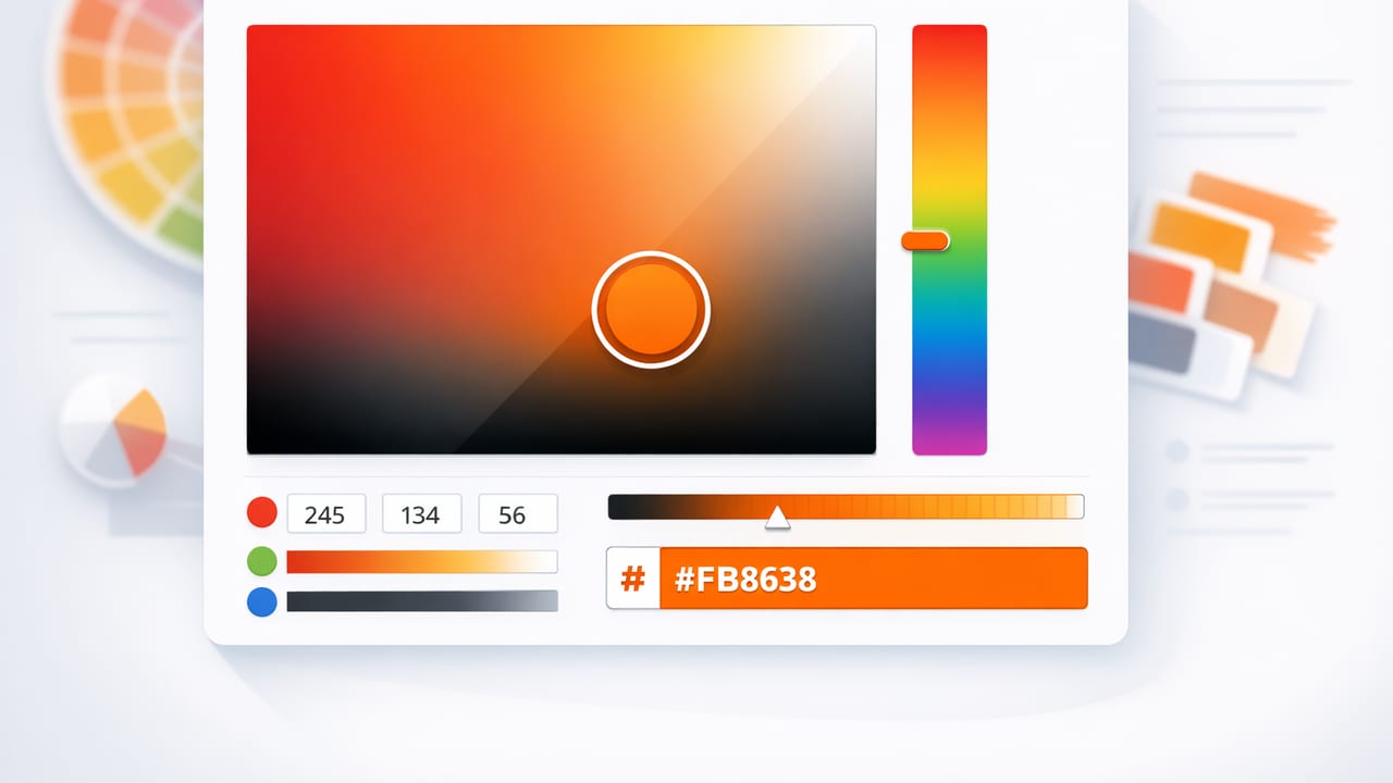
A hex color picker sounds simple: tap a pixel, get a HEX value, and move on. In real projects, though—branding, UI design, illustrations, or interior mood boards—color accuracy and consistency can fall apart quickly. The same photo can produce different results depending on lighting, compression, shadows, and the way your screen displays color.
This guide walks through a practical, repeatable workflow for picking HEX colors from photos, validating what you captured, and turning raw samples into usable palettes. The goal is not just “a HEX code,” but color decisions you can trust across different tools and deliverables.
What a hex color picker actually samples (and why it matters)
When you use a hex color picker on an image, you’re sampling a pixel’s color values. That pixel is a product of:
- Lighting (warm indoor bulbs vs. cool daylight)
- Exposure (highlights and clipped whites)
- Shadows (often tinted—blue, green, or muddy)
- Camera processing (HDR, sharpening, noise reduction)
- Compression (JPEG artifacts can shift edge pixels)
- Color profile (sRGB vs. Display P3, and conversions)
So the “true” color of a painted wall, fabric swatch, or logo in a photo is rarely a single pixel. The best practice is to sample multiple nearby pixels and then choose a representative value (often a midtone rather than highlight/shadow).
Step-by-step: a reliable hex color picker workflow
1) Start with the best possible source image
If you can control the input, you’ll spend less time correcting later.
- Prefer original photos over screenshots of screenshots.
- Avoid heavy filters (they can shift hues and crush shadows).
- Watch out for glossy surfaces (reflections contaminate the color).
- Use even lighting when photographing physical objects (diffused light is ideal).
Tip: If you’re sampling a real-world object (paint, textile, packaging), take two photos: one in shade and one in indirect daylight. Compare samples to avoid lighting bias.
2) Sample strategically: pick midtones first
When you tap a pixel, you’re choosing a point on a gradient. Highlights are usually closer to white and can hide saturation; shadows often skew cooler and less saturated. For most materials, your best “representative” sample is a midtone area where the surface is evenly lit.
- Zoom in to avoid selecting edge pixels (edges often include anti-aliasing or compression artifacts).
- Tap 3–7 points in the same region (not just one).
- Note the range: are the HEX values wildly different? That’s a sign you’re sampling a gradient, glare, or noise.
3) Sanity-check the color using HSL (not just HEX)
HEX is a compact way to store RGB values, but it doesn’t explain why a color looks off. Interpreting the same sample in HSL (Hue, Saturation, Lightness) makes problems easier to spot:
- Hue answers “what color family is this?” (red vs. orange vs. green).
- Saturation answers “how intense is it?” (muted vs. vivid).
- Lightness answers “how bright is it?” (near black vs. near white).
If your sample looks too gray, saturation may be too low (often from shadow sampling). If it looks oddly warm or cool, the hue may be biased by lighting.
4) Build a palette: roles beat random swatches
Raw picks are just ingredients. A usable palette assigns roles so the colors behave predictably in designs:
- Primary: the most recognizable brand/scene color
- Secondary: supports the primary, often lower intensity
- Accent: sparingly used “pop” color for emphasis
- Neutrals: background, surfaces, typography support (off-whites, warm grays, charcoals)
- States (UI): hover, active, disabled, error/success
A good rule: keep your palette small (5–9 colors) and derive tints/shades systematically rather than sampling dozens of near-duplicates.
Common hex color picker mistakes (and how to fix them)
Mistake: Sampling from edges and text
Edges often contain blended pixels (anti-aliasing), and compressed images create mosquito noise around text. Fix: sample from larger flat areas and zoom in.
Mistake: Trusting a single pixel
One pixel can be a glitch, a reflection, or noise. Fix: sample several points and choose a median-like value.
Mistake: Ignoring color profiles
Some images are tagged with wide-gamut profiles; others are assumed to be sRGB. If you export colors into workflows expecting sRGB, verify consistency across apps and devices.
Mistake: Using “photo truth” in production UI
Colors from photographs can be beautiful but not always accessible or consistent for UI. Fix: treat photo-extracted colors as inspiration, then refine for contrast and usability.
Quick reference: HEX vs RGB vs HSL (and when to use each)
| Format | Example | Best for | Watch out for |
|---|---|---|---|
| HEX | #2F6FED |
Design handoff, CSS, tokens | Not intuitive for humans (hard to “see” hue/lightness) |
| RGB | rgb(47, 111, 237) |
Screen-based work, programmatic manipulation | Hard to tweak intentionally without tools |
| HSL | hsl(220, 83%, 56%) |
Tuning hue/saturation/lightness | Some HSL adjustments can shift perceived brightness oddly |
Turn picked colors into reusable design tokens
Once you’ve chosen your key colors, the most reliable way to keep them consistent is to define them as tokens (variables) and reuse them everywhere.
:root {
  --color-primary: #2F6FED;
  --color-primary-600: #275FD0;
  --color-accent: #F25C54;
  --color-surface: #F7F7F8;
  --color-text: #1E1E22;
}

.button {
  background: var(--color-primary);
  color: white;
}

.badge {
  background: var(--color-accent);
  color: var(--color-text);
}
Even if you’re not building a web UI, token thinking helps: name colors by role (Primary, Surface, Text) rather than by vague labels (Blue1, Blue2). This makes later changes safer.
How to validate your palette (contrast and harmony)
1) Contrast checks for readability
If your palette will appear in interfaces, presentations, posters, or signage, ensure text remains readable on backgrounds. As a quick heuristic:
- Use dark text on light surfaces and light text on dark surfaces.
- Avoid mid-gray text on colored backgrounds (it often fails).
- Test your “Primary” as a background with white text and with dark text; pick the pairing that stays crisp.
2) Harmony: reduce accidental clashes
Photo-derived palettes can contain multiple competing hues. To keep harmony:
- Choose one dominant hue and let others support it.
- Shift “almost the same” colors closer together to avoid a noisy look.
- Prefer one strong accent over several weak accents.
Interior design and decor: extracting “paint-like” colors from photos
If you’re using a hex color picker for interior inspiration—pillows, tile, cabinetry, wall colors—remember that screens emit light while paint reflects it. Two practical steps help bridge the gap:
- Sample larger areas (not tiny patches) to reduce texture influence (woven fabric, grain, plaster).
- Create a muted variant of your picked color by lowering saturation slightly; many real materials read less saturated than screens suggest.
Then use your extracted HEX values as a directional guide and compare against physical samples (paint chips, fabric swatches) when making final purchasing decisions.
Troubleshooting: when your picked HEX doesn’t match expectations
- The color looks too bright: you sampled a highlight. Re-sample in a midtone area and compare HSL lightness.
- The color looks too dull: you sampled in shadow or noise. Try a brighter region or increase saturation slightly.
- The color shifts between apps: check color profile handling and ensure exports are consistent (often sRGB is the safest default).
- The palette feels messy: too many similar hues. Reduce to roles and keep only distinct, purposeful colors.
A simple checklist you can reuse
- Pick the highest-quality image available.
- Zoom in; avoid edges and glare.
- Sample 3–7 points per material/color.
- Validate using HSL (check hue and lightness).
- Assign roles (Primary, Accent, Neutrals).
- Create tokens/variables to preserve consistency.
- Test contrast for text and key UI elements.
- Export in the formats your workflow needs (HEX/RGB/HSL).
Choosing the right hex color picker tool on iPhone or iPad
Any tool can display a HEX value, but if you work frequently from photos, look for features that support accuracy and reuse:
- Fast sampling with zoom and a precise picker
- Multiple color models (HEX, RGB, HSL/HSB)
- Palette organization (save sets by project/client)
- Export options (copy, files, common palette formats)
- Layout customization so palettes are presentation-ready
If you want a lightweight iOS option built specifically for extracting colors from photos and arranging them into palettes, Color Viewfinder is one example worth exploring.
